Brainstorming and feedback loops
One of the first steps of designing is always brainstorming — sometimes this starts before research, sometimes I research first, and often I go back and forth, letting brainstorming push me to the limits of my current knowledge and then taking to the internet to open up new territory. For the equipment for Astronomics (demo on steam right now!), while the design team had a few key assets they were looking for, they were also still brainstorming and so we were all kind of discovering what the equipment part of the game could be as a whole.
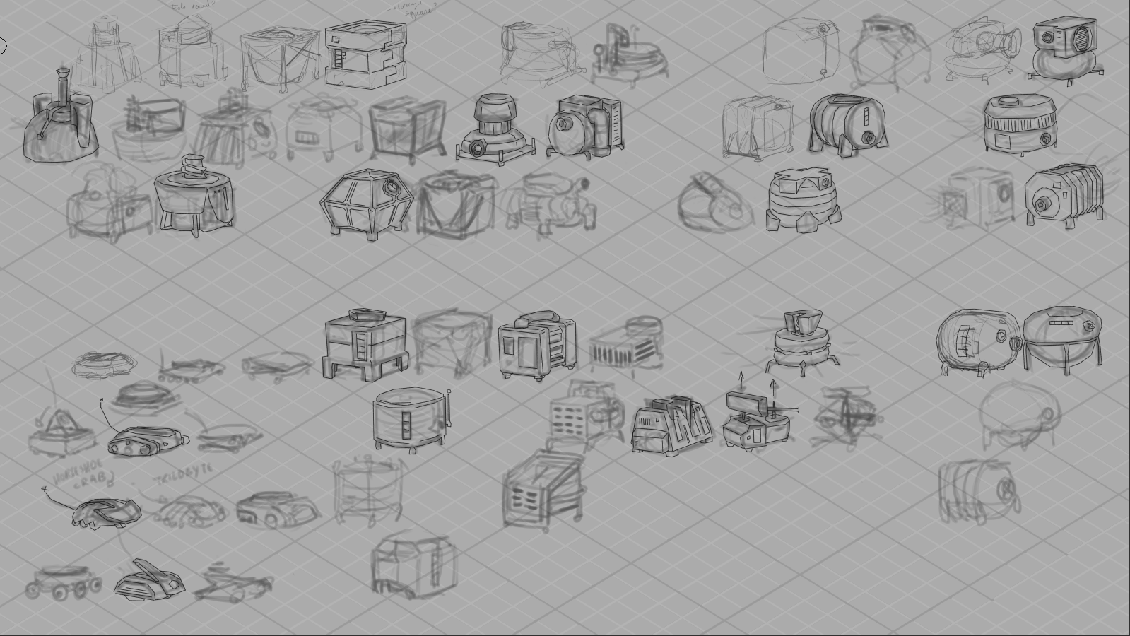
For me, that brainstorming usually looks like a LOT of very rough drawings. I usually have my research sketches open nearby for reference, and I try and draw small enough that i can see all my brainstorming and seek out possibility spaces between ideas.
Above is my first VERY rough brainstorming page, and on it you can see art from two passes – the softer, lighter drawings are the open-ended thinking; the darker clear lines are the second pass, where I start filtering, choosing which pieces to take to the rest of the team to start conversations with.
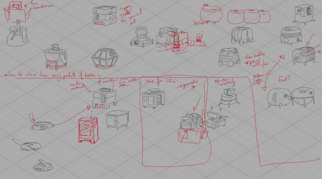
You can see how we would collect feedback above – i would write notes and do additional drawing on top of the submitted artwork as we went through things in screenshared video meetings, and then have these with me as I iterated further.
One thing you might notice is that these are all drawn with straight lines — Astronomics is a low-poly 3D style game, and it was fun to think about simplifying the shapes right from the beginning. While I didn’t do all my drawing like this, it was a fast and quick way to get clean linework that had some connection to the style of the game long before we really knew anything about said style!
Speaking of style…
Next up, we had to make some big decisions. Astronomics has a lot of equipment with a big range of functions and scales and the most important thing was making sure it all read like equipment from the same manufacturer – that being CubeCorp, as you’ll see in the demo. I narrowed it down to three possibilities:
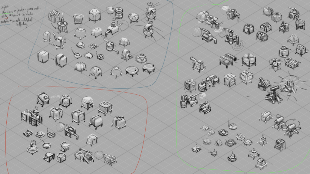
I went in three directions — “Star Wars” style, all panel lines and chamfered edges and a sense of overall complexity; “Safety” style, with safety bars and frames around everything, focusing otherwise on simple, chunky shapes; and “Modern” style, exploring simple silhouettes with hidden complexity.
(none of these are official names for known styles, eg, the star wars style didn’t actual aim for matching the style in those films particularly — these names were more mnemonic devices to help me quickly sum up what I was thinking in a punchy way, and help my coworkers refer to the styles more easily in conversation while we discussed an debated direction together.)
In the end, what we chose was mostly Safety-styled, but elements from both other directions made their way in too!
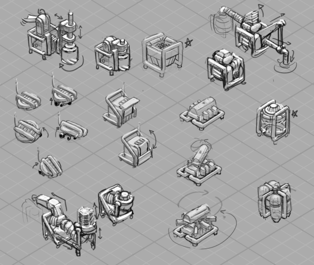
And here was my first sheet ft a pass on the drill, pump and vaccuum, containers for solids, liquids and gasses, a worker bot, a worker bot home, and a robust scanner machine.
A few things we were thinking about: we wanted there to be a sense of a unit of size that everything fit into – CubeCorp, remember? – and so even our most complicated equipment needed to pack down into that cube. That meant that we were going to be animating equipment essentially unfolding, so I tried even at this stage to think about what that could mean for the drill and pump and vaccuum, and you can see packed and unpacked states up there for each design.
They also were likely to be carried around by our little darling worker bots — so everybody needed feet the bots could squeeze between to get underneath. Speaking of, they probably went through the most designs of everything, and what’s in the demo does not appear in these pages at all, haha, but here, a few more passes:
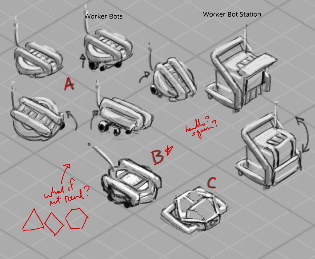
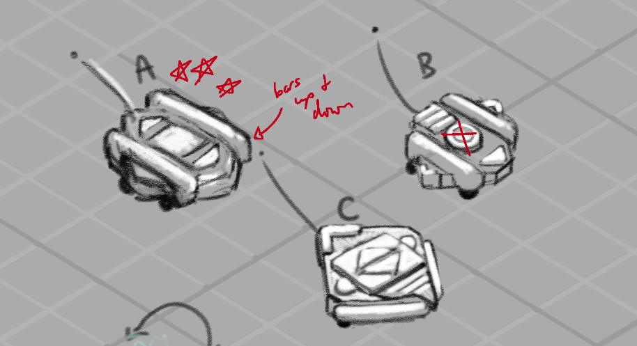
In fact, you might not be able to find any of these exact designs in the demo — that’s just the nature of concept art in games! What the game needed then and what it needed later — as the game design itself was developed — well, it changed, as it often can! I think it can be easy from the outside to assume that everything anyone thought of was eventually brought to life, but that rarely ever happens. Concept art is a process, and so even if these designs didn’t make it into the game, they were an important step along the path towards designs that did, and they taught us a lot about what we did and didn’t want Astronomics to look like!

Leave a Reply