
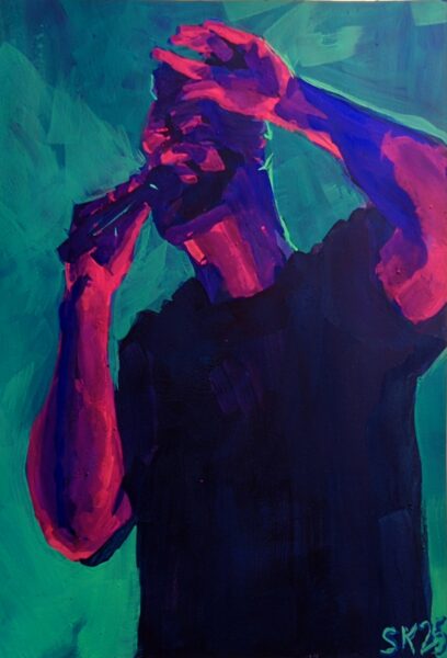
7 x 10″ gouache on hot press, referencing my own photos from seeing Leprous in Toronto back in September 2024.
The photo itself is much more blue than teal, but bright, saturated light blues are such a challenge to mix with gouache! So i turned the background teal and was able to get the relative saturation and values I needed, and keep the moody vibe of the photo.
My concert photos have certainly improved over the years, as digital photography tech got better at low light and phones started including physical telephoto lenses, but it’s rare i get close enough to get clear shots of performers’ faces.
In parallel, it’s usually tough for me to allow myself not to fully render a face in a painting, but given the absolute absence of details in my reference I was able to keep things very abstract here, and honestly i think it was good for me! I loved the hand pose in particular and i think it really kind of stands in for where a portrait would go .
Additionally, to talk for a minute about my painting process, I was taught still life and study painting via the Hawthorne method, which i would summarize thus:
put the right shapes in the right colours in the right place
It’s deceptively simple and forces you to sometimes forget what you’re painting and focus entirely on the graphic abstraction of what’s in front of you. People joke that you don’t need to know how to draw to paint like this, and I often think that’s oversimplified at best, but: I’m very happy with the hand anatomy in this piece and i definitely did not approach the hands through a drawing mindset. I just looked at the shapes of the colours and placed them as accurately as I could.
Intriguing.
Leave a Reply