
swap to chronological order of most recently modified
-
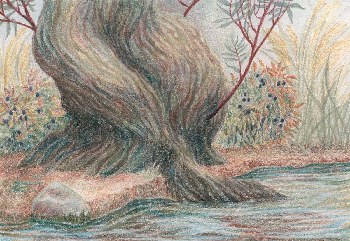
This was a delightful test drive of these Derwent brand Drawing Pencils!
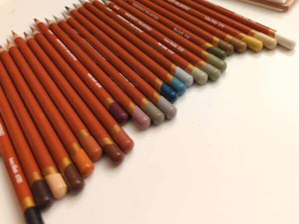
the pencils 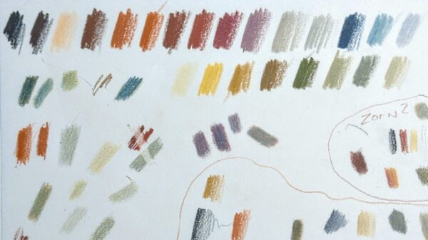
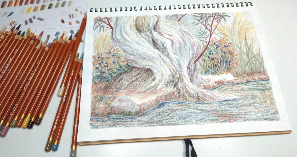
the swatches They’re a limited palette of 24 earth tones, very soft and waxy, decently opaque, and, it turns out, pretty erasable! So they were a very friendly and low stakes material to play with at length.
I did find some useful tips on youtube over time! One video explained that when they waxed out the paper – when you’ve added enough pigment that the grain of the paper has gone completely smooth, and there’s a milky film forming over your marks and dulling your colours – they had success wiping off that top layer with a paper towel, and it boggled my mind but this worked really well! That’s what made me try the white gum erasers, and they also worked well! Though the smaller, drier ones were certainly more effective than the bigger, more stretchy kind.
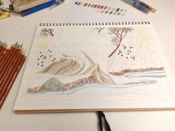
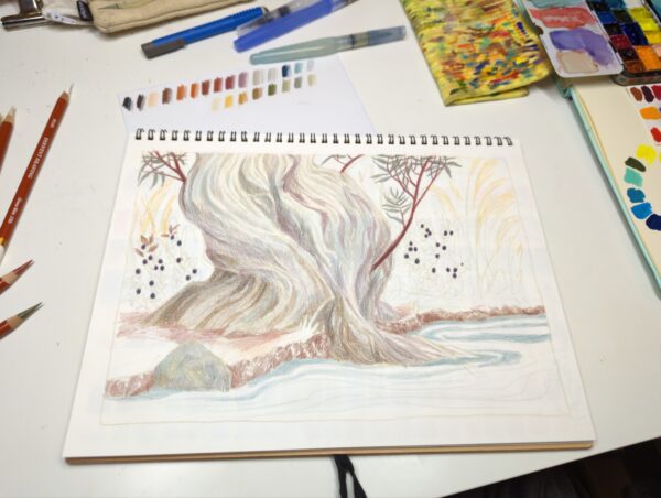
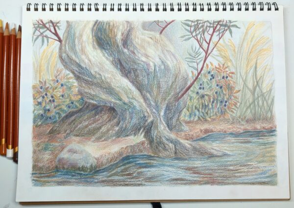
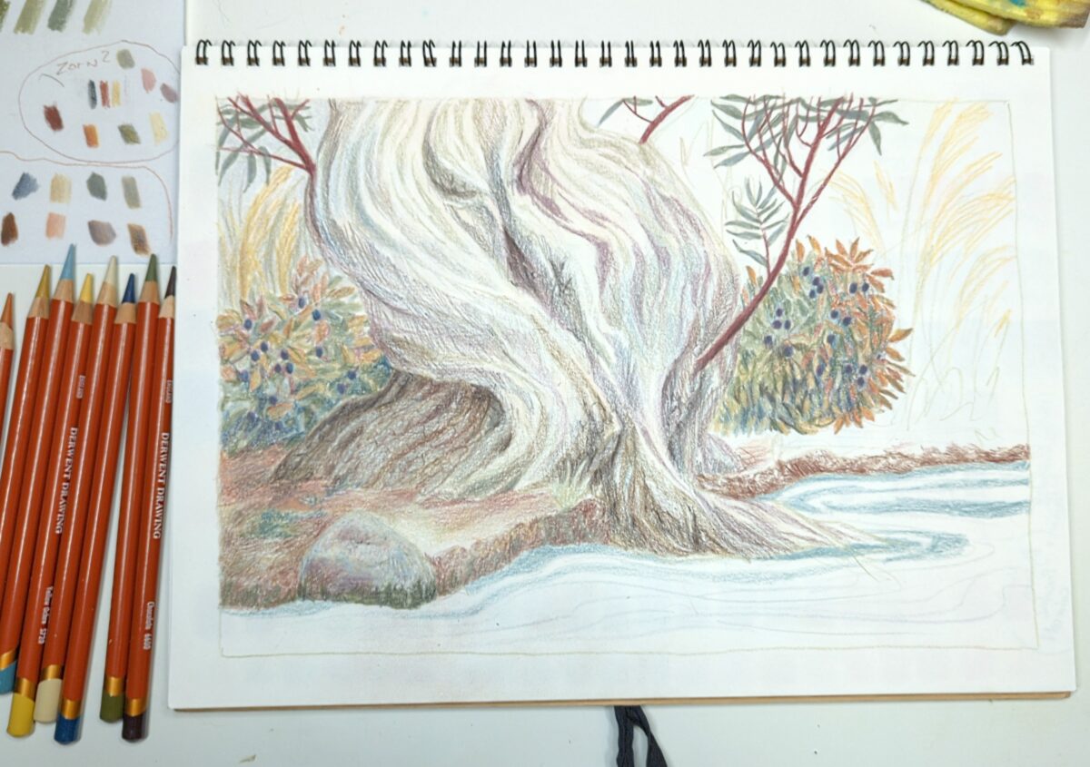
This exercise was done in a MUJI sketchbook, a very cheap option that I’m quickly getting very attached to! These things take gouache, marker, pencil, and ink very well, and have a nice tooth that lets me lay down a fair amount of waxy pigment before any consequences. Since discovering how much I loved them, I have gone and picked up a few extras, which hopefully will quiet any scarcity-mindedness that might haunt me.
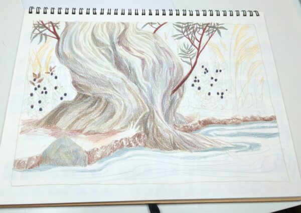
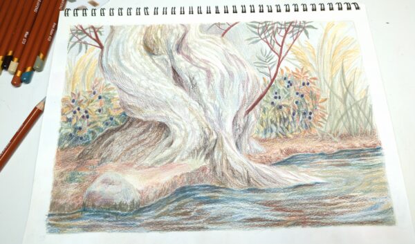
I worked on this in the evenings, mostly as a wind down before bed, over two weeks or so. I’d been meaning to do a thorough test run of these pencils and found it really rewarding to let this piece build up slowly over days of short sessions – it let me test a lot of the properties of these pencils fully, and draw some of my favourite things!
You probably saw this piece in progress, but if not, I did take a decent amount of shots, and shared them here as casual process posts. Please let me know if this ended up being annoying, especially those of you on the RSS feed! I can probably gate it off into its own tag better in future if that helps.
Here’s process shots from my time working on this piece:


-

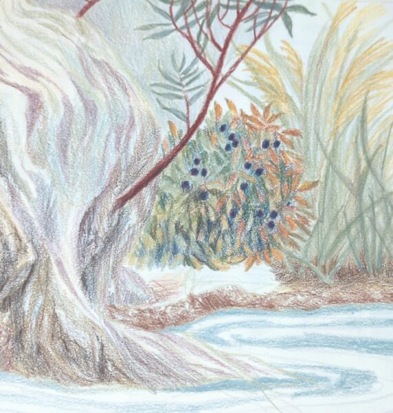
Just need to figure out what approach to take to make it feel like the focal point again – this is what happens when you over-render your blueberry bushes, friends.
-
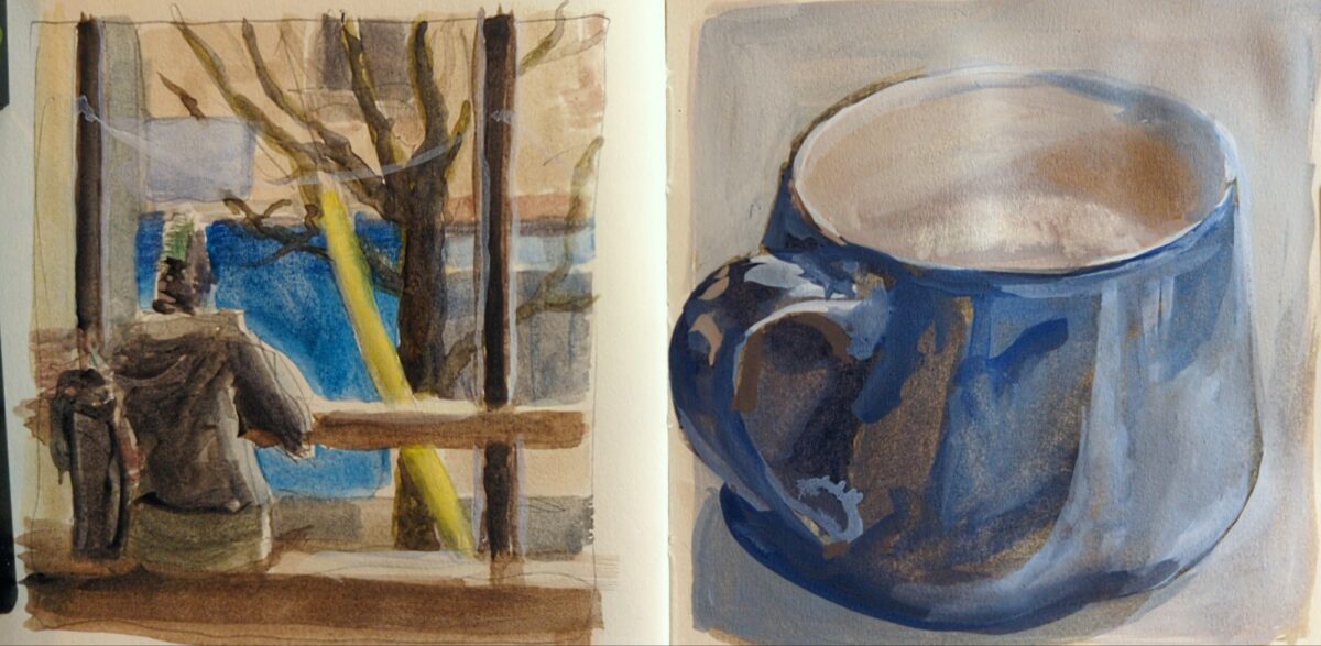
watercolour and white gouache, in my little square royal talens create art sketchbook. one of my favourite london fogs on this side of Toronto.
2 responses to “Cafe sketches”
-

love these
 the reflections on the mug are super nice
-
hey thank you!
-
-
-

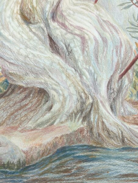
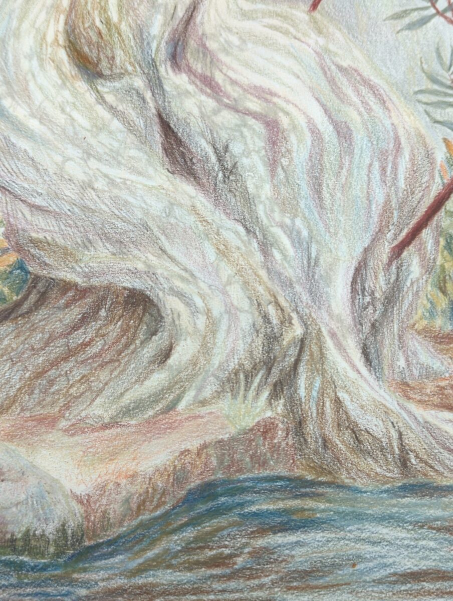
I am starting to really get into the bark, and I think this is going to take a few passes to get right, but! I am so, so excited about how much vibrance I can get by layering these neutrals together!
-
I now have a beautiful new digital mirrorless camera + gorgeous telephoto lens to take on adventures! But I cannot willingly do so without a protective case.
What I’d like is a very lightweight sling or messenger style bag that lets me keep my camera assembled, so I can easily pull it out and then pop it back in depending on terrain, transit, weather, etc. Something that doesn’t look too high tech would be nice, but I definitely am more worried about padding, weatherproofing, etc. than looks. If it’s big enough to also carry some sketching supplies, that’s a win, but not my first concern.
I’m gonna try and hit up some camera shops downtown in a week or two to fulfill this quest.
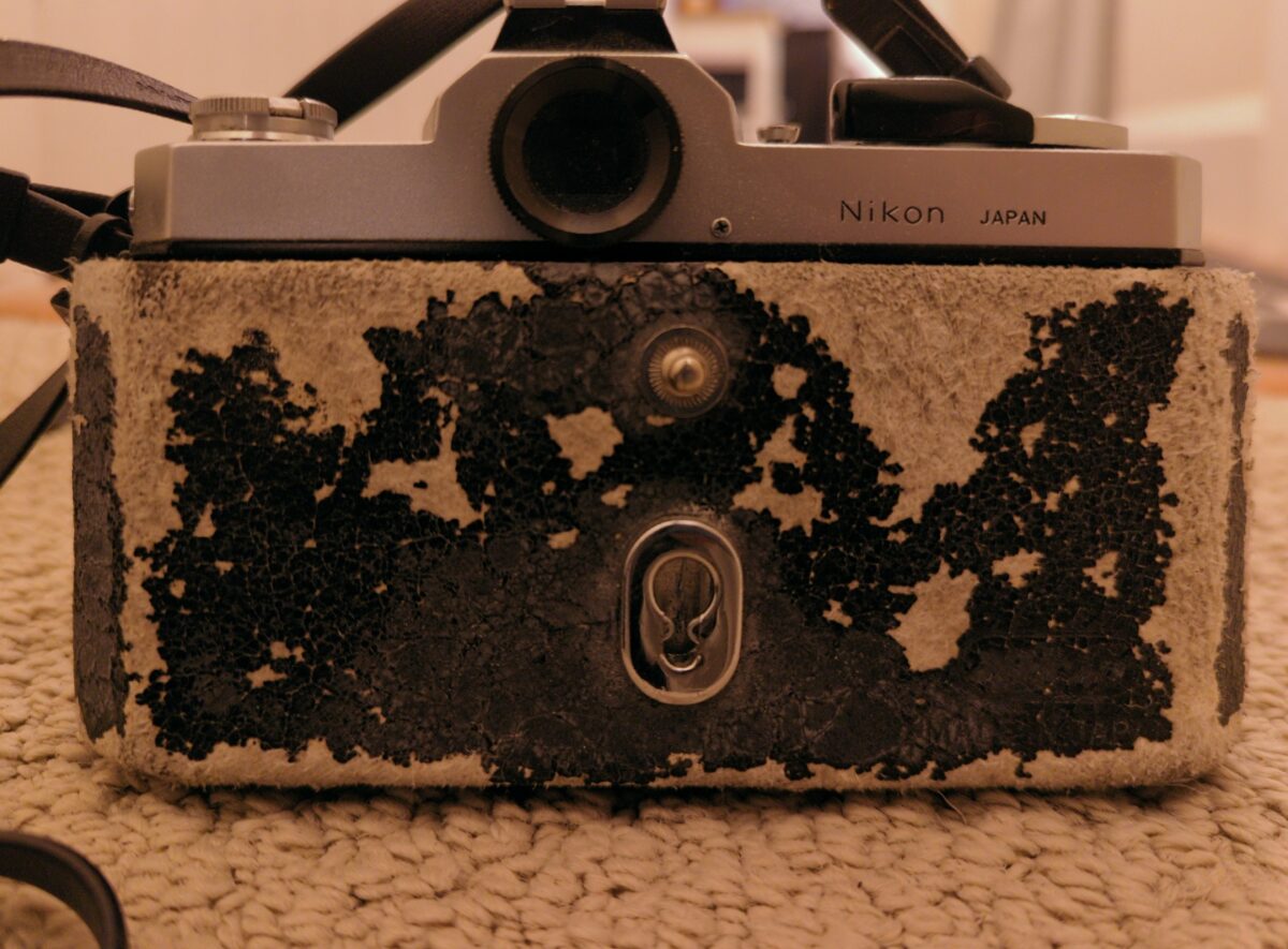
Pictured: the leather case I somehow still have for my dad’s 1970s nikkormat 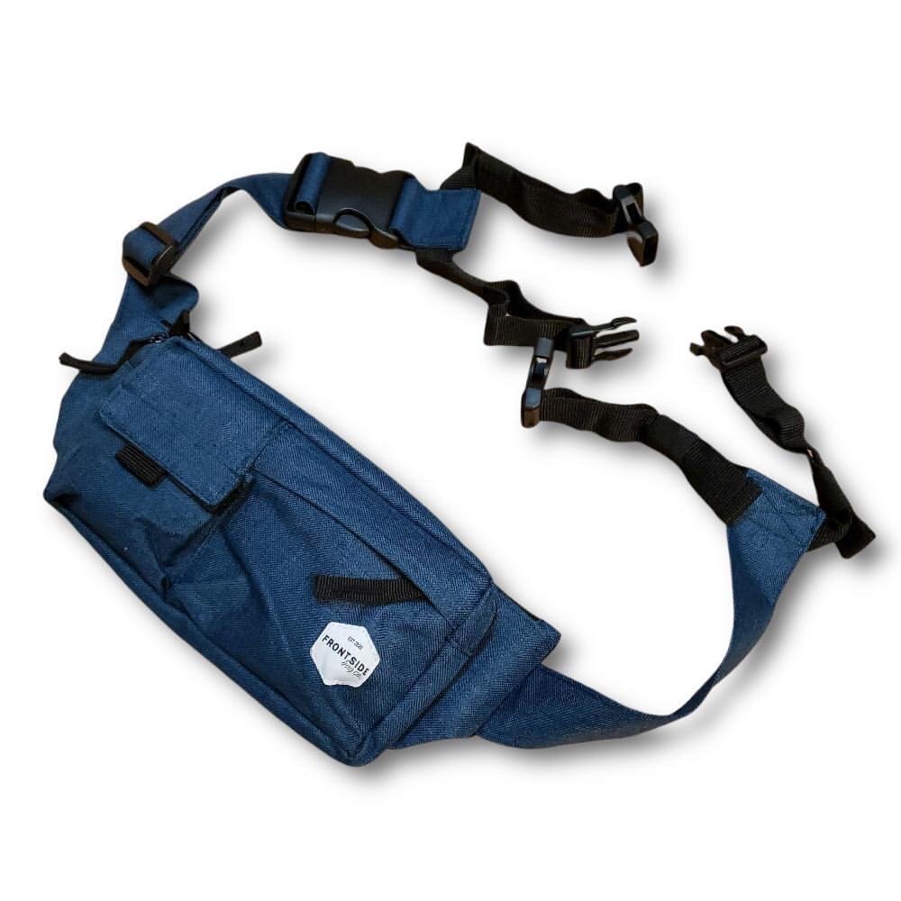
My partner has a weatherproof sling/crossbody bag that also carries his skateboard, very similar to this newer model I found, which is an amazingly targeted piece of equipment that also fits his camera! I’m pretty sure he could use the skateboard bits to carry a tripod instead, which is just old fashioned good design in my books. Anyways, what have you found, what do you love, what do you recommend keeping an eye out for?
thanks!
-
Well, starting to. This is where I realize a little ref would have gone a long way.But we can probably get somewhere pleasing, even if not accurate, if I keep going.
-

The texture on the paper in this MUJI sketchbook is so pleasing!
-
I love how they start to go red in the end of summer, they are underrated ornamental beauties!
-
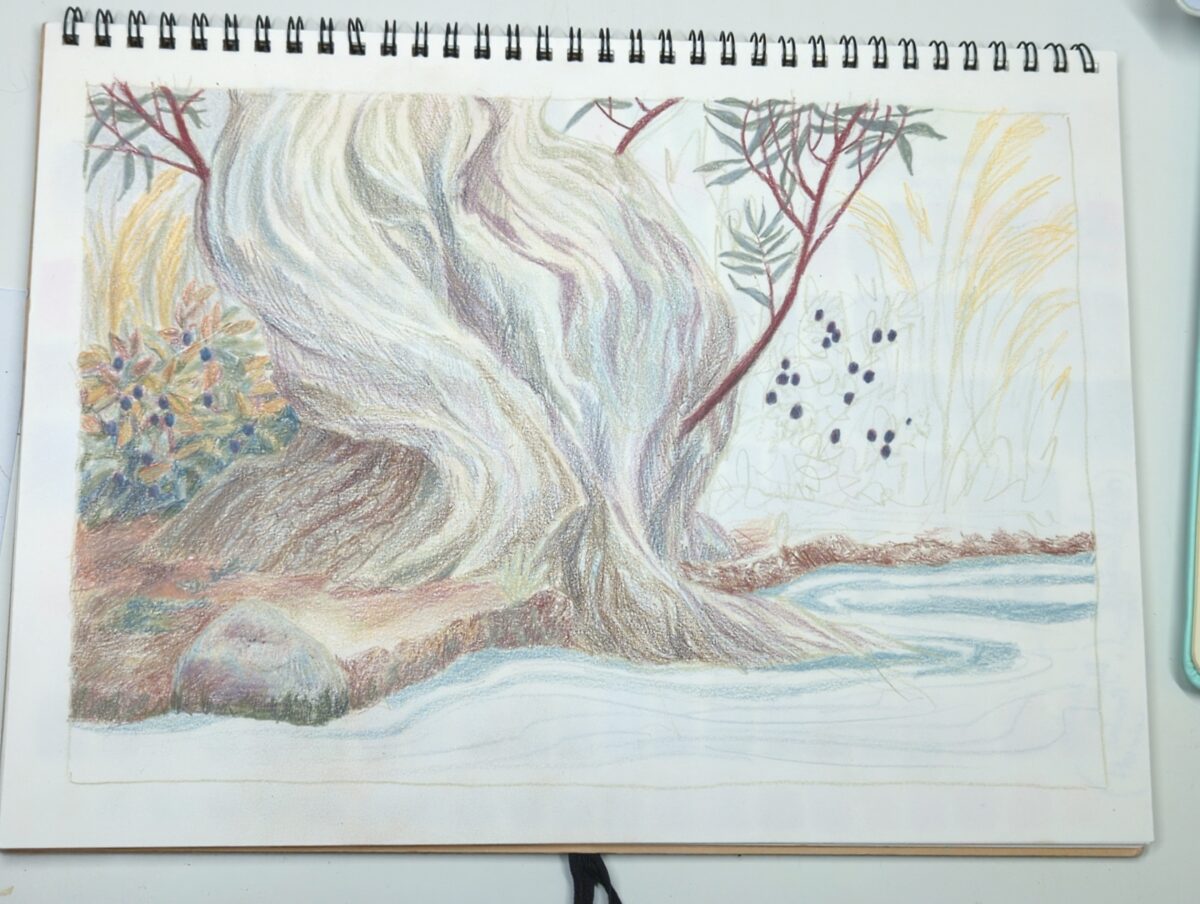
This palette really holds you accountable to relative colour! But also: you can use every pencil crayon in your possession and it will still feel perfectly harmonious.
-
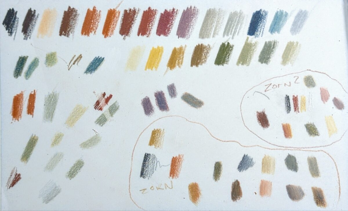
Twenty four colours including white, so, the 23 larger more uniform swatches at the top are the full line of pencil crayons. the rest of the swatches are me tearing blending and mixing, erasing, or making up miniature Zorn pallets of black, red, yellow and white, using different reds and yellows.
it’s a very limited palette, not just in color and saturation but also in value, with really only a few proper darks. I don’t know why the entire range is limited to this palette, but I am finding the challenge of working within it to be really fun and would recommend giving it a shot!
Leave a Reply