
swap to chronological order of most recently modified
-
For the past year or so I’ve been hosting a monthly remote lifedrawing/other digital art exercise session with my team at work, and I wanted to share this one with y’all because I think it’s been a really important exercise for me over the years and my team really got a lot out of it too!
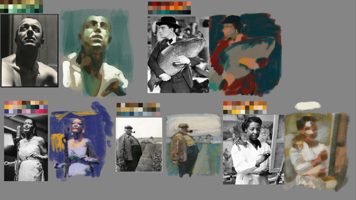
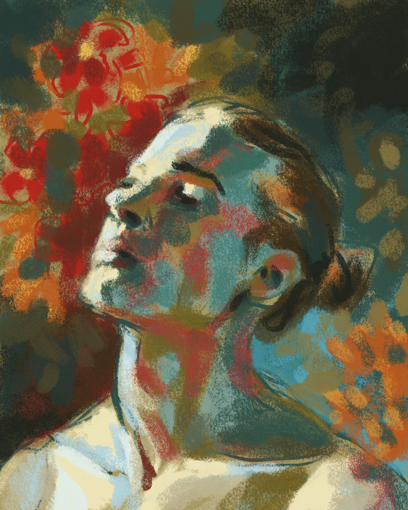
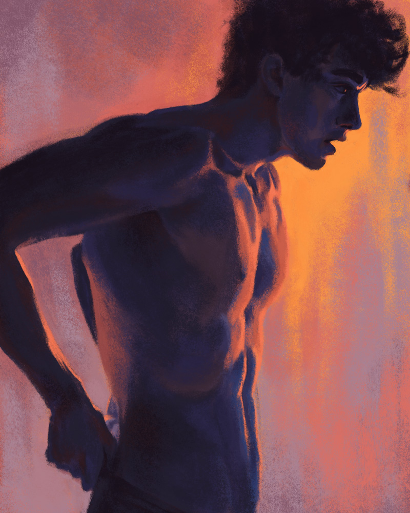
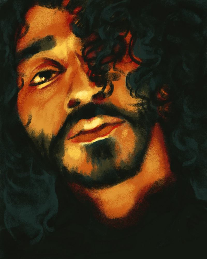
So there’s two pieces you need: a black and white reference, and an unrelated limited colour palette.
I’ve just been grabbing the reference off of pinterest, because we’re not doing anything with these except practicing so copyright doesn’t really apply. The color palettes can be created however you want, there’s definitely some great tools online, but these ones I made by using the color palette from image tool in Procreate. you dropped any image you have and then it will generate you one of these color palettes from it based on the color spread and the color frequency. it’s a really great quick way to grab limited palettes from images that inspire you!
Anyways, with both of those pieces in hand you can get to work creating a study of the image using only colours you’ve taken directly from the limited palette, or, if you’re feeling generous to yourself, mixed from the palette on screen.
It’s a bit of a mental stretch at first, but you will quickly start to find different vectors for your decision-making: are you using the colours to try and create a realistic image? or are you grouping them by value? does it make sense to try and assign warm and cool to light and shadow? or are there objects in the frame that would benefit from a strong local colour?
For me, it’s a decent digital version of a standard limited palette exercise I might do in watercolour our other traditional media, where I limit myself to a few paints or crayons or such. I did this exercise a lot with the full colour By Crom! comics, and it’s been great to bring it to my digital work.
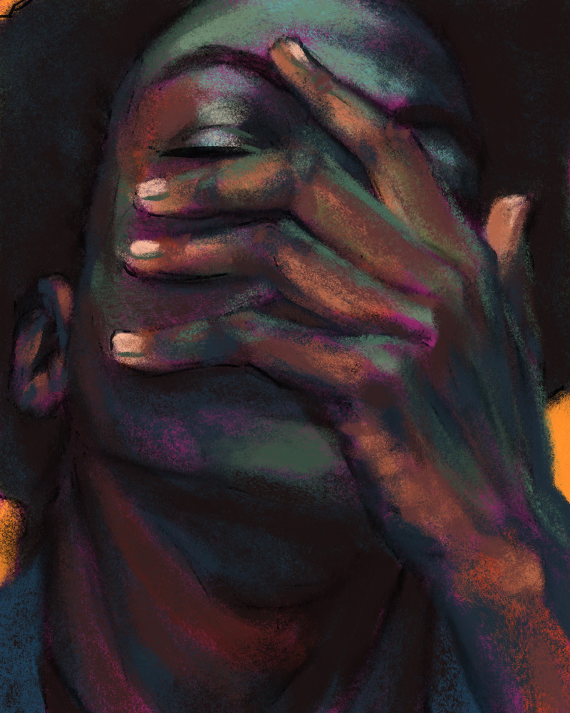
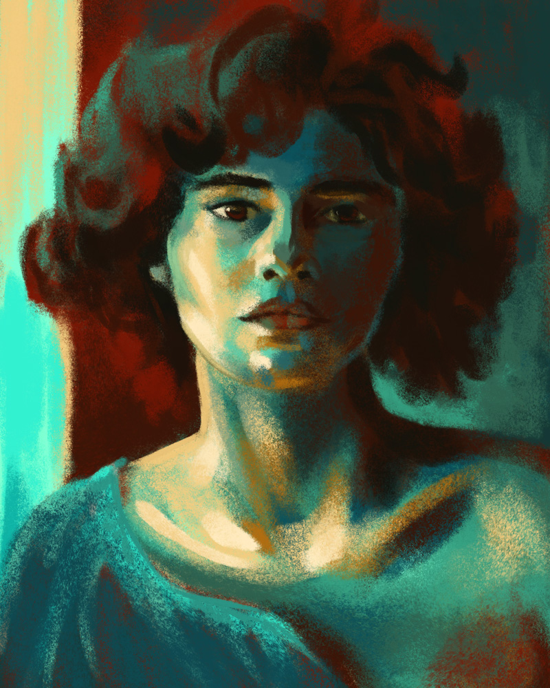
Speaking of digital work, this technique is the basis of a lot of the digital paintings I did in the past four or five years:

Let me know if you end up giving it a shot!
4 responses to “digital studies exercise”
-
These are so gorgeous!! I love the use of light and color here.
-
thank you! giving myself the limited palettes really did stretch my brain in ways I think were really worthwhile – I doubt I’d have gotten results I liked half as much just trying to reproduce these faithfully!
-
-
thank you for sharing this! this was my first shot at one, but i definitely plan to do more: https://candiedreptile.club/picture.php?/3443/category/5
-
whoah that’s so cool you took this idea and ran with it! I love the soft pallette you used, and you’re getting such nice warms and cools in the face and fluffy collar. Thanks for letting me know!
-
-
-
This is a great short breakdown into getting prints out of your label printer! Hope this helps folks hack theirs while I keep testing the limits of mine.
-
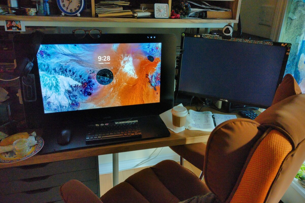
a 27qhd cintiq! complete with pen, stand AND express key remote!
seriously, I’ve already discovered how useful the remote is, it saved me yesterday during hours of setting up tiny assets in unity. it’s enormously more ergonomic for my partially paralyzed right hand than a keyboard right now and i wish I’d thought to try one much much earlier!
overall it’s beautiful and the extra screen real estate even makes game dev’s constant problem of too many apps slightly less annoying! not sure I’m back to full digital painting yet, but it was a great deal and i am glad i snagged it, even if it’s a bit earlier than initially planned.
anyone have any hot tips for min-maxing a Cintiq of this vintage?
-

no answers here, folks, I’m asking!
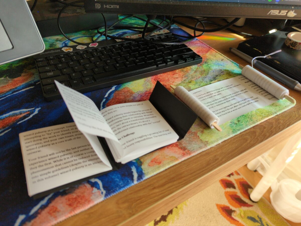
accordion and scroll address both honestly very cute; i suspect there’s a stapled version i could figure out too given time.
4 responses to “how to bind your thermal zine”
-
omg i want a scroll zine, that’s amazing
-
hell yeah, thanks! can’t wait to make a bunch!
-
-
OMG These are soooo cute!! I want a scroll zine. I feel tempted to waste a bunch of receipt paper at work to make one of these. “Oh I just accidentally printed a receipt for a weeding project oh nooooo a long receipt I’m going to keep it though”
-
I HUGELY recommend making one and would def like to see it when you do!
-
-
-
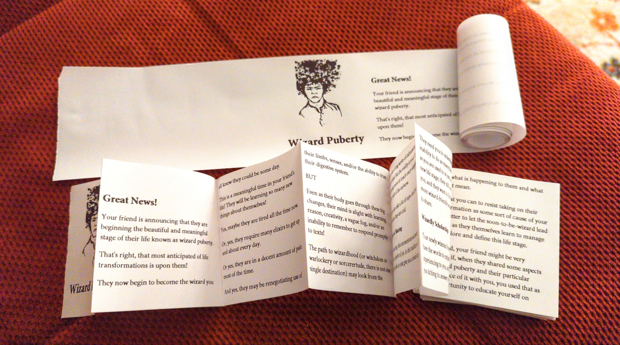
finally got some paper rolls for my label printer and started the important process of figuring out how to make zines with it 💪
-
oil pastel pinterest study; i bought a pack of much firmer pastels and did the whole under drawing with those, and then layered the thick opaque pastels on top, and it really worked well!
-
metallic and shimmer watercolours plus fountain pen
-
really love the colour palette i achieved here! not sure the drawing was strong enough to support it though, and the canvas was definitely too small for me at the level of precision in comfortable with right now. in the end i called this off before feeling 100% satisfied, but that’s simply the nature of exploratory work and no harm done. as i said, still very proud of this colour scheme!
-
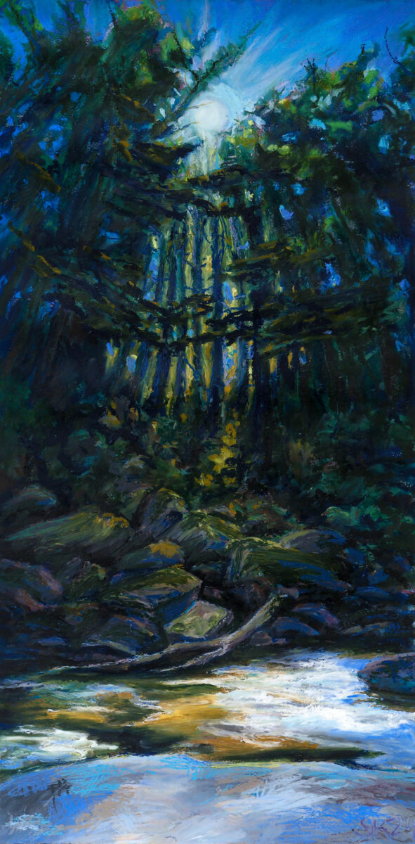
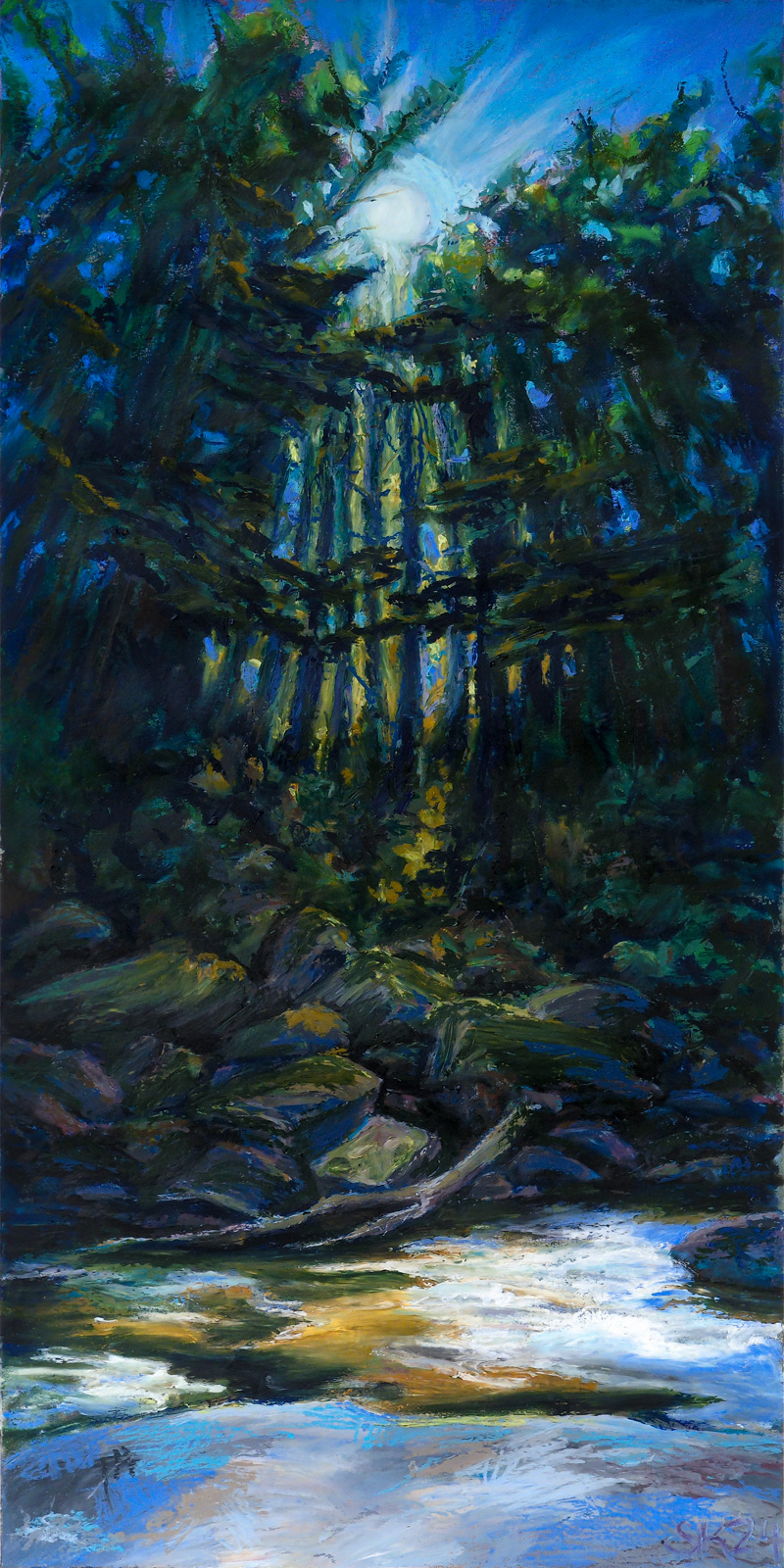
Presenting: this huge oil pastel painting I created this past August! It’s nearly two feet tall, painted in a variety of brands of oil pastel on stonehenge cotton rag paper, with an underpainting in watercolour.
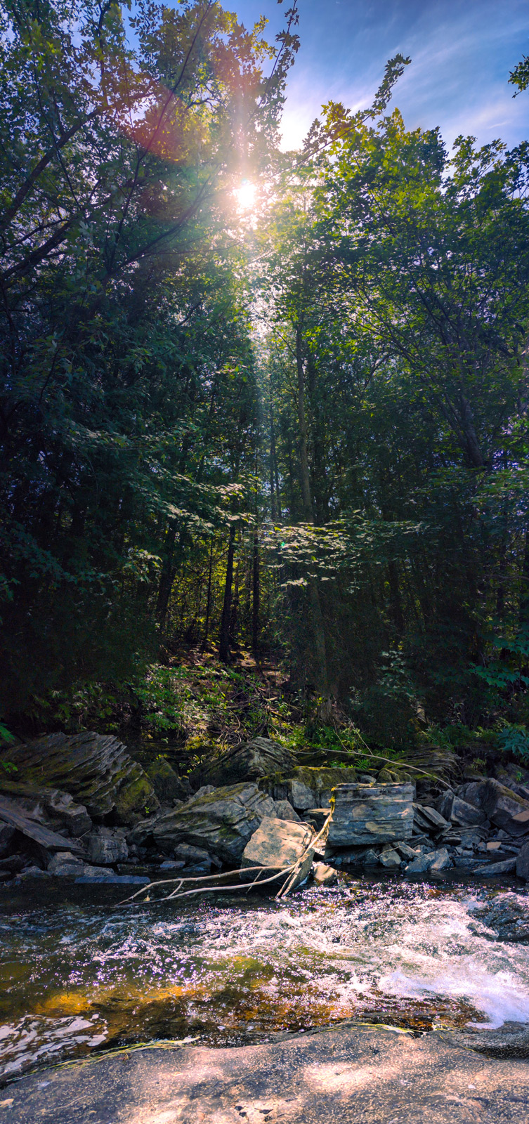
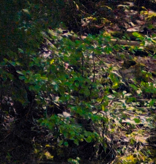
I created it based on photos i’d taken while on a roadtrip around the great lakes through Canada and the US. These were captured on a beautiful cataract waterfall segment of the Voyageur trail across the northern shore of Lake Huron – we’d stopped for a rest and a drink sitting on the rocks in the shade, watching this stream go by and seeing the sun winking through the leaves.
I took a huge pile of photographs sitting there, trying to capture everything that felt so special about the spot, and when I got home I sat down with lightroom and photoshop and tried to develop and collage the photos torebuild my memory. Here’s the results of that digital shenaniganry:
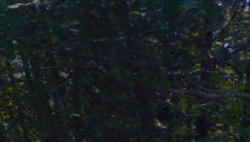
Unfortunately, photoshop was more interested in giving me generated nonsense in some spots than bothering to reassemble every leaf shared between shots, as you can see in these details below:

So it didn’t feel like I could, with the tools and patience I have at my disposal right now, create the epic collaged photo of my dreams — but so be it, I have other methods! Hence, oil pastel!
One of the things I keep doing to myself is trying to create oil pastel works with huge and subtle dynamic ranges, despite the fact that I know – I know! – that oil pastel has a very limited range of darks. Anyways, this is how I used up a third of a stick of Sennelier Sap Green, the rich warm nearly-black green of my dreams, and one of the most pricey and yet also soft and yet also small sticks of oil pastel. Worth it, I think.
I hope this post is also interesting for those curious about how I go from reference to painting! Here is a very literal side by side comparison:
As you can see, keeping objects in subtle scale with one another goes at least a little out the window, especially with oil pastel. Even at the size I worked, it was beyond my skills or interest to get all the tiny fine details, and I moved things around compositionally quite a bit.
Honestly, this feels like a reference photo I might find myself coming back to someday for another go, but not out of dissatisfaction – I am enormously proud of this painting! But there’s so much in it, so much happening with perspective and rhythmic line and the scattered light, it might reward reinterpretation into a variety of media.
Do you have references you see yourself returning to in the future?
-


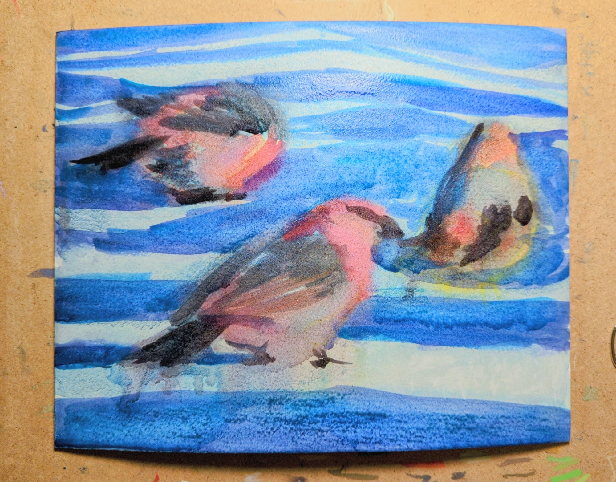
my latest oil pastel experiment is this painting of three pine grosbeaks, referencing a CC0 photograph shared as part of an observation on inaturalist.
this one was created on illustration board, with a full under painting in watercolor first, which you can see in the third image. The illustration board texture has a wonderful grain and could be a very satisfying surface for oil pastel, but it tends to warp pretty dramatically when painted on with water-based media. you can see any image on the right how much it has bowed out while wet; what you can’t see is that it has an inverse warp in it once dried. clamping it down to draw on it released some but not all of it. unfortunately this means it’s just not a good solution for anything with a watercolor under painting.
inaturalist has been a really exciting thing for me to explore, and once I discovered that you can search observations by image license I got really excited. if you’re also looking for reference, especially of specific animals, it might be a great place to start.

Leave a Reply