
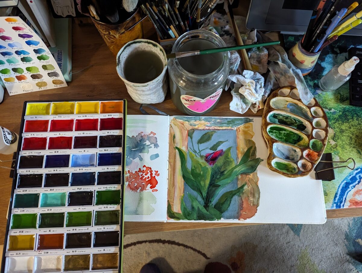
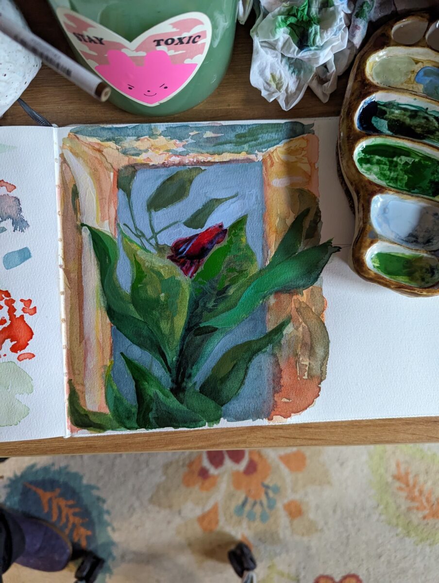
I got this set of Kuretake Gansai Tambi in the fall and day down to play with them in my etchr sketchbook this week. The 100% cotton paper that usually is my best friend, however, felt less useful with these than with my usual watercolours.
which isn’t to say i didn’t have fun! the colour range of the set is great and the vibrancy is *amazing*.
but i realized i really don’t know much about these paints besides the fact that they’re at least a little different from Western style watercolours; so i did some googling, and i thought I’d share some highlights:
a great breakdown of the actual chemical differences:
a great demo of how they can be pushed far beyond what you think in terms of layering and vibrancy:
They sound like a product related to traditional paint prep methods for nihonga, which is painted on washi paper :

this playlist is a very clear overview of nihonga materials:
Nihonga Tutorial Playlist
these days they seem very strongly associated with etagami, which I’m just starting to research:
In summary, no, they definitely don’t work like my Daniel Smith or Mijello or Holbein watercolours, but that’s because they’re very definitely not the same thing. I’m excited to play around with the paints in combo with different materials and see what they unlock for me!
Also, god, I’m already tempted to get more; they really do have a jewel-like quality, shining in those big flat pans….
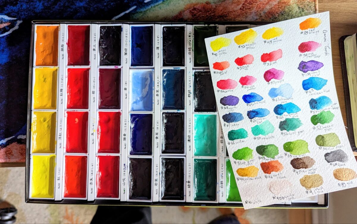
(i did rearrange them into this colour wheel order to help me learn the palette, if you noticed the labels in the box no longer line up with the colours)
Leave a Reply