
Treated my birthday self to an Art Toolkit Folio Palette! It’s both big and small, with lots of mixing space, even though it packs up very slim and weighs very little; and it magnets to itself and to whatever I want to stick it to for painting. While the -14C snowy weather here in Southern Ontario is not going to have me doing much plein air this month, I think my future self will really enjoy taking this to the beach, the park, etc!
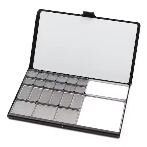
(I also picked up an extra mixing pan to swap out for two of the larger square pans; I already appreciate the extra space, as I am a messy, chaotic mixer.)
In good timing, I also finished swatching all my watercolours onto cards, so I used them to assemble myself a palette of tube paints to fill this with:
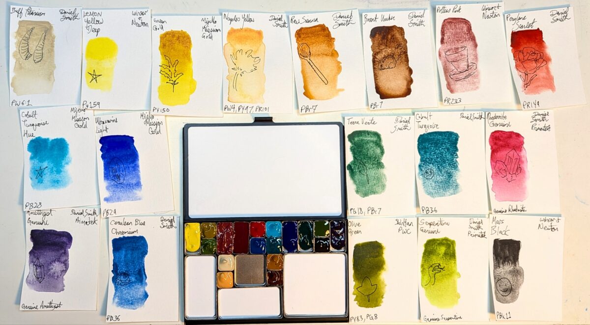
I went heavy on the granulating paints; if this is a plein air landscape and urban sketching palette, then it doesn’t need as much texture control as one I might take figure drawing. I got to include a few of my newer tubes, too, to really test run them in a more focused way:
- Lemon Yellow Deep (W&N)
- Perylene Scarlet (DS)
- Terre Verte (DS) (I picked this up because the Winsor & Newton terre verte I own is probably the palest, weakest paint I own and yet I adore the colour, so i was hoping for just a more powerful version thereof; sadly the Daniel Smith one is a totally different colour and pigment composition, but turns out I also love IT, so~)
- Olive Green (SH PWC)
- Mars Black (W&N)
The yellow, scarlet and black listed are all notably granulating versions of those colours, so I am excited to see what kind of unhinged texture I can lay out on the page with this palette!
I’ve started doing some sketchbook studies to test drive it and while I think I might have made a mistake omitting my perylene green, maybe that kind of challenge is good for me!
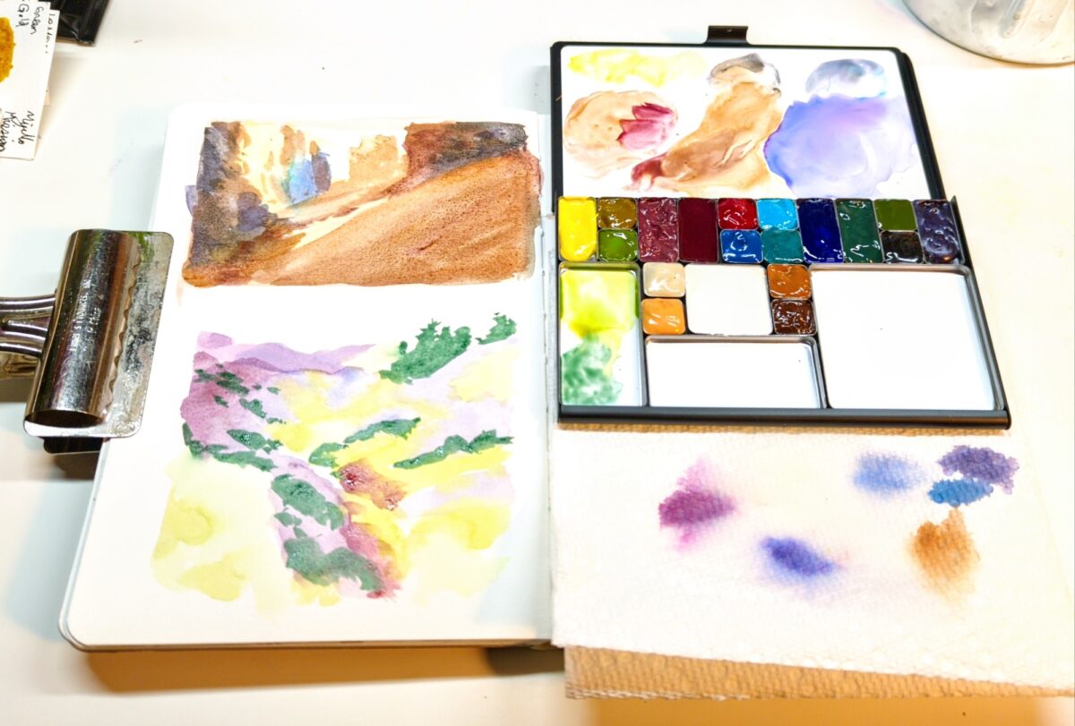
I will say, the mixing area on this palette is velvety and perfect. I have never had a palette be such a joy to mix on out of the box – the paint spreads usefully on it in a way I have enormous trouble conditioning my enameled metal or plastic palettes into achieving literally ever! It’s raised the bar for me and whoops, now I have higher standards.
What do you think of these colours? Do you have a beloved palette you have conditioned into perfection? Are you also dreaming of sitting under a tree and painting in a few months?
Leave a Reply