
A painting from the cafe window and two made up landscapes, to test drive this watercolour selection and see if it’s missing anything.
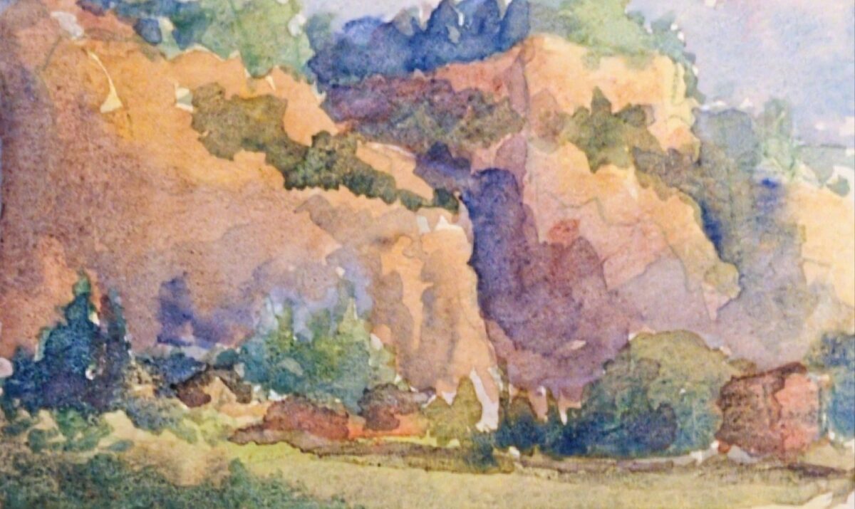

I love how warm the greens can be despite my palette having cobalt teal AND cobalt turquoise! And the granulation is really working for me.
I do miss having a near-black blue or green – anthraquinone or prussian blue, or perylene green – but it is fun finding other ways to get those deep darks. It’s definitely making me use my purple more, and I do love what purple does to green.
Probably the biggest thing missing from this palette is a saturated middle yellow. I have lemon yellow deep, which is very cold and quite pale, and I have Mijello Mission Gold’s green gold, PY150, which is warm in masstone (full power) and quite cold and intense in dilution (watered down). My only warm wash colour is raw sienna. It is giving things kind of a cool cast even to the yellow light in that middle landscape sketch; that might honestly be a nice technique to use for a palette destined for outdoor painting. We’ll see!
These were all painted in my lightwish 100% cotton watercolour sketchbook, and you can see I have a hard time getting crisp small details in here. I think there’s two reasons: firstly, the paper holds SO much water, it takes much longer than I expect to dry (this is also a feature, if you want to control and modify washes at length); and secondly, I’m testing this palette with waterbrushes, and it’s very hard to control the water enough to get dark rich sticky mixes that are JUST liquid enough to lay down smoothly. I don’t particularly think the paper itself is at fault as much as my technique. BUT. Something I’m noting and thinking about.
Leave a Reply