Just playing around between work and comics and life.
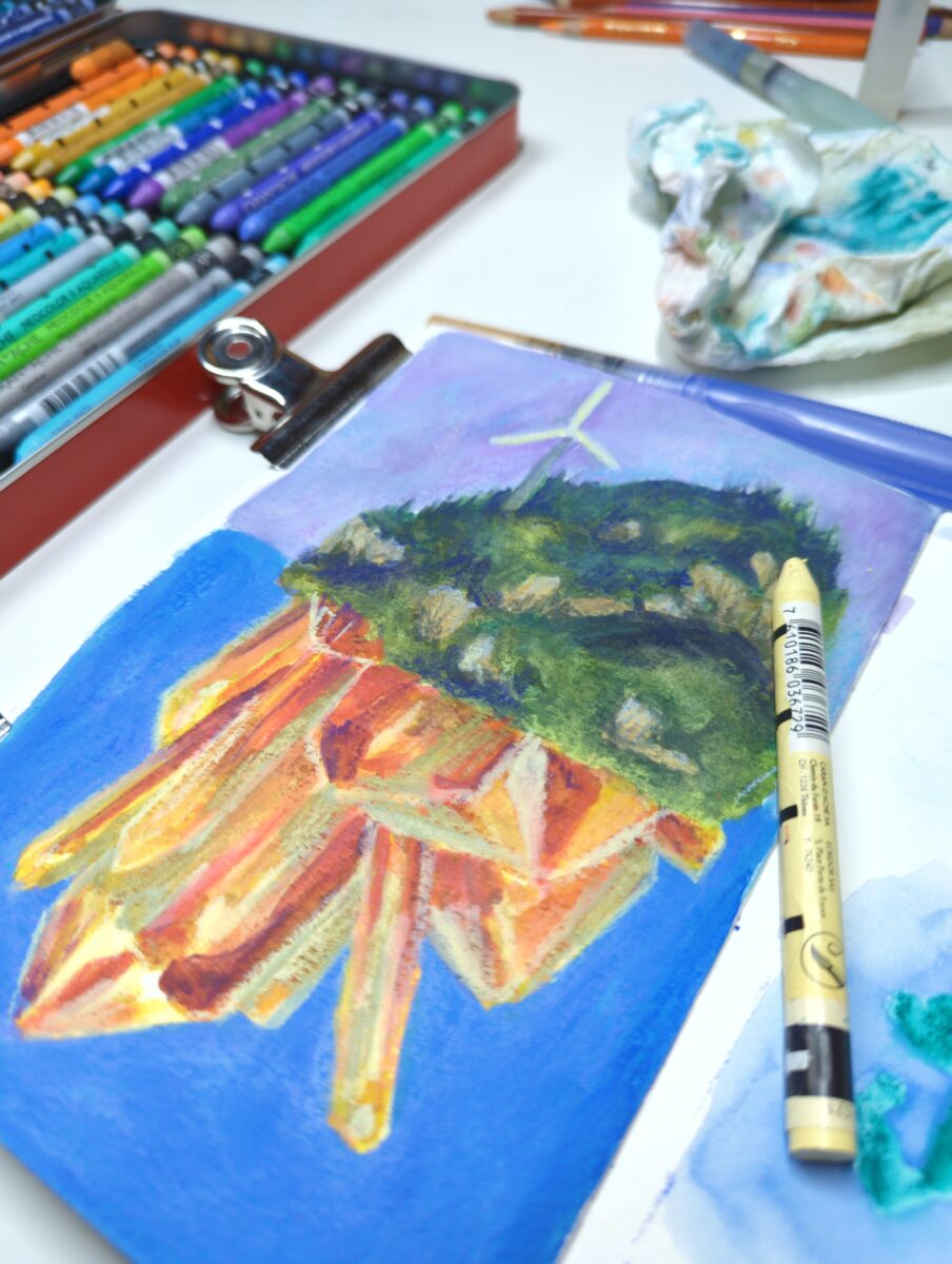
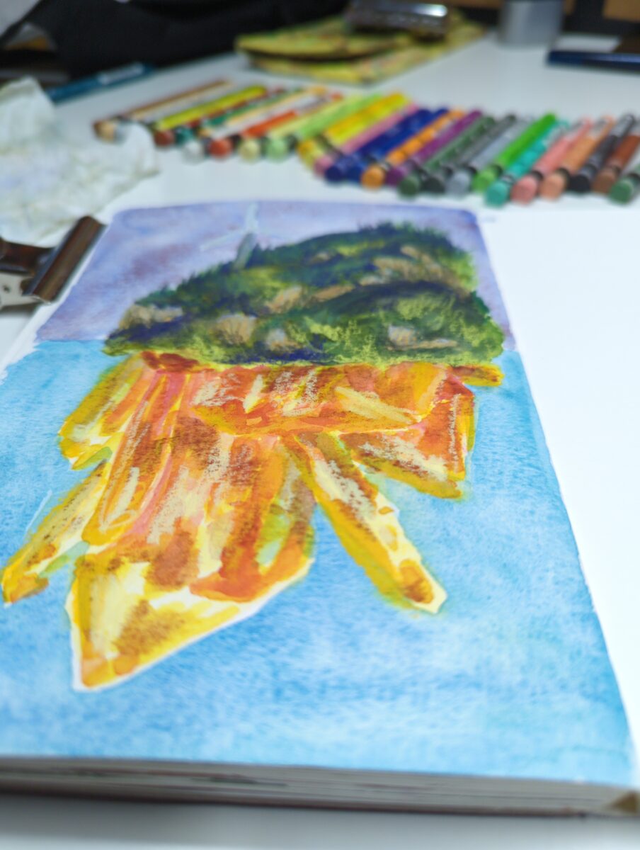
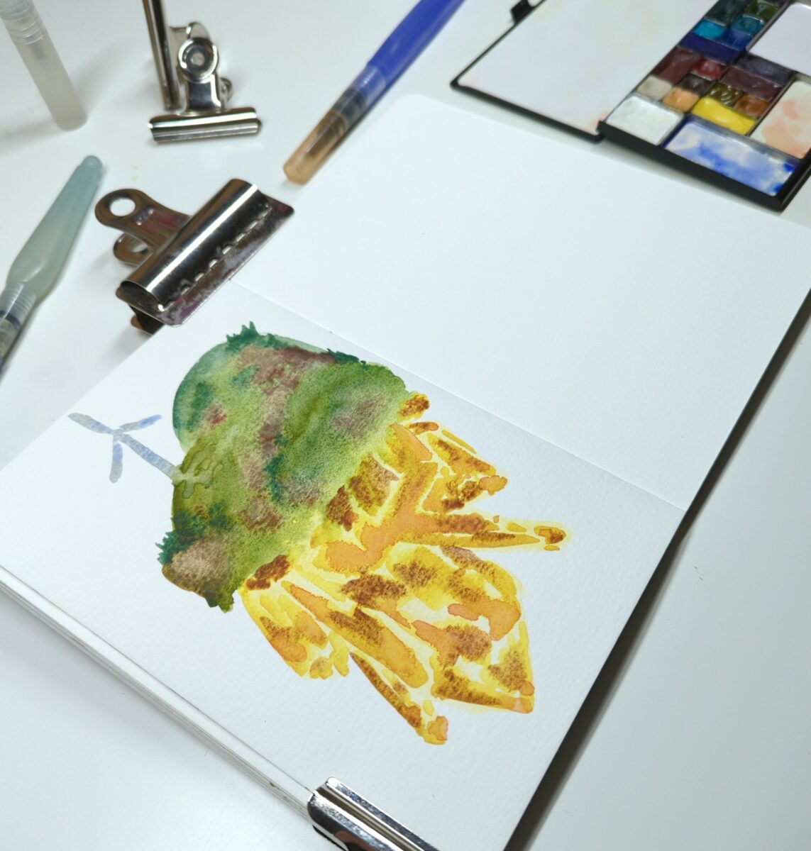
Neocolor iis and watercolours!

by definition, not static
construction is continuing / old posts are being rebuilt / new archives are being built
I make art!
I make things. We’re calling them art for the time being but honestly it’s mostly process and some outcomes.
You might enjoy perusing specific tags! Tags such as:
oil pastel or watercolour or gouache or digital art or sculpture
I am happiest when helping other people get excited to make things, so please drop questions and such in the comments fields and let me know what you’re hoping to make these days too!
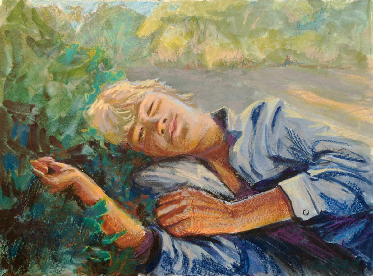
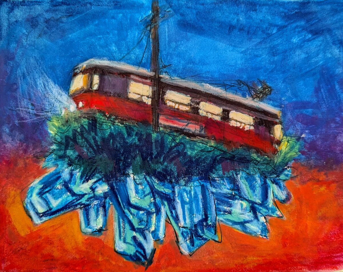
After a few weeks away it was great to get home to the oil pastels! I painted this one on canson mi-teintes paper, with sennelier oil pastels, and was reminded that when used on paper, even the greasiest oil pastels do set somewhat! Between days, the pastels set up enough it wasn’t blendable with my […] — read more —
I’ve been thinking about how the sennelier oil pastels are so soft that you can get full on painting style soft and hard edges etc, and I picked up a few small canvas boards to see if they were a useful substrate for faking oil painting effects! Unfortunately the sennelier pastels are so slippery that […] — read more —

I got this set of Kuretake Gansai Tambi in the fall and day down to play with them in my etchr sketchbook this week. The 100% cotton paper that usually is my best friend, however, felt less useful with these than with my usual watercolours. which isn’t to say i didn’t have fun! the colour […] — read more —
Treated my birthday self to an Art Toolkit Folio Palette! It’s both big and small, with lots of mixing space, even though it packs up very slim and weighs very little; and it magnets to itself and to whatever I want to stick it to for painting. While the -14C snowy weather here in Southern […] — read more —
Gansai tambi paints and neocolor iis; a very fun combo! I am often sad about the difficulty of making watercolours create rich even dark washes, but the gansai tambi paints excel at it. The only tragedy is how glossy they come out if you go thick with them. Neocolors lay down beautifully on them though, […] — read more —
6 x 6″, sennelier oil pastels on unprimed wood. My partner gave me the full set of sennelier oil pastels for my birthday last week and it’s been excruciatingly hard not to abandon all my other commitments and responsibilities and just play with them incessantly because they are an incredibly enticing and beautiful medium that […] — read more —
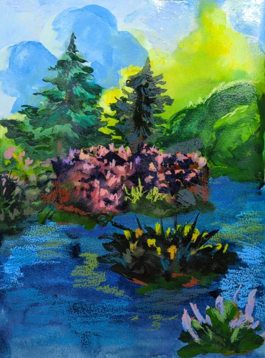
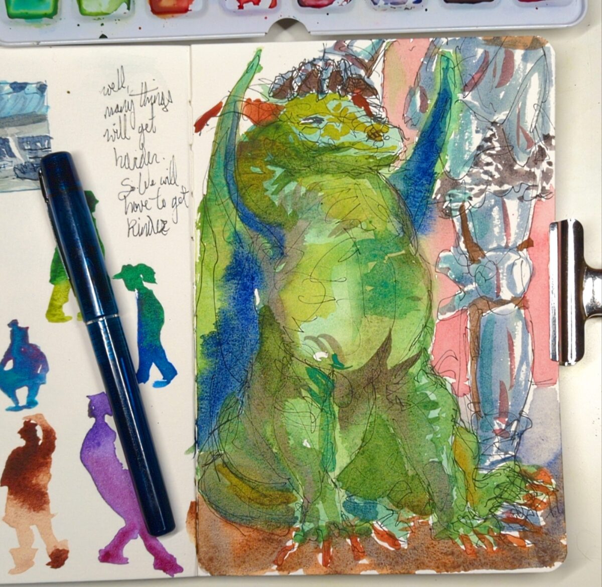
Painted this in short bursts over several years – drew it in 2018, and printed it out on watercolour paper and started painting during the pandemic, and finished it last week. Gouache layered with neocolor iis on cold press paper. — read more —
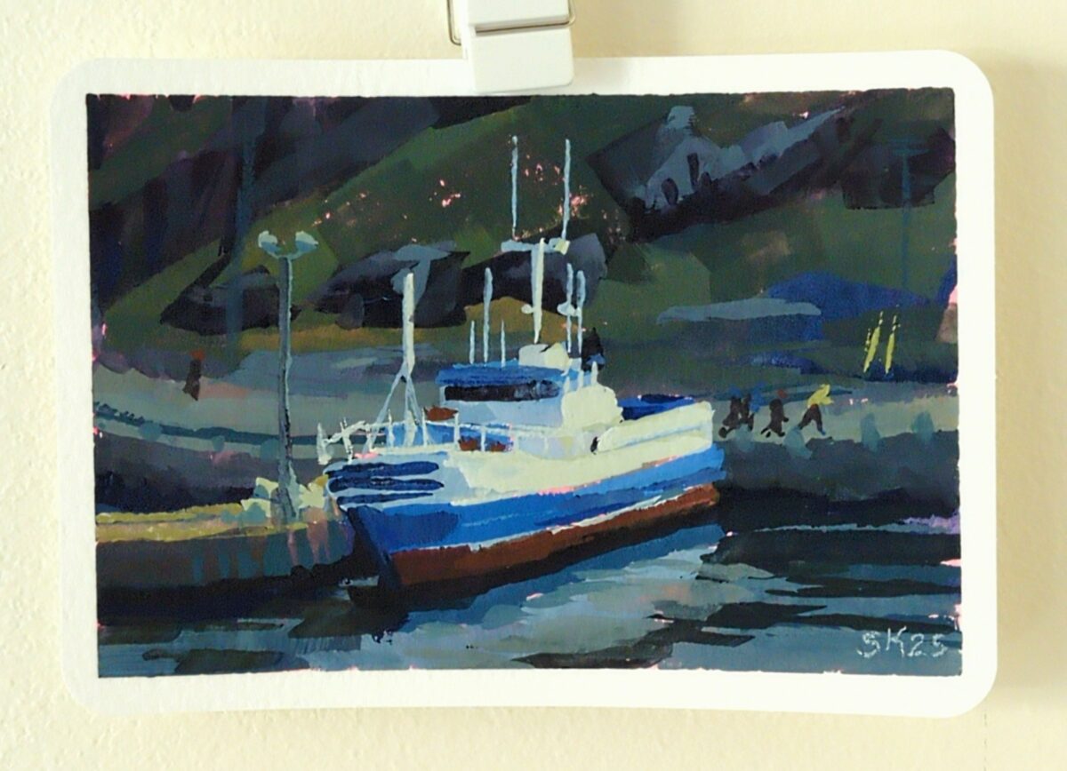
Painted this gouache study on a 4 x 6 postcard, from a photo I took on a winter visit to St John’s, NFLD, from years ago. I was reminded that much of the appeal of painting in gouache lies in the brush strokes, and the quickest route to intentional brush strokes is to use the […] — read more —
More neocolor II crayons on hot press watercolour paper! Learning these is taking some time; unfortunately much of the content on youtube about them is people trying them for the first time, and that’s really not helping me unlock their secrets! But as I keep digging I am finding more folks at least systematically testing […] — read more —
Neocolor II crayons on hot press watercolour paper. This is my first piece done entirely with the neocolors – putting down layers, washing them into the paper, and adding more on top, over and over. They’re very fun, but it does require some hand strength to press them hard enough to get the richest colour […] — read more —
I got a gift card in return for doing a friend a favour this winter break and I decided to spend it on caran d’ache neocolor II watersoluble wax crayons. I’ve had a couple colours for a while and not really … grokked them? But with a broader range of colours and values I am […] — read more —
Gouache and pencil crayon on paper. Some detail shots for the texture: And here’s the piece at the gouache only stage: — read more —
Just playing around between work and comics and life.
Neocolor iis and watercolours!
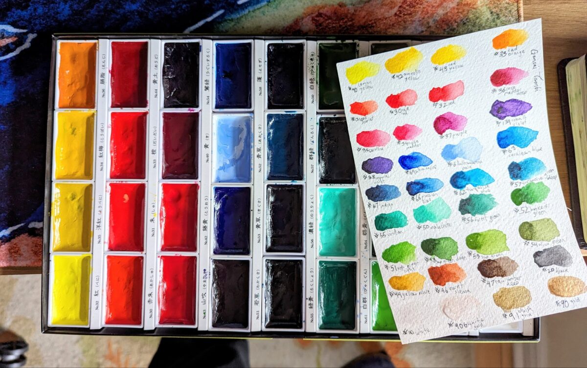
A painting from the cafe window and two made up landscapes, to test drive this watercolour selection and see if it’s missing anything.

I love how warm the greens can be despite my palette having cobalt teal AND cobalt turquoise! And the granulation is really working for me.
I do miss having a near-black blue or green – anthraquinone or prussian blue, or perylene green – but it is fun finding other ways to get those deep darks. It’s definitely making me use my purple more, and I do love what purple does to green.
Probably the biggest thing missing from this palette is a saturated middle yellow. I have lemon yellow deep, which is very cold and quite pale, and I have Mijello Mission Gold’s green gold, PY150, which is warm in masstone (full power) and quite cold and intense in dilution (watered down). My only warm wash colour is raw sienna. It is giving things kind of a cool cast even to the yellow light in that middle landscape sketch; that might honestly be a nice technique to use for a palette destined for outdoor painting. We’ll see!
These were all painted in my lightwish 100% cotton watercolour sketchbook, and you can see I have a hard time getting crisp small details in here. I think there’s two reasons: firstly, the paper holds SO much water, it takes much longer than I expect to dry (this is also a feature, if you want to control and modify washes at length); and secondly, I’m testing this palette with waterbrushes, and it’s very hard to control the water enough to get dark rich sticky mixes that are JUST liquid enough to lay down smoothly. I don’t particularly think the paper itself is at fault as much as my technique. BUT. Something I’m noting and thinking about.

I’ve been enjoying sketching with the neocolours over a base layer or ink or paint, so today I threw a bunch into my bag of crayola mini markers that I normally save for visiting my friends and family with kids1. Markers + neocolour iis in the very cheap, light, portable sketch books you can get at Muji turns out to be very fun!
I included a shot of my swatches; one of the things I find challenging about the kids markers is that they almost never include any truly light or pale colours. One of the things I’ve learned about the neocolour iis is that they really look their best when layered over a midtone. Together, these problems become a feature!
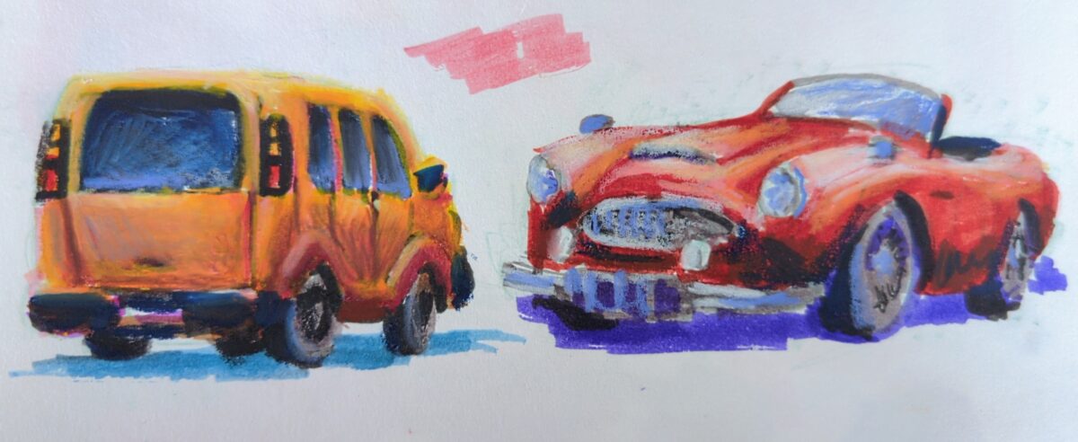
These are certainly not the world’s best cars; this is a sketchbook page done for fun while onthe phone. But maybe you, seeing this, are thinking about some supplies you have that might work really well together? And if so you should go try that and let me know what you learn!
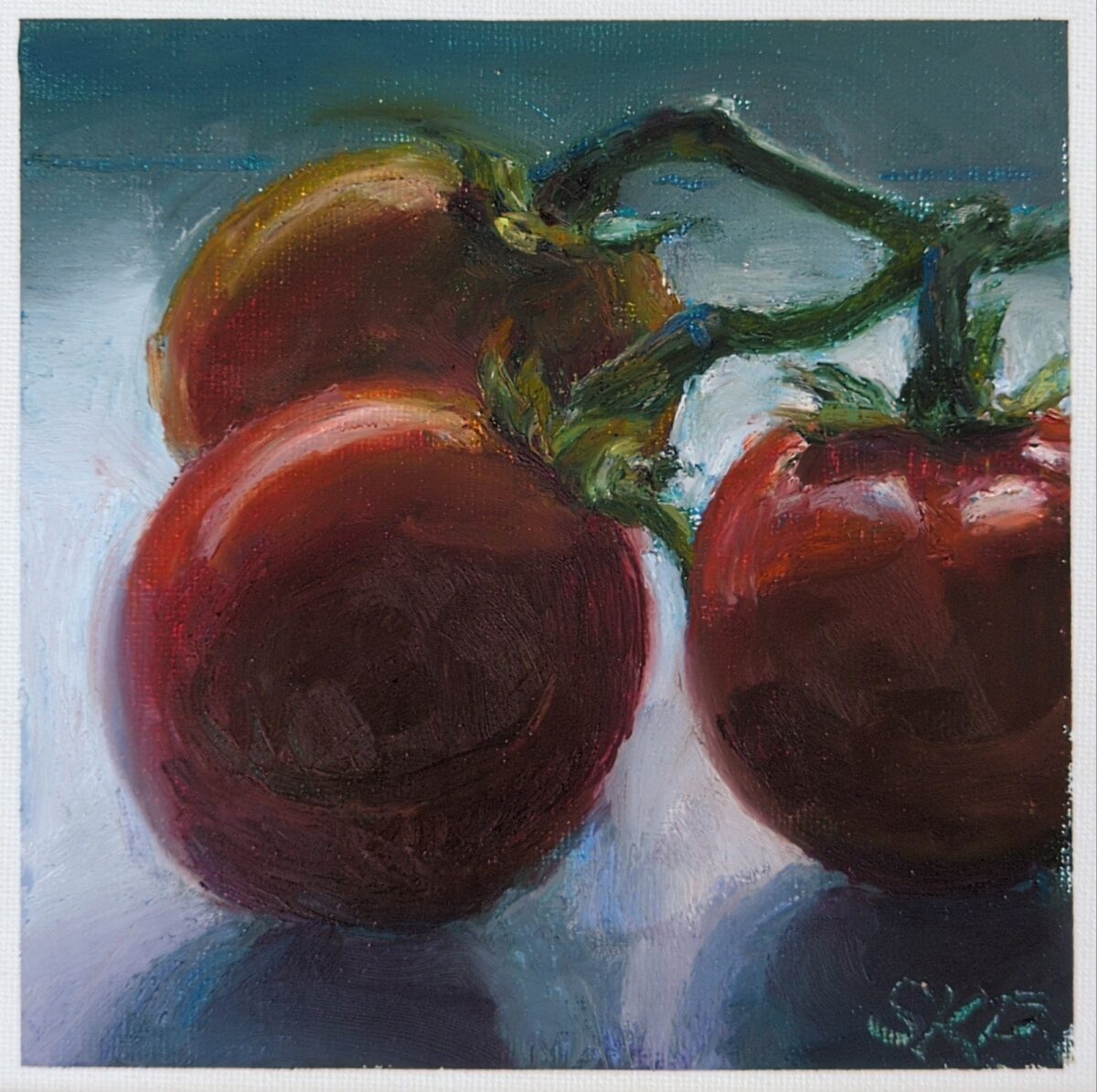
For this one i used all my oil pastels, from the hardest to the stickiest to the softest. The grain of the canvas panel was filled in very quickly and because all the pastels besides sennelier are so opaque, i feel like i lost some of the vibrancy I’d found in the strawberry earlier. However, still life is a wonderfully fun way to treat out and push your skills in a new medium and i can’t recommend it enough!
Also, man, studying ripe tomatoes on the vine from my snowy window seat in February is an exercise in… something. Sitting with unfulfilled cravings maybe.
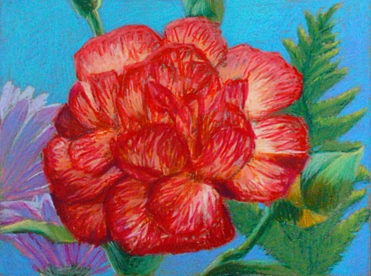
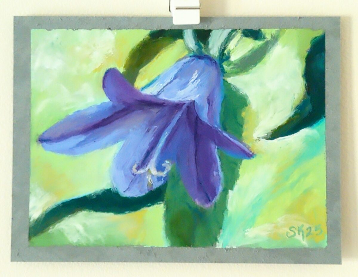
Drawn without water, on a 6 x 9″ grey blue cardstock, I think Strathmore brand. Drawn from life, from a lovely birthday bouquet.
Canadian here, and I can confirm that, while admittedly I have never seen a product list itself as a pencil crayon in Canada, we all agree that’s what coloured pencils are referred to as in conversation.
Now, certainly more research could be worth doing but, I have a theory… see, our packaging is mandated bilingual, and usually english first:
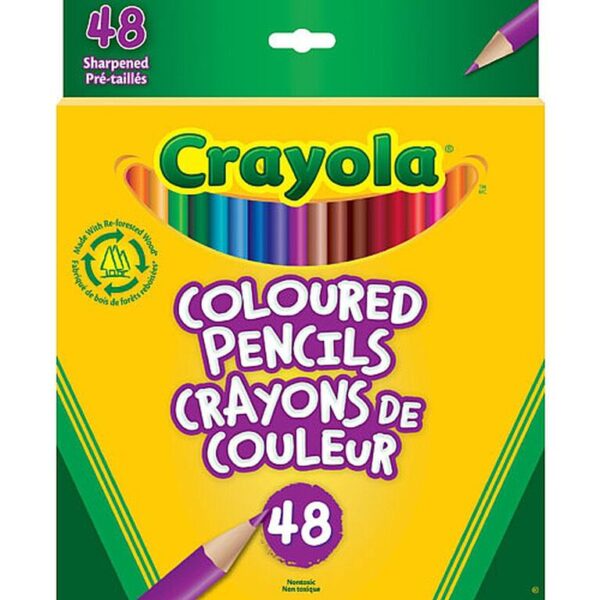
See how it reads as one long title?
Well, now, imagine kids throw that around for a bit till the verbal greebling is worn off:
Dunno what the official history is to this, linguistically, but this has been my working theory for some time.
Get scrungled, as they say.
Watercolour and carbon ink.
I decided go back in and see if I can’t push the clarity on this further with gouache and I think it really helped!

My photodocumentation is such shit in the winter with no natural light available, sorry. Maybe I’ll scan some sketchbook pages this year! But don’t count on it.
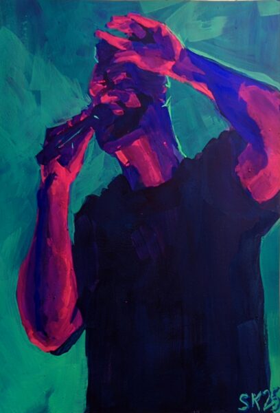
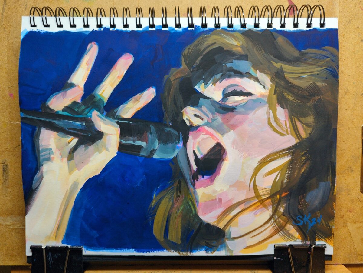
7 x 10″ gouache on hot press, referencing my own photos from seeing Leprous in Toronto back in September 2024.
The photo itself is much more blue than teal, but bright, saturated light blues are such a challenge to mix with gouache! So i turned the background teal and was able to get the relative saturation and values I needed, and keep the moody vibe of the photo.
My concert photos have certainly improved over the years, as digital photography tech got better at low light and phones started including physical telephoto lenses, but it’s rare i get close enough to get clear shots of performers’ faces.
In parallel, it’s usually tough for me to allow myself not to fully render a face in a painting, but given the absolute absence of details in my reference I was able to keep things very abstract here, and honestly i think it was good for me! I loved the hand pose in particular and i think it really kind of stands in for where a portrait would go .
Additionally, to talk for a minute about my painting process, I was taught still life and study painting via the Hawthorne method, which i would summarize thus:
put the right shapes in the right colours in the right place
It’s deceptively simple and forces you to sometimes forget what you’re painting and focus entirely on the graphic abstraction of what’s in front of you. People joke that you don’t need to know how to draw to paint like this, and I often think that’s oversimplified at best, but: I’m very happy with the hand anatomy in this piece and i definitely did not approach the hands through a drawing mindset. I just looked at the shapes of the colours and placed them as accurately as I could.
Intriguing.
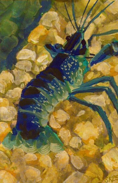
4 x 6″ gouache prawn. I decided to try using some drying time extenders – glycerine, watercolour blending medium – to try for more of a wet in wet blend approach, but honestly it was hard to keep the paint thick enough that it wasn’t just running all over the page. Something to retry in future on either more absorbent paper or with more viscous, fresh gouache.
Drawn on very, very smooth paper, a mistake I will not make again. Photo ref taken from my database of plants that I have grown (intentionally or not!) in my garden over the years.
Drawn from pinterest ref with my FPR ultraflex nib over an undersketch done with a long blade nib and washed into the page with a waterbrush.
this is lovely, I love this one
heck cheers!
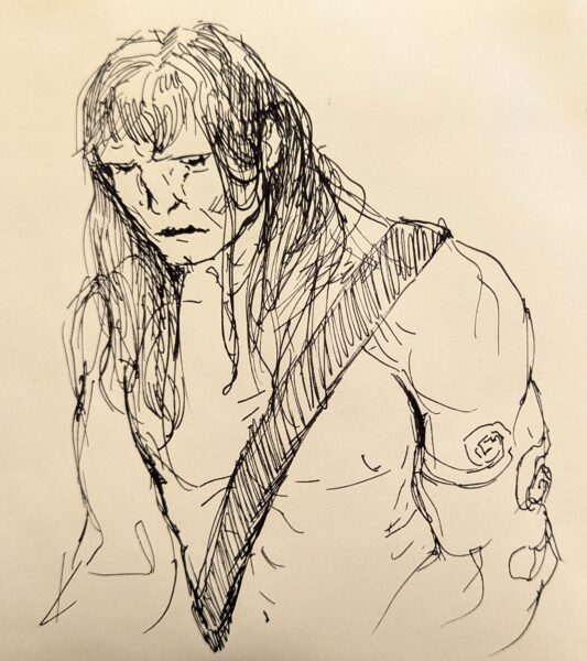
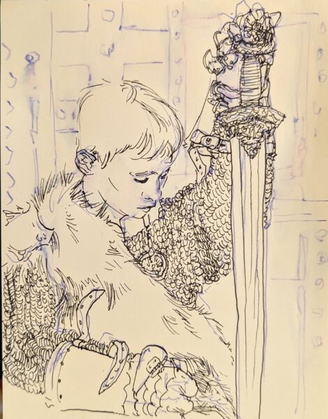
Haven’t drawn a Conan in a while, so, tried my hand at it. Fountain pen is such a delight to sketch with! This was drawn with an FPR Ultraflex nib, tho I dunno if I was really pushing it to its limits with this one.
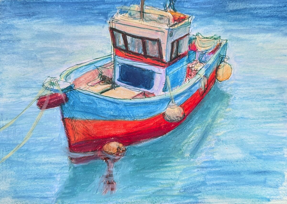
Painted in my sketchbook with neocolor iis over a fountain pen sketch. Reffed from pinterest. After having my ass kicked learning to draw boats for a game in 2021, I can’t stop thinking about them! Little boats especially I find so incredibly cute.
Sketchbook page, fountain pen and neocolor iis and a waterbrush, layered and layered and layered.
I think there’s something here but it’ll take a fair bit more reworking to really see it. An idea for later.
Berkey-inspired, done in one of muji’s very cheap and much-nicer-than-expected sketchbooks.
I loved the sketch for this and the painting isn’t quite capturing it, so I’m wondering if, at this WIP stage, it might make sense to go in next with pencil crayons and see if i can’t capture more of what I’m looking for gesturally.
watercolour, including some amazing shimmery blues gifted to me by a friend, white gouache, metallic gelly roll pens, white pencil crayons, and tense neck muscles.

I’ve got a few iterations I’m exploring here and I’m thinking these might be worth doing full paintings of at some point.
A lovely array of flowers i used to walk by every day after work.
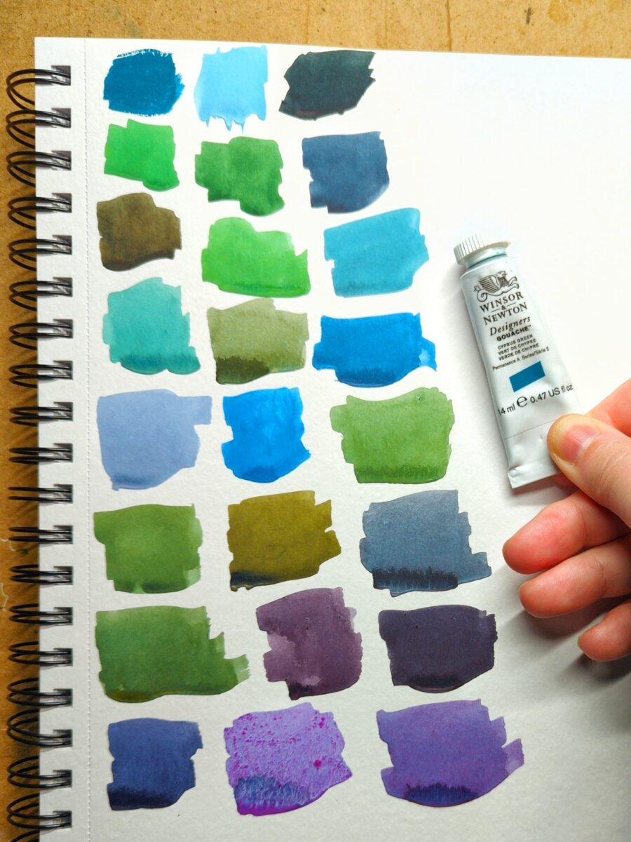
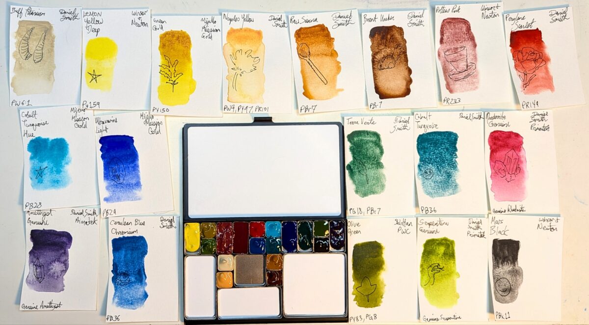
got a new tube of gouache paint! Winsor & Newton’s Cascade Green. You can see the tube colour pure in the top left swatch – the rest are mixes.
Teals are wonderfully fun pigments to work with because of this incredible breadth of mixes possible. Functionally, Cascade Green is working like a very highly saturated blue, giving me really vibrant greens, rich royal purples, and cool, elegant greys. Those singing purples in the last row are mixed with W&N Primary Red and Holbein Opera (both paints that do not like to rewet – especially the opera, hence the confetti of pigment in that one purple), the two yellowish olives with burnt umber and burnt sienna, and those vibrant glowing sky blues with various purples.
This colour is extremely hard to neutralize. the greyest two-colour mixes i could get from it still felt quite greenish, blueish or purplish. It’s going to be a very fun addition to any limited palette because of that incredible flexibility.
I chose it over buying a replacement tube of Winsor & Newton’s Turquoise Blue, a colour i used with abandon a few years ago, simply because i hadn’t tried Cascade Green yet. Honestly, I think i prefer it – I’m getting richer mixes from it, even with my multi-pigment pastels. I wouldn’t say no to owning both paints someday, but I’m definitely going to have fun with Cascade Green in the near future and I’m glad I gave it a try.
in terms of its dominance in a mix, it’s as dominant as any of my of earth tones, but not quite powerful enough to stand up to spectrum red or perylene violet.
heck, i love gouache, I’ve missed gouache
Leave a Reply