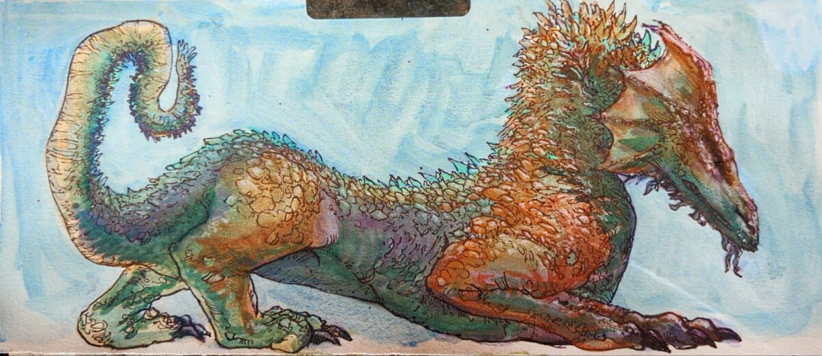
metallic and shimmer watercolours plus fountain pen

by definition, not static
construction is continuing / old posts are being rebuilt / new archives are being built
I make art!
I make things. We’re calling them art for the time being but honestly it’s mostly process and some outcomes.
You might enjoy perusing specific tags! Tags such as:
oil pastel or watercolour or gouache or digital art or sculpture
I am happiest when helping other people get excited to make things, so please drop questions and such in the comments fields and let me know what you’re hoping to make these days too!
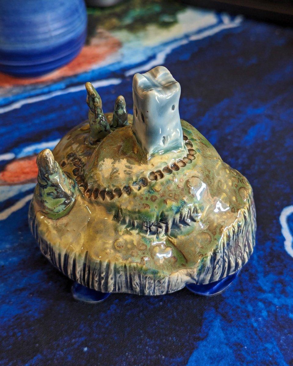
I’ve been learning ceramics in a casual ongoing way now, enjoying getting out of my comfort zone, and playing with a new medium. Much like printmaking, kiln fired and glazed ceramics are really a collaboration with chemistry and physics as well as a personal creative act, and I love that aspect so much. Below I’m […] — read more —
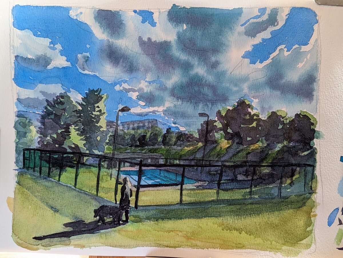
Watercolour in my etchr coldpress sketchbook. And some process shots, which I always find so enticing in their own way: — read more —
Friends, I just finished teaching the last third of a course on print production, and between that and the whole thing with twitter’s crop changing (somewhere? not for me but somewhere?) I’ve found myself thinking a lot about copper etching and my relationship with the acid bath. So, first up, copper etching is an art […] — read more —

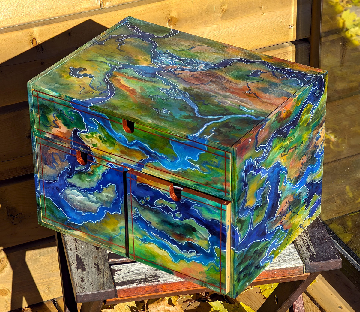
I have had this wooden ikea tabletop box for decades, and since it took a beating in my last move, I decided to sand it all down to clean wood and paint it up decadently, in hopes that it delights me whenever I look at it, and I feel comfortable saying it sure does! I […] — read more —
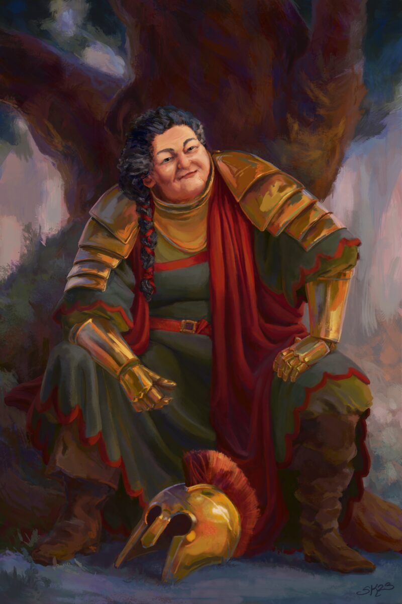
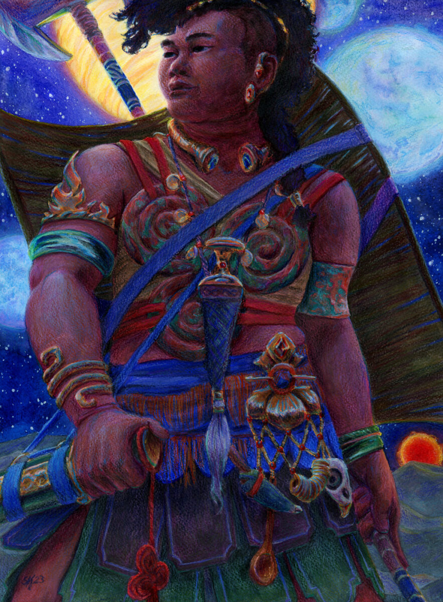
Well-worn warrior queen. Painted in procreate with my non-dominant hand. — read more —
In April 2023 I tackled the annual Plein Airpril challenge, and painted from life or from my own (or a couple of friends’) photos every day for the full month! I mostly but not only used gouache. It kicked my ass but I was very proud to complete it, and I think there are some […] — read more —
I love it and it’s so fun and also it’s really infuriatingly hard and I’m on year 7 of seriously trying to make it a part of my life, so, y’know, I have some thoughts! Regarding getting started, there’s some real rabbit holes you can fall down, including ones such as “what sketchbook is best” […] — read more —
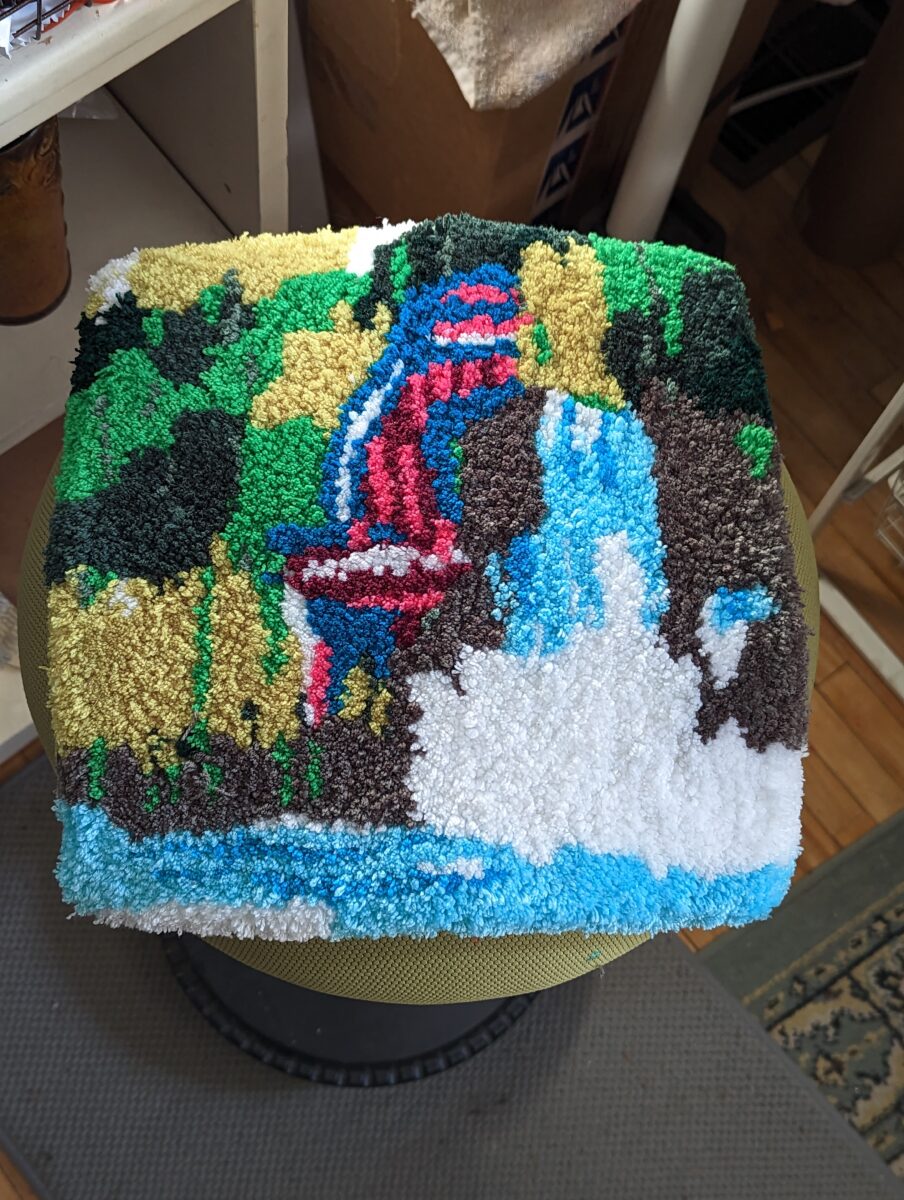
I took a few friends to a rug tufting workshop for my birthday! We brought our own designs, and I spent some time earlier in the week making mine more and more simple. It was still definitely way too ambitious, but I had a lot of fun making it and would love to try again […] — read more —
So my first round of art school was a fine art degree. And I didn’t really know a lot about art careers and I wasn’t really sure what I WANTED to be doing, but I did kind of chafe against the “comics aren’t art” vibe some teachers had. And then Shannon Gerard came and talked. […] — read more —
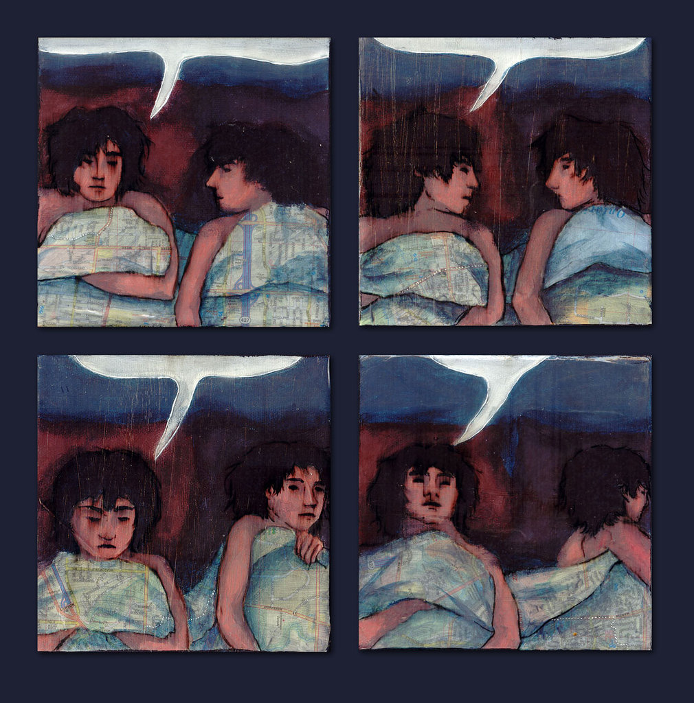
Mixed media painting, watercolour and pencil crayon on watercolour paper. — read more —
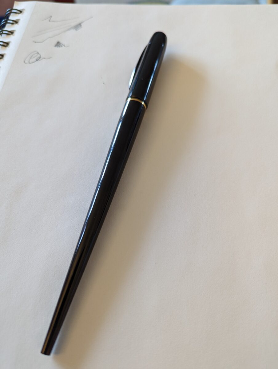
Took some photos of my fav pen right now, the Platinum desk fountain pen! It’s fun to sketch and to write with – I’ve been taking work notes with it and also doodling a fair bit recently. I’m going to do a test run of inking a simple short comic with it and I will […] — read more —
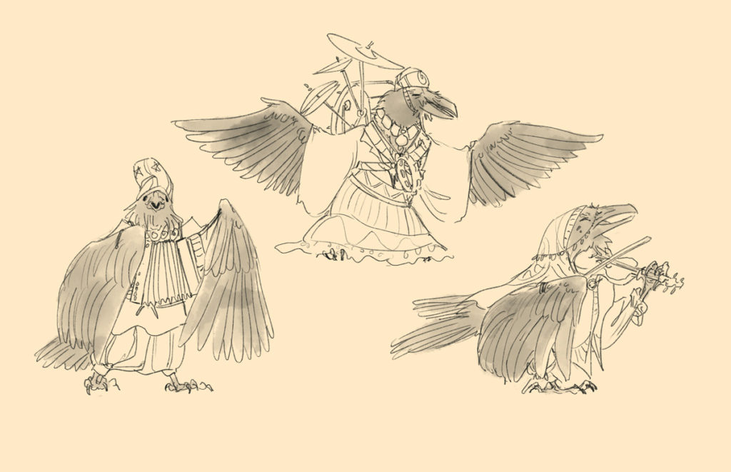
Twelve character designs created as a private commission for use as a selection of NPCs, with inspiration lifted from deep sea photography, Byzantine court robes, 17th century french coats, European folk costume, and Errol Flynn outfits. Available to license. — read more —
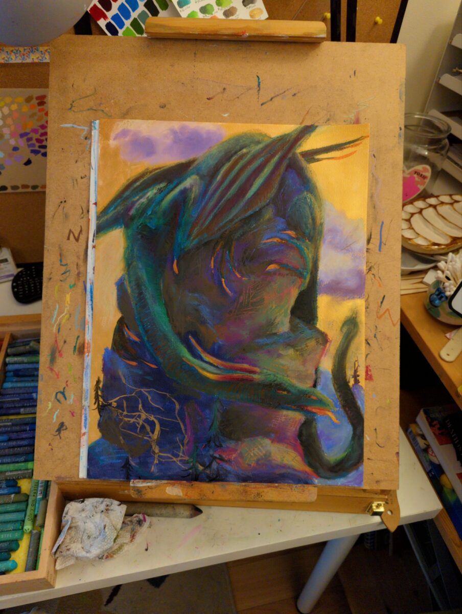
really love the colour palette i achieved here! not sure the drawing was strong enough to support it though, and the canvas was definitely too small for me at the level of precision in comfortable with right now. in the end i called this off before feeling 100% satisfied, but that’s simply the nature of exploratory work and no harm done. as i said, still very proud of this colour scheme!


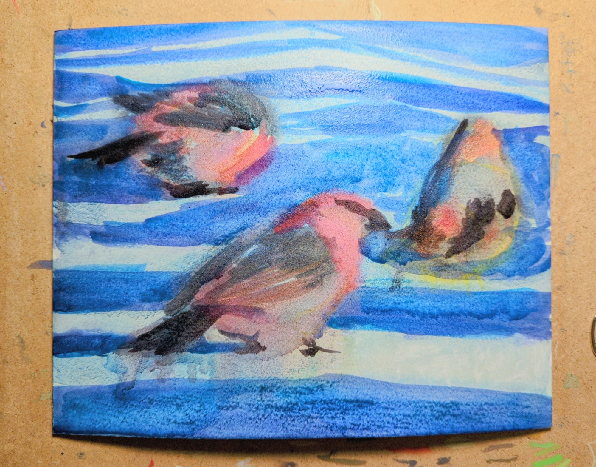
my latest oil pastel experiment is this painting of three pine grosbeaks, referencing a CC0 photograph shared as part of an observation on inaturalist.
this one was created on illustration board, with a full under painting in watercolor first, which you can see in the third image. The illustration board texture has a wonderful grain and could be a very satisfying surface for oil pastel, but it tends to warp pretty dramatically when painted on with water-based media. you can see any image on the right how much it has bowed out while wet; what you can’t see is that it has an inverse warp in it once dried. clamping it down to draw on it released some but not all of it. unfortunately this means it’s just not a good solution for anything with a watercolor under painting.
inaturalist has been a really exciting thing for me to explore, and once I discovered that you can search observations by image license I got really excited. if you’re also looking for reference, especially of specific animals, it might be a great place to start.

I painted this one on sanded paper, the much admired pastelmat type, and found it desperately unintuitive. The grippy surface could be nice, but it’s completely unabsorbant, and i found myself unable to layer the way I’m used to on rag papers, or honestly even on wood. that said, you really can blend infinitely on this stuff, so if that’s your jam you might get more out of it than i did!
Subject-wise this is based on my own photograph from a recent roadtrip, and it was a delight to get to zoom in on something I shot myself and try translating it into oil pastel! I’ve been playing more and more with macro lenses and extreme depth of field, and have been meaning for a while to experiment with translating that effect into paint of some kind of another.
That said, abstracting, blurring, and softening things is both really easy to do with oil pastel and really tricky to add nuance to. I can see some places in here where the effect is really landing, and others where things feel almost into only two planes, rather than the three or more I’d like to have had throughout. So, much to learn down this path, but I’m excited to keep going with it!

i did a quick watercolour (first) and gave it a coat of fixative so i could try out layering oil pastels on top for a mixed media look (second), but I’ve hit a few challenges:
so likely I’ll toss this now and move on, but it has taught me a fair amount of interesting technical facts, which i plan to remember, and also reminded me of some basic truths about planning, drawing, and values, that i would like to remember but will probably ignore once again at some point in the near future.
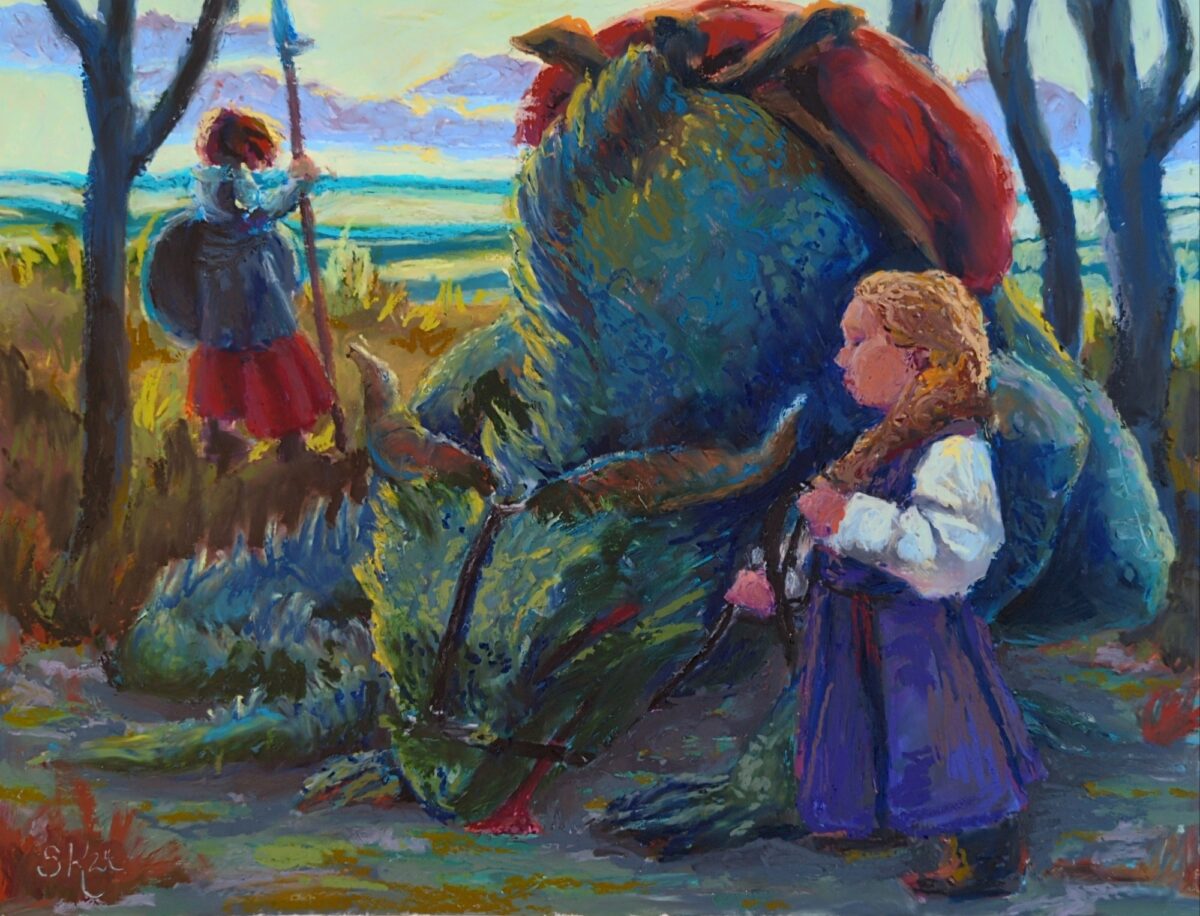
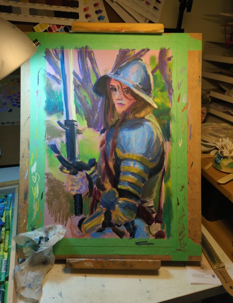
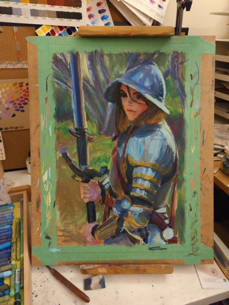
this is the biggest thing I’ve painted yet with the oil pastels; gonna be working in it for a while
i was looking at digital paintings from 2022, and thinking about the method I had started using back then of having a mark making stage and a blending stage as two separate things; and the oil pastels are letting me start to approximate the same workflow, but on paper! interesting…
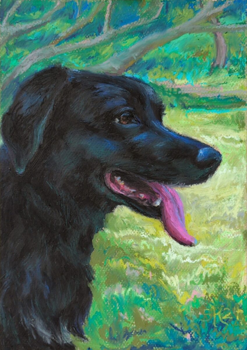

finished this piece of a much missed lucky boy; oil pastel on canson mi-tientes paper.

working on canson mi-tientes paper, which really let’s the pastel slide around despite the rougher side’s surface texture.
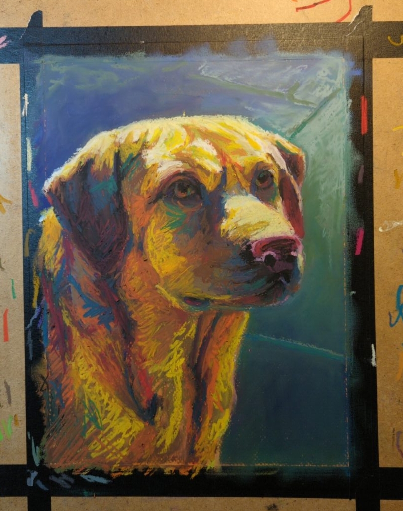
painted on canson mi-tientes pastel paper
I love this
✨!

in a Robert Bateman sketchbook, using Neopastels from Caran d’Ache.
This piece was painted using textural chalk and pastel brushes in Procreate.
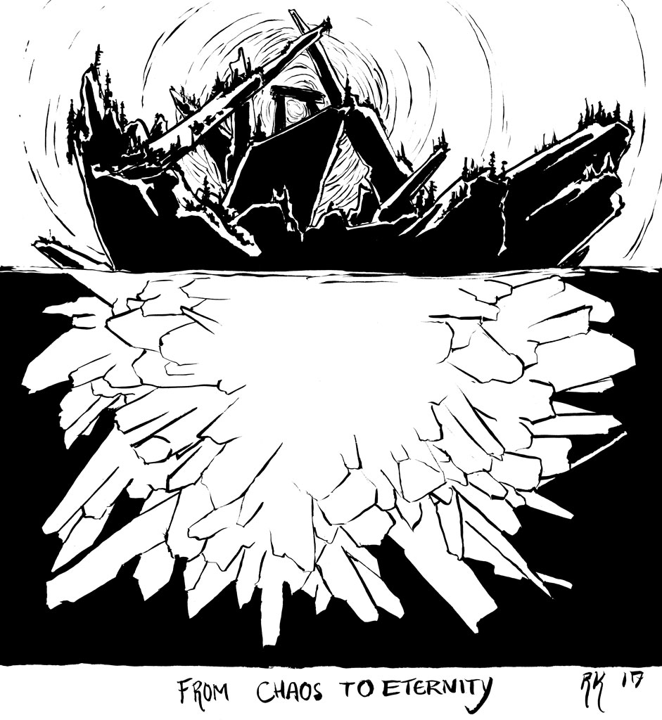
Painted in gouache on watercolour paper, 5 x 7″, 2017
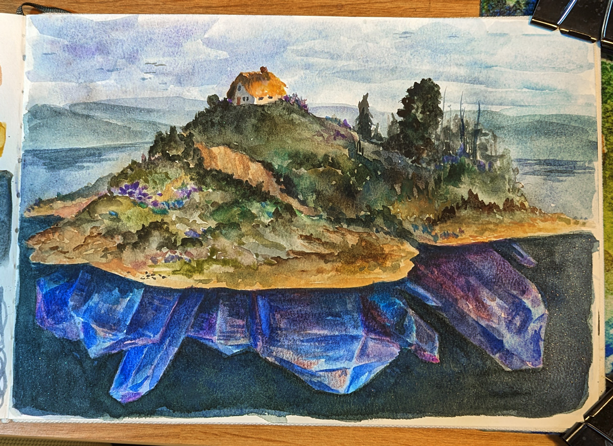
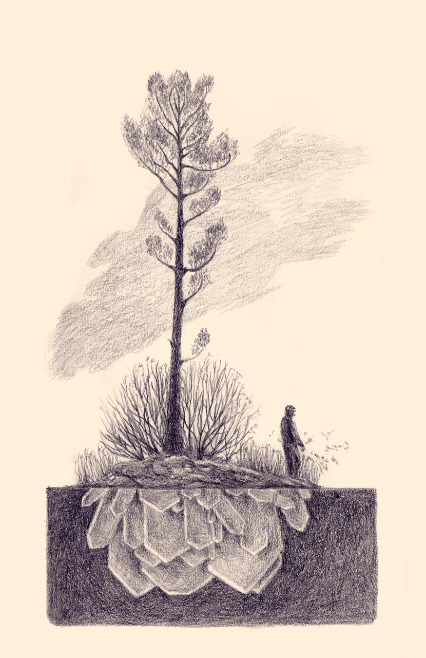
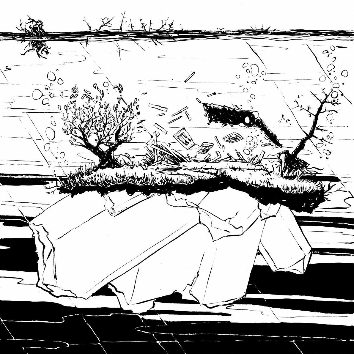
This drawing on cream paper is an exploration of the Crystal Island concept to include people. The figure creates a psychogeography of the landscape.
The landscape in this drawing was taken from reference photos of French River Provincial Park, an absolutely gorgeous place in Ontario, Canada. There are delicate tall pines and windswept shrubs and bushes along the shores of a rushing river, passing through a deep gorge. Despite the speed of the water and the constant wind, the place feels still and isolated and special.
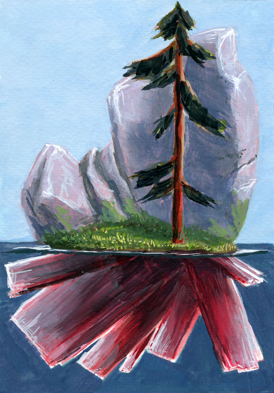
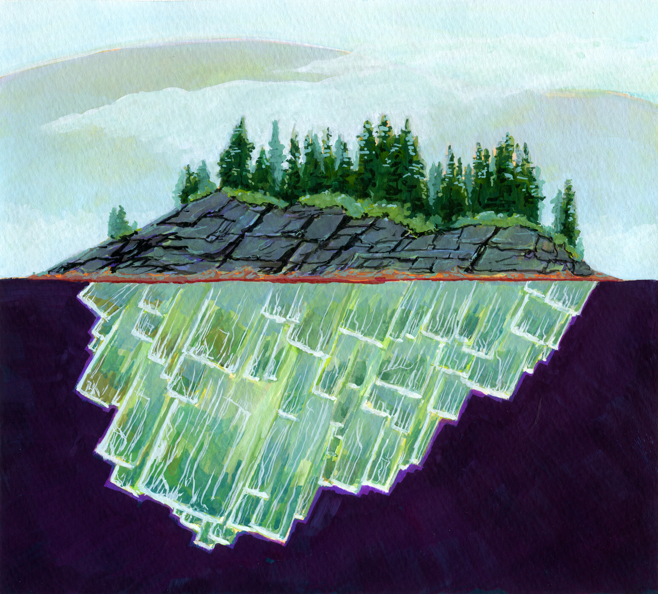
This gouache painting is about 7 x 9″ in size, on watercolour paper. It’s an exploration of the geological identity of some parts of Gros Morne National Park, in Newfoundland, Canada. The green serpentine crystals are growing from the granite and serpentinite mix of Gros Morne, specifically the Tablelands. The dark spruce and fir trees are silhouetted against distant hills and rolling fog. This piece is my love letter to that gorgeous park and the sense of magic it has.
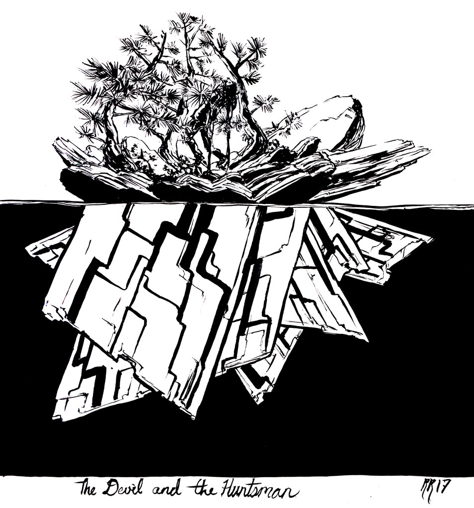
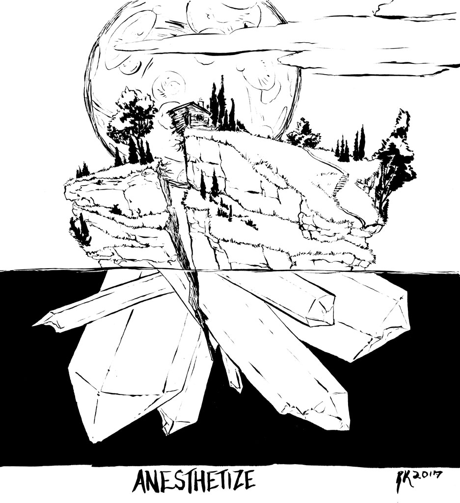
Painted in gouache on watercolour paper, 4 x 6″, 2017

Leave a Reply