
swap to chronological order of most recently posted
-
Getting to know a new palette!
posted:
updated:
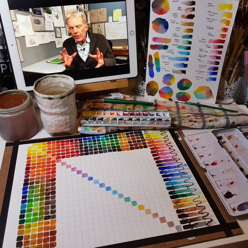
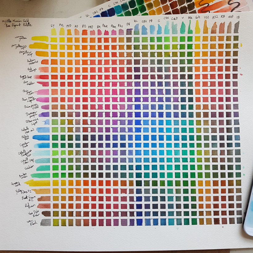
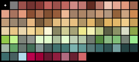
posted to: arttagged: artist, glazing chart, how to, mijello, mission gold, mixing chart, paint, pigment, process, pure pigment, structure, watercoloursI treated myself to a new watercolour set, higher quality than the sets I’ve used in the past, about on par with the one-tube-at-a-time purchases I’ve made in terms of lightfastness and pigmentation and such. It’s a Mijello Mission Gold pure pigment palette!
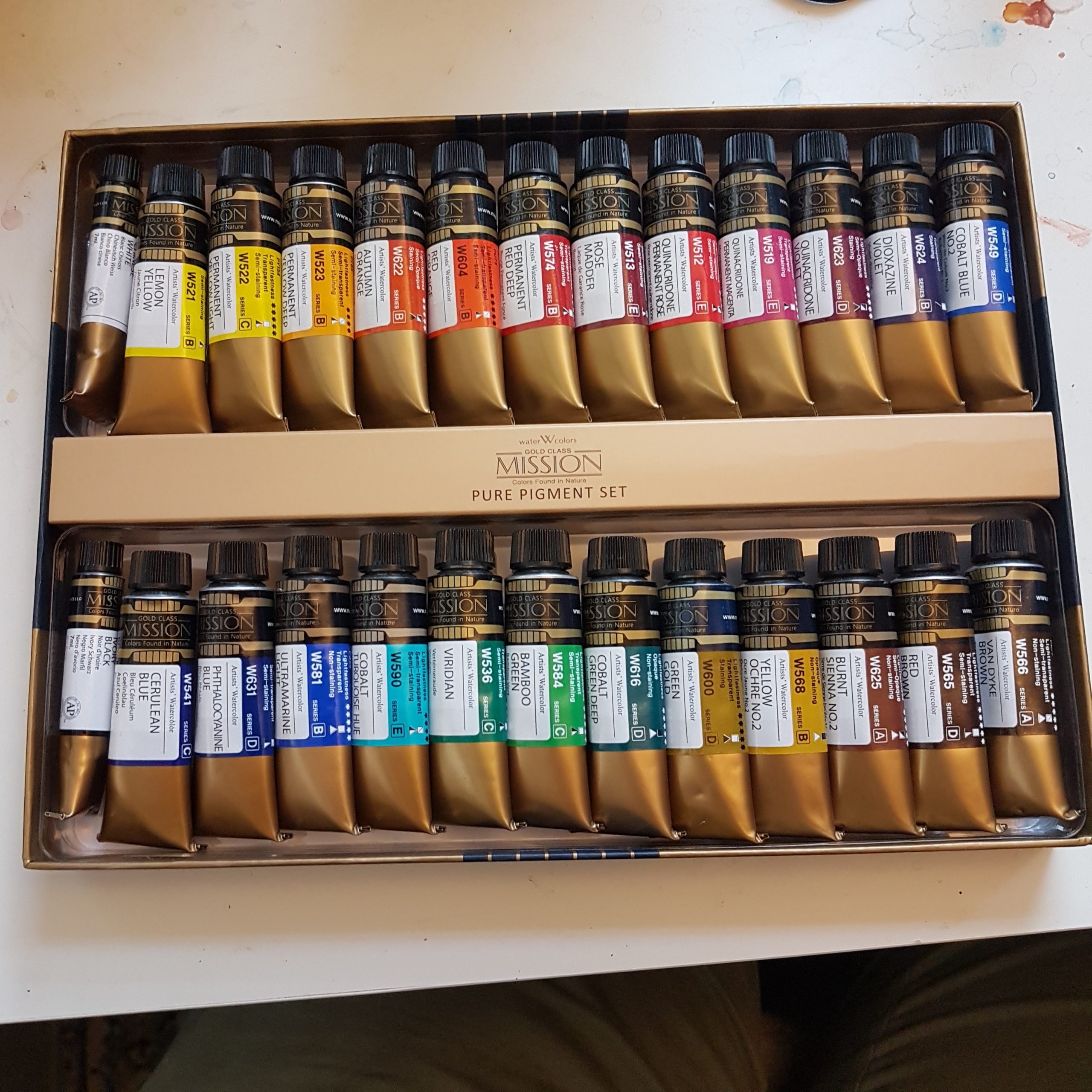
The premise of a pure pigment palette is that each paint is made up of a single pigment. Often, paint sets include convenience colours like payne’s grey that are composed of several pigments mixed together into one paint; and cheaper palettes might use a blend of cheaper pigments to make colours close to but not exactly matching more expensive pigments. This isn’t inherently bad! I have a wonderful collection of convenience colours and colours that granulate into separate pigments thanks to my Daniel Smith collection, and I love them! They have many good uses. But one potential challenge with multipigment paints is that you are likely to get a muddier result from mixing them than you would with a single pigment equivalent. So I thought, if I’m going in on a whole set, why not get one that fills this gap in my collection?
It’s been a while since I got a new full set – it’s been a REALLY long while, actually. The only other watercolour SET I own is the Windsor & Newton Cotman line hard pan set I got as a gift from my dad in grade 13 in highschool – yeah, back in MY day we had 13 grades – we do not anymore – and that was 18 years ago. To say that I know those paints like the back of my hand wouldn’t be an exaggeration – they’ve carried me through two rounds of art school, a ton of freelance, and an entire webcomic. But they’re student-grade paints, and I’ve used up my favourite colours, so I’ve been slowly adding single tubes of nicer paints in an effort to test the waters of my commitment to watercolour. Learning how a single new tube of paint works is a slightly smaller challenge than mapping a whole new set in my head, though – and I figured, with 25 new colours (ignoring the white in that set) to learn, it might be worthwhile doing some swatching and some charts.
So here, take a look at some swatches, gradients, and charts I’ve made since getting this!
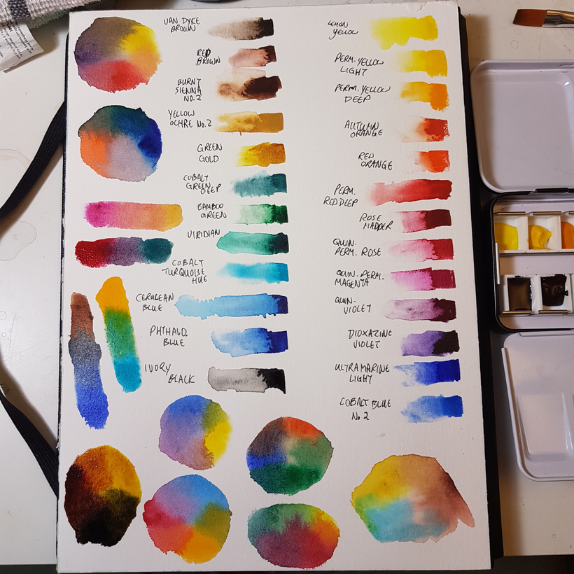
First chart I did was ambitious – a full mixing chart:
it was slow work! I would do a couple rows before bed for over a week, usually with some quality youtube art content on to keep me company.
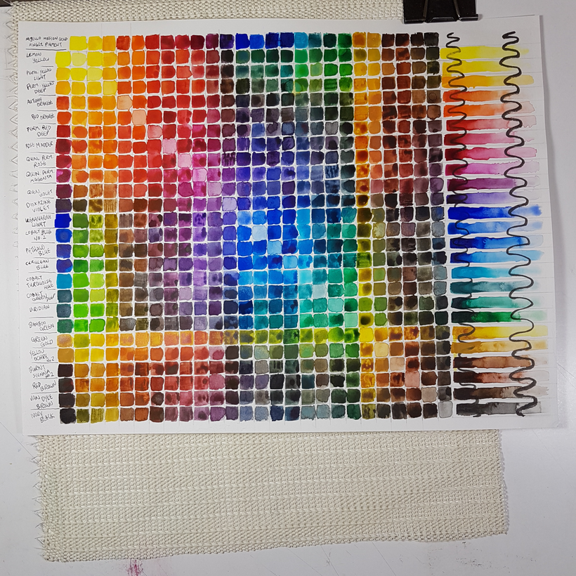
It’s so satisfying now though! I can see the possibility space of this palette!
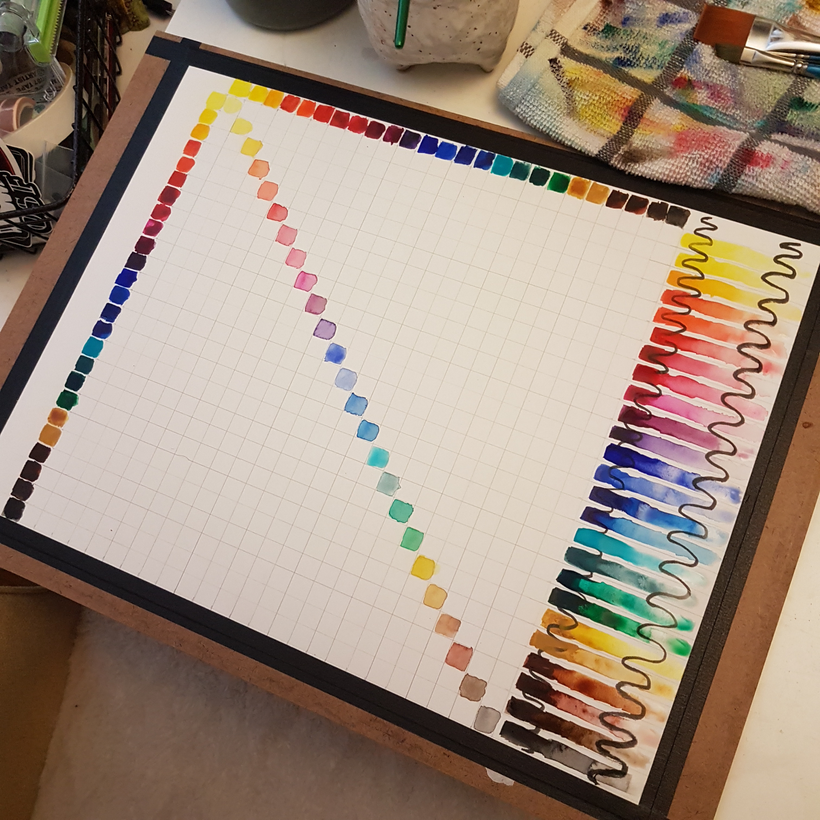
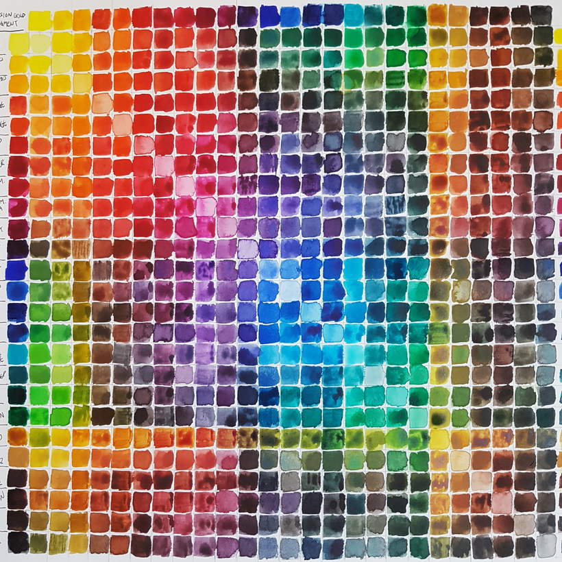
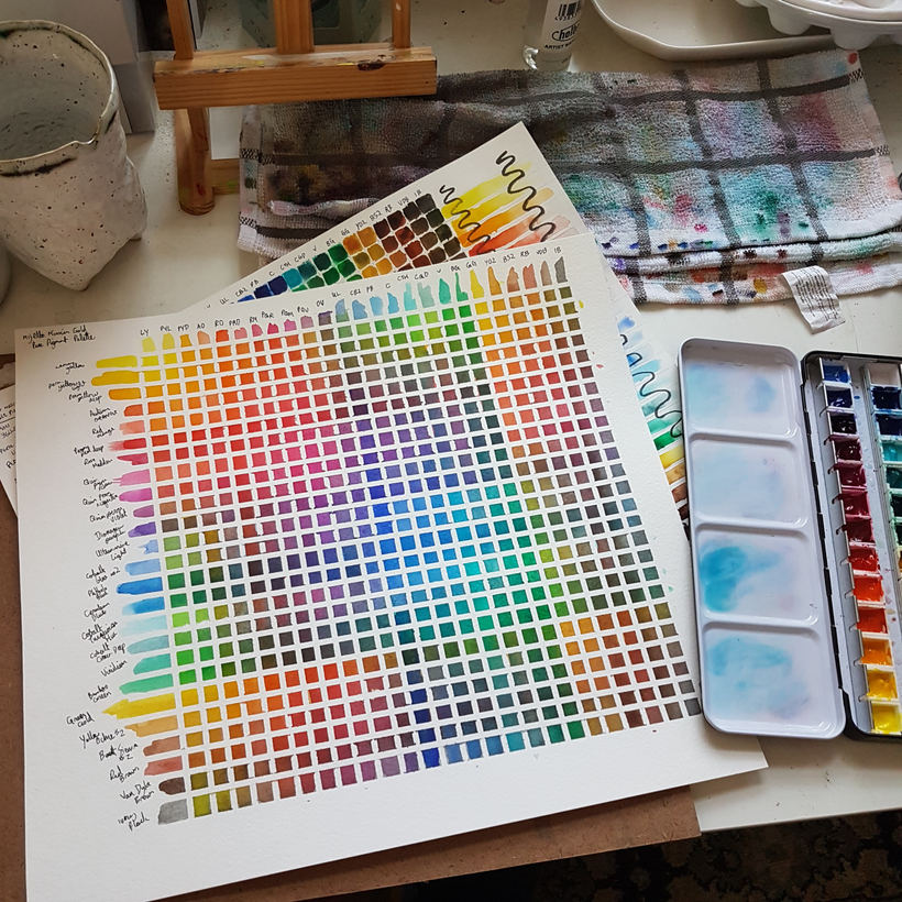
So then I did a glazing chart, to compare palette-mixed colour to equivalent glazed colour:
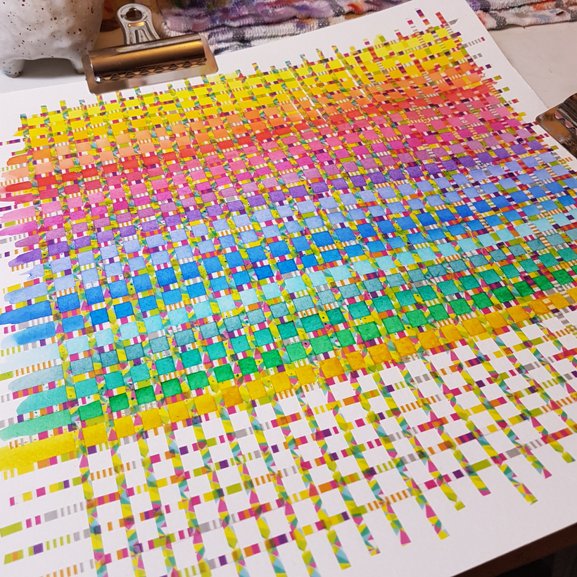
This one required thin tape, and the only thin tape I have is … very decorative, so it was a bit hard on the eyes while I was filling it in. That said, the result is thrilling AND beautiful:
I’m glad I did these, but now it’s time to properly test drive this palette. Here’s six little landscape thumbnails ft different colour palettes as a starter project:
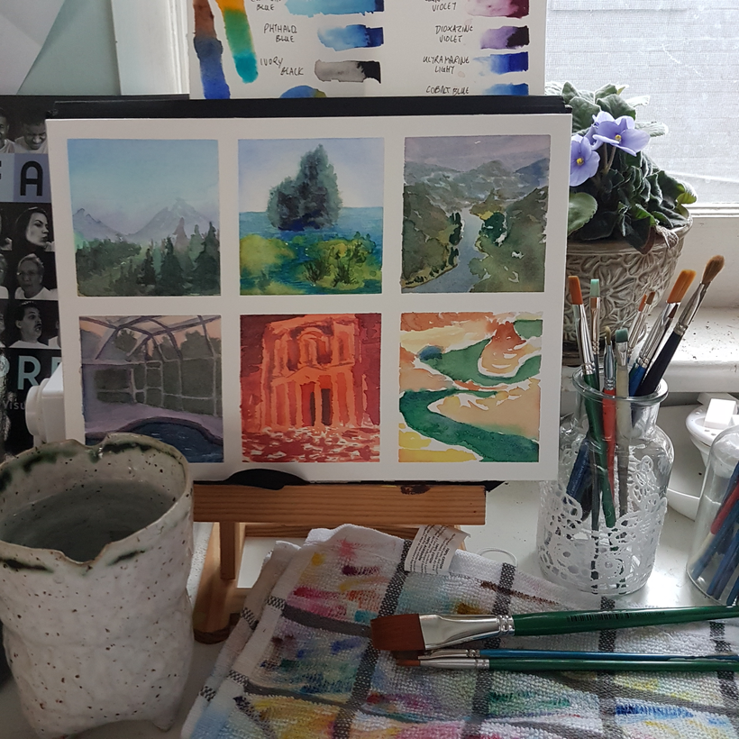
It’s been great and very meditative testing this palette out! And now it feels like time to really dig into it and see what it can do for me within personal work!
Here, have one more studio table glamour shot for fun:
-
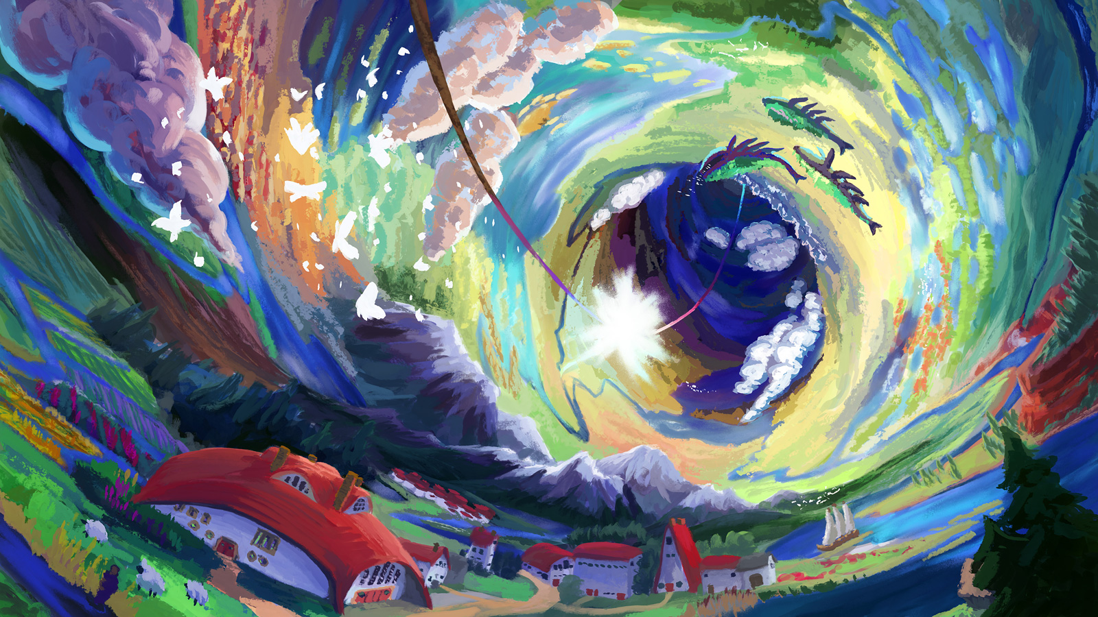
When Ryan asked for a quick proof of concept sketch of a curving tube world with a whimsical, pastoral feel, I was happy to oblige! Shoutout to the beautiful O’Neill Cylinder concepts that NASA artist painted in the 60s and 70s for being very helpful in how to visually sell the concept.
Art owned by Ryan Khan.
-
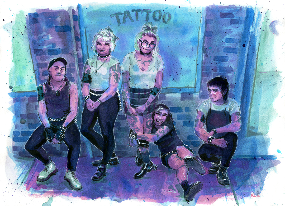
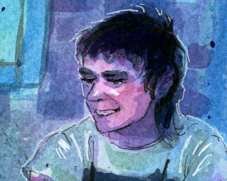
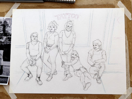
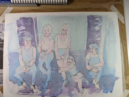
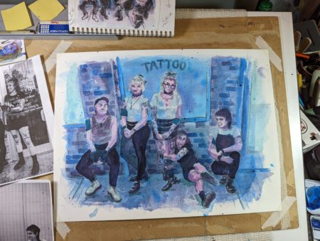
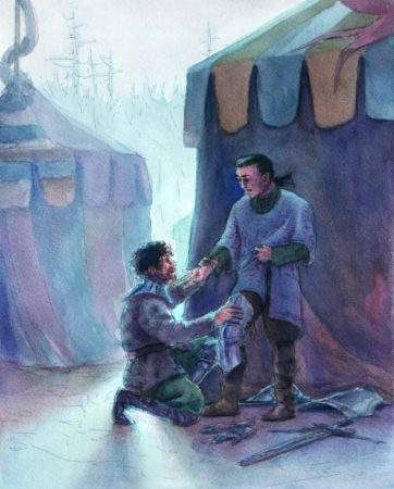
This winter I was approached to work on a commission based on the heavy metal portraits I did as studies last year, which, friends, that’s the dream, hey? Do a personal project, hear from someone who connected with it so much they want a private commission that seamlessly extends that body of work? Incredible!
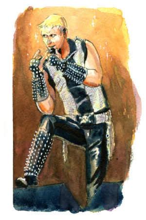


Lowell reached out with a request for a commission of the trans-feminist hardcore punk band G.L.O.S.S., and sent along a few reference photos and a link to this youtube video of a live set, which certainly set the stage for what an earnest, and intense, and also loud! band they were!
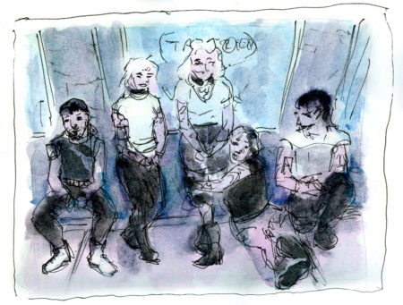
So, without further ado, here’s the final painting:
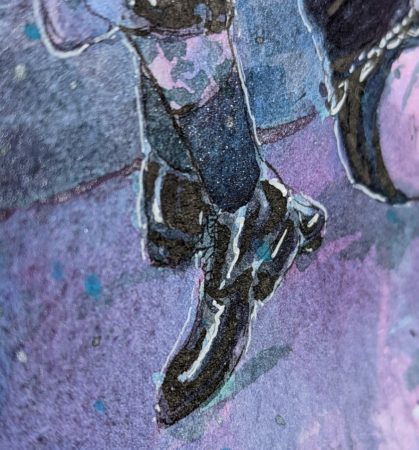
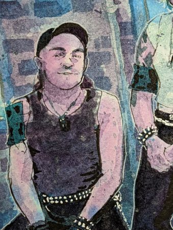
I don’t think this scan quite covers it though, because this piece is also luminescent, and iridescent, and also quite sparkly:
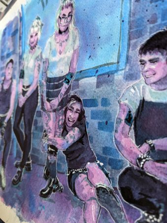
It’s also quite large – 12 x 16″, it’s gonna be a great statement piece and I wanted the colours to not worry about realism but to focus on pulling viewers in – while also being as queer as the core politics of this band.
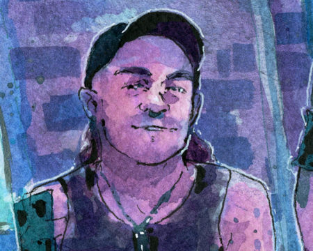
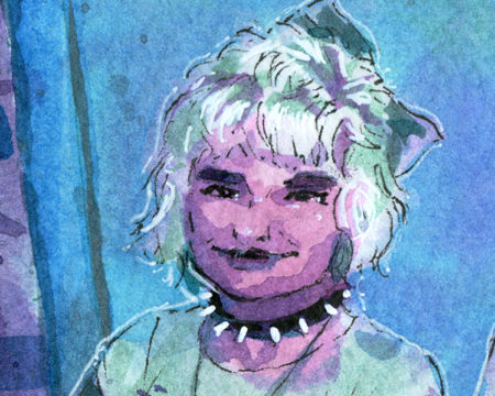
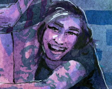
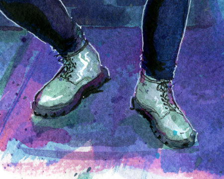
Finally, here are close-ups on the faces, and some other favourite moments of mine:


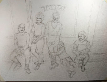
Also, would you like to see a couple in-progress shots from the drawing table? I really treasure these little reminders of how my paintings came into being:
-
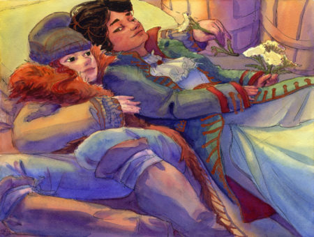
Three Dyads
posted:
updated:
posted to: arttagged: couples, little scenes, moody, original characters, painting, romantic, structure, watercolourI’ve been practicing taking pose ref and building a fictional scene around it, and decided to focus in on people having quiet moments together; I’ve also been trying to use more soft gradients in watercolour, which is DEFINITELY one of the trickier parts of the medium, so it’s been a great challenge! It’s also taught me the value of good watercolour paper, but I suspect that’s a lesson I’ll keep re-learning. So far the Fluid 100 line, which is 100% cotton, has been holding up better than I expected for something so affordable! Not quite as cheap as the paul rubens 100% cotton paper, but available in much bigger sizes.
It’s maybe not evenly distributed yet throughout these drawings, but I am trying – for real, really really trying – to find a fun and charming and simple way to cartoon faces that feels repeatable for me.
What do you think?
-
Thanks to the Orb, they’d been living large outside of time — until it all came crashing down.
Stranded on a strange moon, four space pirates and one stowaway find themselves forced to discover what comes next.

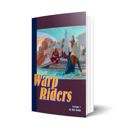
Warp Riders is a fast paced, pulpy, and sapphic orb-and-planet novella. It grew out of a NaNoWriMo tweetfic, and since then I’ve polished it up quite a bit.
If you’d like to read it for free, I’m running it online in small chapters, like a webcomic – catch up and subscribe right here!
But I’m also offering it as a pdf and epub, and all the money raised there will go to me getting it properly set up for professional level self publishing, including funding me drawing interior illustrations. Pick up a copy for yourself here and I’ll send you updated versions as they happen!
If you love a little magic in your sci-fi, a little space wizardry spiced with queer romance, I think this might be your jam!
-
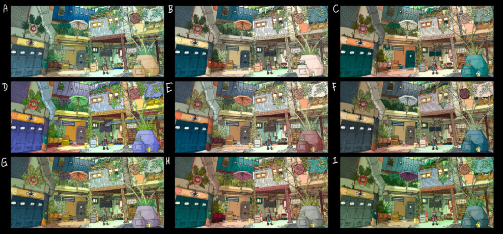
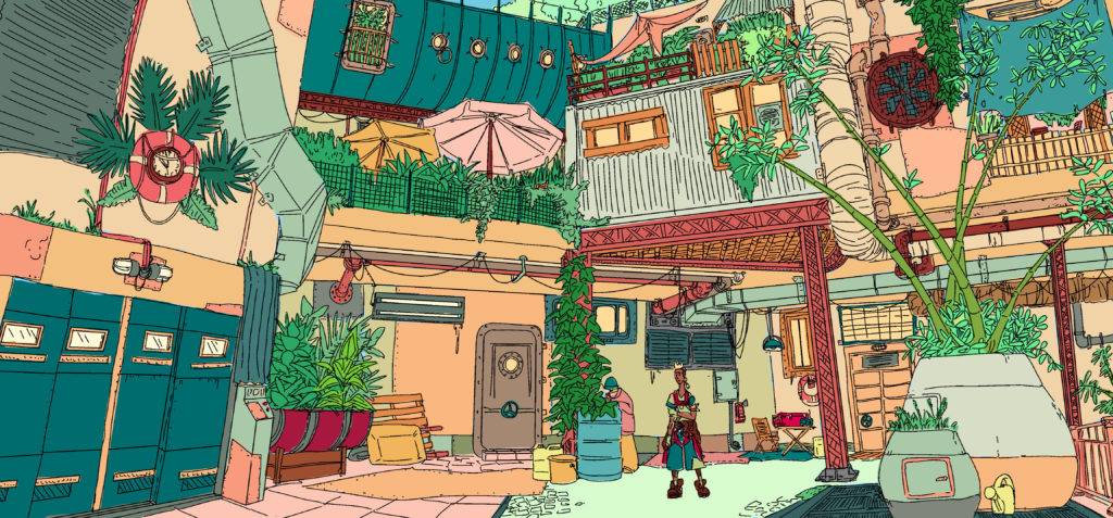
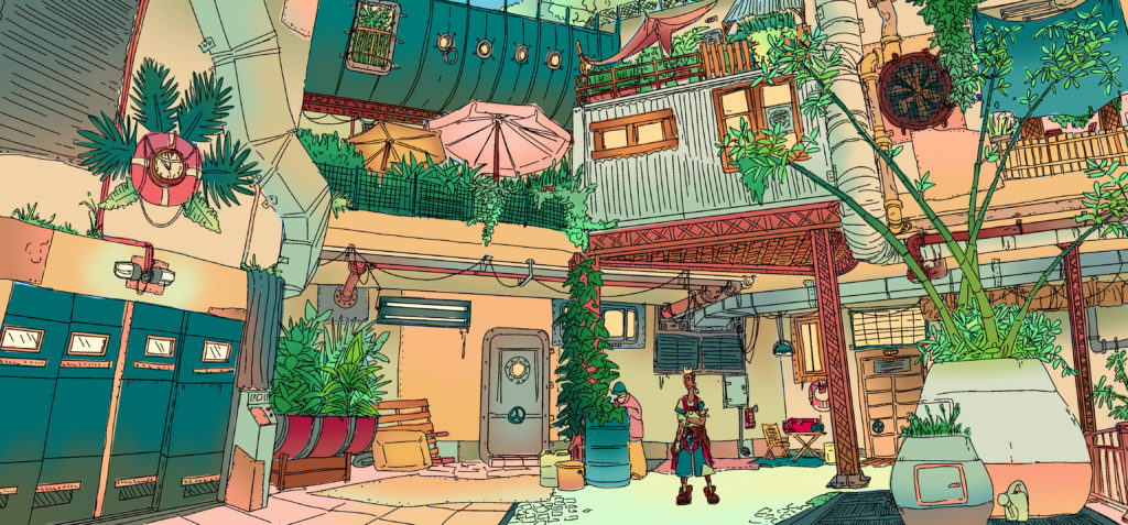
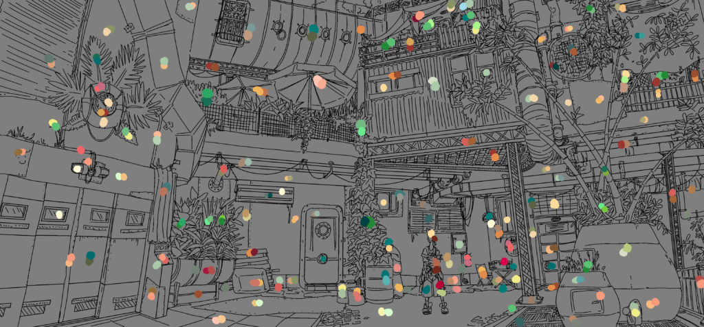
Environment design exploring the possibility of using asset store models to populate the level without losing the worldbuilding and colour design. Created as a thorough guide for the level designer, including labelled assets and isolated colour palette information.
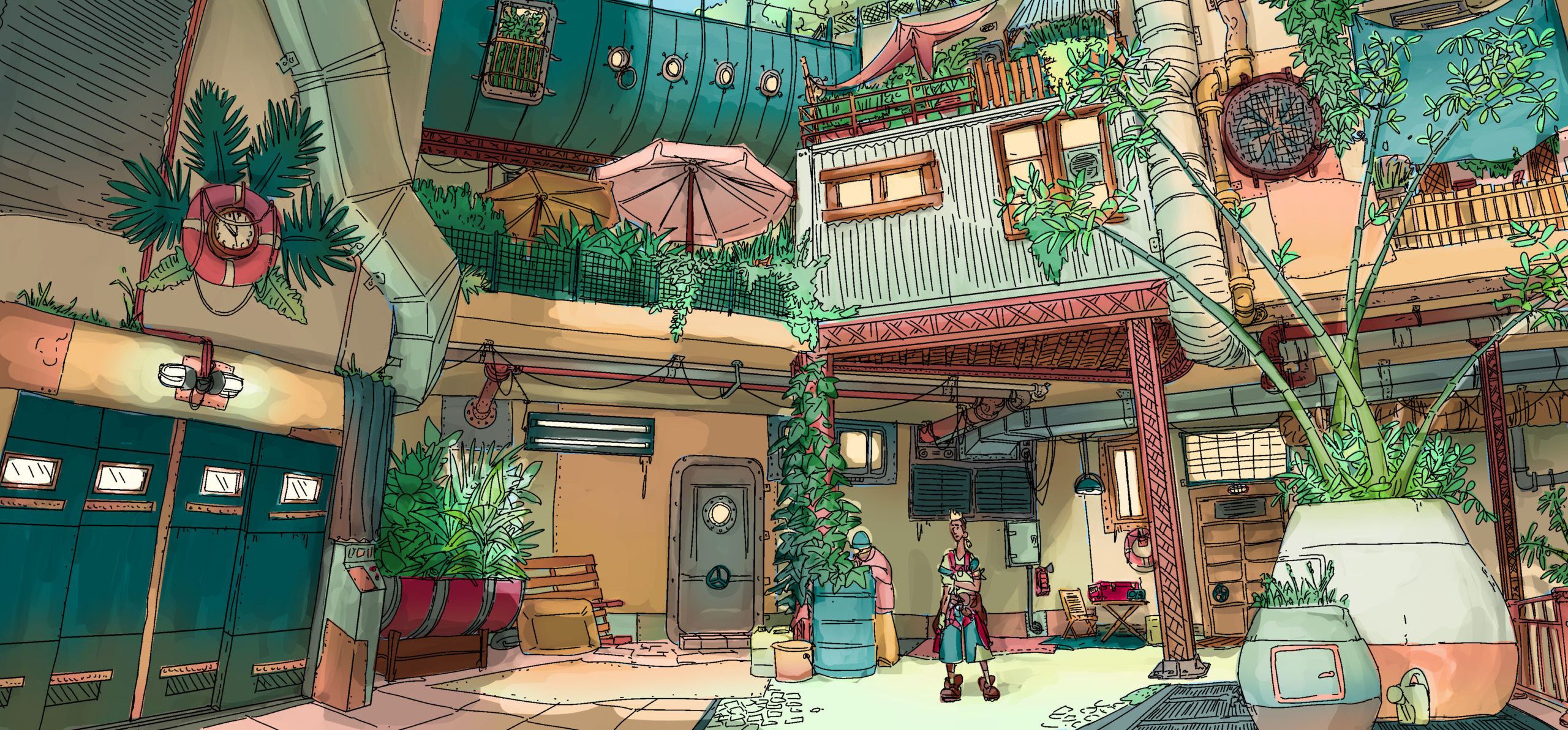
We started with thumbnails painted from level blockout exploration to choose a location to build up:
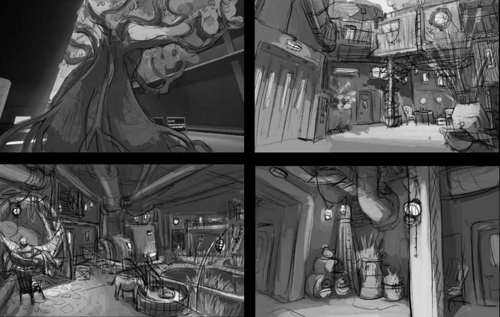
The chosen blockout:

From there I created a rough concept as a guideline for what we wanted to achieve:
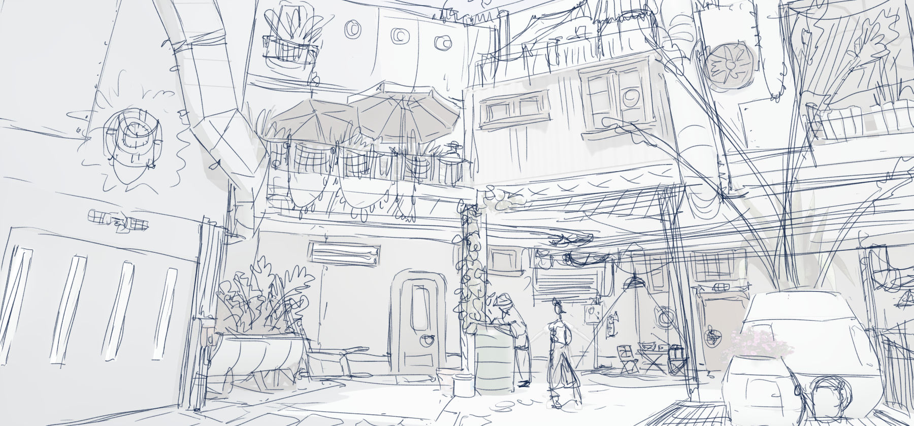
With the client’s approval, I went on from there to use the asset packs to choose props and objects that could set dress this area, developing a rendered greyscale layout and a reference image labeled with the associated asset back for each element:
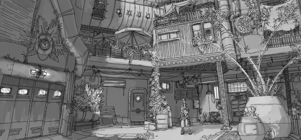
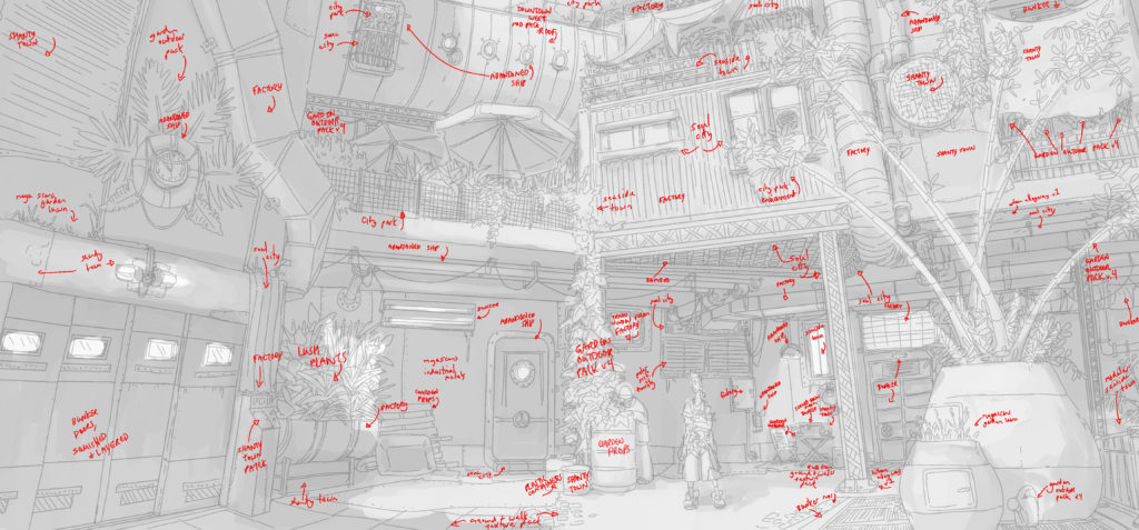
From there I went on to design the colour scheme, from flats to gradients, tagging each asset with its local colours and creating a palette for the environment artist to use on the asset pack props.
-
Herders and their stagmoose, dramatic geology, and a landscape strewn with the remains of history. Loose sketch concept.
-
I’ve been trying to nurse a sketchbook habit back into existence this year, and one of the things I desperately miss is a place where I can share drawings as ideas and not as achievements.
-
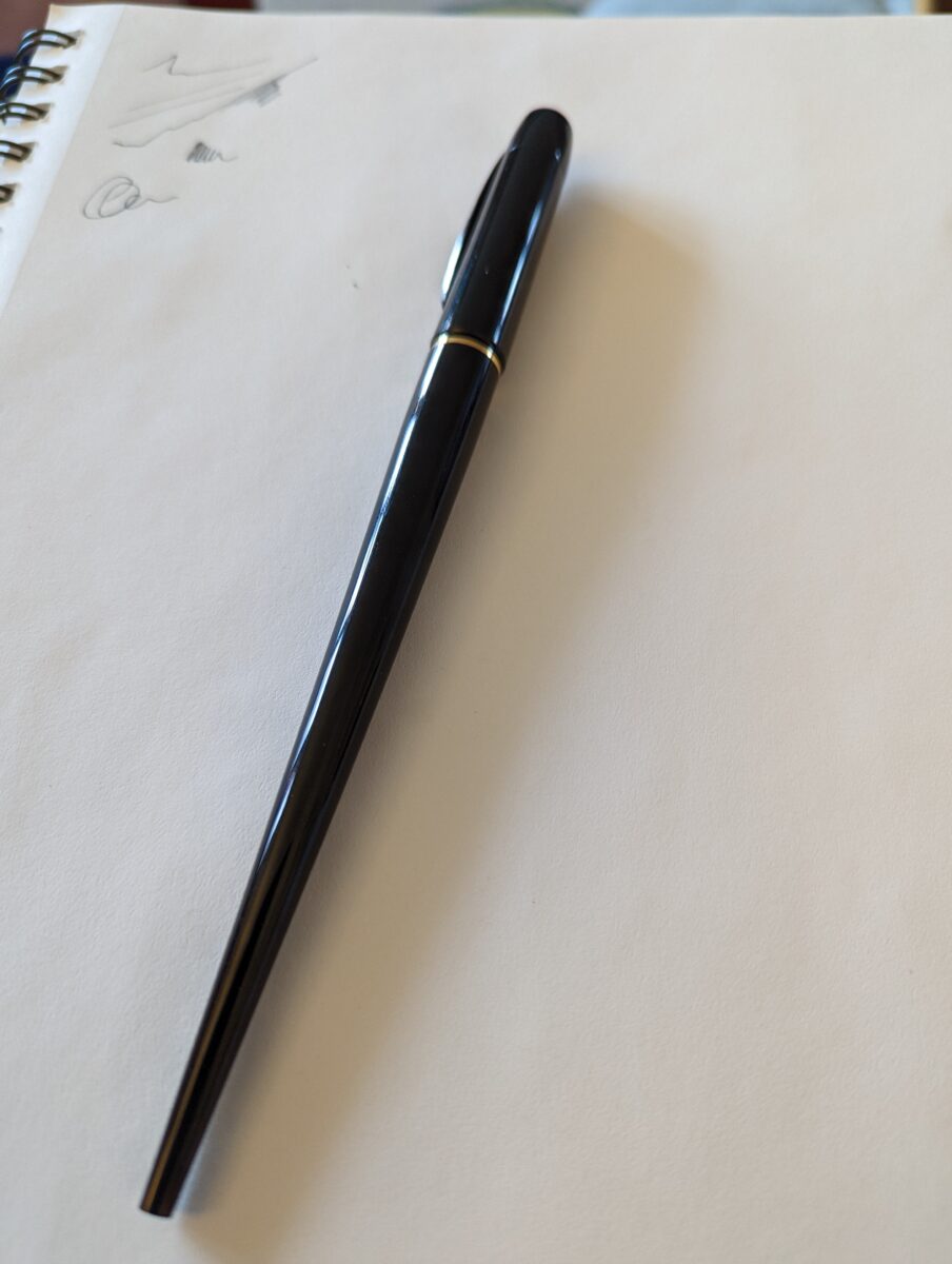
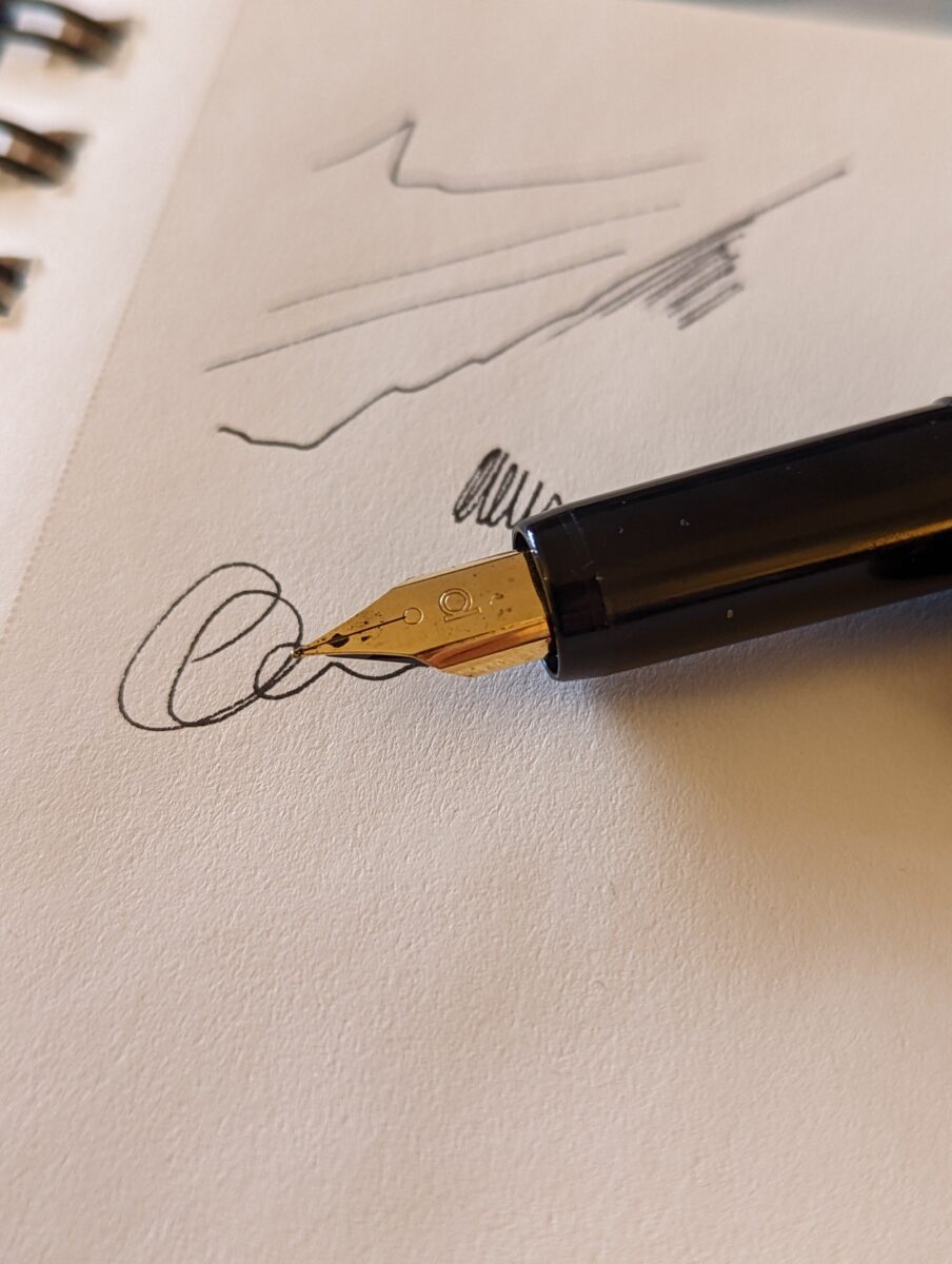
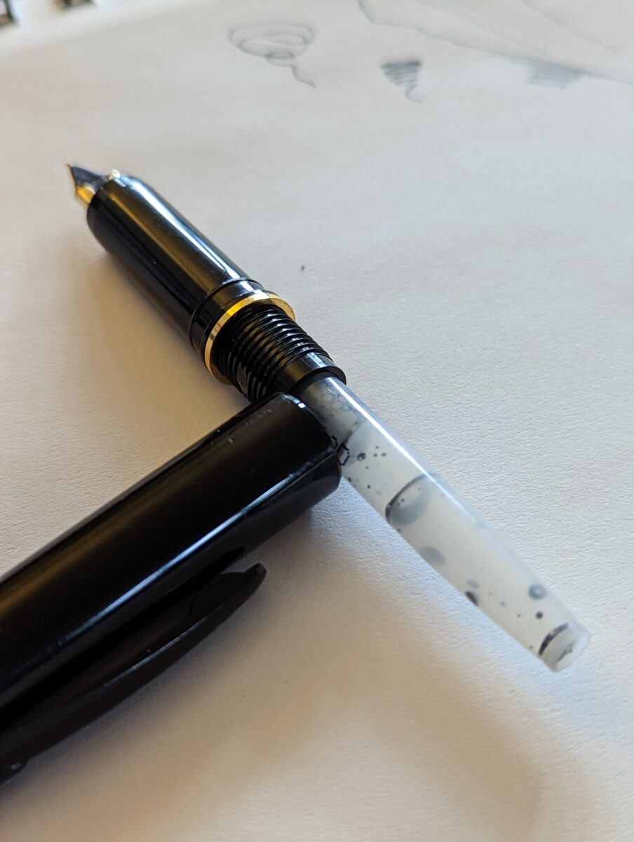
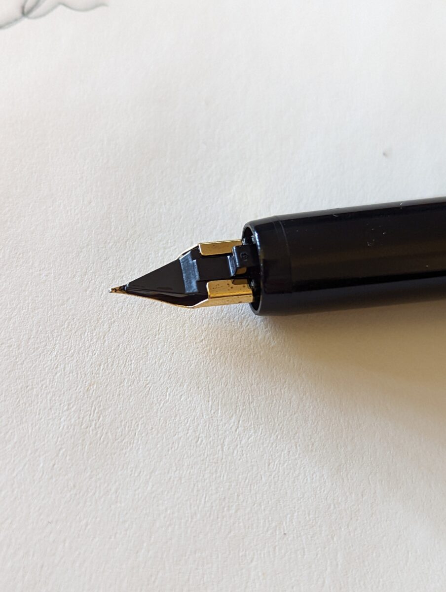
Took some photos of my fav pen right now, the Platinum desk fountain pen!
It’s fun to sketch and to write with – I’ve been taking work notes with it and also doodling a fair bit recently. I’m going to do a test run of inking a simple short comic with it and I will certainly let the internet know how it goes.
I think getting Extremely Into Watercolour has set a precedent where I am now bringing a connoisseur attitude to all of my art supplies, which can definitely get expensive, but this pen is, like, $15~? Not pricey, and when I get around to getting an ink converter and some bulk ink for it I will have a very affordable drawing tool indeed.
They also make a pigment ink for it – carbon ink – in cartridge form, and I’m curious to try it! But I legit might buy a second pen so if I do really fuck up the nib, I don’t deprive myself of my favourite drawing tool for any length of time.
The last time I got so attached to a particular tool like this was when I picked up a turned antler mechanical pencil in Rocky Harbour, NFLD, when we visited Gros Morne National Park. It took a .07 lead and had a wonderful weight and feel as well as the fond memories attached to it, and I think I dropped it in a cab back in 2018 and lost it for good.
Related, if anyone knows someone who sells turned antler mechanical pencils please let me know.
-
freelance artist psa from your friendly neighbourhood art director
posted:
updated:
posted to: game devplease, please, please god, please, put your website address on all your social medias
and then
please,
please, please,
PLEASE
put your email on your website
Leave a Reply