
swap to chronological order of most recently posted
-
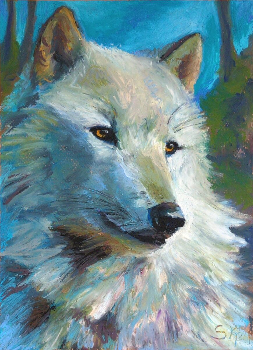
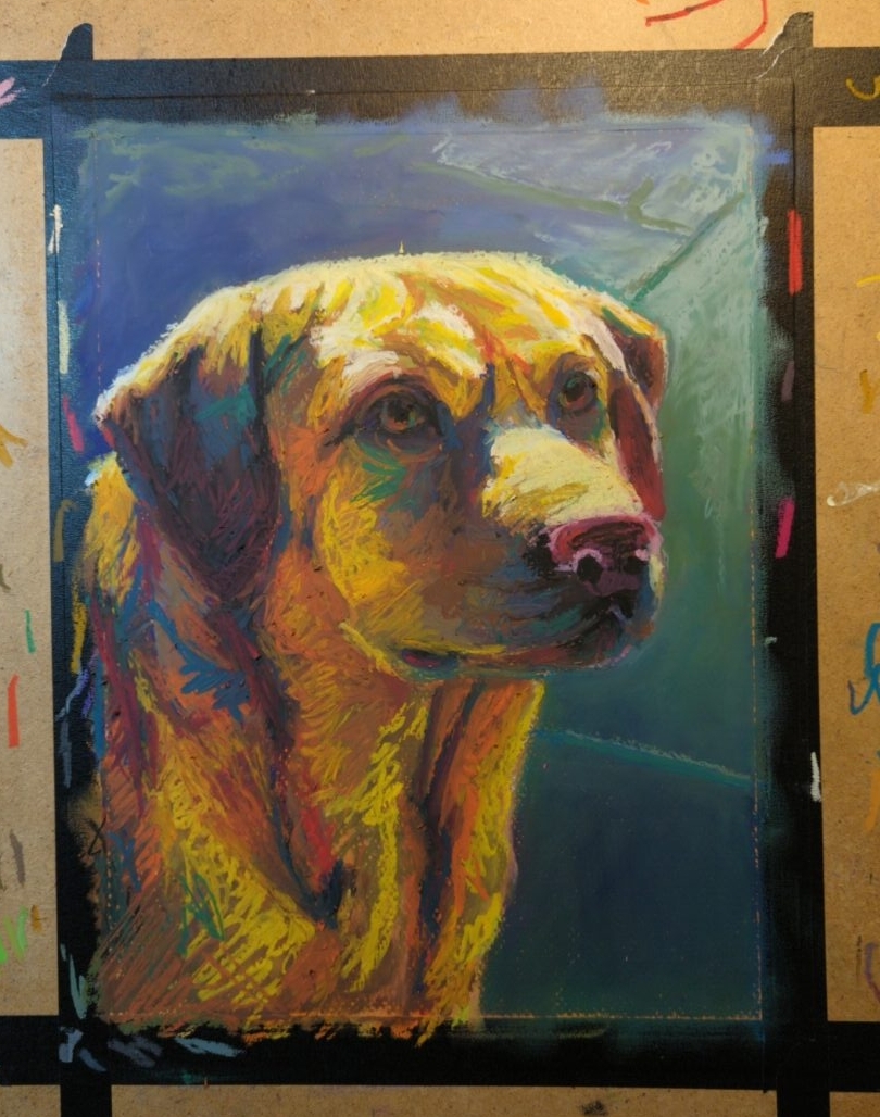
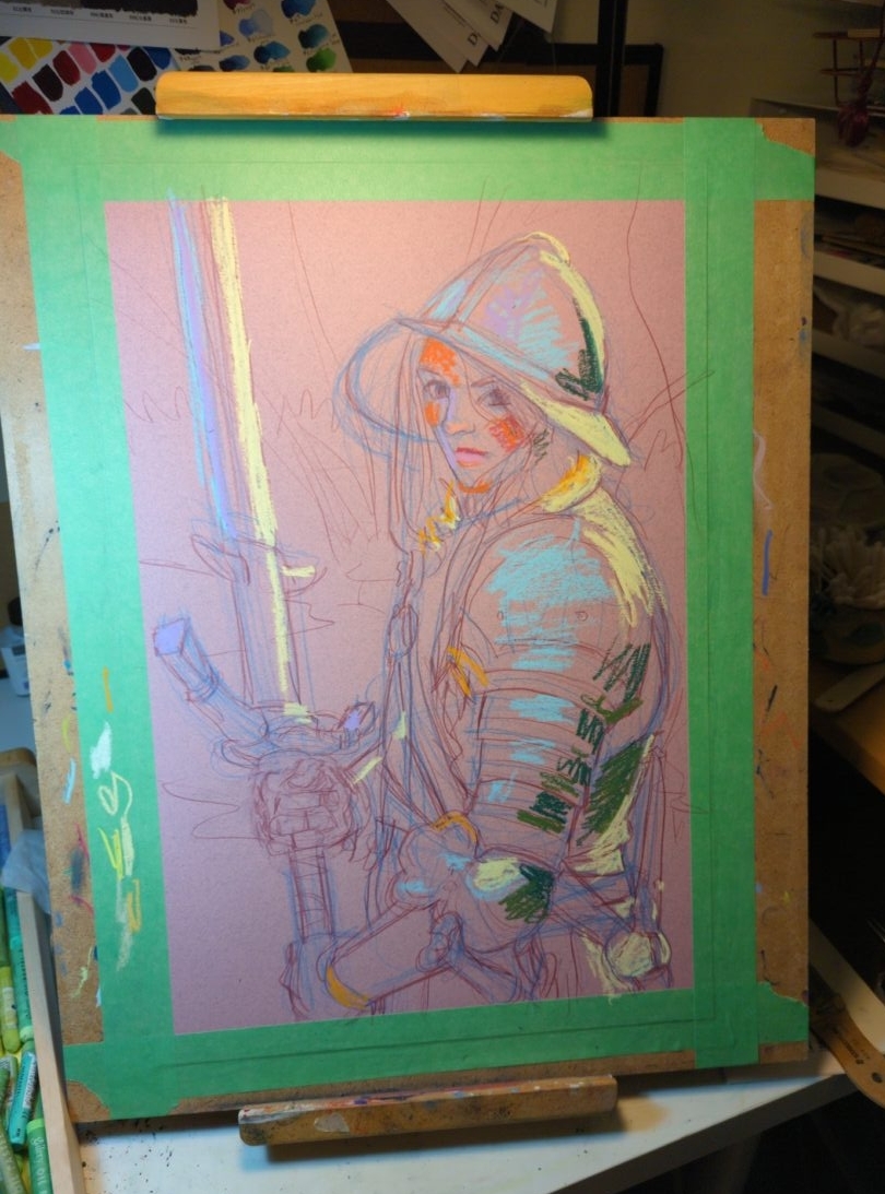
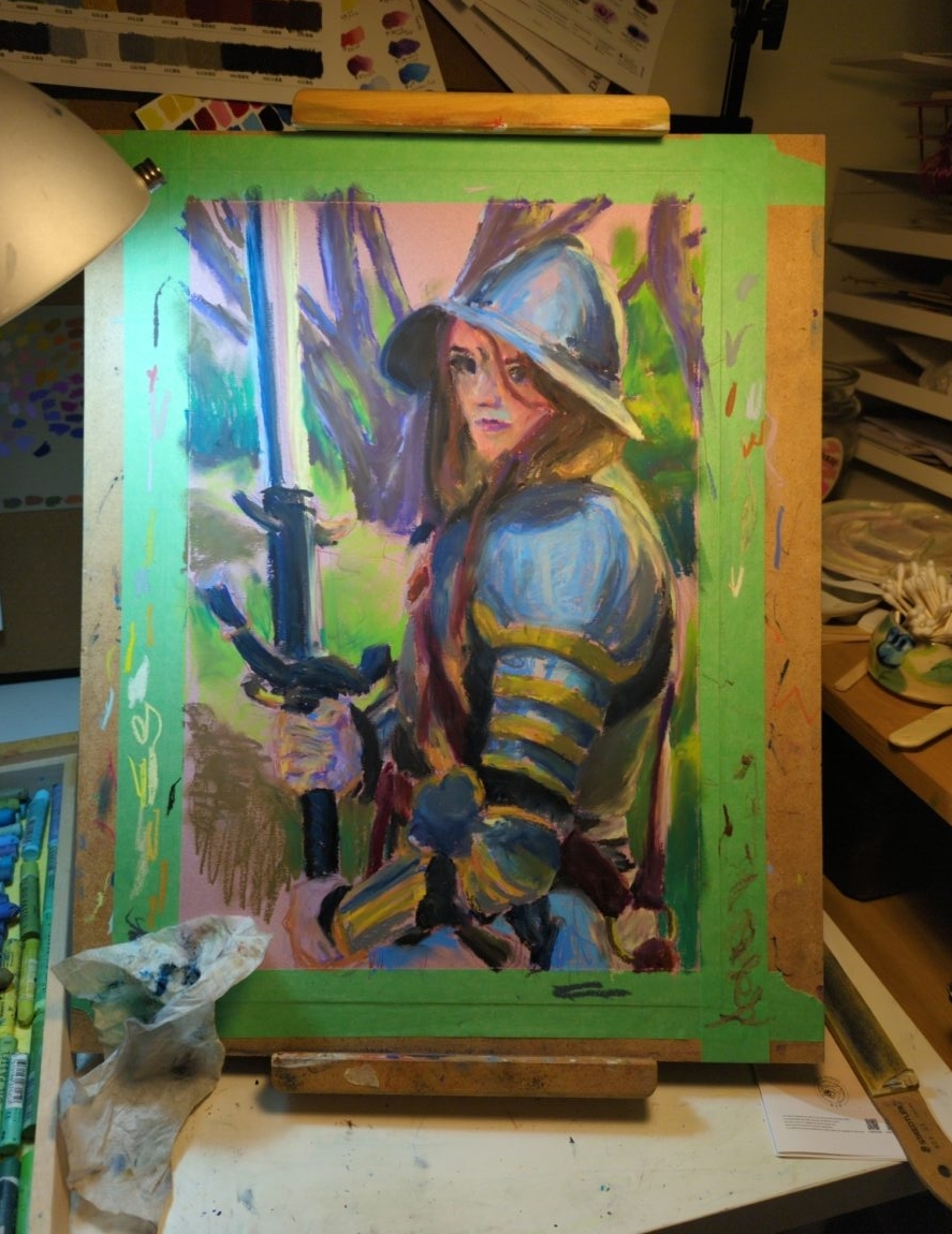
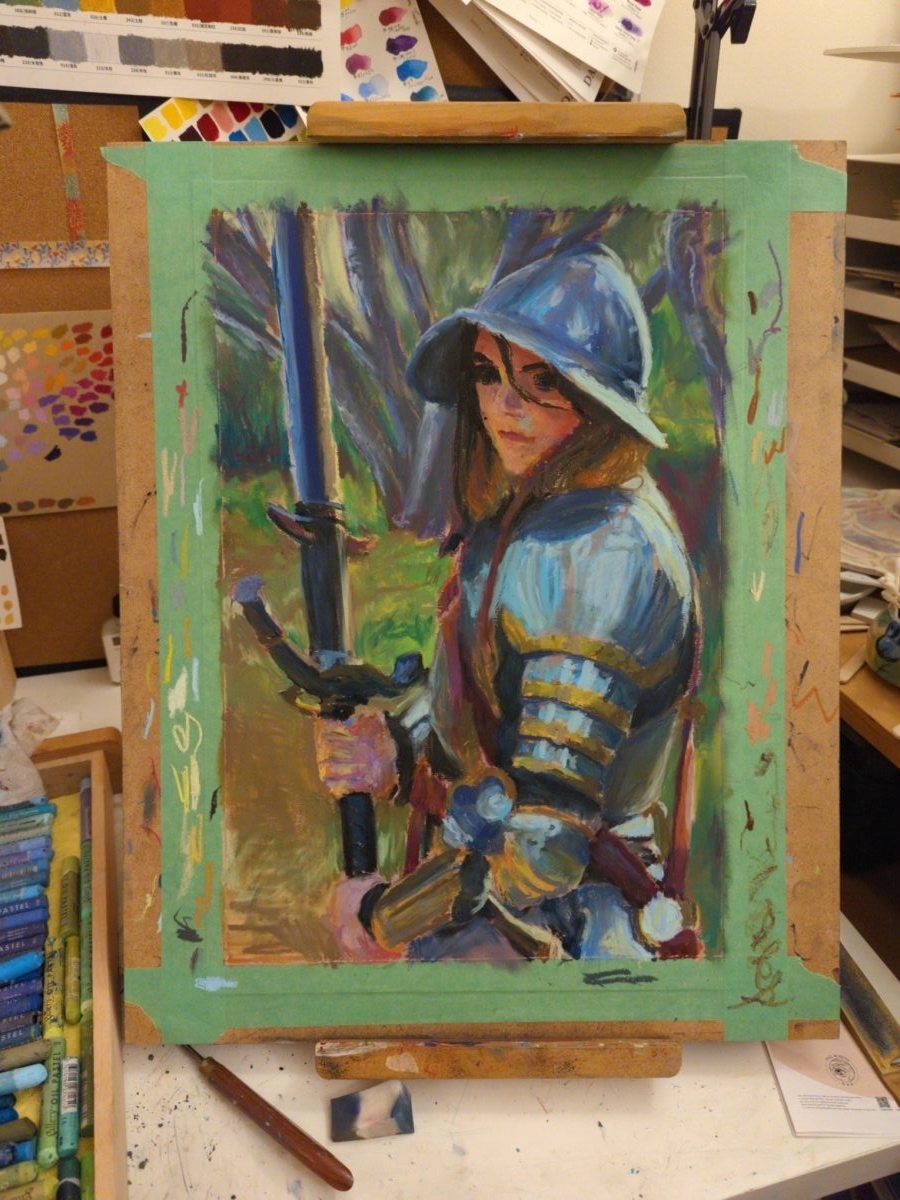
painted on canson mi-tientes pastel paper
2 responses to “Wolf in oil pastel”
-
I love this
-
✨!
-
-
-
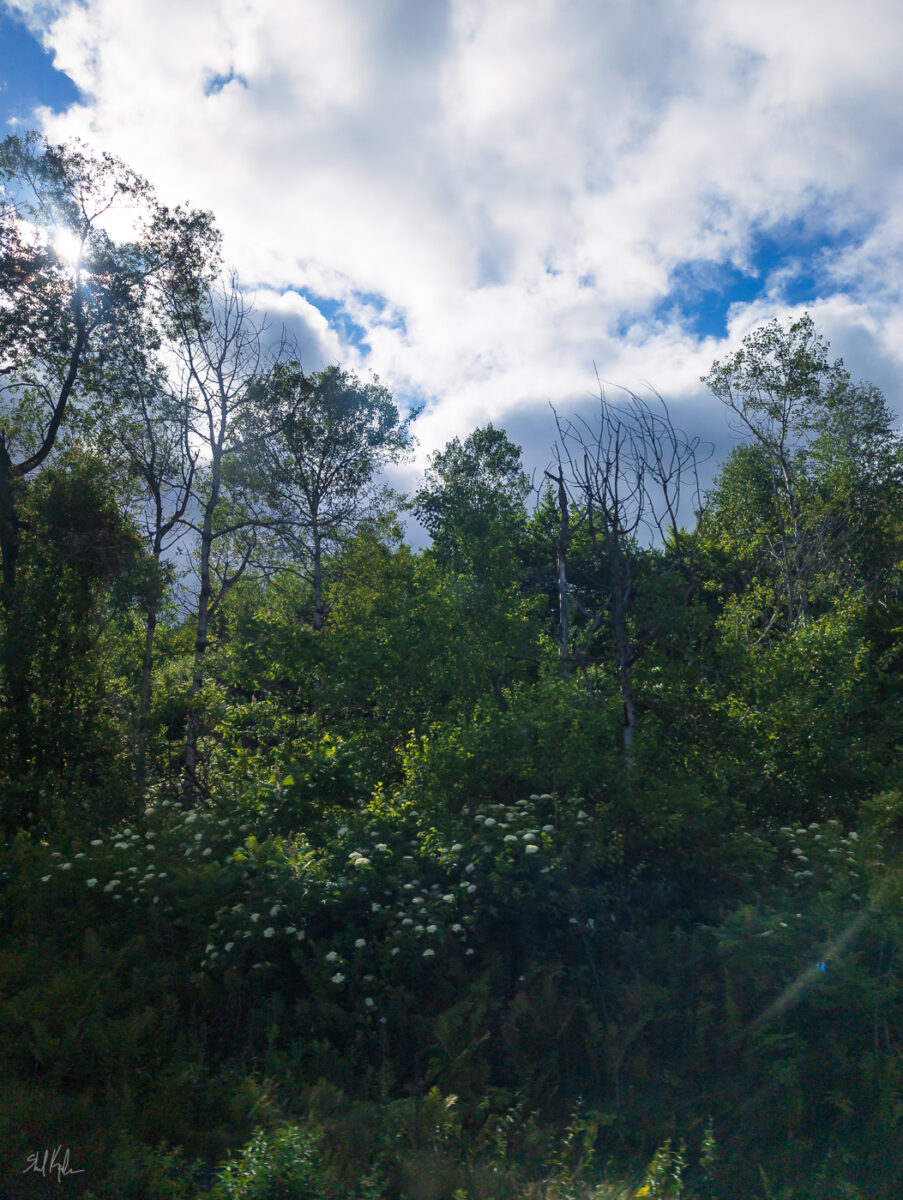
Can’t resist a backlit forest! I love this especially because it feels like a Paul Saari or George Outhwaite painting.
-
how i am doing accidental exposure therapy for my fear of bugs
posted:
updated:
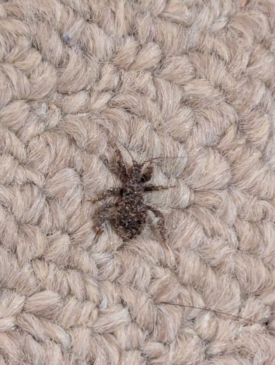
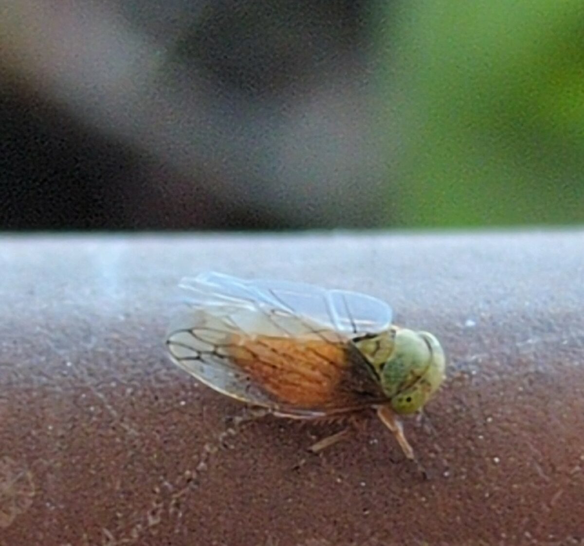
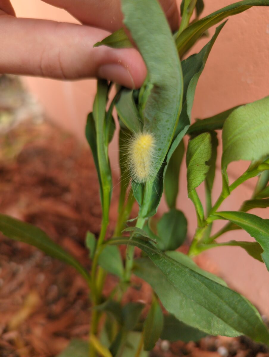
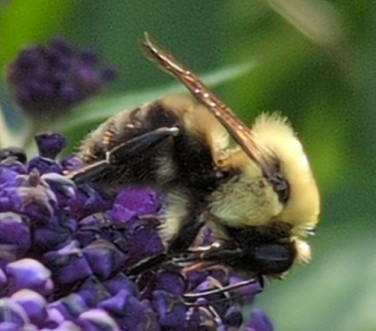
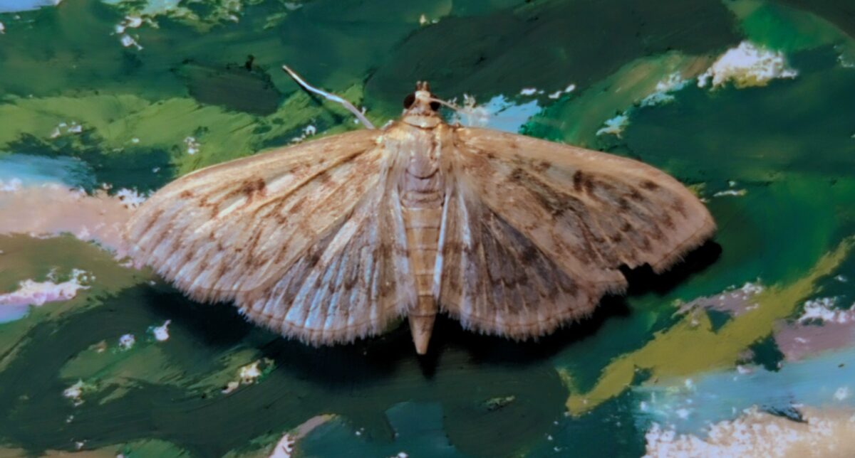
posted to: phototagged: bee, bugs, fly, inaturalist, insects, leaf hopper, moth, nature photography, photography, spider, structureSo I’ve been taking photos of bugs, now that I can trust my phone to not chew up any macro or zoom photography I take, and sharing them onto iNaturalist. it scratches my look I took a photo itch, it scratches my talking about cool things itch, it often tells me what bug I took a photo of, and it connects me with a whole lot of other people who occasionally also look at my photo of a bug and say yep that’s that bug. it’s a really great motivator is what I’m saying. but the best thing about this is that it has completely changed the dance my brain does when it sees a bug.
for context, I am a twitchy and tense person who doesn’t see very well in dim light or out of my peripheral vision, so I am usually very surprised by bugs flapping or running into my field of view — or if I’m very unlucky I hear them first. and because I’m twitchy that often makes me jump, flail, and in general just be stressed. but now, while I might still yell and flail once if I am surprised by a bug, the secondary instinct of taking its photo and putting it on inaturalist to find out what bug it is completely takes over my brain almost immediately. and all of the adrenaline and fear response that I’ve spent a lifetime training myself for just leaves.
The other night I let this little moth climb onto my hand and it let me carry it outside and it was the sweetest interaction I’ve had with a wild animal maybe ever? and while I extremely do not expect to have that kind of interaction with a house centipede or any of the many wasps in my yard, I don’t think I could have had it with a moth either before improving this loop in my brain.
which is to say, if you too do a lot of yelping and freaking out over bugs despite wishing you were not yelping and freaking out at every bug, maybe try taking a photo of more bugs. going out and opting into finding and looking at a bug has made being surprised by them much, much less awful.
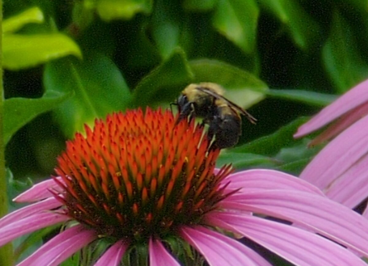
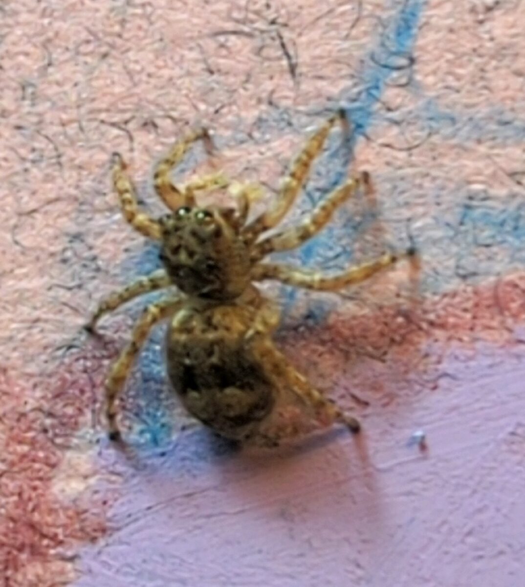
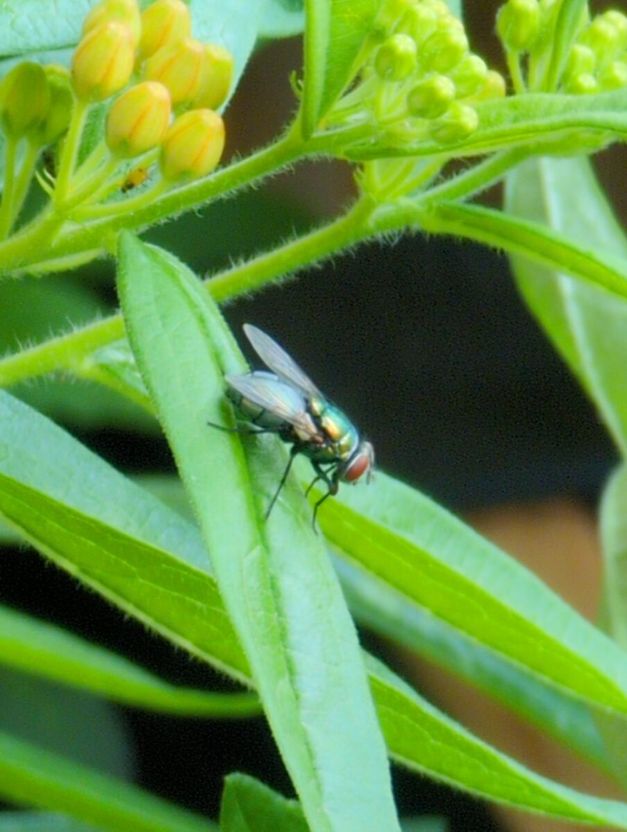
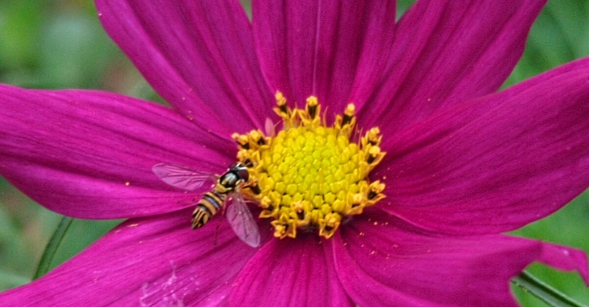
Here, also, have some cool bug photos:

August 2024 update bonus!
Yesterday I watched a small ant wander around my patio table, pause, give herself a good scratch, take a solid look (or smell) around the area, and then go about her day. Relatedly, this tumblr post spoke to my soul:
-

working on canson mi-tientes paper, which really let’s the pastel slide around despite the rougher side’s surface texture.
-

finished this piece of a much missed lucky boy; oil pastel on canson mi-tientes paper.
-
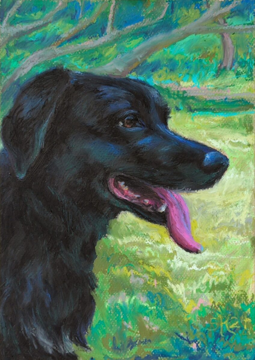
New challenge recognized: glossy black fur.
-
This was a response to an ask on tumblr! The question was:
What format do you recommend I save photographs in? Like raw or jpeg? I don’t know the difference.
Here are my thoughts!
so it depends on what you wanna do with your photo!
if you want to post it right away, you want a jpg; raw files aren’t web-ready and can’t be viewed by various devices easily.
if you want to take a bazillion photos and keep all of them too look at regularly on your phone, you want a jpg; raw files are much, much bigger sized files and will fill up your storage way more quickly, and they don’t actually look good out of the box.
if you like to post-process your photos on your phone or computer, you might prefer raw; jpg files contain only a fraction of the image data that a raw file does (hence the size difference) and it’s much harder to adjust them in ways that look and feel like professional photography.
however: processing a raw file is not optional – you can’t use it till it’s processed, and processing them is a skill you’ll need to give yourself time to practice. They also can require specific software to process them; famously lightroom and photoshop are the industry standards, and they’re pretty $$$, but I bet folks can drop some cheaper options in the notes!
I never shoot only raw, personally, because I love to share photos with friends ASAP, but sometimes I do shoot jpeg & raw together. If you have never tried out shooting and processing raw photos before, this is my recommendation.
Also, shooting raw is great but it’s super not necessary to do if you don’t want to process all your images by hand. There’s a bazillion reasons to take photos different ways, and “convenience” and “speed” are really good ones.
but also: post processing can be fun as heck. try it out! see what you think!
And for fun, on the left here’s a jpg photo straight from my favourite photo app for my phone, Open Camera, and in the middle here it is as an undeveloped raw photo exported directly to jpg, and on the right here is my processed raw photo exported to jpg:

-
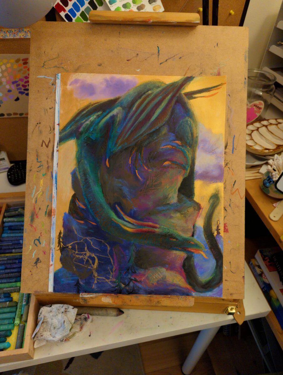
this is the biggest thing I’ve painted yet with the oil pastels; gonna be working in it for a while
i was looking at digital paintings from 2022, and thinking about the method I had started using back then of having a mark making stage and a blending stage as two separate things; and the oil pastels are letting me start to approximate the same workflow, but on paper! interesting…
-

i did a quick watercolour (first) and gave it a coat of fixative so i could try out layering oil pastels on top for a mixed media look (second), but I’ve hit a few challenges:
- the oil pastels are very opaque and happily fully obscure the watercolour under them very very quickly
- the fixative has reduced the absorbency of the paper so the pastels are staying greasy and moving around very easily, giving me wonderful nuance and also no control somehow at the same time
- my original value plan was loose and crappy and had little contrast to speak of, not a strong place to start
- and watercolour has, naturally, such incredibly dark values compared to oil pastels, that i can’t get them both in the same range whatsoever. i dug too deep into the darks, as it were.
- also i had very little plan to speak of and a pretty terrible drawing, so this was maybe doomed from the start
so likely I’ll toss this now and move on, but it has taught me a fair amount of interesting technical facts, which i plan to remember, and also reminded me of some basic truths about planning, drawing, and values, that i would like to remember but will probably ignore once again at some point in the near future.
-
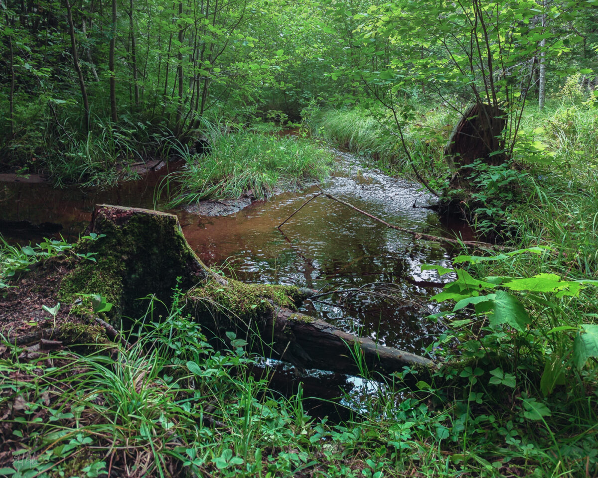
Loved this hike and felt immensely inspired the whole time and yet still wrestled with all the green in the photos. I never understood how people could say green was hard to deal with until I tried to post process digital photos.

Leave a Reply