
swap to chronological order of most recently posted
-
This is a great short breakdown into getting prints out of your label printer! Hope this helps folks hack theirs while I keep testing the limits of mine.
-
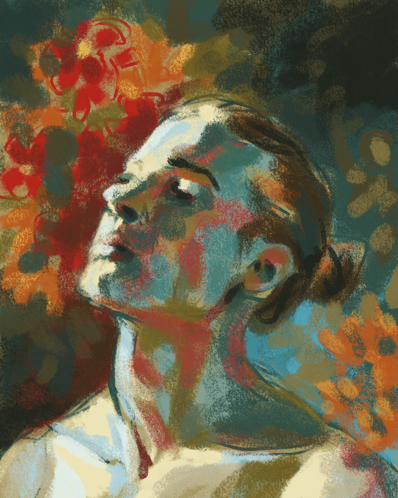
For the past year or so I’ve been hosting a monthly remote lifedrawing/other digital art exercise session with my team at work, and I wanted to share this one with y’all because I think it’s been a really important exercise for me over the years and my team really got a lot out of it too!
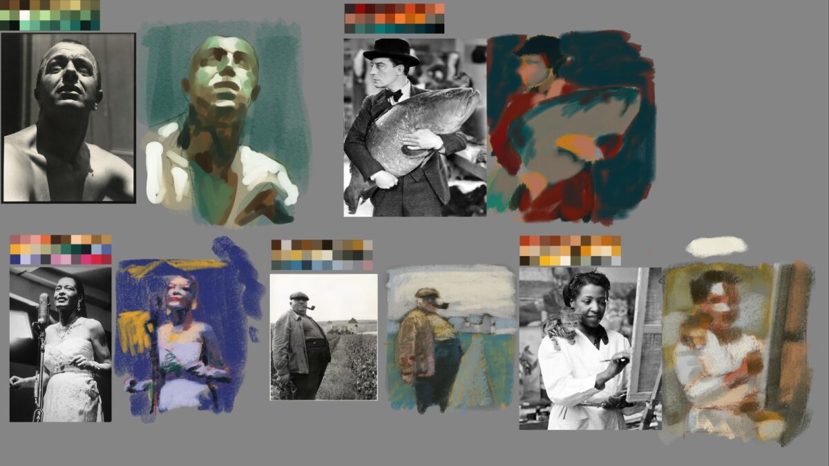
So there’s two pieces you need: a black and white reference, and an unrelated limited colour palette.
I’ve just been grabbing the reference off of pinterest, because we’re not doing anything with these except practicing so copyright doesn’t really apply. The color palettes can be created however you want, there’s definitely some great tools online, but these ones I made by using the color palette from image tool in Procreate. you dropped any image you have and then it will generate you one of these color palettes from it based on the color spread and the color frequency. it’s a really great quick way to grab limited palettes from images that inspire you!
Anyways, with both of those pieces in hand you can get to work creating a study of the image using only colours you’ve taken directly from the limited palette, or, if you’re feeling generous to yourself, mixed from the palette on screen.
It’s a bit of a mental stretch at first, but you will quickly start to find different vectors for your decision-making: are you using the colours to try and create a realistic image? or are you grouping them by value? does it make sense to try and assign warm and cool to light and shadow? or are there objects in the frame that would benefit from a strong local colour?
For me, it’s a decent digital version of a standard limited palette exercise I might do in watercolour our other traditional media, where I limit myself to a few paints or crayons or such. I did this exercise a lot with the full colour By Crom! comics, and it’s been great to bring it to my digital work.
Speaking of digital work, this technique is the basis of a lot of the digital paintings I did in the past four or five years:

Let me know if you end up giving it a shot!
4 responses to “digital studies exercise”
-
These are so gorgeous!! I love the use of light and color here.
-
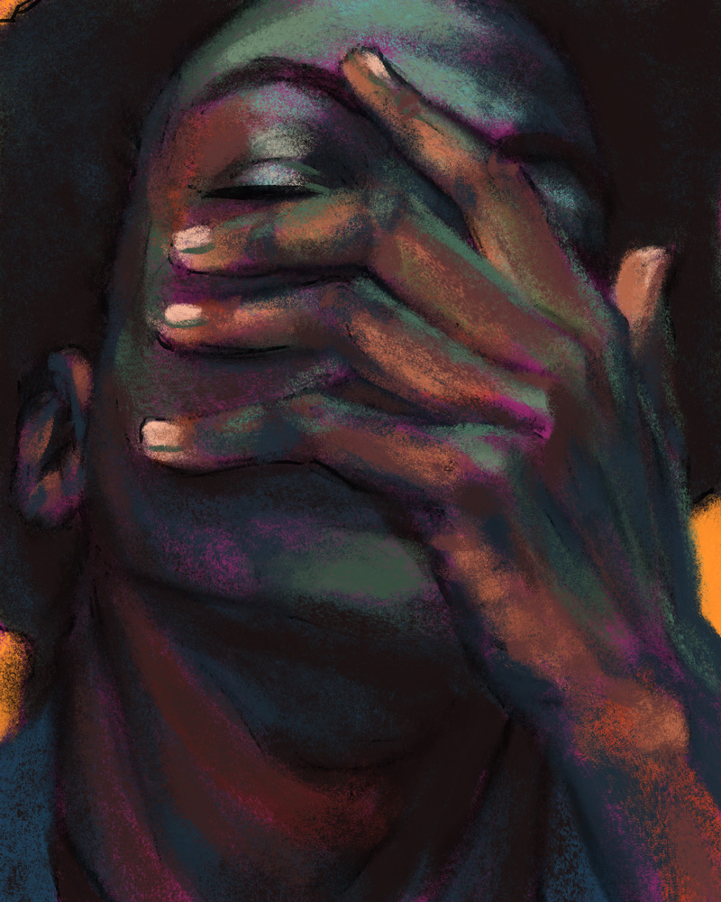
thank you! giving myself the limited palettes really did stretch my brain in ways I think were really worthwhile – I doubt I’d have gotten results I liked half as much just trying to reproduce these faithfully!
-
-
thank you for sharing this! this was my first shot at one, but i definitely plan to do more: https://candiedreptile.club/picture.php?/3443/category/5
-
whoah that’s so cool you took this idea and ran with it! I love the soft pallette you used, and you’re getting such nice warms and cools in the face and fluffy collar. Thanks for letting me know!
-
-
-
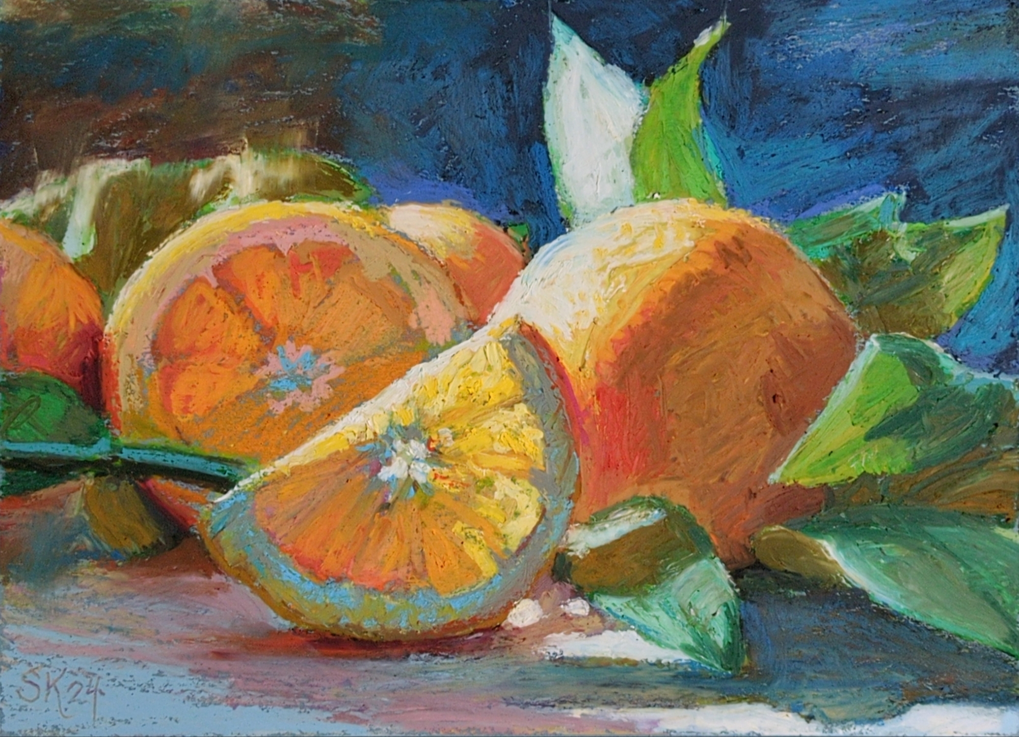
reffing a lovely still life from unsplash, i believe.
done on slate blue 9 x 12″ canson mi-tients paper.
I’ve been doing a lot of underdrawing with the cray-pas expressionist pastels, which are a lot firmer, so they don’t layer that well with themselves but they behave really predictably underneath the rest of my pastels, and are still really quite lovely as a color spread themselves. I think this might be my new go-to process!
I might try giving this one a real glossy varnish, just to see how close I can get things to look to an oil painting. maybe doing that on paper is stupid, but worth a try!
4 responses to “oil pastel oranges”
-
Beautiful!
-
✌️
-
-
oh wow that’s lovely!
-
heck thanks!
-
-
-

painted on wood! I converted my reference photo to black and white, as well, and I think it did give me more permission to be weird with the color.
you might not know this, but I kept pet birds from the age of 9 until I was almost 30, first a peach-faced lovebird named Pickles (i was 9, and it was a genius name) and then a series of budgies, Glacier, Uther, and Percival.
as an adult, I know a lot more about the exotic pet bird industry, and I don’t know if owning birds is for me anymore, but if I did, I think I would go for pigeons: proper domesticated creatures that have had evolutionary time to be less stressed around people, and big enough to feel less terrifyingly vulnerable in the hand.
but there is something extremely magical about a bird choosing to sit on your hand, and as I was flipping through unsplash looking for something to paint, I started putting together a collection of reference of just that. so maybe? there will be more of these?
-

I was doing a sketch with this fountain pen, which has non-waterproof ink in it, and I decided to try washing over it with a water brush, and then painting over the tonal result with some gouache, which I haven’t done in a while. it ended up being a very enjoyable if very small painting!
6 responses to “tiny gouache view”
-
what a lovely little painting
-
thank you!
-
-
Oh this is so sweet
-
heck thanks!
-
-
oh I love this!
-
thanks!
-
-
-
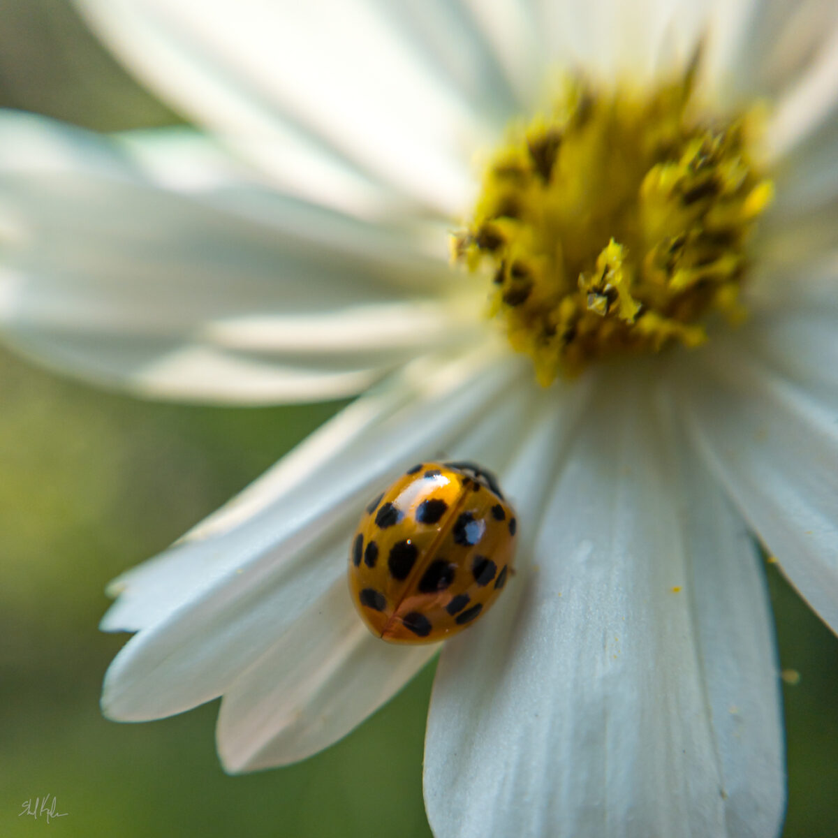
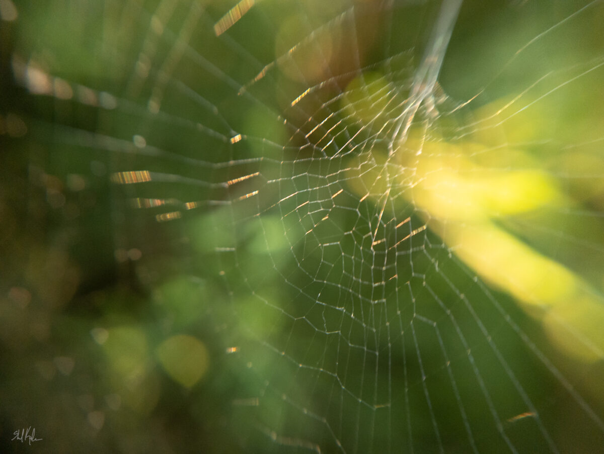
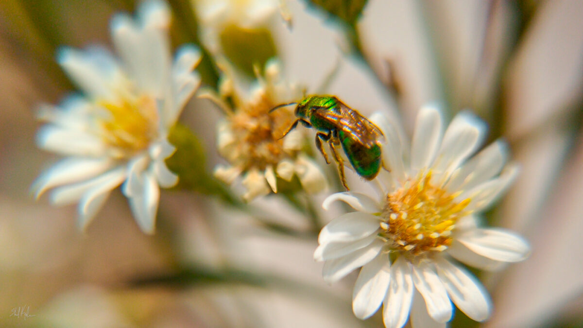
Some of my fav macro shots from the summer. Love a sweat bee!
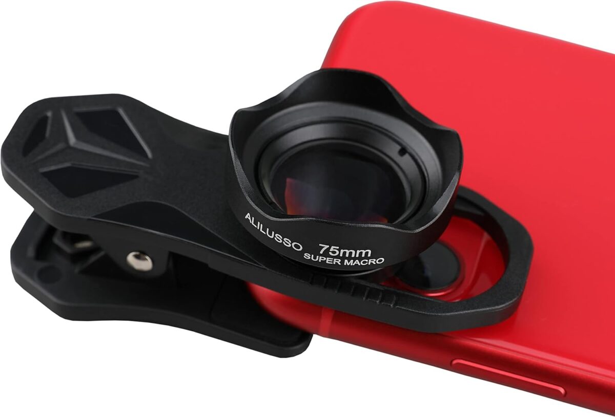
I’ve been using cheap cellphone camera lens attachments to try out macro photography, and honestly it’s been incredibly fun! These are the two sets I got that have worked well for me – they’re kind of random to track down, Apexel is consistent but the Alilusso one seems to go under a few brand names. Generally if you can find the same shape somewhere you’re probably good.
The Apexel set:
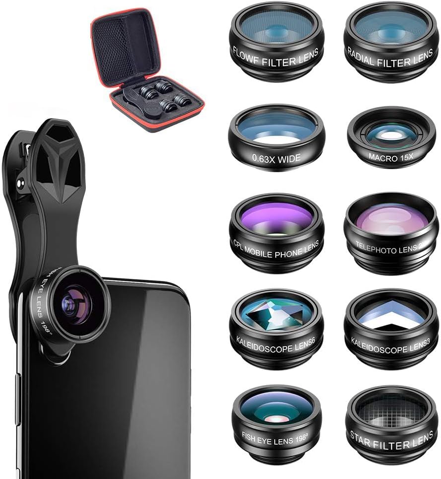
The alilusso macro lens:
-
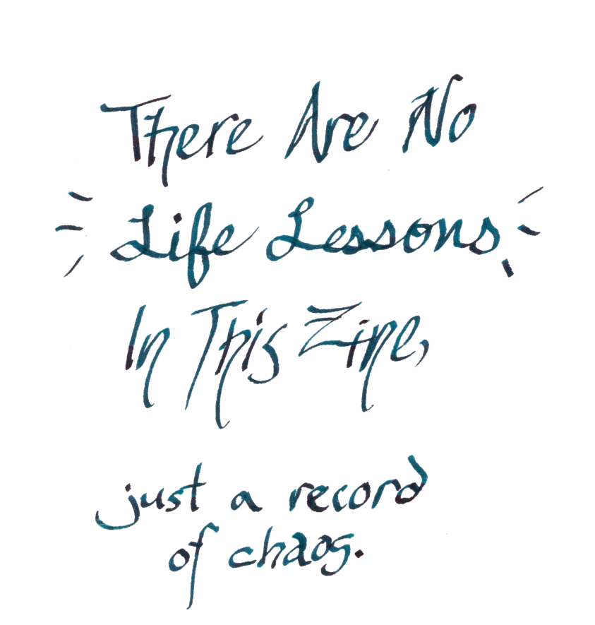
as mentioned elsewhere, I’m not a huge fan of my handwriting right now, but it feels like it would be worthwhile to hand write this poem for my zine. I did a first pass and it’s all pretty rough, but I scanned it at a nice high resolution just in case I do use it.
Maybe I’ll pick up some tomoe river paper so my fountain pen inks can really flex for this.
-
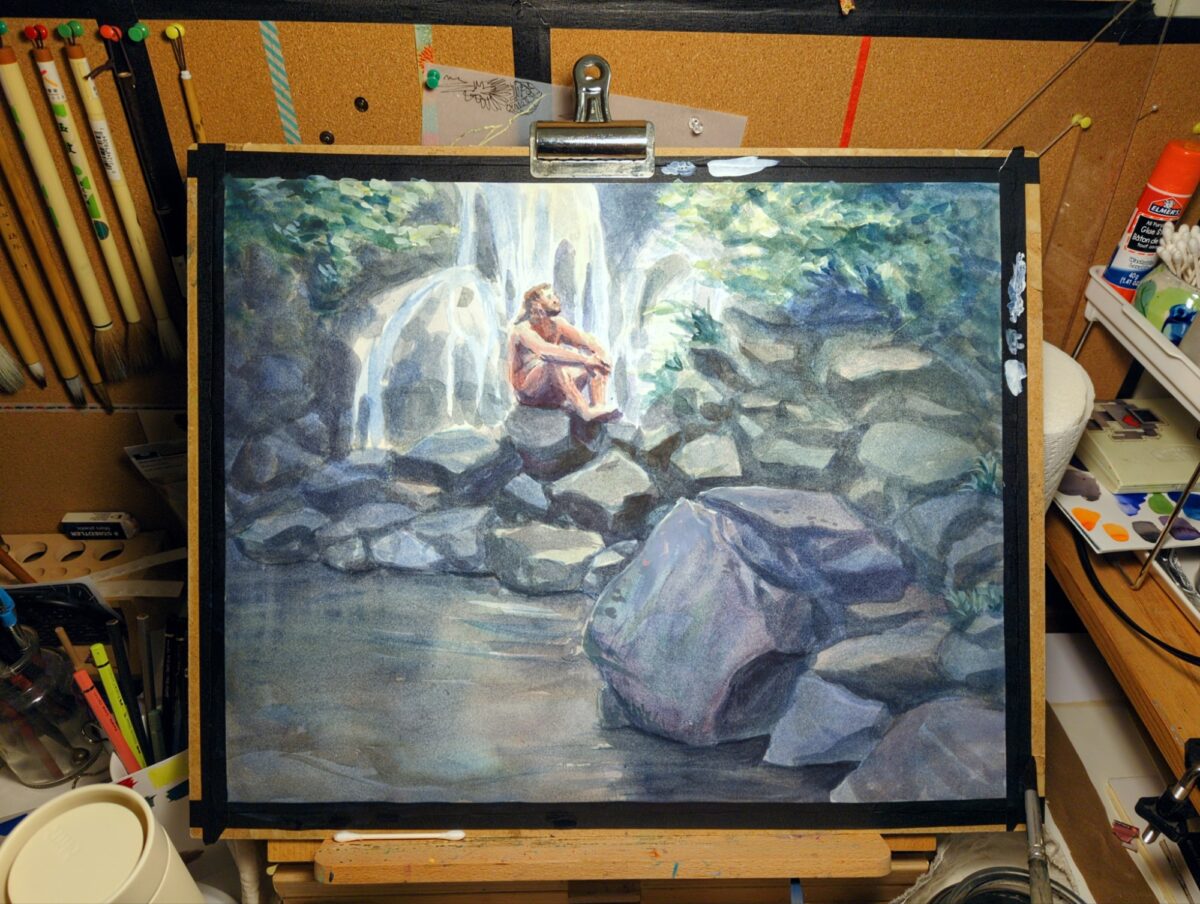
This paper is not sized like watercolour paper and it’s sucking up all my paint! but I’m getting such soft and complex colours because of that… but I’ve lost a lot of my contrast and smaller highlights from the way the paper lets the paint spread into it like a sponge. So it’s definitely time to start bringing back some contrast with white gouache. hopefully i don’t overdo it!
Also, I’ve been meaning to get a better work lamp for these bigger pieces. here’s a photo that better captures what it feels like working at my desk at night:
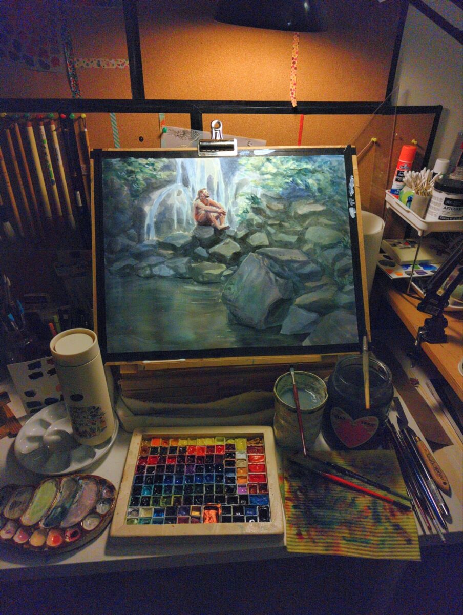
i think i need one of those long arm florescent tube drawing lamps – anyone have a recommendation?
-
Shoutout to curious quail for this wonderful example of where thermal printing is fun and cute and useful!
 Hunting Cryptids with Frame 352 (and a cheap thermal print camera) | quailblogAnalog journaling game meets toy receipt paper camera – just in time for October
-
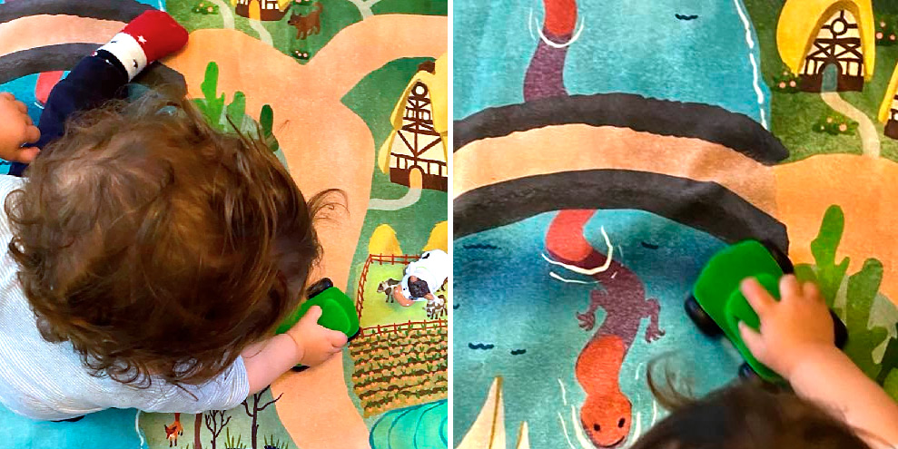
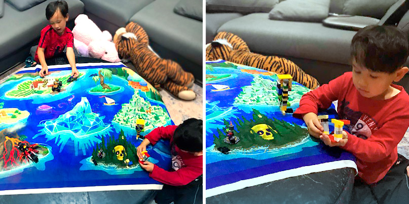
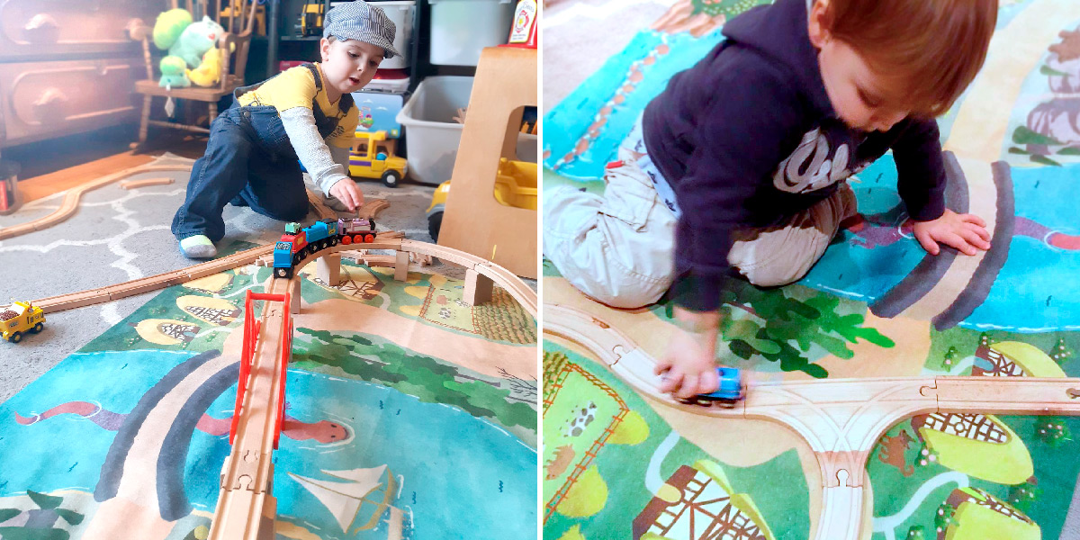
One of my ongoing interests is making storytelling toys for the kids in my life – and for me, playmaps on rugs or blankets are one of the first storytelling toys that I remember from my own childhood.
I’ve had the good luck to make maps with excellent friends like Evlyn Moreau and to get feedback on them from kids of all ages.
While I do not always keep them in stock, all of the maps have been available and will be available again someday in the Sorcerer’s Catalogue!
Here’s a gallery of my maps so far:
I’ve been lucky to receive enthusiastic feedback on these overall!
Photos here used with permission (and if you would like to revoke permission – or submit photos of these maps being used and loved – please email me!)


I’ve always got more ideas percolating, but if you are interested in these and want to know more, I’ll collect all my writing on the subject below:
-

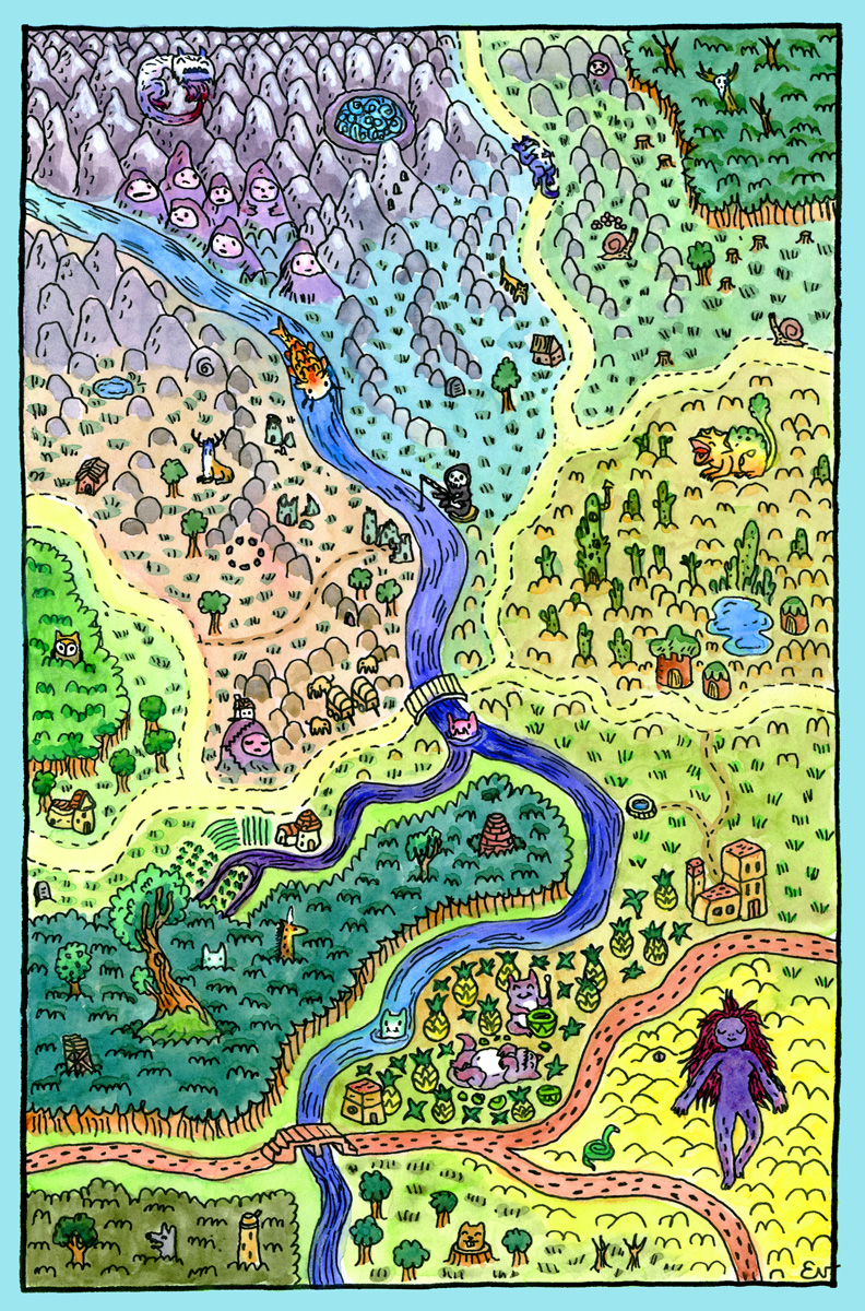
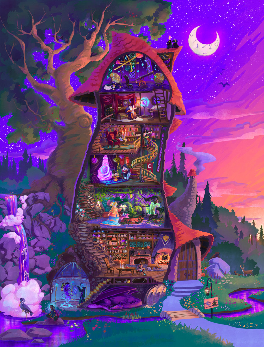
The Tower of the Forest Wizard
Presenting The Tower of the Forest Wizard, a vibrant painting of a magical wizard’s tower, complete with everyone and everything that it might contain. The tower was inspired by Jill Barklem’s beautiful Brambly Hedge tree homes, combined with my love for cutaway schematic drawings and late 90s airbrushed fantasy art colours. It was designed to…
-
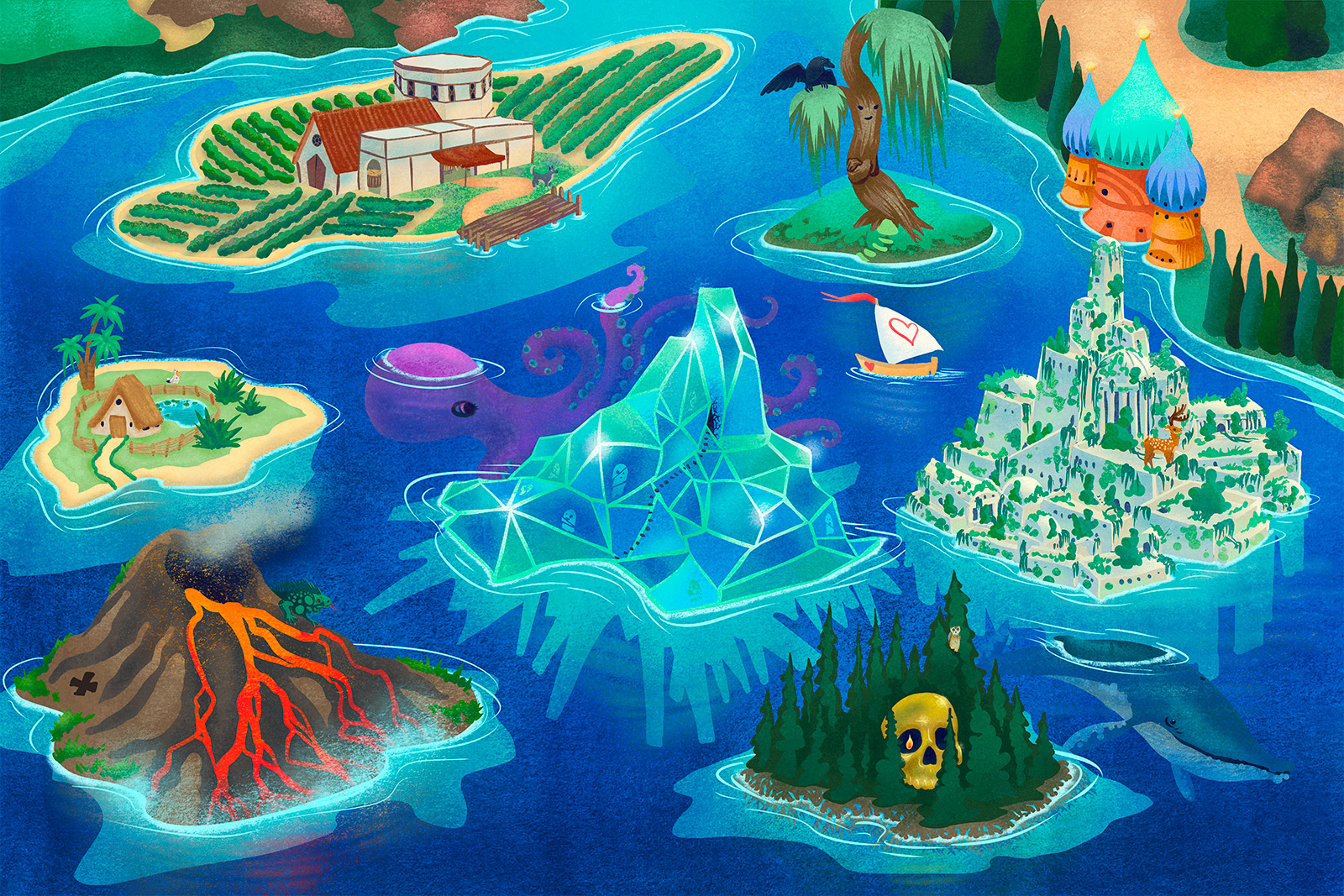
Kids’ Playmap Design – Seven Odd Islands
Seven Odd Islands is a playmap designed for floor or wall display. It prints up at 36 x 54″.
-
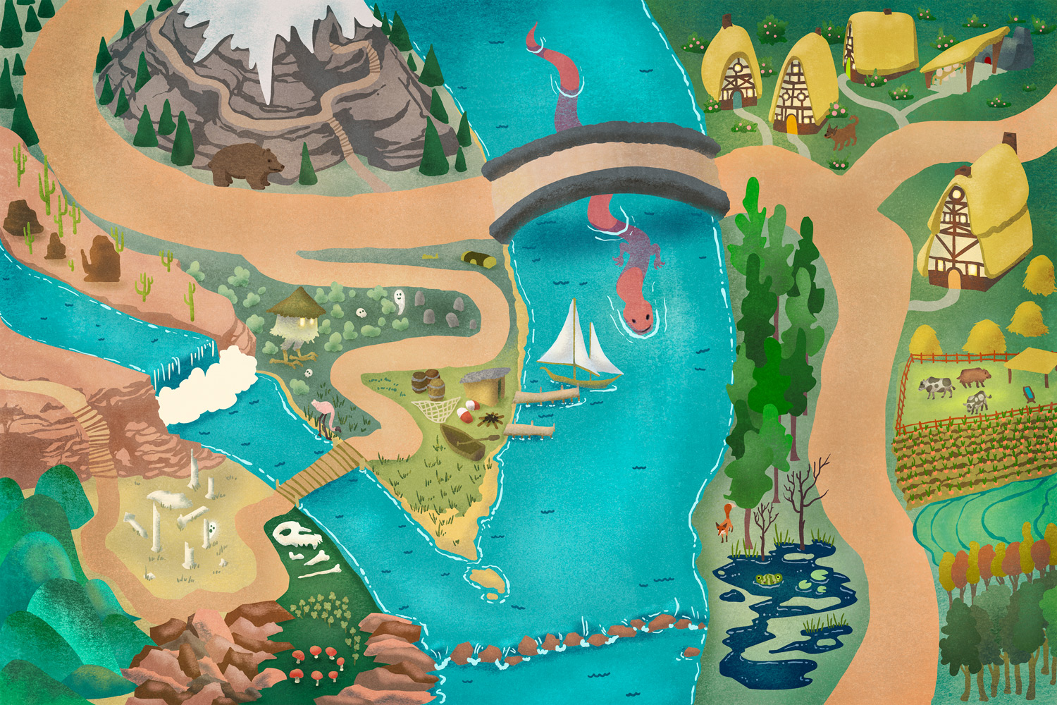
Kid’s Playmap Design – Realm of the River Dragon
The Realm of the River Dragon is a playmap designed for floor or wall display. It prints up at 36 x 54″. Below, see several compatible character designs.
-
Leave a Reply