
swap to chronological order of most recently posted
-

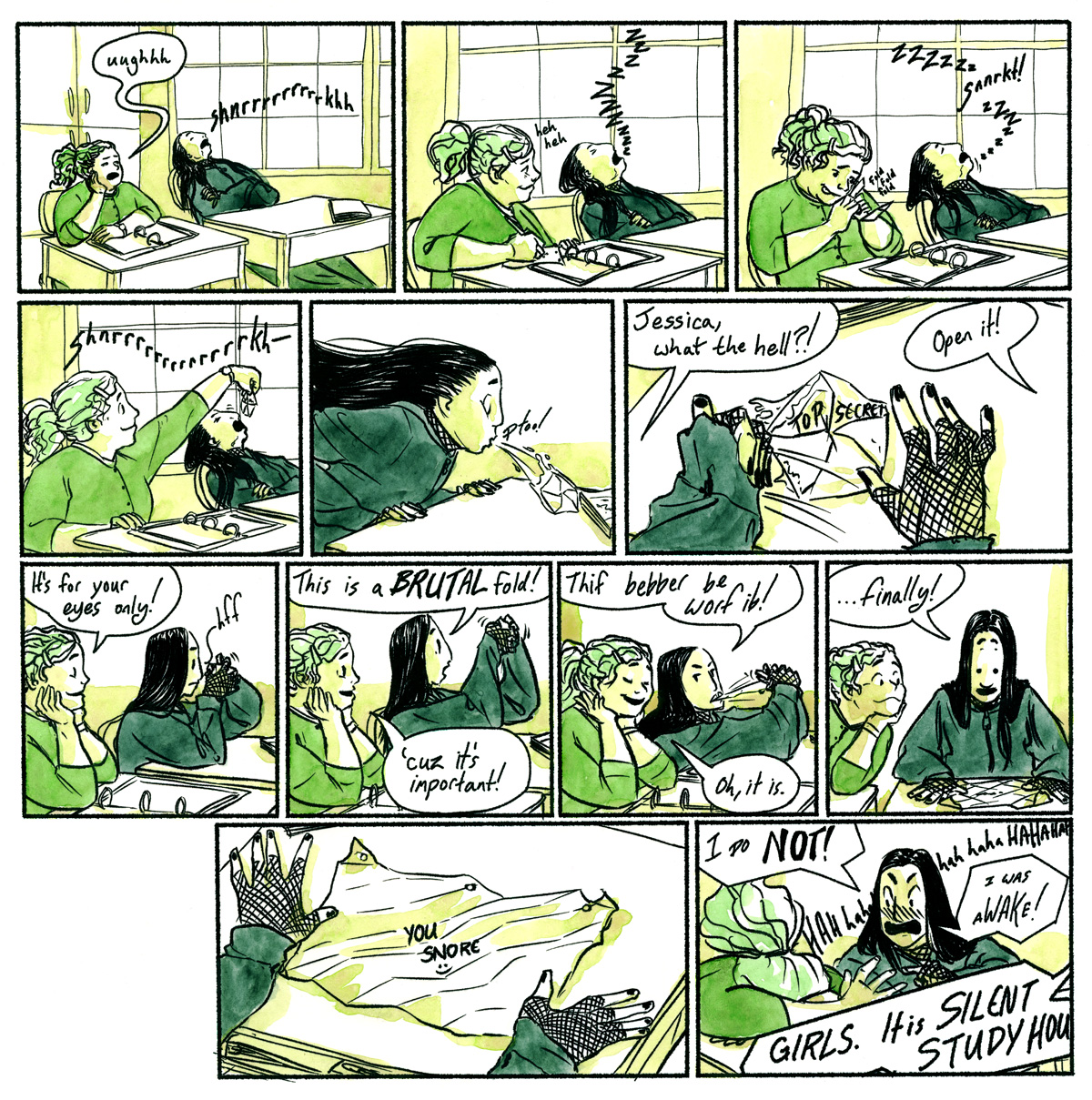
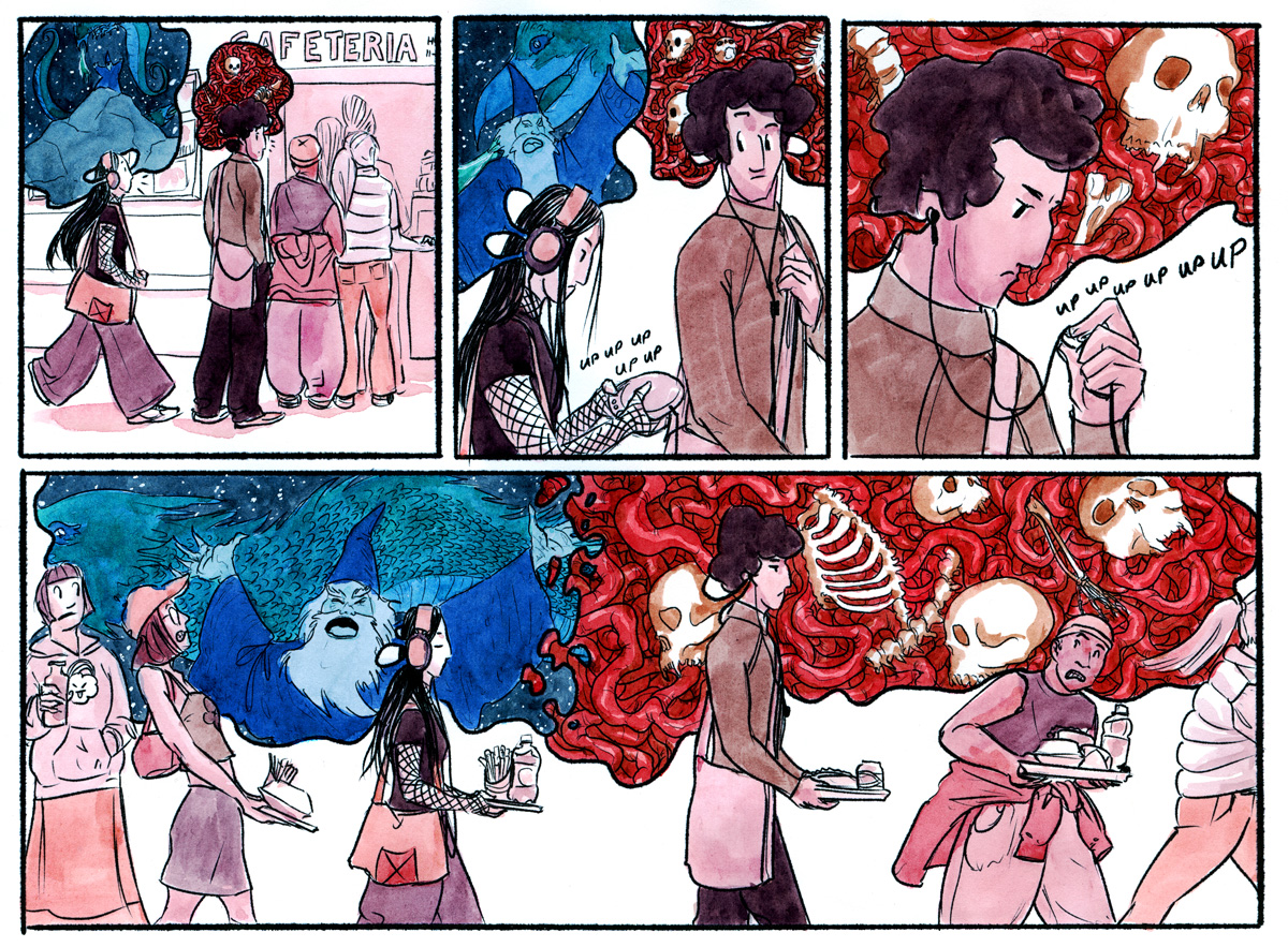
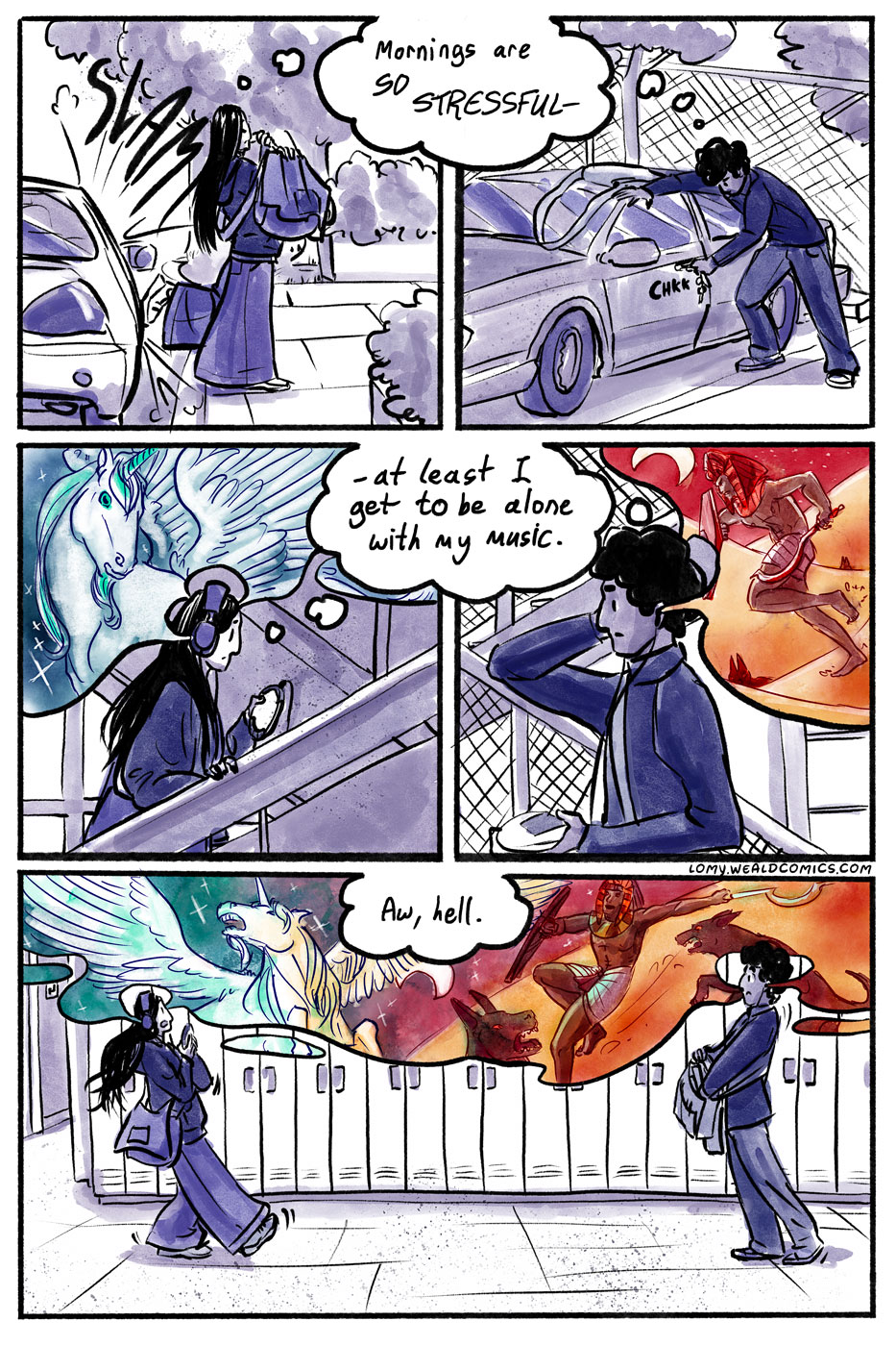
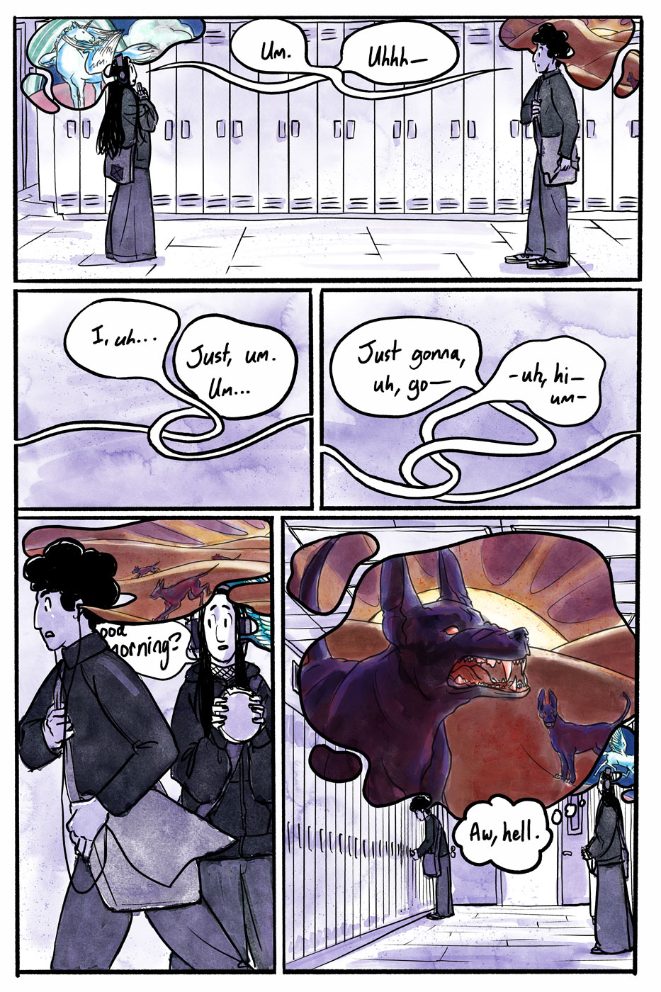
Lomy in the Abyss is a humor webcomic about highschool and heavy metal at the turn of the millennium. You can read the archives on Stories.

-
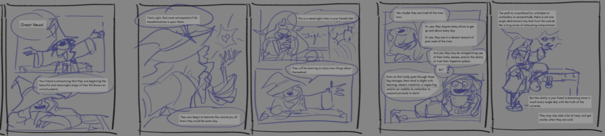
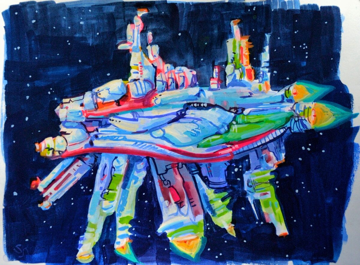
I started thumbnailing out my wizard puberty zine! I think there’s another edit pass on the text ahead of me though; I’m gonna do the first ten or twelve pages, maybe all the way to finish, so I know sort of what my visual language IS, and then go back to the text one more time.
-
I came across detail shots of these on tumblr and had to go questing for more, and while it seems likely I’ve seen Levon Biss‘s work before, it’s been amazing rediscovering it after dipping my own toes into amateur macro photography.
Sometimes these days when I watch movies or play games that use speculative designs, I find myself able to namedrop the visuals they reference simply because Cool Visuals Online have such a consistent cycle of being rediscovered by the next of Today’s Lucky 10 000.
Insect anatomy. Poppy seed heads. Crabeater seal teeth. Transparent fish. Olms. Petra. Brutalism. Mont Saint-Michel. They are striking visuals and it’s natural to use these as starting points for something fantastical or futuristic, but it does give me a strong case of

when they remain fairly surface level and recognizeable as references. Hopefully people who don’t work in concept art aren’t nearly so sensitive to this stuff!
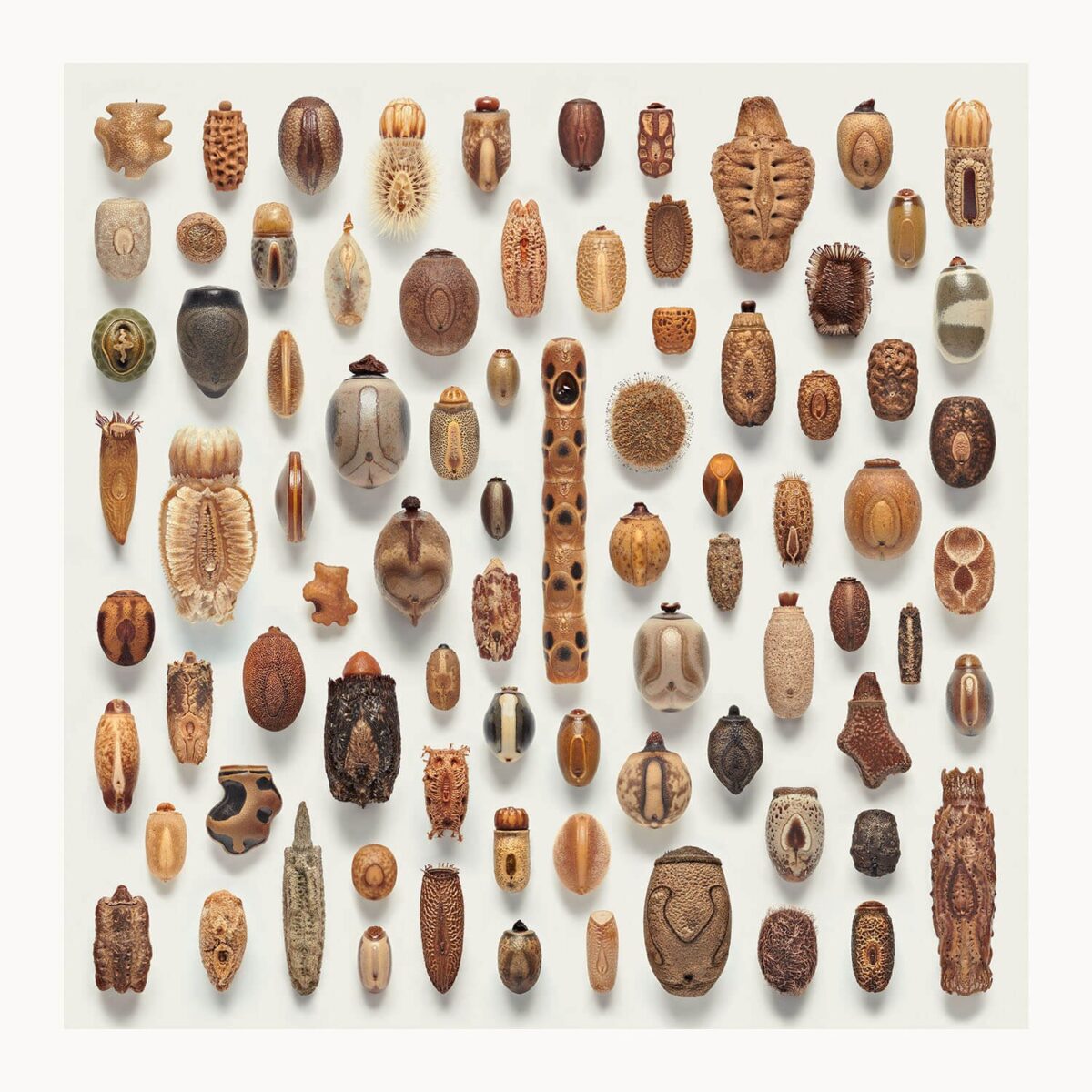
But it does leave me giving myself anxiety about what visual references are useful and novel and interesting whenever I get to approach something fantastical as well, and so when something hits my eyeballs that fully stops me in my tracks I really have to grab and hold it. These phasmid (stick insect) eggs are absolutely doing that to me now!
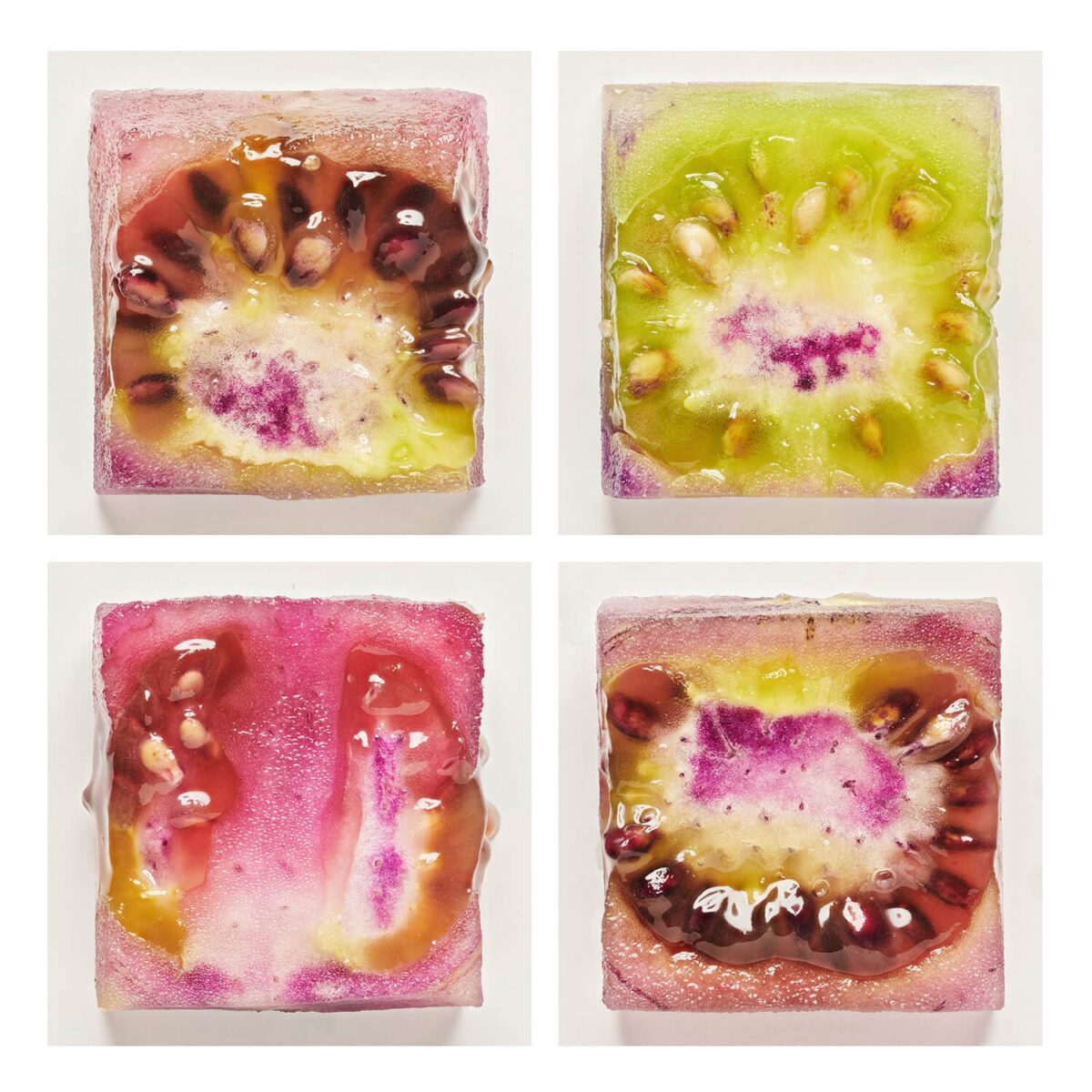
That said, browsing Levon Biss’s website, it’s hard to say if it’s the essence of the subject matter that is giving me such a hit of novelty, or the photographer’s treatment of it. Say what you will about knolling and similar urges, but Biss really has an eye for presenting things in surprising and exciting ways. Look at these cubes of genetically modified tomatoes!
In concept art, you always have to balance novelty, interest, and clarity (something I need to write about more myself on here). Fine art photography has totally different pressures and goals.
Biss’s photography doesn’t need the viewers to be able to read the contents clearly – and in fact kind of relies on them not, despite the framework and performance of clarity – so while it is immensely satisfying for me to look at, it can’t translate one-to-one into a videogame item or cinematic set piece without some additional elements that give the audience information that takes them from surprising objects or visuals and turns them into little lenses that can tell you about the fictional world.
Which is why I want to turn all those phasmid eggs into collectible hats.
-
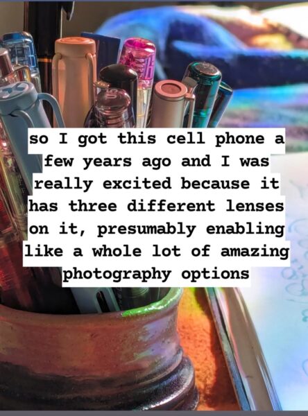
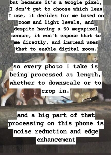
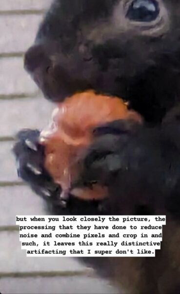
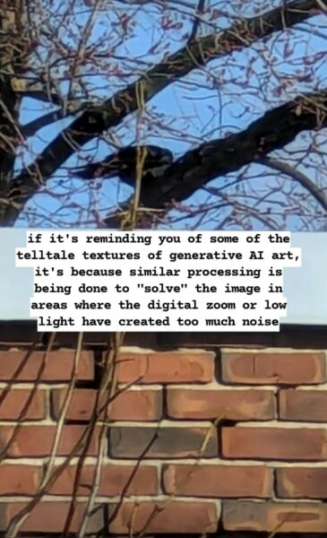
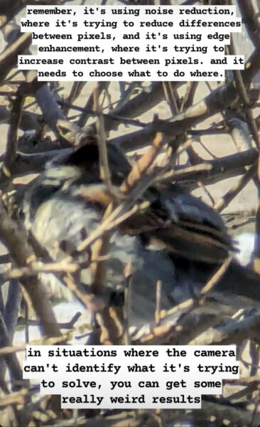
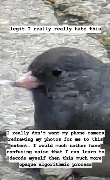
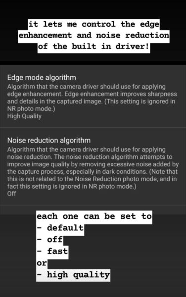
I am mad about cellphone cameras hiding the processing they do to my photos, and I am glad about software I found that lets me control it and opt in and out.
A breakdown of what I noticed on my Pixel 6 Pro camera and what I used to get around it:
This was initially written on instagram, dictated into the stories feature, so, uh , that’s what I’m putting here, at least to start. As I am still living that partial dominant hand paralysis life, alt text taken from IDs generously written by brianbrianbrian on tumblr.


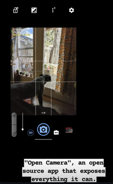

Here’s the website for the app I’m getting so much good use out of: https://opencamera.org.uk/ – it’s open source, android only. A comparable app iOS folks have recommended is Camera+, but I don’t think it’s free.
important note! this is an open source app, and that means scammers can copy it, relist it, and fill it with ads or malware. Make sure the version you get is published by Mark Harman, and remember it’s free and you shouldn’t be asked to pay for it on the app store at all.
An example of how much this means to me:
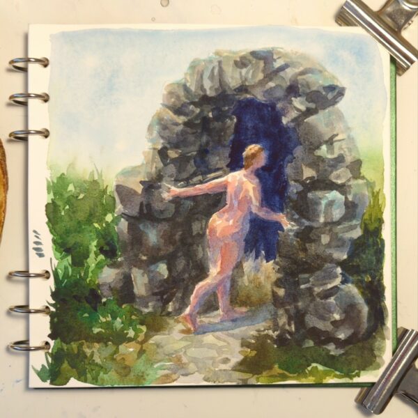
I’ve been really feeling like I’m terrible at photographing my own work, especially watercolour, and i can’t seem to really capture what makes a painting special in person.
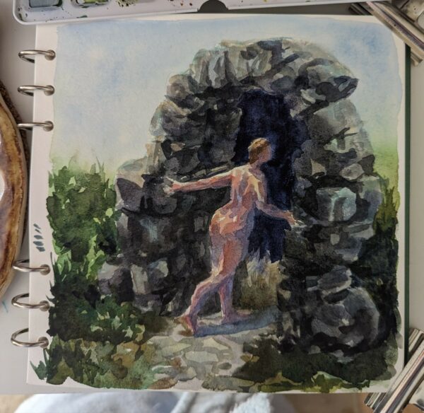
Here’s some examples of my attempts to photograph this sketchbook painting using the native camera app on my phone:
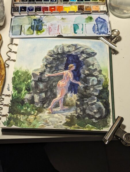
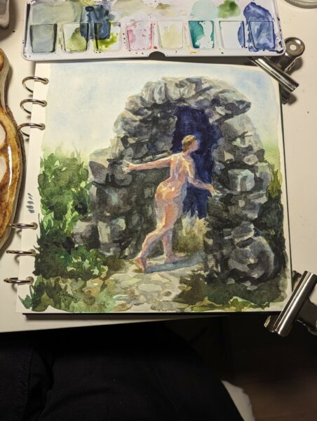
no matter the exposure, the lighting, the lens I use, it’s grainy, blotchy, the colours feel off, the contrast is too much… it really doesn’t capture what’s on paper in front of me!
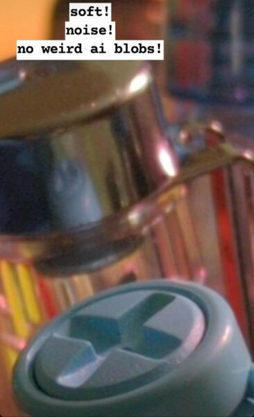
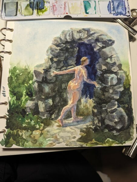
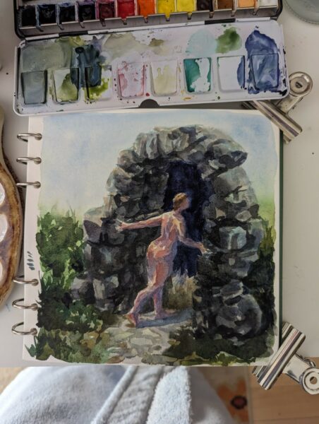
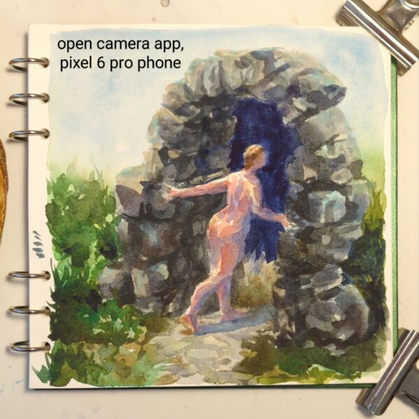
so then i try with the processing turned off in Open Camera:
it’s night and day!
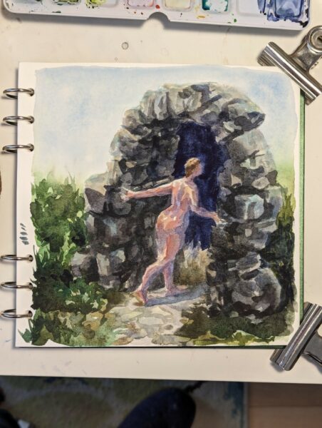
A clearer comparison for you:
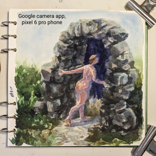
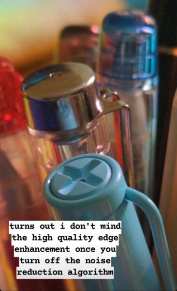
To sum up what’s different: the google camera app is trying to reduce noise AND sharpen the image it creates, leading it to both remove actual colour complexity in my painting and then to oversharpen what details it kept. It’s also doing a ton of HDR value-balancing, attempting to even out contrast across the whole image instead of letting some parts be darker and others lighter. In the end, it makes my watercolour painting grainy and high contrast, while removing all the subtle colour and value choices I made while painting.
The open camera photo shows you the nuance that’s in the actual painting – or at least something much closer to it!
what a game changer!
A few notes!
First, this may remind you of a scandal specifically regarding moon photography! You can read more about that here: https://www.theverge.com/2023/3/13/23637401/samsung-fake-moon-photos-ai-galaxy-s21-s23-ultra
Secondly, a lot of folks were confused about why I would need this app when my phone can shoot raw photos in the native app as well! And to that I have a two stage answer!
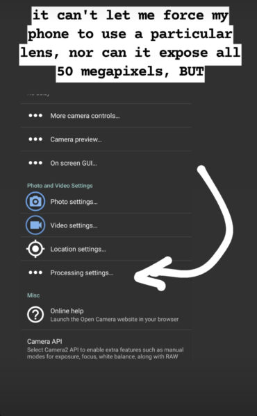
- Bold of you to assume google has made its raw files pristine. They’re certainly less chewed up than the jpgs, but not all raw files are equal, and these are not great. Google also does not allow raw photography through all three of the lenses – only the main one, as far as I can tell. If I want less processing on a photo I take through the telephoto lens, I need to use OpenCamera to take a jpg photo. Additionally, google’s camera app, evenwhen shooting raw, doesn’t give me any granular control over exposure, focus, ISO or colour. OpenCamera solves many problems at once for me, and shooting raw in the native app solves none of them completely.
- It occurs to me that people who do shoot raw might not understand how inaccessible that can be for folks who don’t! And folks who don’t shoot raw at all might not know what it entails. So I’ve put up a post about what I weigh when deciding whether or not to shoot raw right here: https://www.portablecity.net/what-format-you-might-want-to-save-digital-photos-in/
Finally, I intend to keep growing and cleaning up posts like this as I research and experiment and learn about this stuff! So if you have questions I haven’t answered yet, or suggestions, definitely drop me a comment below so I can follow up.
-
More neocolor II crayons on hot press watercolour paper! Learning these is taking some time; unfortunately much of the content on youtube about them is people trying them for the first time, and that’s really not helping me unlock their secrets! But as I keep digging I am finding more folks at least systematically testing them out.
I am also systematically testing them out – next up will be to do a gouache piece and work these overtop; and also to test out how they interact with my prismacolour pencil crayons. I also want to test these solo on midtone or darker papers; and I want to see how they could work as underpaintings with oil pastel work on top. They also advertise themselves as extremely substrate-agnostic, and promise functionality on “paper, cardboard, glass, wood, leather, fabric, stone” and so forth, so there’s a lot more experimentation possible ahead of me. Mars, an artist I know over discord, told me they use these for monoprints too! which sounds extremely fun and honestly I haven’t explored monoprinting at all so far as an artist! But we might be enterinbg the dangerous realm of scope creep with these revelations, so for now I’ll focus on a gouache layering test next and take it from there.
Have you used anything like these before? How else are they fun?
-
Neocolor II crayons on hot press watercolour paper. This is my first piece done entirely with the neocolors – putting down layers, washing them into the paper, and adding more on top, over and over. They’re very fun, but it does require some hand strength to press them hard enough to get the richest colour laydown. Not the most accessible for me yet, but in counterpoint: so convenient!
-
I got a gift card in return for doing a friend a favour this winter break and I decided to spend it on caran d’ache neocolor II watersoluble wax crayons. I’ve had a couple colours for a while and not really … grokked them? But with a broader range of colours and values I am starting to see how these can work!
Shoutout to these artists’ videos for helping me understand what these are good at:
I’ve been exploring adding dry media on top of watercolours and gouache paintings for a while now – I don’t usually even get out the pencil crayons except for this purpose – so for me I think the most exciting use case of these is as a medium somewhere between pencil crayons and oil pastels. They’re much easier on my hand than the pencil crayons, and they can lay down a field of texture so easily; and where oil pastels are just pure satisfying pigment, they are too messy for many contexts.
The watersolubility is also a standout element – being able to gently hydrate them, let them absorb into the page, and then being able to layer even more paint on top? That’s a very flexible practice.
I’m excited to push them farther!
-
Berkey-inspired, done in one of muji’s very cheap and much-nicer-than-expected sketchbooks.
-
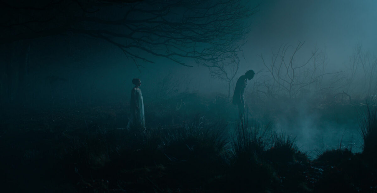
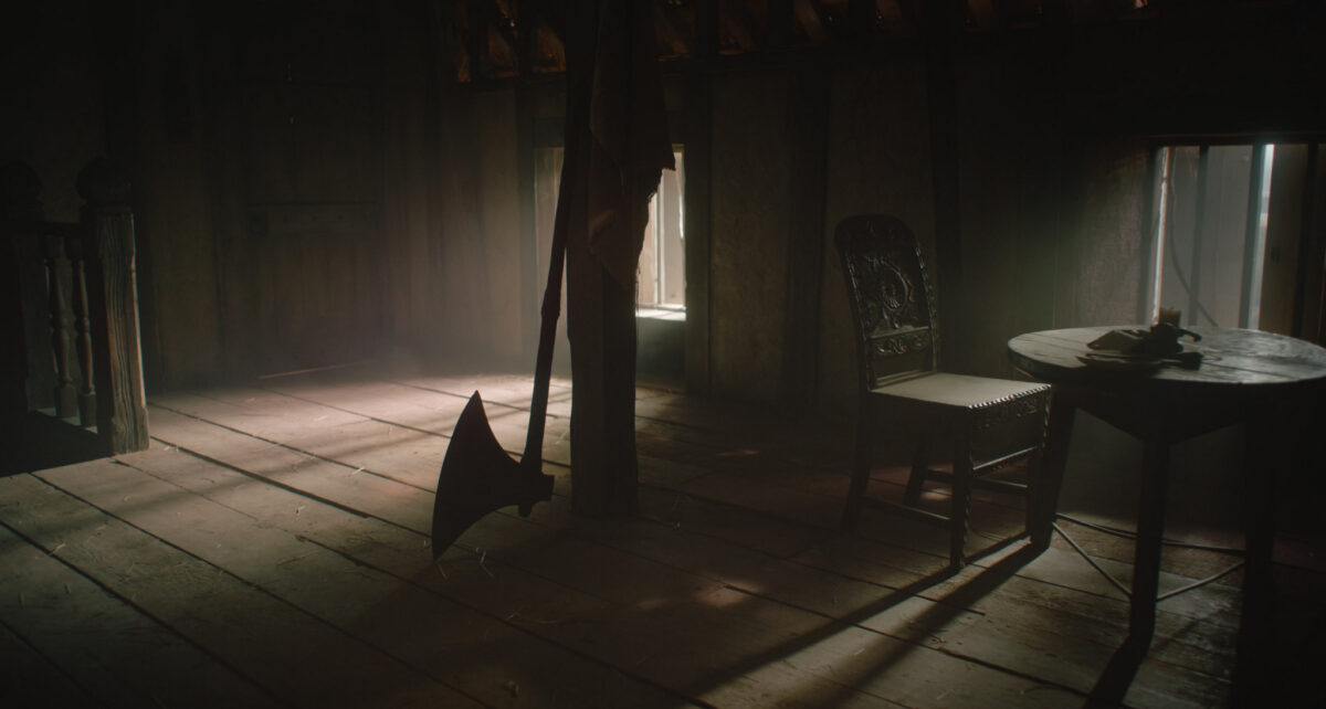
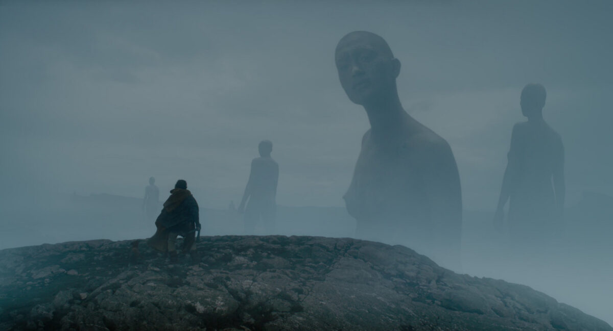
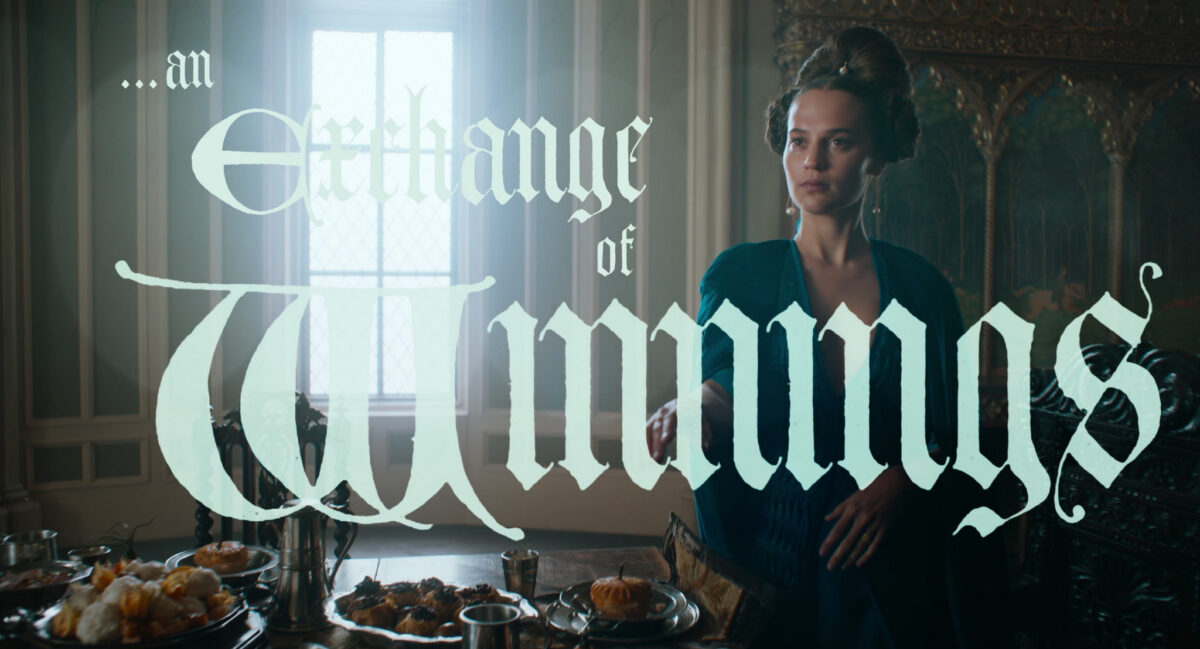
A Wizard of Earthsea and the Green Knight
posted:
updated:
posted to: mediatagged: A Wizard of Earthsea, arthuriana, books, fantasy, gawain, ged, media theory, structure, the green knight, ursula leguin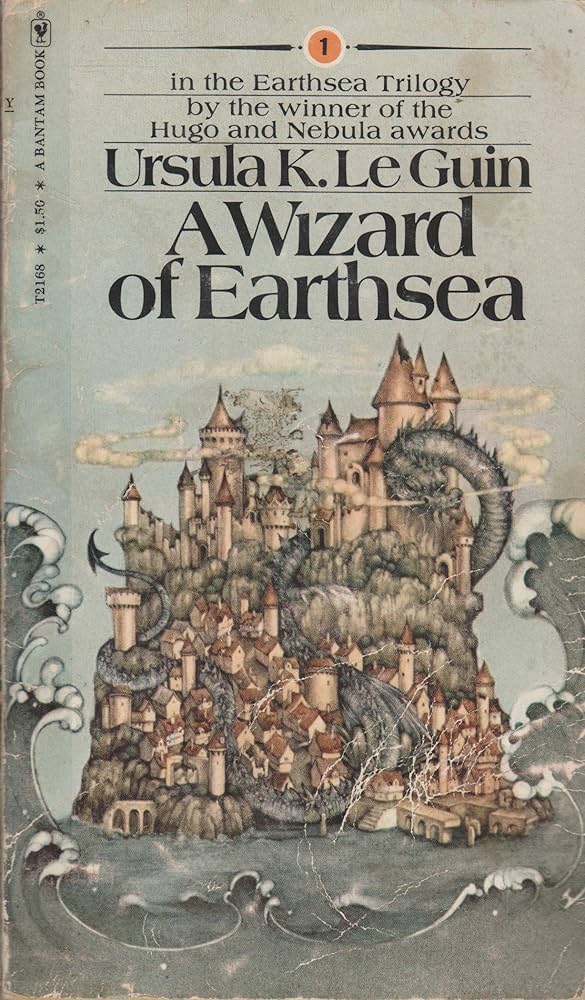
I’m rereading A Wizard Of Earthsea, and there is so much more Green Knight in this story than i ever noticed before. I wrote this up on tumblr in November, and I’m reposting it here for posterity, mostly mine.
In summary: I think it follows many of the same beats and deals with the same themes of destiny, pride, great acts, submission to duty/destiny/fate, and erasing of the self. But allow me to go into detail:
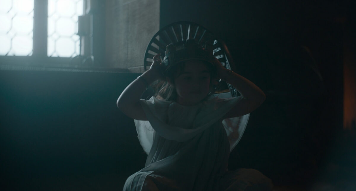
(spoilers for the Wizard of Earthsea below)
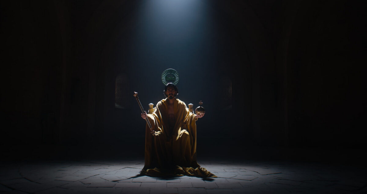
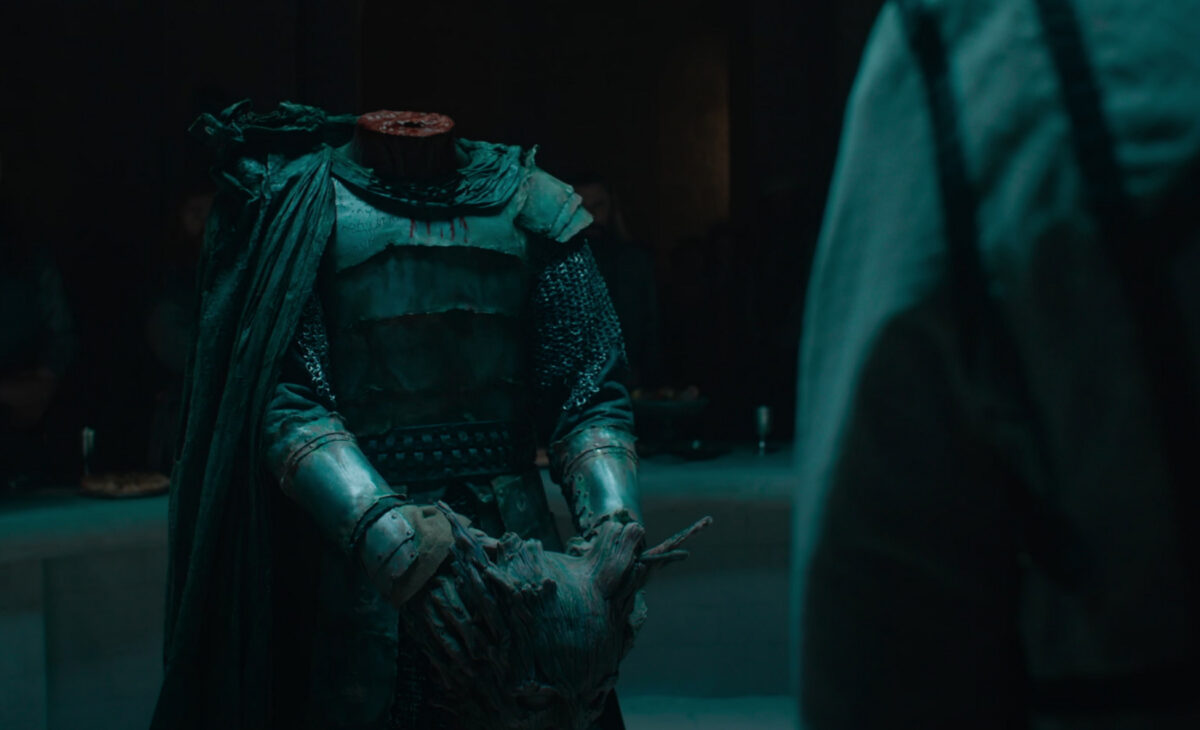
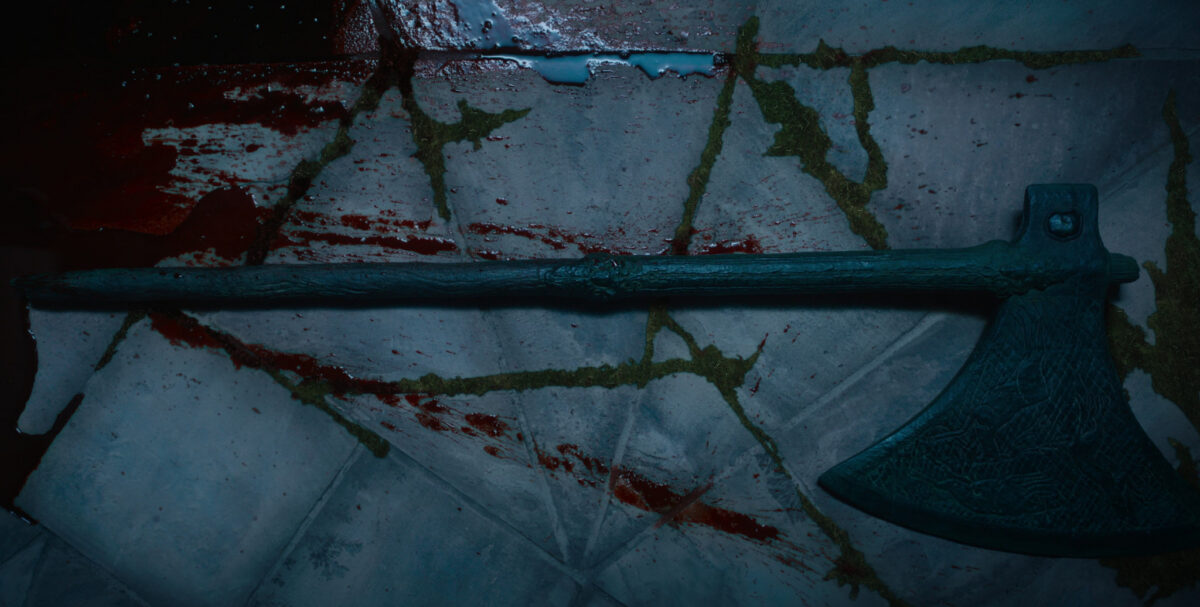
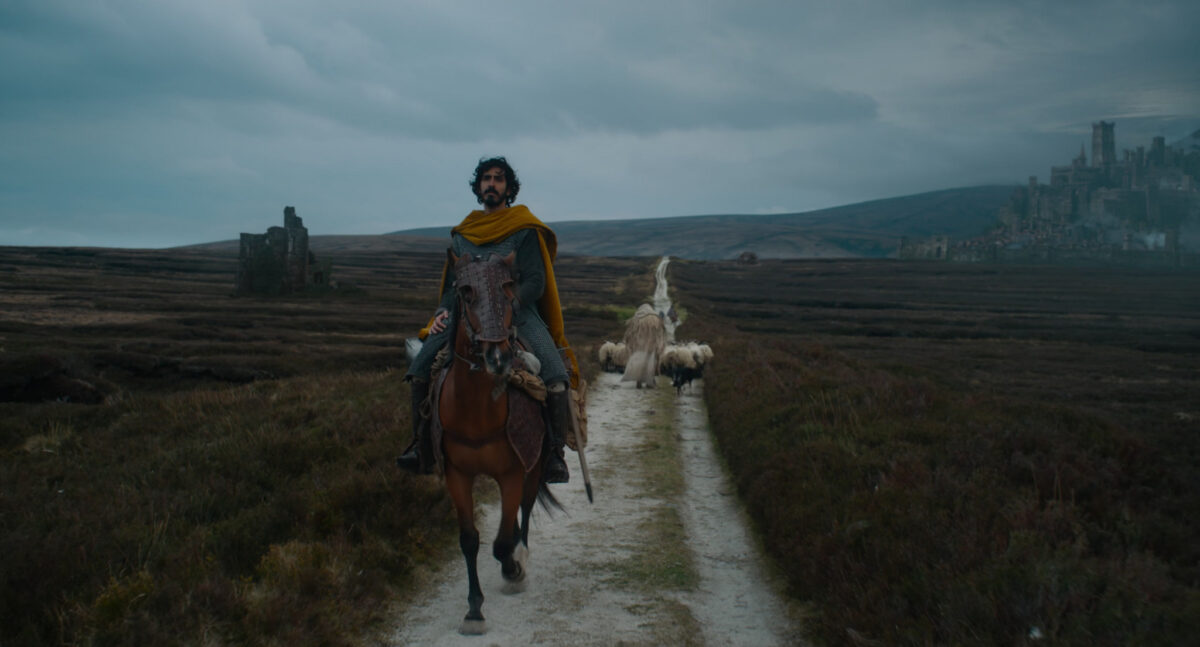
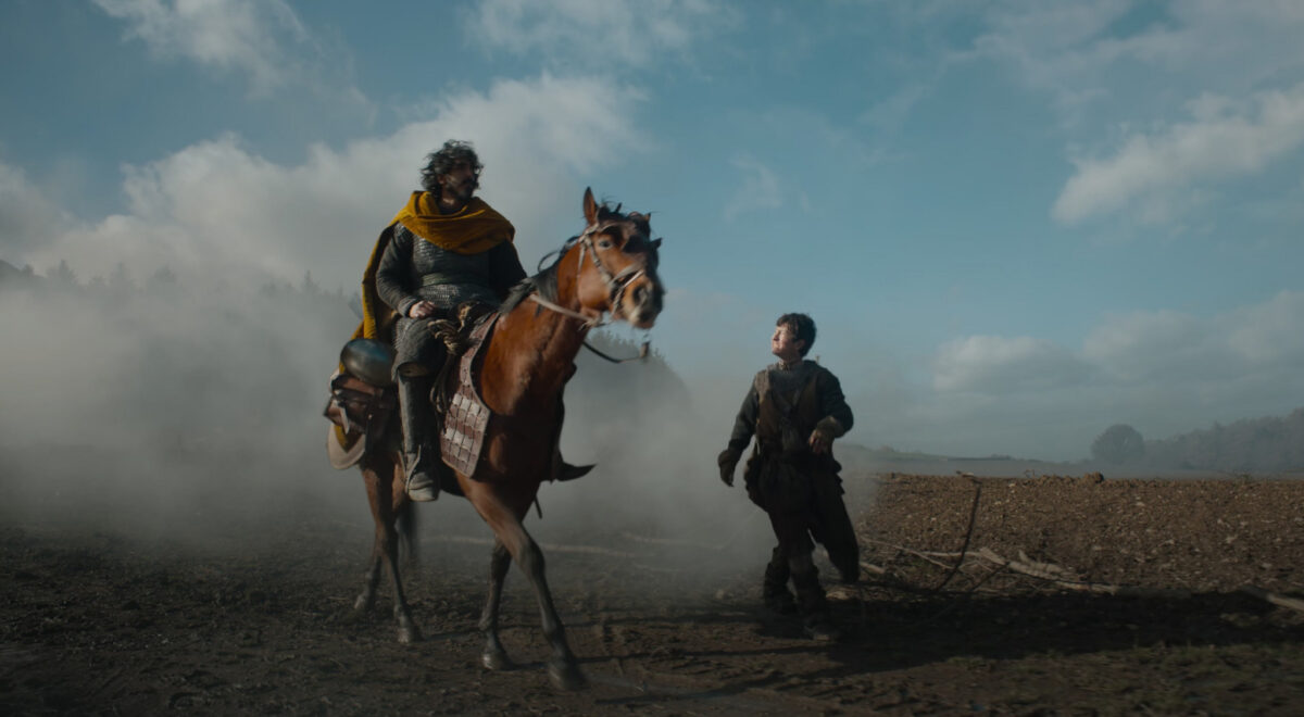
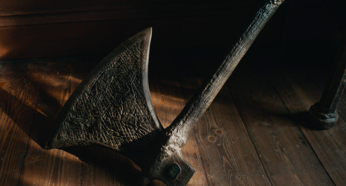
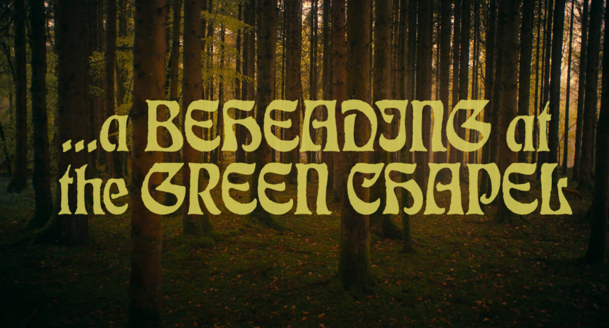
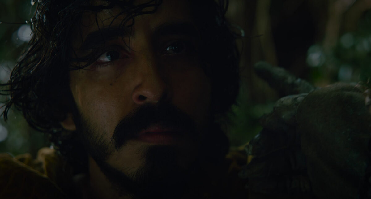
(spoilers and screencaps from The Green Knight film below)
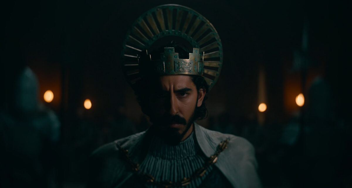
(dev patel for ged in a future adaptation filmed by someone who knows how to film the unfilmable please please please)
first we have ged, a proud boy of humble origins finding himself in a place where he has been told he has potential, power, capability, a destiny — and we the reader are told he will be a Great Man, go on to do things that change the world, become myth
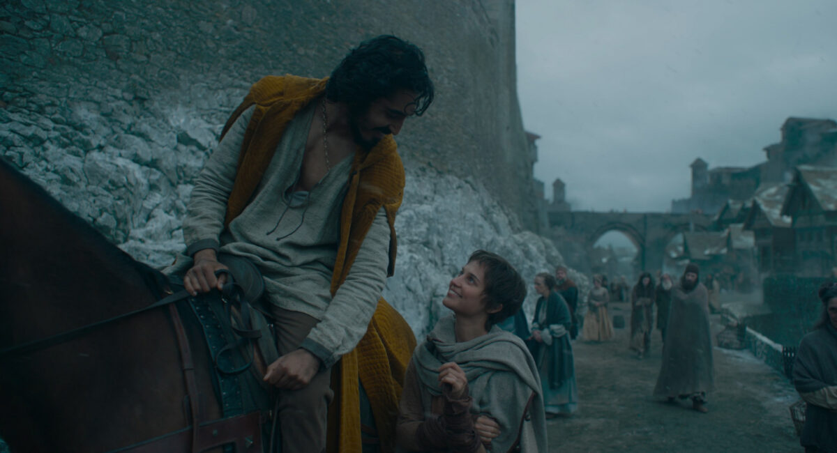
but he can’t see any of it yet – he’s trying to be good, but really he’s feeling a bit purposeless, and he gets caught up in the confusion and frustration of youth

but! it’s solstice! a festival! and games are afoot! and young, ambitious, and desperate to prove himself, Ged takes on a challenge out of pride and hubris — and it goes wrong in a way he could not have imagined – he opens the door and lets in the shadow, right?
and the terms of that mistake are: it is his burden and his alone now. No one else can deal with it for him. And it is transparently a mortal danger from the start.
but he doesn’t have to deal with it immediately! he has time to prepare himself. but he doesn’t know what he is up against – no one does! so preparation feels somewhat futile.

And then it is time for him to go forth. And he tells himself he is prepared, that he is noble and capable, and that he is on a noble quest – but he can’t ignore it. it is a doom as well as a quest.
He is offered false (or true but impossibly costly) protection/aid by a dragon and resists it. He is a good man and he is trying to do right, but he made this choice earlier and it compromises his ability to do right. He is vulnerable because of it.
he nearly dies.
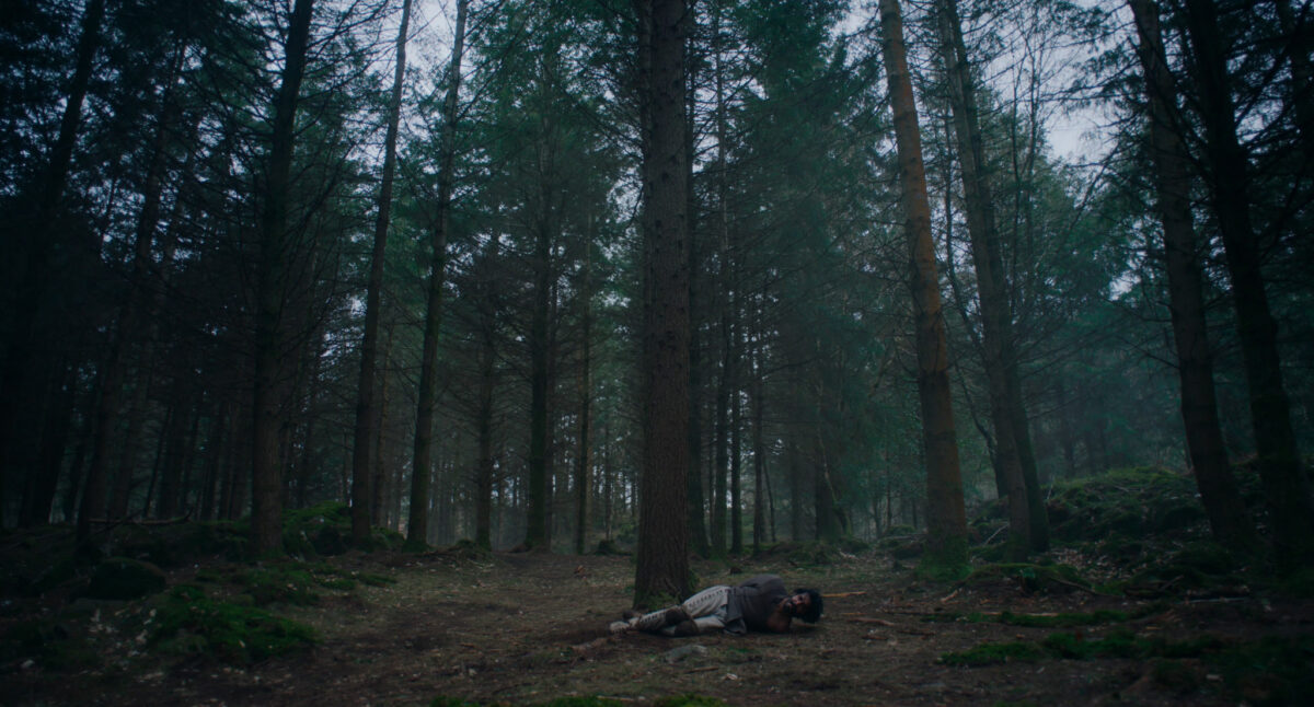
he is humbled again and again, and in his darkest moments he becomes a puppet of fate, arriving on the sandbar to receive and give basic kindness to people so ill done by, so ruined as to seem almost beyond life, who reward him for it.
but he doesn’t understand the gift they give
great history is happening around him and he cannot engage at all with it, he is trapped inside his own quest.
and as he becomes more afraid and the fear controls him, he ends up trapped in a castle, courted, kind of, by a woman who would subvert him against her lord’s wishes.
She wraps him in gold and furs and he becomes a rare treasure until he realizes what is happening.

She promises him protection but it becomes clear to him that he is worth more to her while in this doomed state, and he confronts the trap. Escaping it reduces him to almost nothing – he is nearly lost as a hawk on his way out. All he takes with him is the doom he owns.
and finally he knows he must go to meet the challenge despite the horror of it

he submits to his fate as an intrinsic part of himself

in fact by turning to meet it the horror lessens, the haunting is reversed, and he becomes the pursuer – there is an incredible clarity and beauty for him now
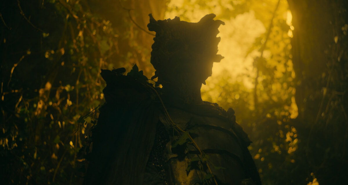
but only once he accepts he must pursue it to the edge of life and death.
and he knows that everything hinges on this confrontation. if he fails, and the gebbeth takes his body, he will rise to great power as a shell of himself, housing only fear and darkness
so he must own it fully, he must entirely accept his own fate.
…and then he is reborn from the edge of life and death, which is perhaps a twist on many green knight interpretations
LeGuin was very interested in balance and cycles and the wheel of the seasons and the intrinsic ties between dualities, so for an arthuriana reference, this makes a lot of sense to me? But i haven’t noticed till now! The movie really made the Green Knight stick in my mind in a way reading it decades ago as a teen did not.
Would love love love to hear actual arthuriana folks’ thoughts! Or if anyone knows of other writing on the subject!
-
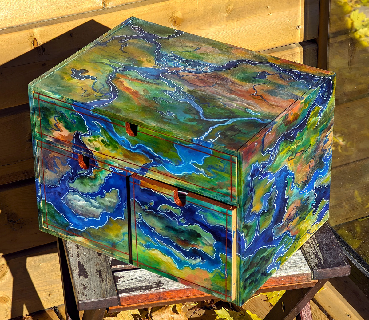
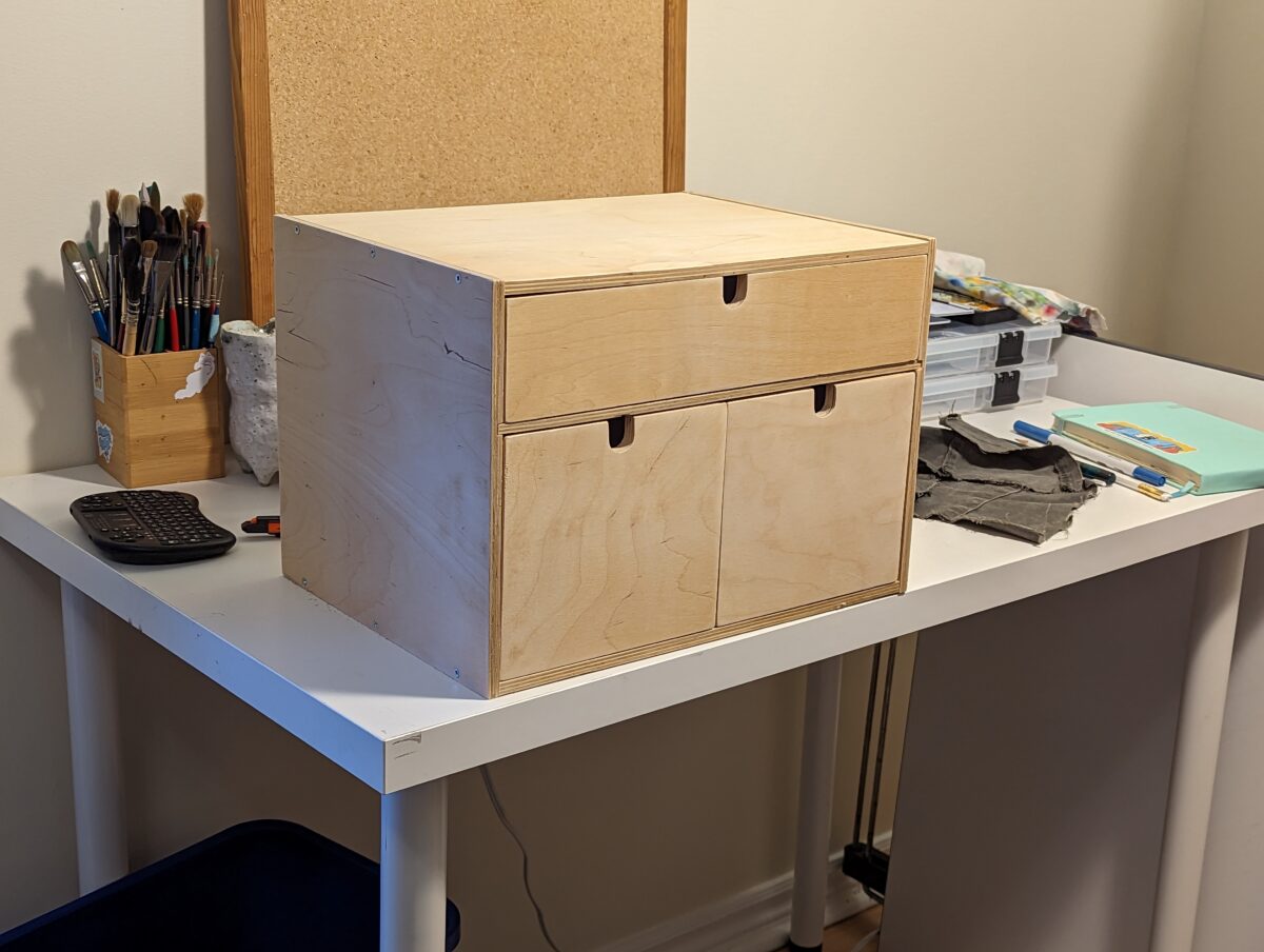
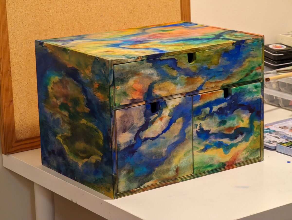
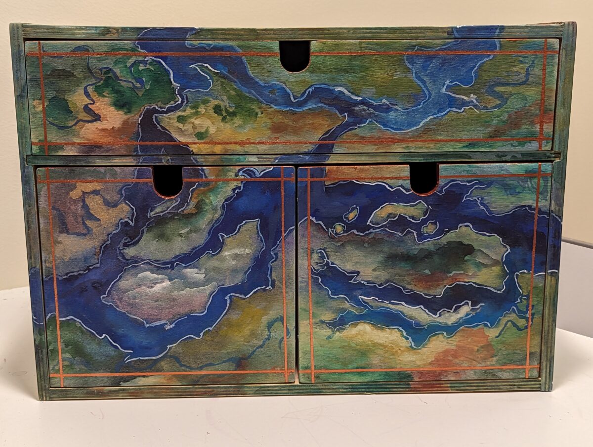
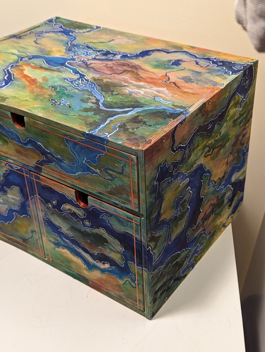
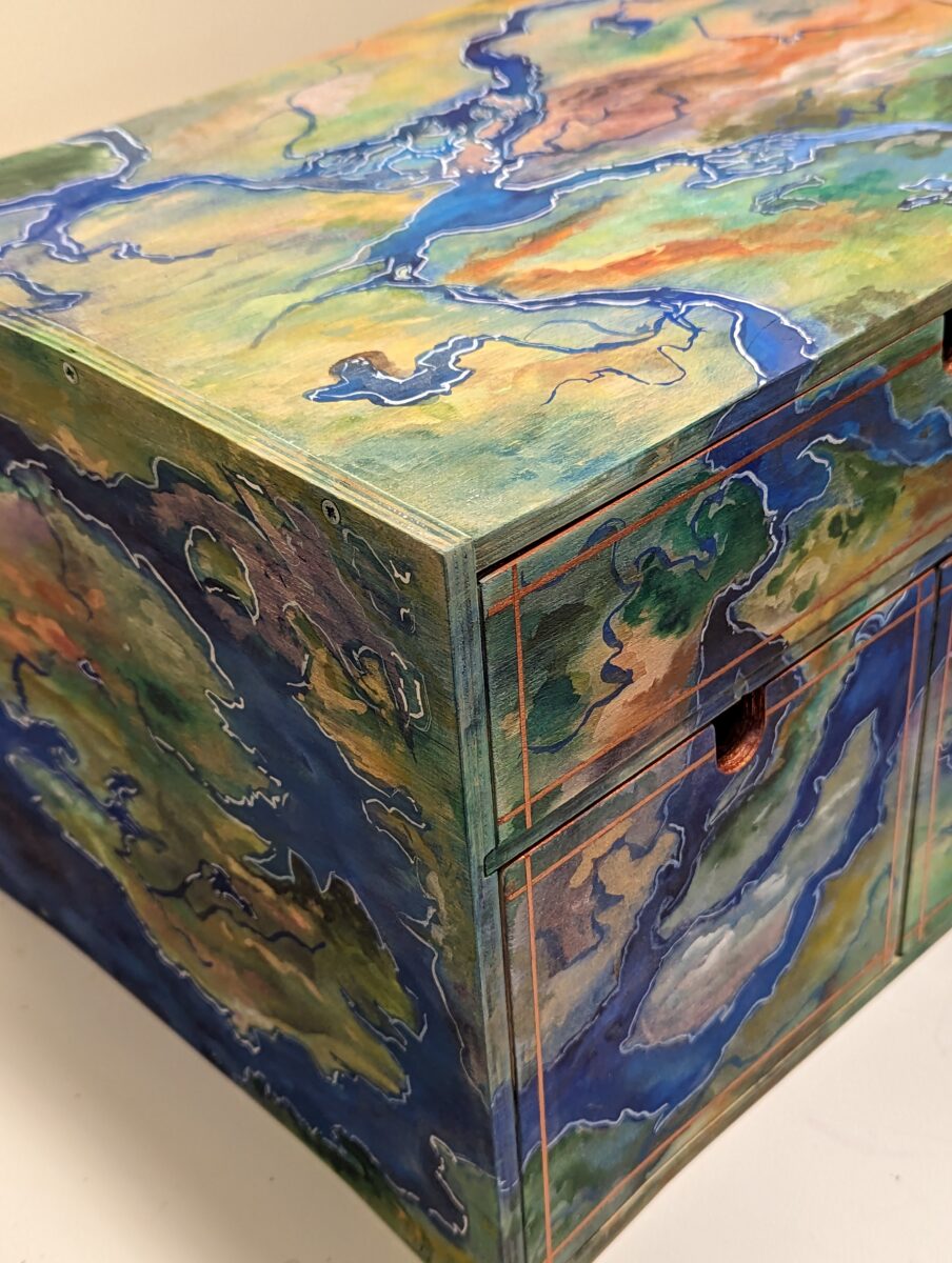
I have had this wooden ikea tabletop box for decades, and since it took a beating in my last move, I decided to sand it all down to clean wood and paint it up decadently, in hopes that it delights me whenever I look at it, and I feel comfortable saying it sure does!
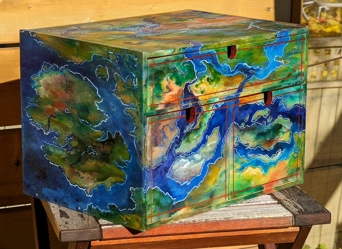
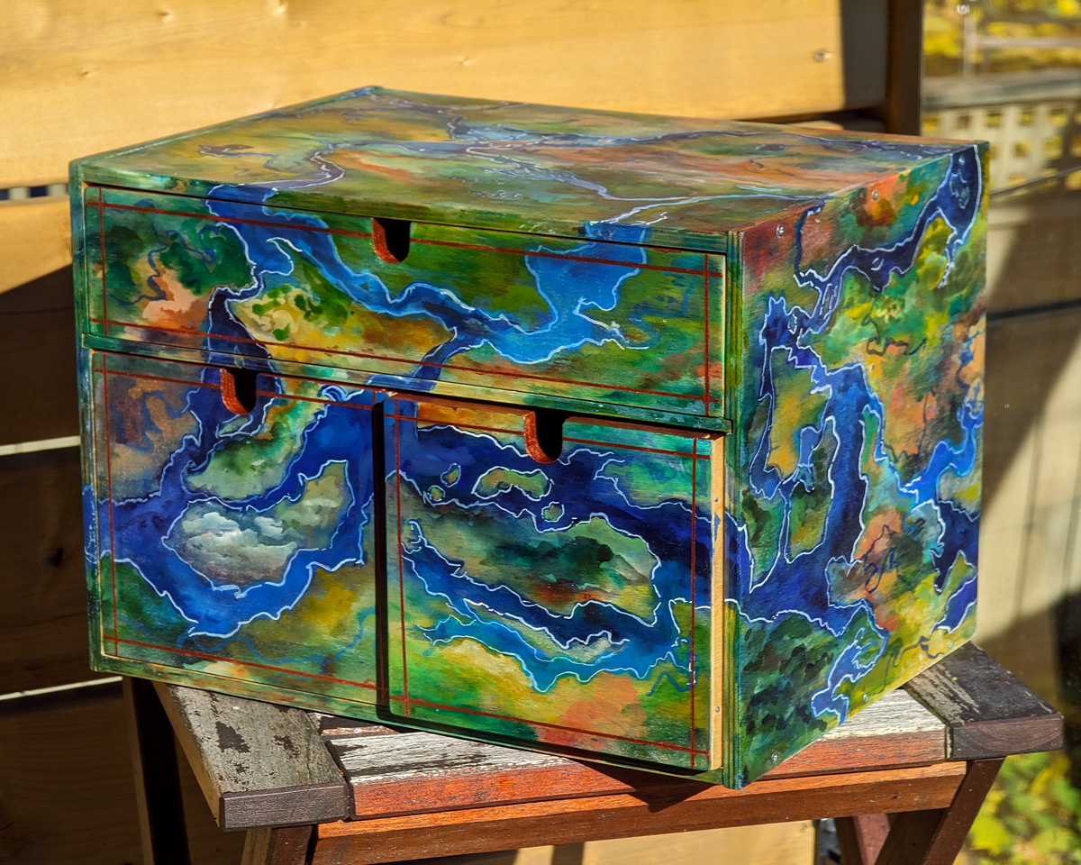

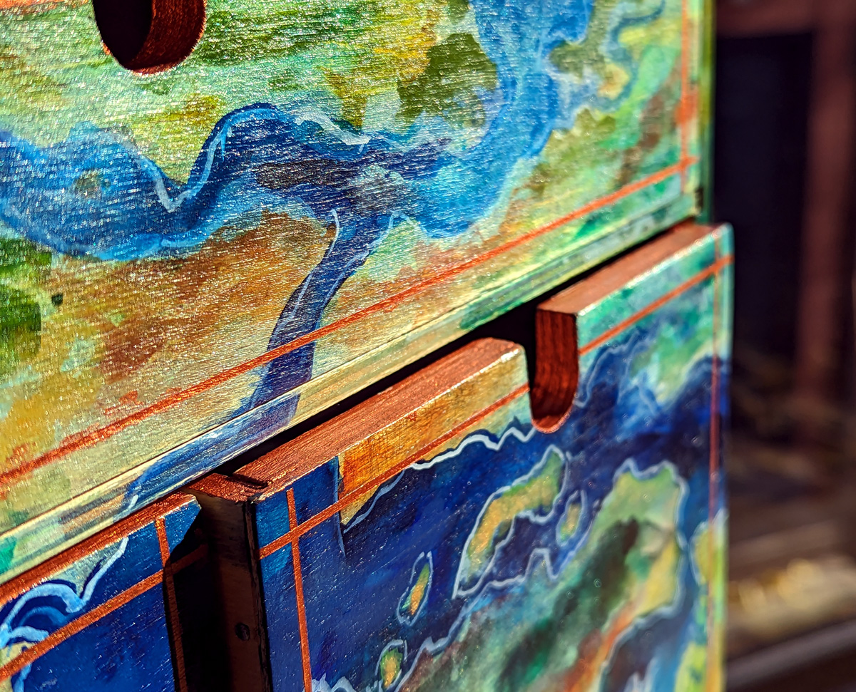
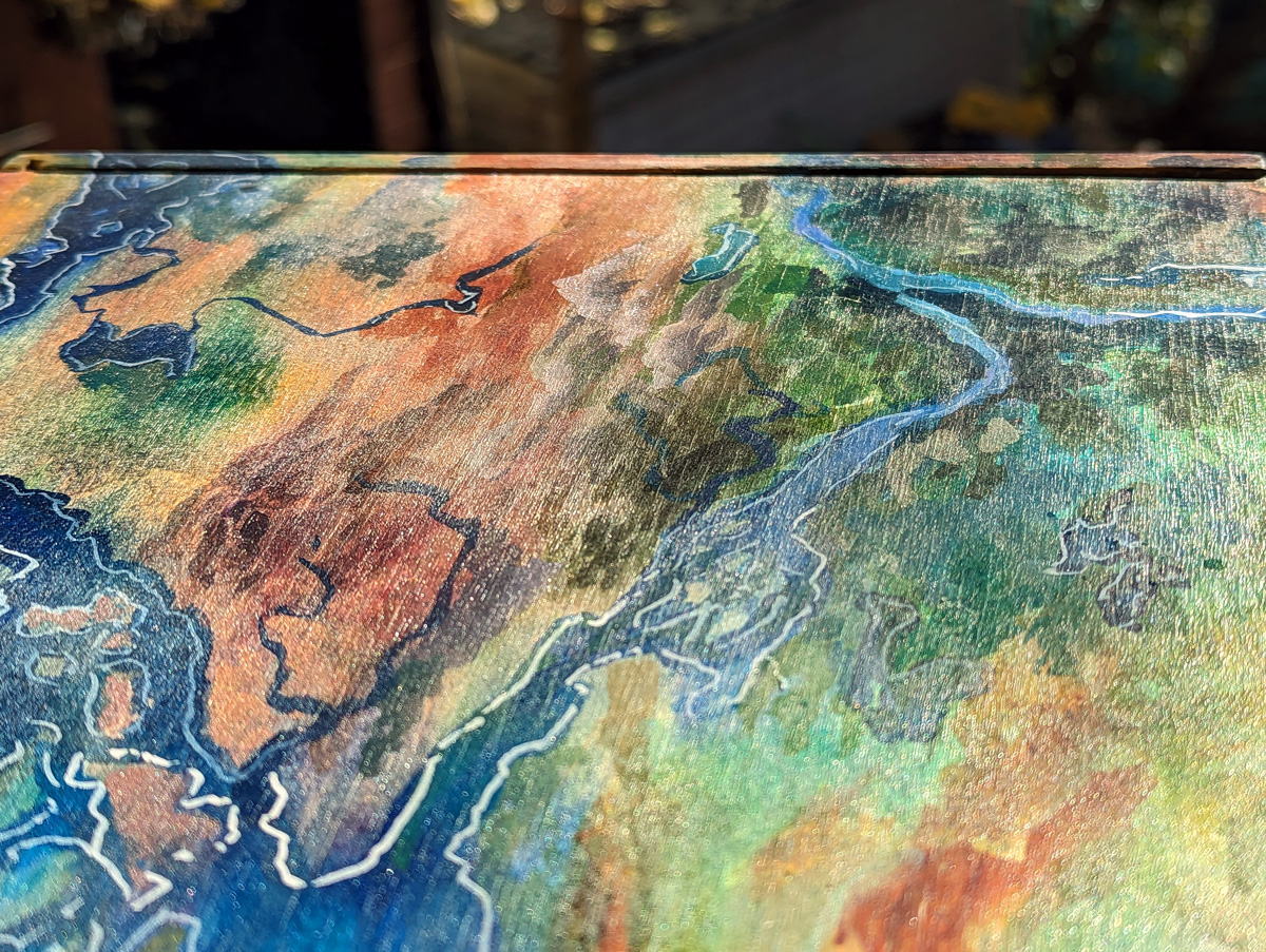
I sanded the wood down, painted directly onto the raw wood to let the watercolour run into the grain, then sanded it all, lightly sealed it with transparent watercolour ground, and added much more opaque paint to detail the terrain, rivers, etc. Then I used my finetec copper paint to add metallic detailing on the drawerfronts and around the top edges of the drawers to class things up.
Not pictured: the interiors of the drawers are all pastels from the general palette.
Process shots:
Leave a Reply