
swap to chronological order of most recently posted
-
A Brief Guide to (early onset) Wizard Puberty is a silly but sincere explanation for bystanders of what is happening when their friends become disabled, as narrated by a very tired wizard.
This comic has been in progress for over a year now, and will be launching in summer 2025! I’ll build out the preview here as more pages get finalized! In the meantime, spread #1:

-
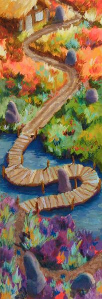
Painted this in short bursts over several years – drew it in 2018, and printed it out on watercolour paper and started painting during the pandemic, and finished it last week. Gouache layered with neocolor iis on cold press paper.
-
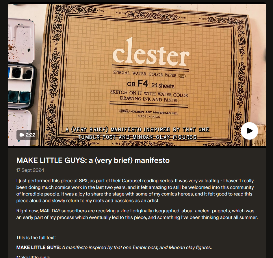
Shing Yin Khor’s “Make Little Guys”
posted:
updated:
posted to: linkstagged: building block, link, little guys, manifesto, recommendation, sculpture, shing yin khor, videoWe’re all getting bombarded, and the fight, flight, freeze response is probably flooding your brain, and I too am feeling paralyzed by the constant internal question “what can I even do about ~everything~?!” —
— and this piece – manifesto, poem, performance – from Shing Yin Khor’s patreon popped up in my bookmarks-to-revisit and reminded me that zooming in on something like a Little Guy can be a wonderful empowering connecting experience.
So here, go, enjoy, hold on, challenge the aggressive flood of learned helplessness the world is throwing at us all right now:
-
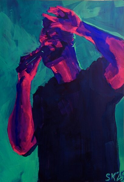
7 x 10″ gouache on hot press, referencing my own photos from seeing Leprous in Toronto back in September 2024.
The photo itself is much more blue than teal, but bright, saturated light blues are such a challenge to mix with gouache! So i turned the background teal and was able to get the relative saturation and values I needed, and keep the moody vibe of the photo.
My concert photos have certainly improved over the years, as digital photography tech got better at low light and phones started including physical telephoto lenses, but it’s rare i get close enough to get clear shots of performers’ faces.
In parallel, it’s usually tough for me to allow myself not to fully render a face in a painting, but given the absolute absence of details in my reference I was able to keep things very abstract here, and honestly i think it was good for me! I loved the hand pose in particular and i think it really kind of stands in for where a portrait would go .
Additionally, to talk for a minute about my painting process, I was taught still life and study painting via the Hawthorne method, which i would summarize thus:
put the right shapes in the right colours in the right place
It’s deceptively simple and forces you to sometimes forget what you’re painting and focus entirely on the graphic abstraction of what’s in front of you. People joke that you don’t need to know how to draw to paint like this, and I often think that’s oversimplified at best, but: I’m very happy with the hand anatomy in this piece and i definitely did not approach the hands through a drawing mindset. I just looked at the shapes of the colours and placed them as accurately as I could.
Intriguing.
-
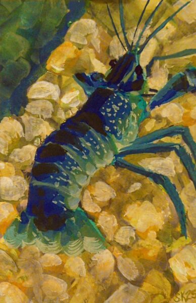
4 x 6″ gouache prawn. I decided to try using some drying time extenders – glycerine, watercolour blending medium – to try for more of a wet in wet blend approach, but honestly it was hard to keep the paint thick enough that it wasn’t just running all over the page. Something to retry in future on either more absorbent paper or with more viscous, fresh gouache.
-
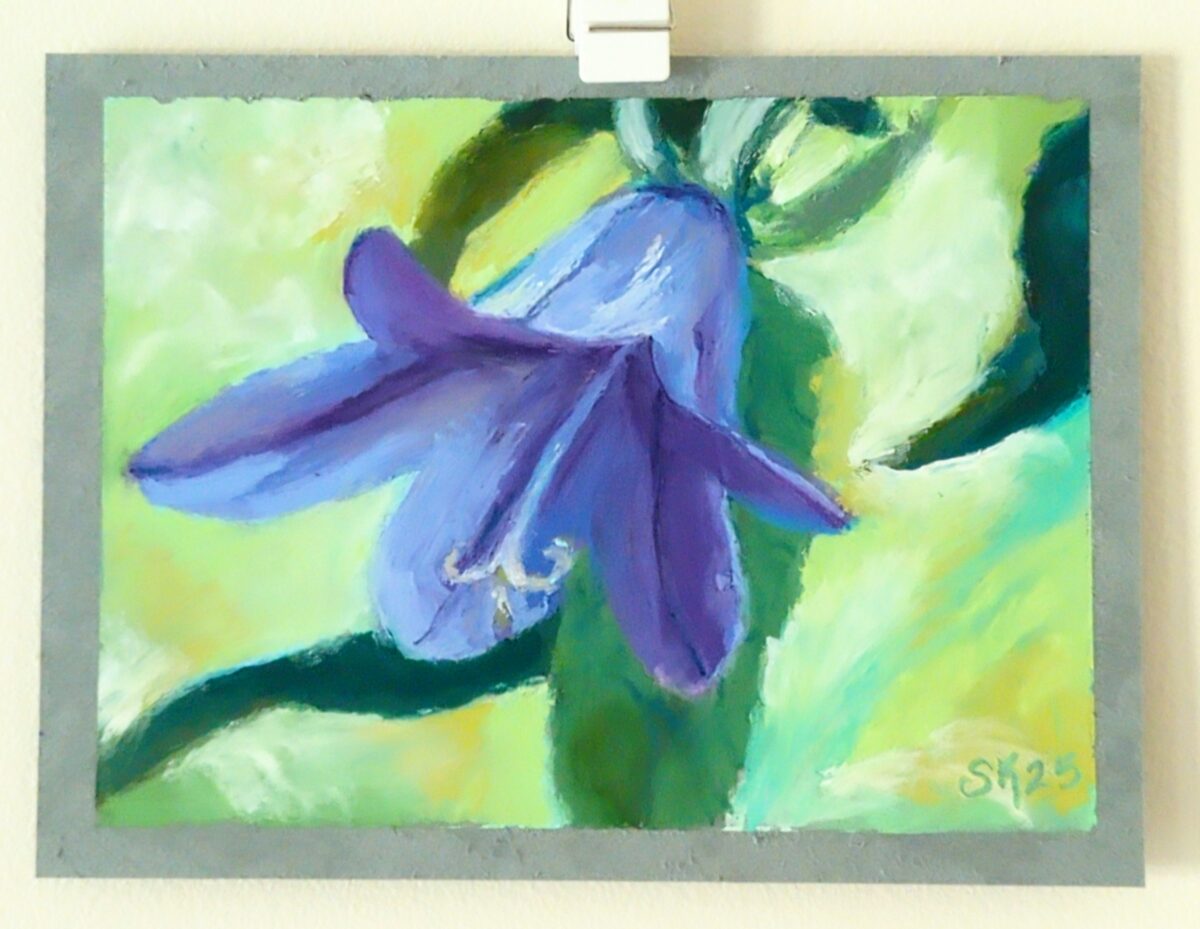
Drawn on very, very smooth paper, a mistake I will not make again. Photo ref taken from my database of plants that I have grown (intentionally or not!) in my garden over the years.
-
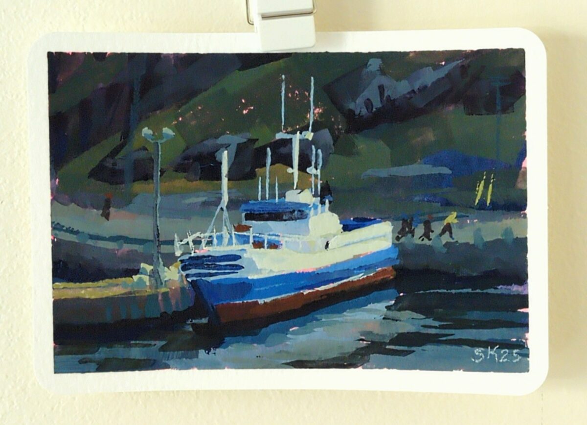
Painted this gouache study on a 4 x 6 postcard, from a photo I took on a winter visit to St John’s, NFLD, from years ago.
I was reminded that much of the appeal of painting in gouache lies in the brush strokes, and the quickest route to intentional brush strokes is to use the biggest brush possible. IIRC, James Gurney says to “use the biggest brush you can get away with.” So this 4 x 6″ study was painted with a 3/4″ flat, and the next one I’ll try a full 1″ flat I think.
Thing is, after using these brushes for years, I do know how to get tiny marks out of them – I painted the joggers, the posts and antennas and floodlights all with that one big flat. So the trick is to try not to make tiny marks – solve the painting with the biggest marks you can make. Something to remind myself of on the next one.
-
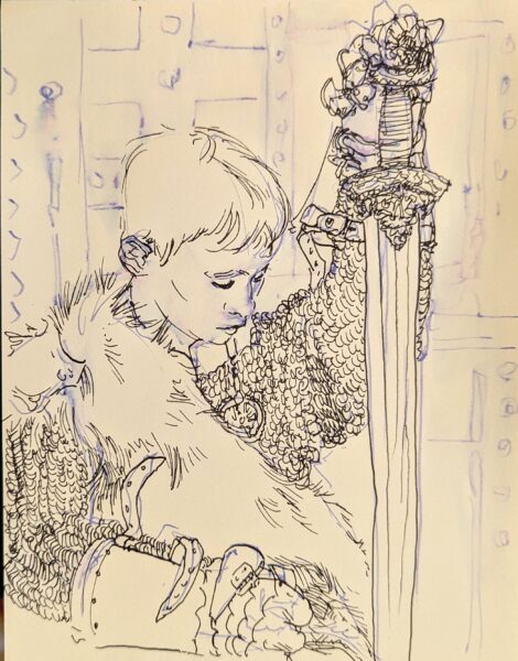
Drawn from pinterest ref with my FPR ultraflex nib over an undersketch done with a long blade nib and washed into the page with a waterbrush.
2 responses to “Fountain Pen Sketching”
-
this is lovely, I love this one
-
heck cheers!
-
-
-
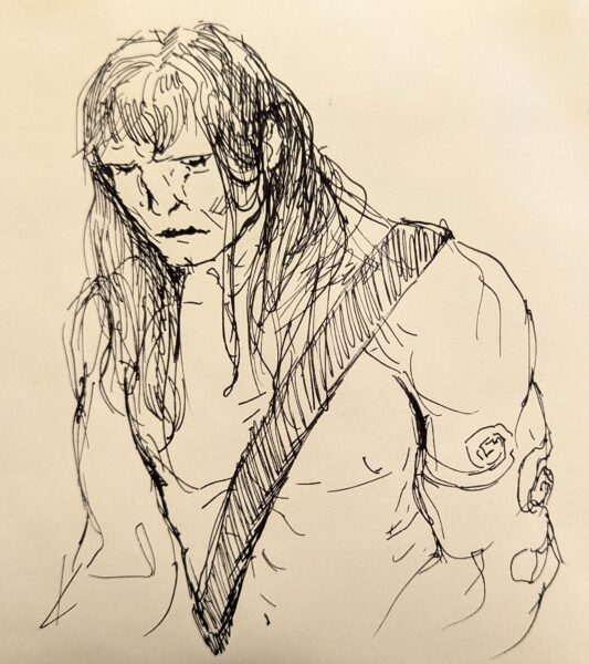
Haven’t drawn a Conan in a while, so, tried my hand at it. Fountain pen is such a delight to sketch with! This was drawn with an FPR Ultraflex nib, tho I dunno if I was really pushing it to its limits with this one.
-
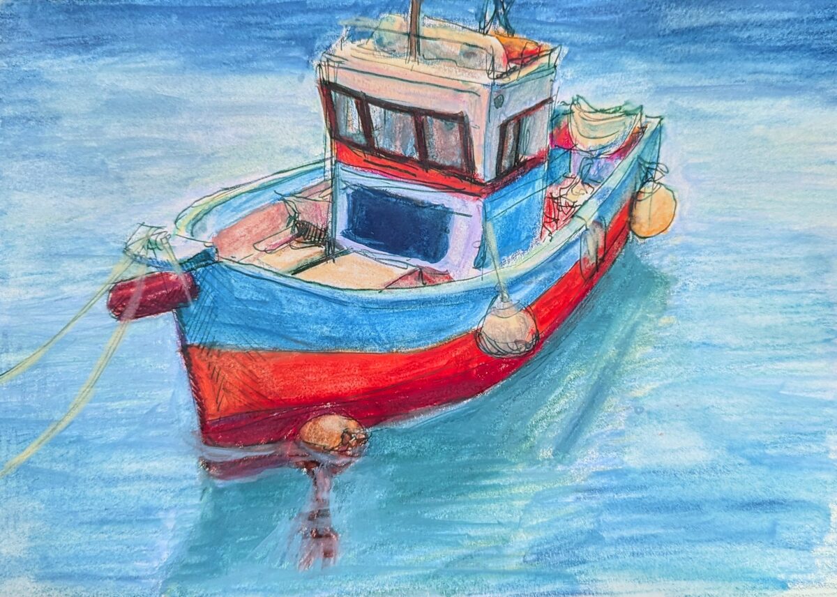
Painted in my sketchbook with neocolor iis over a fountain pen sketch. Reffed from pinterest. After having my ass kicked learning to draw boats for a game in 2021, I can’t stop thinking about them! Little boats especially I find so incredibly cute.
Leave a Reply