
swap to chronological order of most recently posted
-


My first art directed game has been announced! Now I can tell you all about all the robots!
We made a lot of robots, robots I have become emotionally attached to. Please, check them out.
 Astronomics – An Asteroid Mining Automation Game by Numizmatic
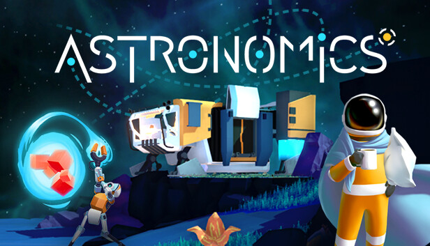 Astronomics on SteamTop-down action and space exploration meet asteroid mining automation! Navigate to randomly generated asteroids passing by and start mining. Impress your employer, upgrade your equipment, fight off pirates and save up for that ticket to Earth so you can finally come home… for the very first time.
-
Astronomics Game Art : Designing Mining Equipment! Pt 1
posted:
updated:
posted to: game devtagged: art directing, astronomics, concept art, indie games, numizmatic, structure, videogames, visdev, visual researchPt 1: Research
Gonna talk this week about designing mining equipment for the sci-fi game Astronomics – demo on steam right now! – And I thought I’d start with a little conversation about research and process (…that doesn’t really have on a much art in it but just stay with me) and maybe get to tap in a little bit into how someone like me who doesn’t do a lot of technical design learned a lot about how to get excited about that whole field through the research stage of this game.
So when I say research I really do mean fairly old-school research — and this is probably gonna be a theme with a lot of the posts about this game in particular, because I don’t think you can build sci-fi without some understanding of engineering systems and current scientific realities to then play with, you know?
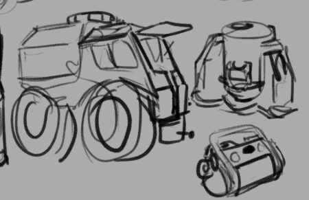
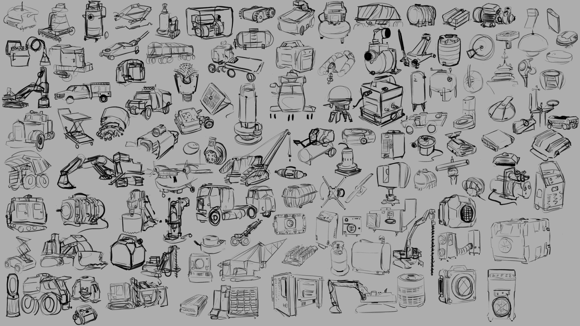
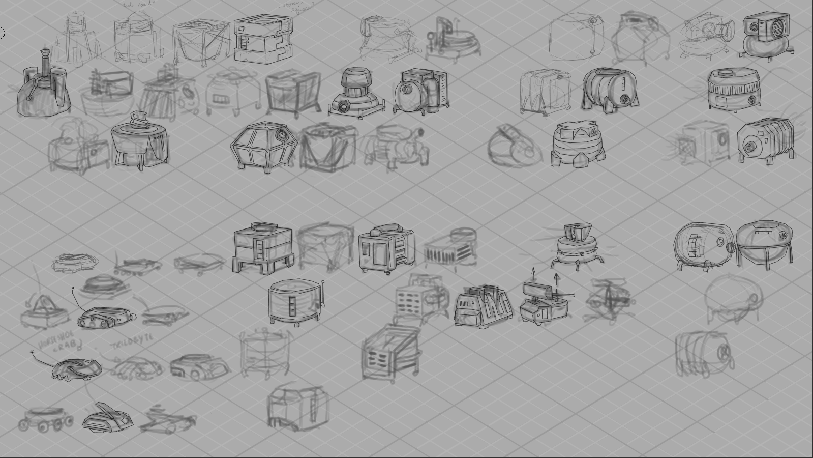
As you may gather from the trailer, Astronomics is a game about asteroid mining, among other things. Which meant that we had a lot of need for legit industrial feeling props and tools for the player to use, things that felt functional and believable without feeling complicated or delicate. I really enjoy the challenge of adding appeal to something that maybe people don’t always think about being appealing or fun or cute (this is never an absolute statement — there’s always somebody already able to see more appeal in any given subject and I could ever imagine) so part of the research stage is going and looking for that appeal. So above you can see a sheet of loose rough sketches I did in clip studio paint from reference that I gathered with the rest of the team and by myself that seemed relevant to some of the designs we were pursuing.
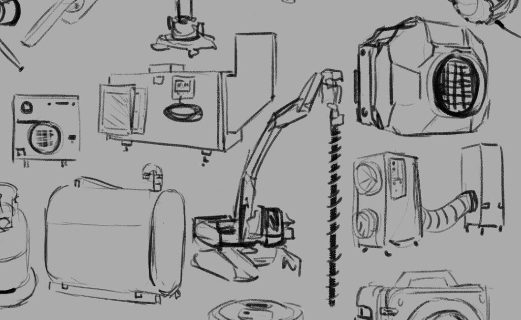
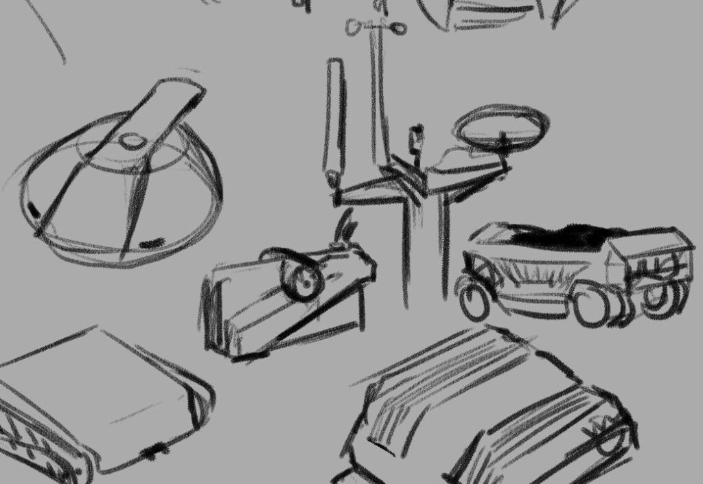
If you’ve had the chance to play the demo, you’ll know that it’s not just surface mining but we are going to be letting you mind gases and liquids and underground mineral veins as well — these are all things that people do in the real world of course, so process one was taking a quick look at those actual industries and then figuring out how I could condense that activity down into a pretty simple and easy to understand machine.
So turned out what we needed was something that drilled and dug, something that pumped liquids, something that sucked air, and all of these things needed to then produce some sort of container to hold what they had collected.
In a videogame you really need to communicate to the player why each act they do is significant and different from the others, and as the art director it was my job to figure how to do that through visual design of the tools they’re going to be using. So that meant that even though you could certainly store liquid and gas and solid resources in the same kind of box, I wanted to try and find ways to keep each thing feeling different. Best case scenario is that you’re able to look at a prop we’ve designed and know in a split second which of these three states of matter it will be containing; in the research stage one of the things I’m looking for is any existing visual language that we have (in this Western English-speaking North American videogame audience culture) that already solves this problem.
The great thing about industrial design is that they indeed have very intentionally tackled this problem. Part of it is purely physics optimization that the field of engineering has been working towards for human history. For example, when you’re storing liquid and you want to remove all of it from a container you probably don’t want something with corners — that’s how you end up with cylindrical liquid storage. When you’re storing a gas you’re likely keeping it under pressure, which means you need a shape that will withstand pressure evenly, which means you’re looking for something with literally no corners or edges ideally — and that’s how you end up with bubble-shaped gas storage like a propane canister. And then when you’re storing something solid and you want to use the space most efficiently and be able to stack whatever it is that you have packed it into, you have a box.

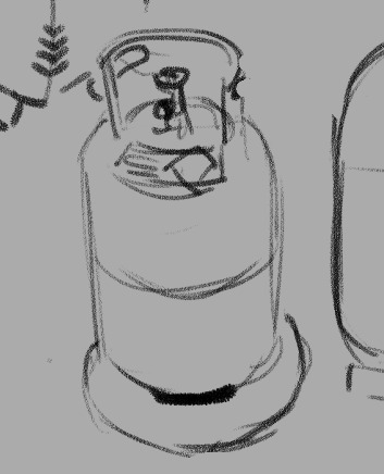
Real good news is, a box and a cylinder and a sphere are all wonderfully visually distinct shapes in a fantastically strong place to start when it comes to solving the question of storage. So then we get into the challenge of the machines themselves — what distinguishes a drill from a pump from a vacuum?
So that’s the beginning of some of the questions that you have to answer when you’re designing props for a game — in the research stage is only one of bunch of different ways you start figuring out these answers. But I want to talk for just a second a little bit about how I personally wrangle my research, because I am definitely not telling you this is the only way to do it. It seems like it may be worth explaining what I get out of this process and see if anything here make sense for you!
One of the reasons that I have this huge page of sketches, big and detailed or tiny and loose, all laid out in one place for me to look at, is because I personally learn and remember things more strongly by taking notes. With my hand holding a pencil ideally. And when they’re abstract concepts or verbal or numerical then I’ll use writing and I won’t have a problem with it, but my job at this stage was not to figure out abstract concepts or to find themes — my job was to solve visual problems. So my first order of business was visual research specifically. Now for me, that involves lots of things — I have a Pinterest board for any sort of subcategory of stuff I’m researching to just do enormous broad research with; then I probably bring most of those images into a huge working .PSD file and move them around to create groupings. And then I start drawing.
I really think that drawing is integral for me at this stage. I don’t think I could do this without drawing as part of my research. There’s so much that I just don’t bother noticing if I’m not going to be drawing the thing that I’m looking at; even the worst, fastest, sketchy as drawing makes me pay infinitely more attention to something then I do when I am simply collecting information mentally. I’m phrasing this in a somewhat exaggerated, self-deprecating way, but I really can’t exaggerate how much more I get out of things when I sit down and draw them. They talk about drawing is a way of seeing, and for me that’s a practice I’ve intentionally pushed and explored in my life.
The other thing, though, is that visual problem that I need to solve. Sometimes solutions to the problem aren’t obvious until they are visualized — it can be very easy to get distracted by things like surface details and miss the silhouette language, or vice versa, but when you are doing the drawing you have to wrestle with the silhouette and the details and make decisions about them. Visual trends appear way more clear when you are drawing something for the 10th time as opposed to simply seeing it for the 10th time. And all of the layers of cultural meaning and context that clutter up a photograph can be simply ignored as you transfer only what you need to a drawing, where you might discover something that everything else hid until then. Beyond that, one of the things you may notice about the sketches is that they are somewhat cartoony — I’m certainly trying to capture important details and be representational to a degree, but much like gesture drawing the human figure, researching this way lets me start finding out what the gestures are of these different sorts of subject matter. This is something that I knew about creature design, and about flora design, and one of the real joys of this game in particular was proving to myself that this gesture approach applied to industrial machines and technology as well.
I mean, I knew that there were cute trucks out there, but gosh.
I think if you are in need of something to reinvigorate a particular piece of subject matter for you — if you’re designing something that you are just not that excited about, or if you don’t feel challenged by the work in front of you — I really think sitting and sketching from reference can open up the complexities and help push you and your work farther. It certainly works for me and I know that the learning I did on this game is something I carry with me to future projects as well.
That seems like a pretty strong place to leave this post in particular, but I’ll be back later this week with more breakdowns and screen caps of the actual design process of all of our adorable mining equipment!
I would really love to hear from folks if you also engage in similar research processes before going into full design mode — or if you have a completely different way to get your mind revved up and ready to go, I would really enjoy reading about it!
In the meantime, if you’re curious about mining asteroids but it’s cute please feel free to check out the Astronomics demo on steam, I made an awful lot of visdev art for this and handed it off to some incredible game creators who have done some really impressive stuff taking their ideas and my ideas and running to honestly some pretty new and exciting places with them.
-
Brainstorming and feedback loops
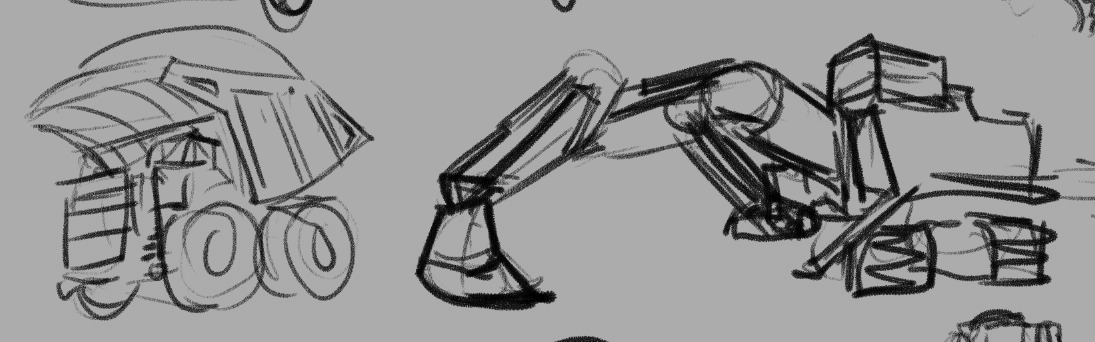
One of the first steps of designing is always brainstorming — sometimes this starts before research, sometimes I research first, and often I go back and forth, letting brainstorming push me to the limits of my current knowledge and then taking to the internet to open up new territory. For the equipment for Astronomics (demo on steam right now!), while the design team had a few key assets they were looking for, they were also still brainstorming and so we were all kind of discovering what the equipment part of the game could be as a whole.
For me, that brainstorming usually looks like a LOT of very rough drawings. I usually have my research sketches open nearby for reference, and I try and draw small enough that i can see all my brainstorming and seek out possibility spaces between ideas.
Above is my first VERY rough brainstorming page, and on it you can see art from two passes – the softer, lighter drawings are the open-ended thinking; the darker clear lines are the second pass, where I start filtering, choosing which pieces to take to the rest of the team to start conversations with.
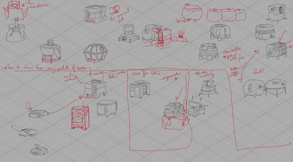
You can see how we would collect feedback above – i would write notes and do additional drawing on top of the submitted artwork as we went through things in screenshared video meetings, and then have these with me as I iterated further.
One thing you might notice is that these are all drawn with straight lines — Astronomics is a low-poly 3D style game, and it was fun to think about simplifying the shapes right from the beginning. While I didn’t do all my drawing like this, it was a fast and quick way to get clean linework that had some connection to the style of the game long before we really knew anything about said style!
Speaking of style…
Next up, we had to make some big decisions. Astronomics has a lot of equipment with a big range of functions and scales and the most important thing was making sure it all read like equipment from the same manufacturer – that being CubeCorp, as you’ll see in the demo. I narrowed it down to three possibilities:
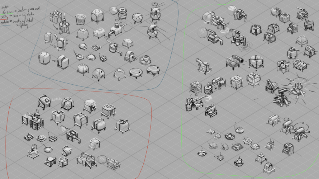
I went in three directions — “Star Wars” style, all panel lines and chamfered edges and a sense of overall complexity; “Safety” style, with safety bars and frames around everything, focusing otherwise on simple, chunky shapes; and “Modern” style, exploring simple silhouettes with hidden complexity.
(none of these are official names for known styles, eg, the star wars style didn’t actual aim for matching the style in those films particularly — these names were more mnemonic devices to help me quickly sum up what I was thinking in a punchy way, and help my coworkers refer to the styles more easily in conversation while we discussed an debated direction together.)
In the end, what we chose was mostly Safety-styled, but elements from both other directions made their way in too!
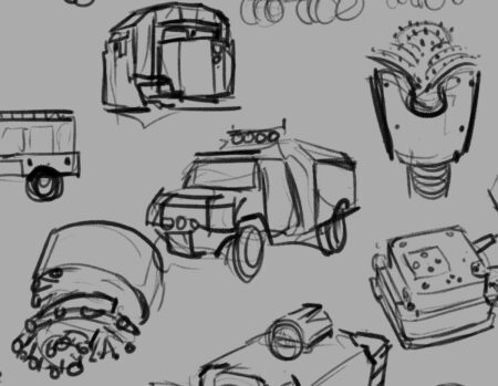
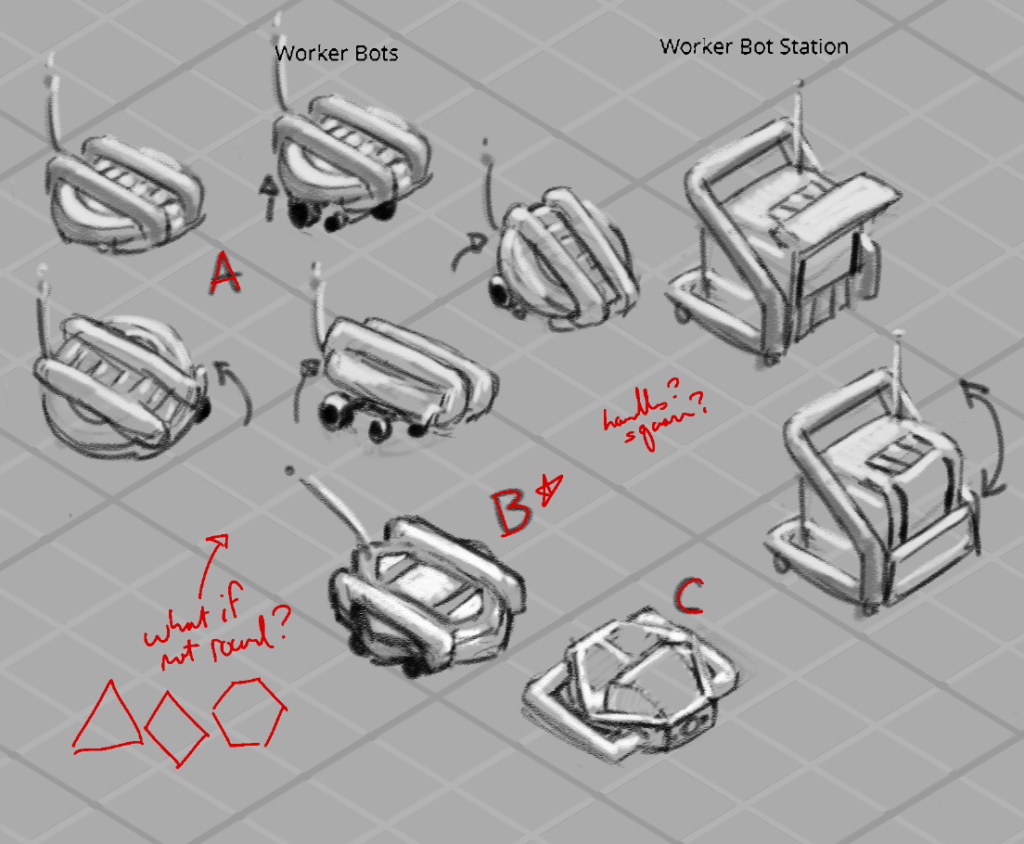
And here was my first sheet ft a pass on the drill, pump and vaccuum, containers for solids, liquids and gasses, a worker bot, a worker bot home, and a robust scanner machine.
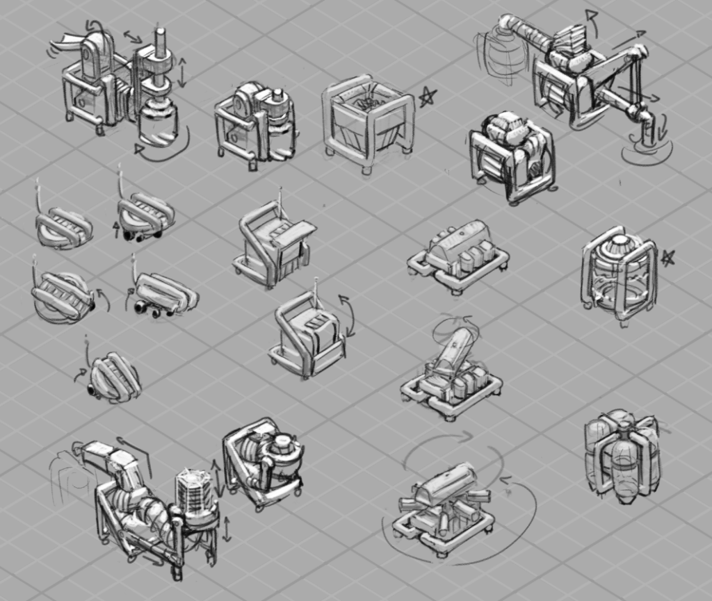
A few things we were thinking about: we wanted there to be a sense of a unit of size that everything fit into – CubeCorp, remember? – and so even our most complicated equipment needed to pack down into that cube. That meant that we were going to be animating equipment essentially unfolding, so I tried even at this stage to think about what that could mean for the drill and pump and vaccuum, and you can see packed and unpacked states up there for each design.
They also were likely to be carried around by our little darling worker bots — so everybody needed feet the bots could squeeze between to get underneath. Speaking of, they probably went through the most designs of everything, and what’s in the demo does not appear in these pages at all, haha, but here, a few more passes:
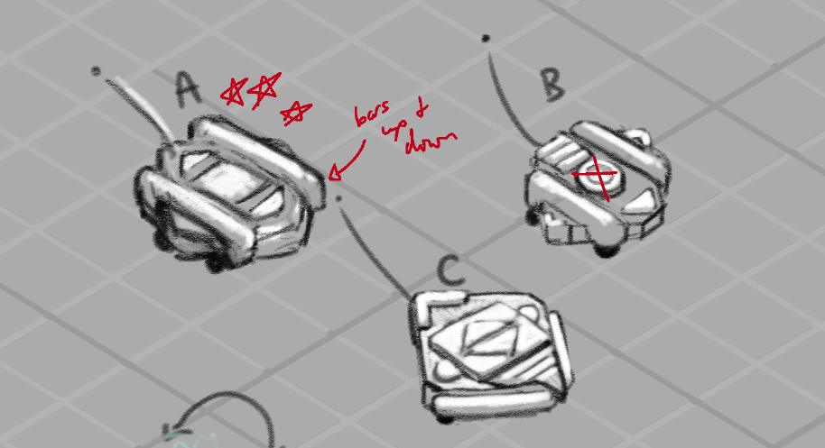
In fact, you might not be able to find any of these exact designs in the demo — that’s just the nature of concept art in games! What the game needed then and what it needed later — as the game design itself was developed — well, it changed, as it often can! I think it can be easy from the outside to assume that everything anyone thought of was eventually brought to life, but that rarely ever happens. Concept art is a process, and so even if these designs didn’t make it into the game, they were an important step along the path towards designs that did, and they taught us a lot about what we did and didn’t want Astronomics to look like!
-
Oversized Equipment
With a base set of equipment solved for Astronomics – demo on steam right now! – there were two things next on the checklist: thinking about colour design, and thinking about some of the equipment that didn’t fit into the neat little categories of drilling/pumping/vaccuuming etc.
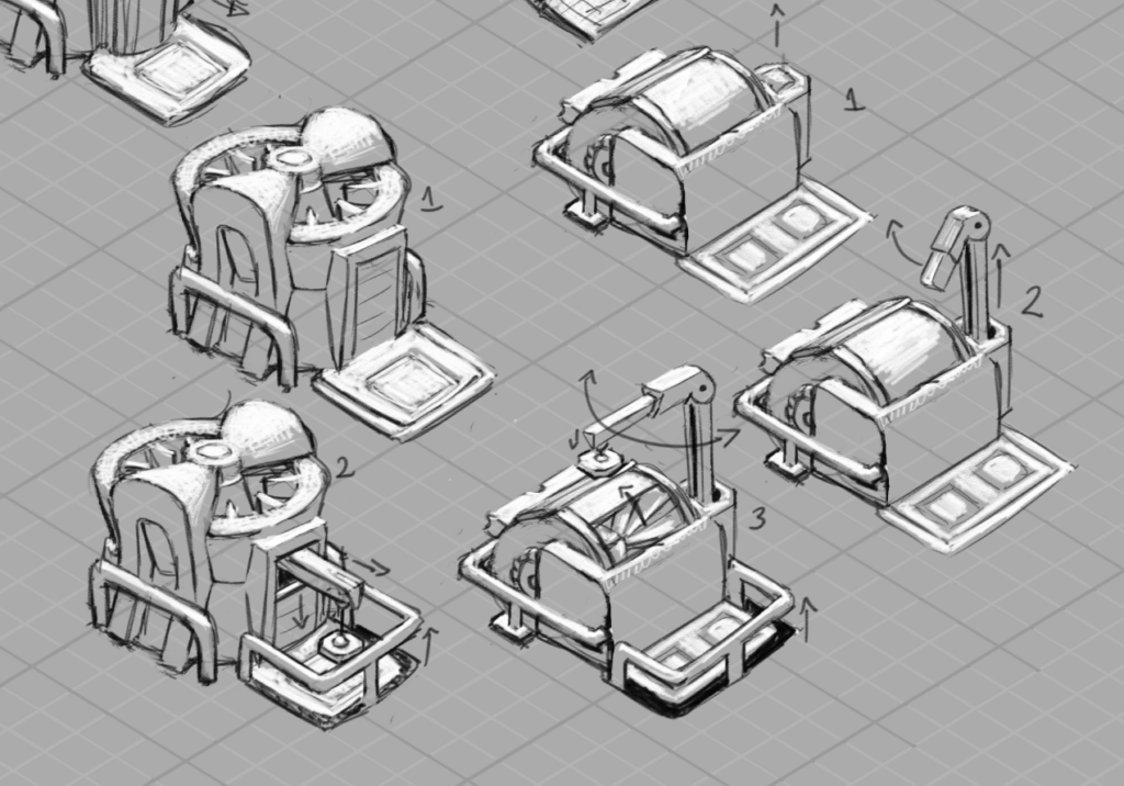
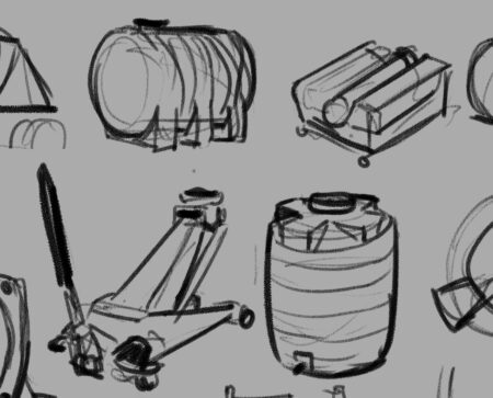
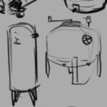
Firstup, we tackled some big ones: one of the things we wanted the player to get to work towards was processing raw materials — and that meant big processing equipment that could intake entire containers of raw material and spit out something different. These were a really fun challenge to keep in the same design language as our smaller machines while pushing the scale.
This is one place where our safety-bar themed style really helped — the ubiquitous bars were very useful as a shared unit of scale between the smaller and larger equipment – and in these early drawings they were a clear warning sign that I hadn’t fully measured out the scale relationships:
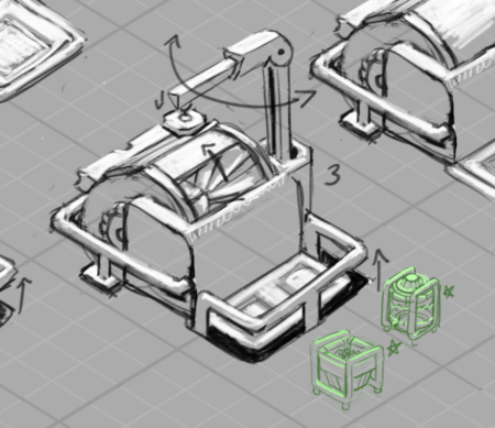
Here you can see the containers, when scaled down to a size where both could fit into that protected area on drawing 3, have safety bars about half or less as thick as the safety bars on the machine. Scale remained something we had to wrestle with and fine tune as we went, and we’ll actually come back to the containers in a little bit.
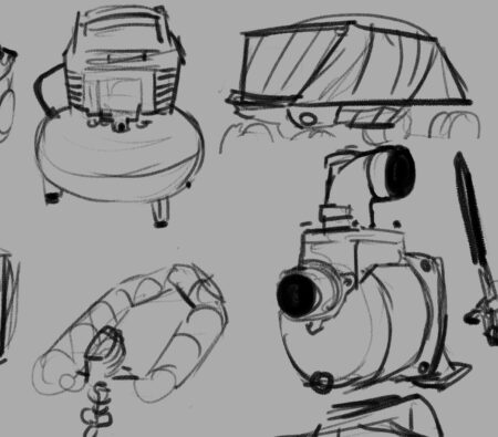
The other larger piece of equipment we needed was one that’s central to the demo — the crane! Here you can see a few of the different ideas we were exploring.

Key elements were: we wanted it to attach securely to the ground, and we wanted the player to feel like they had maximum options when it came to positioning its pickup and dropoff points. With those priorities and with our low-poly 3D outcome in mind, we ended up grabbing the legs from A and putting them on D — D felt like the most flexible in terms of how far we could spin or stretch the reach of the crane, and also the most simple in terms of modelling and animation challenges.
There were further edits and redesigns and tweaks and additional passes on a lot of this stuff — especially the containers — but I thought folks might like to see how we approached colour for the equipment! And that’s a HUGE question, so I’ll be saving that for its own post, alongside the epic journey that colour took while I was on the project.
-
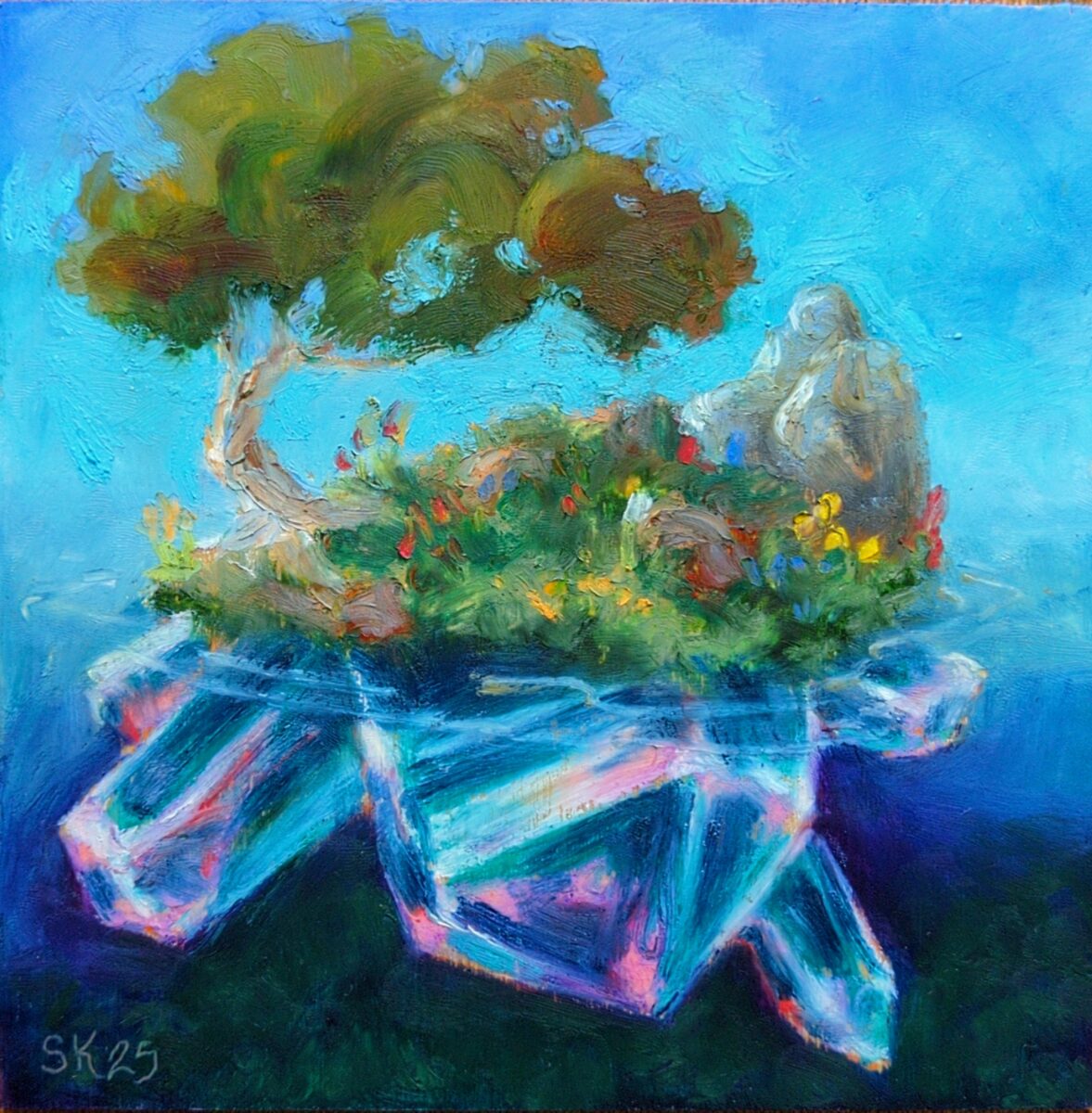
6 x 6″, sennelier oil pastels on unprimed wood.
My partner gave me the full set of sennelier oil pastels for my birthday last week and it’s been excruciatingly hard not to abandon all my other commitments and responsibilities and just play with them incessantly because they are an incredibly enticing and beautiful medium that really doesn’t feel like anything else I’ve ever used!
They are buttery soft, and instead of the consistent opacity of other brands, they actually have a range from opaque to fully transparent stocks, based on the pigments in them. What this means is that they work much more like my watercolours, and allow me to transfer over my payment and mixing knowledge from watercolours to these oil pastels! This also means that they can produce super vibrant mixes, which you can see at work in the crystals in this piece especially, but which really helped me being everything here to life.
Finally, they are so soft that even the gentlest touch with a fingertip or blending stump blurs and spreads the pastel around, making them a constant temptation to soften everything. In this piece i tried to balance my hard and soft edges, and i think the tree leaves are a great success in doing that in an appealing way. I’m very excited to try applying some of my Russian academic oil painting principles to solve oil pastels paintings in future; since i stopped using oil paints and solvents, i really haven’t had a medium available to me that can actually achieve all the fat over lean, hard and soft edges, glazing, and value grouping techniques I was taught. suffice to say I am pumped on this!
have you played with these before? do you have any advice, or questions? and what do you think of this somewhat amped up painterly approach?
-
Canadian here, and I can confirm that, while admittedly I have never seen a product list itself as a pencil crayon in Canada, we all agree that’s what coloured pencils are referred to as in conversation.
Now, certainly more research could be worth doing but, I have a theory… see, our packaging is mandated bilingual, and usually english first:
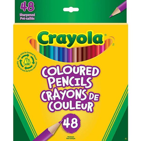
See how it reads as one long title?

Well, now, imagine kids throw that around for a bit till the verbal greebling is worn off:

Dunno what the official history is to this, linguistically, but this has been my working theory for some time.
-
Beautiful abstract video I found while researching music videos and synaesthesia
posted:
updated:
posted to: reccommendationsThis was a bit of a journey! First it started with me looking up Kid Koala‘s music videos, and being very charmed bythe tactile abstraction and simplicity of this one:
Which led me to look up the animation studio he had worked with, See Creature, and start poking around their portfolio of beautiful things:

…wherein I discovered this gorgeous abstract video, “Reflection”:
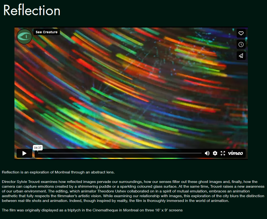
…and of course I HAD to watch that! and I loved it so very much!
Here’s the single window version:
And here’s the triptych, which contains its own amazing decisions regarding integrating three panes. Wish I could have seen this in person!
I love music videos, music animation, and especially abstract music videos! In history of animation in undergrad I remember learning about Oskar Fischinger’s interwar-period abstract animations, and how they led into Fantasia’s Bach sequence. mercifully there’s a beautiful scan of his Optical Poem on youtube these days!
Looks like Fishinger’s work is being archived at the Center for Visual Music in LA, another rabbit hole I absoLUTEly will be going down in future:
Center for Visual MusicWhile I know synaesthesia has a specific clinical meaning, it’s been a term I’ve really found useful to apply to multimedia realtime art – video, dance, games, theatre – to describe the particular effect of temporal unity in visual and auditory work. It’s not the only measure of combing sound and vision! But it feels to me to be similar to visual compositon and musical rhythm or mode – it’s an overall aspect that can build all sorts of emotional responses without necessarily dictating content whatsoever. I love to see it on display for its own sake, the same way I love to see a painting distilling its compositional choices down to one big bold simple statement.
Anyways, thought these were all lovely enough to share!
3 responses to “Beautiful abstract video I found while researching music videos and synaesthesia”
-
Great shares. And yeah, Oskar Fischinger is such a fascinating artist (I studied him too while at university). He was a populist at his core and really attempted to get at something universal with his work by setting abstract shapes and colours to music, something that anyone from any culture or language could appreciate. Since then it’s changed the way I think about abstract art, generally. His paintings are great too.
-
Yeah Fischinger and Kandinsky’s elaborate abstract motivations really helped me get excited about abstract art as well! Undermines the kind of reactionist stance that it’s about obscuring communication.
-
Yeah, absolutely!
-
-
-
-
I want to talk a bit about this tool!
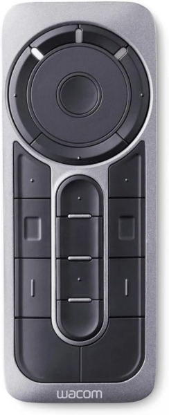
It’s put out by Wacom, who make those screen tablets and drawing tablets that you’ve probably seen artists reference online. Wacom are an old, maybe the oldest brand in that space, and while I wouldn’t describe them as hugely experimental, they do have the decades of experience to know what tools are actually useful for artists. Also, because they make a peripheral, they have to invest in interoperability, so there’s been a large ecosystem of people making accessories to use alongside your wacom tablet or cintiq for a long time now — which I think if they’re open to it, can reveal to a company what their tool is actually missing.
So I would argue that Wacom has everything it needs to make actually useful tools and actually useful peripheral accessories to those tools, and when I finally got my hands on one of these remotes, I feel pretty confident in saying that they’ve succeeded.
What It Is:
The Wacom Express key remote is a tool designed to be used one-handed, that can be programmed to various key presses or macros on your computer. You can program universal settings, or software specific settings, and you can get extremely granular.
There are 12 buttons in the lower chunk of the remote which each have decently touch-identifiable surface decorations and shapes; and then a scroll wheel style circle with a button inside it, surrounded by four more buttons at the top.
It charges its battery via a microUSB port, and has a toggle on the bottom to wake it up before using it. The battery lasts a decent length of time, and it is still usable when plugged in, which is helpful!
How It Works:
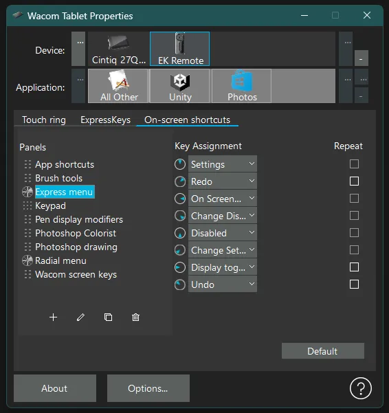
The EK remote’s key assignments are managed by the driver’s properties app, just like wacom’s other tools; you select your device in the top row, and then whether these are universal settings (All Other) or software specific settings in the second row. You can easily add any open software to the list by clicking on those “…” buttons on the side.
Then the main screen area of the properties panel underneath lets you select between the touch ring, expresskeys, and on-screen shortcuts; and within those are more subscreens enabling you to adjust every single aspect of this remote and how it works.
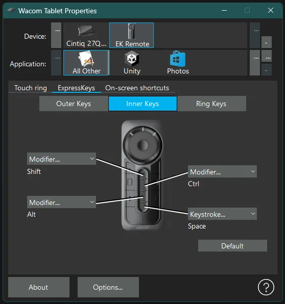
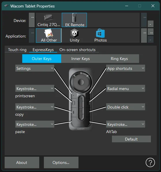
The center column of buttons comes preassigned to modifier keys – shift alt control and space. Outer buttons on the remote come assigned to other useful keyboard shortcuts such as undo, redo, save, etc, as well as to bring up submenus they call On-Screen Shortcuts, or a quick reference image of the button assignments so you can refer back without fully reopening the properties panel – especially useful as you start building out software-specific button assignment profiles and need help remembering where you put the Undo button when in, say, Clip Studio Paint.
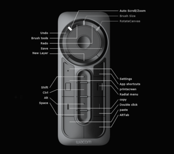
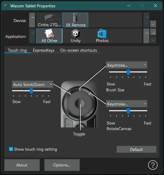
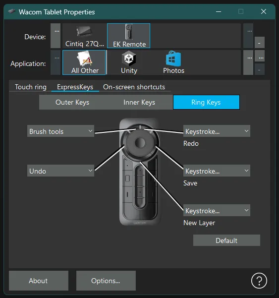
The button at the center of the scroll wheel works to change between three wheel functions, and you know which one you’re on because these are assigned and visible on the remote as little white lights above the wheel separating the buttons that wrap the wheel.
The scroll wheel can be assigned a wide array of different functions, some of them quite sophisticated, others as simple as simply giving each wheel direction a key press assignment and telling it how many key presses to do per stretch of movement as you slide your thumb around the wheel.
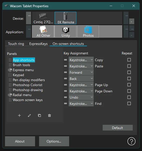
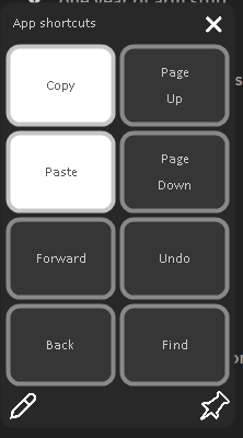
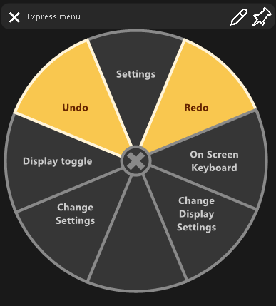
One of the things you can assign to a button is one of the built in On-screen Shortcut panels, which are onscreen popups that you can then assign further macros, keystrokes or such to buttons within.
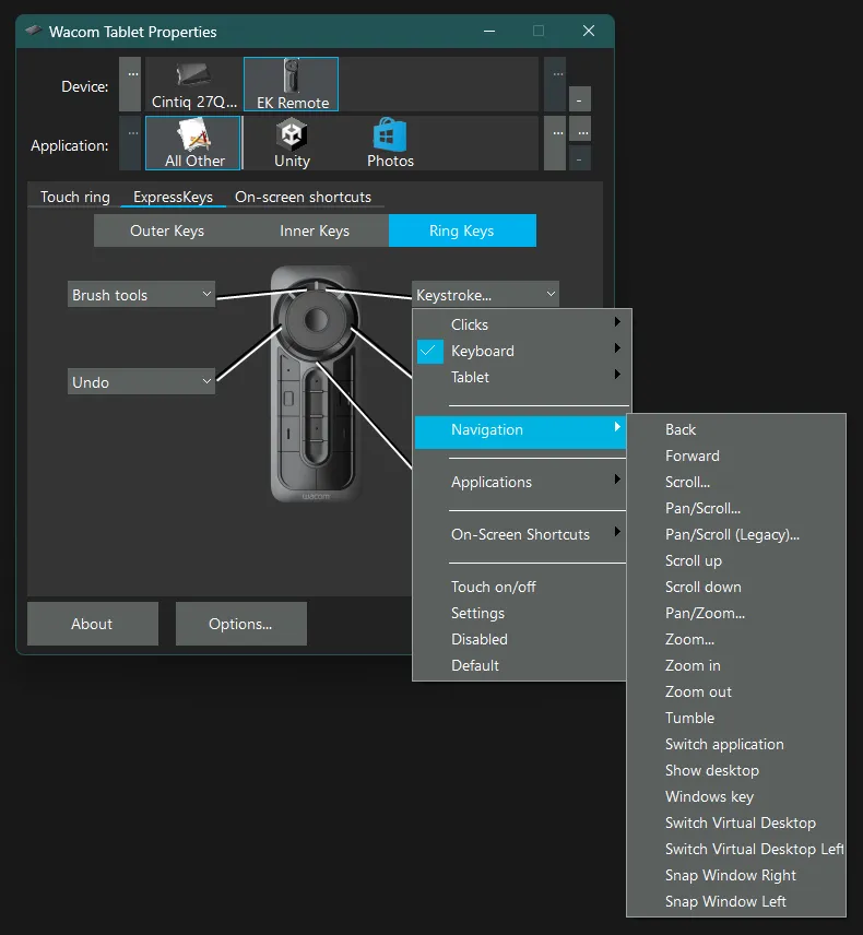
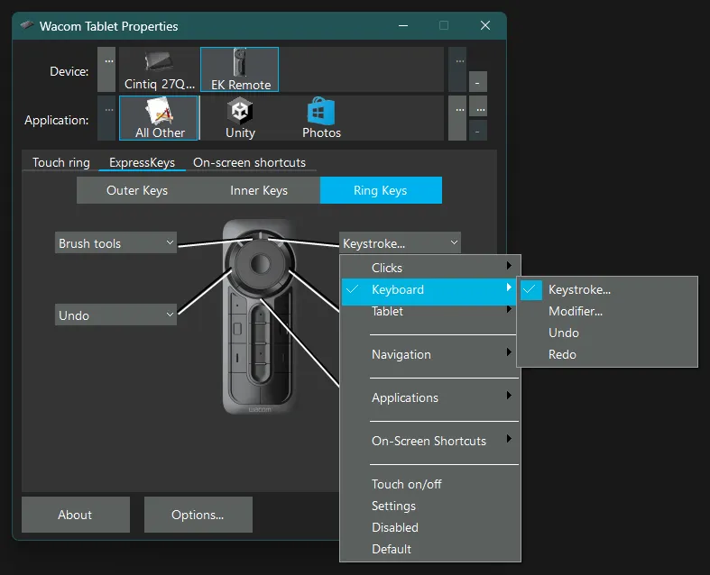
The variety of things you can assign to buttons (physical or in On-screen Shortcut panels) is HUGE – from basic keystrokes to modifier keys to complex types of mouse clicks to contextual things like back and forward navigation or alt+tabbing around your various open applications. It can even move windows around on your desktop.
Why I Like It:
If you’re an artist who works digitally, I probably don’t need to explain any further how useful this thing can be. When I’ve got my tablet pen in one hand, I’m able to program this to contain almost all of the keyboard shortcuts I’ve spent time learning to do with my other hand.
Additionally, the ability to program complex macros and also contextual submenus into this thing is super powerful for digital painting etc. For example:
- I keep copy and paste as buttons on this remote so that it’s easy for me to duplicate pieces of layers as I need to while painting.
- The modifier keys are extremely useful for navigating canvases using spacebar, adding or removing selections using shift control and alt, or accessing other modified tool settings.
- The scroll wheel can be used to zoom in and out, to adjust the rotation of a canvas, to increase or decrease brush size, or anything else that you might achieve in painting software with multiple taps of the same button.
- For example, in clip studio paint, you might access a whole range of different tools with the keyboard shortcut B, so to get to the tool you want, you just keep tapping B until you get there. And it occurred to me this morning that I might assign that to the scroll wheel on the slowest setting and stop having to move my hand to my keyboard to tap B over and over again whenever I’m looking for a specific brush.
- Undo and redo speak for themselves, and also an easy button tap for saving your work.
But I wanted to talk a bit here about how I’ve been using the express key remote in non-drawing software:
I’ve been using it in game engine work, and in data entry work, and it’s really been a big help!
As mentioned elsewhere here on my site, I’ve been navigating a very long recovery after a nerve graft that affected my dominant hand. I’ve moved most of my mousing and typing work to my left hand, and been trying to find ways to help my right hand contribute without the usual amount of dexterity. The express key remote has been a really incredibly useful tool for a lot of complex, keyboard heavy tasks that aren’t simply prose writing.
As an aside, for longer form writing (eg. this blog post), I do try and dictate as much as possible and then manually edit for clarity. It’s not perfect, and sometimes the fancier tools have really let me down, but it’s for sure the best way to get thoughts out of my head these days.
But for work that isn’t simply an infinite flow of text, but instead has me navigating, clicking around, typing in small snippets of text, copying and pasting things, tabbing through options, etc, the express key remote has been an absolute game changer.
In game engine work, there are huge hierarchical trees to navigate with shortcuts for opening and closing subtrees, enabling and disabling objects, and moving between elements to modify or adjust things.
Building out scriptable objects often meant copy and pasting values across a huge range of small fields, as well as alt tabbing between the engine itself and my documentation.
Right now I do all my mousing with my left hand, so moving from my mouse to my keyboard and back again to press copy and paste shortcuts (contextual right click menus being a little sketchy in some of the tools I use *cough* miro *cough*) has been a major repetitive strain on my arm, among other things.
Enter the express key remote: suddenly my otherwise not helpful dominant hand is able to hold this thing and take care of an enormous amount of keyboard shortcuts. Even system shortcuts like alt+tab can be programmed onto a button, and the ability to program software specific key assignments means whatever I’m doing in engine, I can make the EK remote work the absolute best just for that, without affecting my larger system shortcuts or the EK remote shortcuts I end up setting up in my documentation. And in addition to adding navigation shortcuts, and copy and paste shortcuts, the modifier keys also remain extremely useful.
Some Complaints:
There are a couple of frustrations that I have with the remote, I won’t lie.
It’s not the most ergonomic thing to hold in your hand. Clearly their design priorities were to create something that could sit flat, almost flush on a cintiq screen, so that this remote works as a substitute for where there used to be built-in buttons on previous models. This makes it a slippery, somewhat awkward thing to try and hold in a hand with lower dexterity. However, it does magnet onto a cintiq screen quite firmly, so if you do have a cintiq, you’re able to operate it with your hand gripping the full side of the screen as well, and sometimes that can be more ergonomic.
Another frustration is that it is somewhat challenging to press multiple keys at once, but there could be a lot of potential power in combining those modifier keys with other programmed shortcuts! For example doing a ctrl+v shortcut to paste something, and wanting to add in a shift modifier key to paste without formatting. It’s not impossible to do by any stretch, and I’ve done a fair amount of it now, but you get the feeling that they did not plan for that use case.
Finally, while I certainly do not have huge hands, my hands are not particularly small either, and it’s still noticeably a reach for me to operate the bottom buttons on the remote and the top buttons on the remote without adjusting its position in my hand.
I’m not sure how many people who use these have that problem, but I know it’s not just a consequence of my low dexterity hand, as when I am drawing I draw with my pen my right hand and the EK remote in my fully capable left, and I still have the same reach problem. However, this has simply led me to put my least frequently used shortcuts on the top buttons, and frankly that’s worked out fine. Benefit of this level of customization, I guess!
In Summary:
If you do a fair amount of technical work that has you moving between mouse and keyboard, and repeating particular shortcuts, key presses or macros a lot, I would bet you could find some use in this tool, with or without a drawing tablet or a digital art practice to support it.
In addition, it’s always good to mix up your tools to reduce repetitive strain on your arms, so if this seems like a decently ergonomic solution for you, it might help extend the lifetime of your wrist tendons a little by giving them some variety. (If your tendons are particularly cranky, of course, talk with an expert about your particular situation.)
They do sell them solo, though like everything Wacom makes they’re not cheap, but they do tend to last a long time! And that means there’s a pretty good second hand market out there.
I’d also bet that there are people who got these with their cintiqs who extremely do not ever use them at all, simply because artists already have solutions they like. If you know someone who might have one they’re not using, I bet they would let you try it and see what you think.
For me, it’s a favourite tool and one I am regularly tweaking, adding new shortcuts too, and finding new uses for.
Got one yourself that you’ve gotten some use out of? I’d love to know what it’s done for you/how you’ve hacked or tweaked or otherwise improved yours! Hop in the comments if you like!
2 responses to “Recommended: the Wacom ExpressKey Remote”
-
oh my god I want one. I have so many different computer based hobbies, and so many RSI problems QQ
I already use my old school wacom tablet for weird stuff like audio/video editing, which I couldn’t do with just a mouse without hurting real fast. (besides actually using it for visual art)
-
yesss I also use my tablet pen for tasks that would mess up my wrists otherwise! if you can get your hands on a remote I def think it’d be worth trying.
-
-
Shoutout to Jurie and Andy for sharing this gem with me; deeply british, dry, spooky, sweet, and shows you the tip of the iceberg of a larger occult understanding that is revealed further through rewatchings and the subsequent mulling over you might do at the pub after with a friend.
-
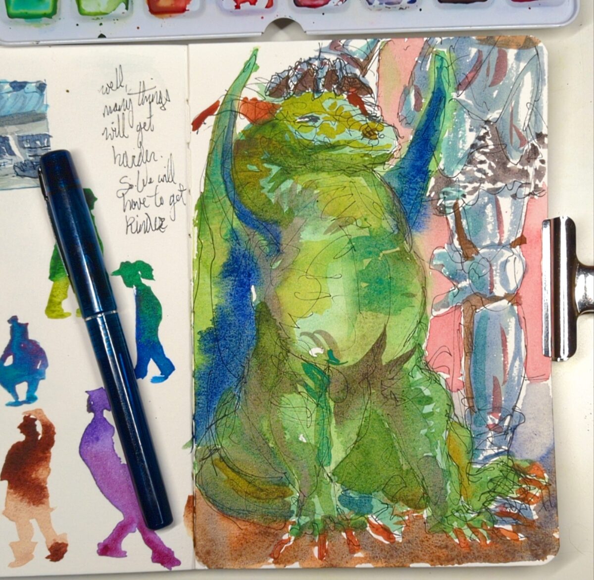
Get scrungled, as they say.
Watercolour and carbon ink.
I decided go back in and see if I can’t push the clarity on this further with gouache and I think it really helped!

My photodocumentation is such shit in the winter with no natural light available, sorry. Maybe I’ll scan some sketchbook pages this year! But don’t count on it.
Leave a Reply