-
Shing Yin Khor’s “Make Little Guys”
posted:
updated:
posted to: linkstagged: building block, link, little guys, manifesto, recommendation, sculpture, shing yin khor, videoWe’re all getting bombarded, and the fight, flight, freeze response is probably flooding your brain, and I too am feeling paralyzed by the constant internal question “what can I even do about ~everything~?!” —
— and this piece – manifesto, poem, performance – from Shing Yin Khor’s patreon popped up in my bookmarks-to-revisit and reminded me that zooming in on something like a Little Guy can be a wonderful empowering connecting experience.
So here, go, enjoy, hold on, challenge the aggressive flood of learned helplessness the world is throwing at us all right now:

leave a comment
-
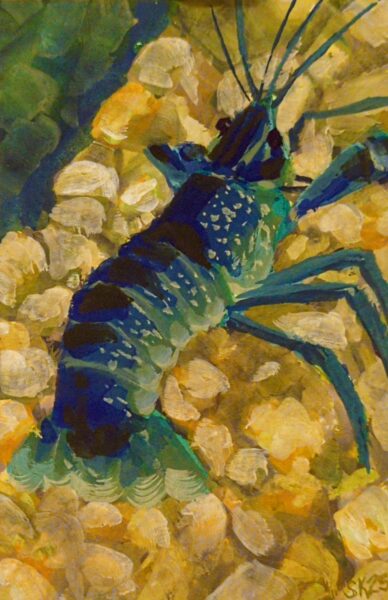
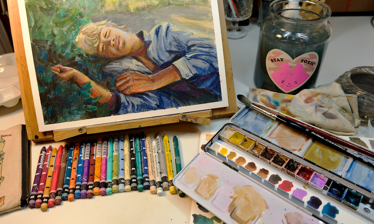
4 x 6″ gouache prawn. I decided to try using some drying time extenders – glycerine, watercolour blending medium – to try for more of a wet in wet blend approach, but honestly it was hard to keep the paint thick enough that it wasn’t just running all over the page. Something to retry in future on either more absorbent paper or with more viscous, fresh gouache.
leave a comment
Leave a Reply
-

Drawn on very, very smooth paper, a mistake I will not make again. Photo ref taken from my database of plants that I have grown (intentionally or not!) in my garden over the years.
leave a comment
Leave a Reply
-
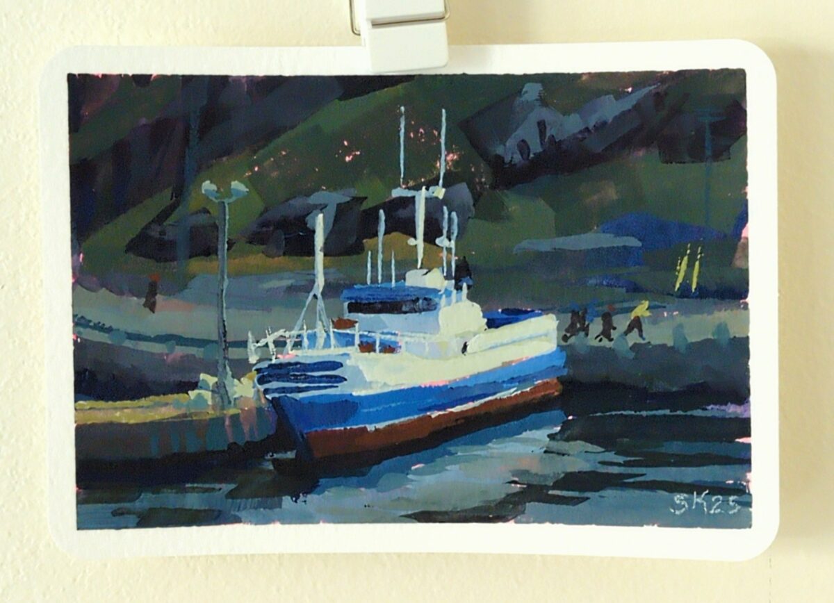
Painted this gouache study on a 4 x 6 postcard, from a photo I took on a winter visit to St John’s, NFLD, from years ago.
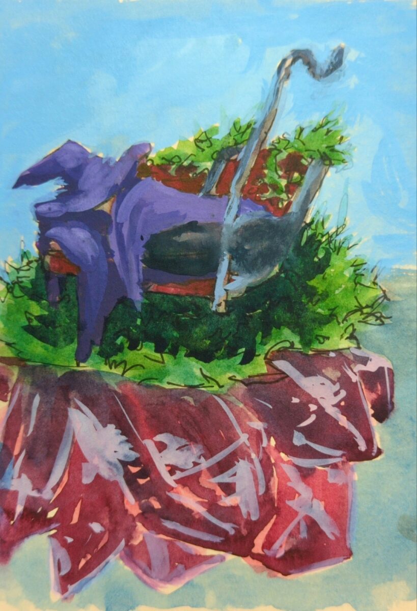
I was reminded that much of the appeal of painting in gouache lies in the brush strokes, and the quickest route to intentional brush strokes is to use the biggest brush possible. IIRC, James Gurney says to “use the biggest brush you can get away with.” So this 4 x 6″ study was painted with a 3/4″ flat, and the next one I’ll try a full 1″ flat I think.
Thing is, after using these brushes for years, I do know how to get tiny marks out of them – I painted the joggers, the posts and antennas and floodlights all with that one big flat. So the trick is to try not to make tiny marks – solve the painting with the biggest marks you can make. Something to remind myself of on the next one.
leave a comment
Leave a Reply
-
Drawn from pinterest ref with my FPR ultraflex nib over an undersketch done with a long blade nib and washed into the page with a waterbrush.
2 responses to “Fountain Pen Sketching”
-
this is lovely, I love this one
-
heck cheers!
-
leave a comment
Leave a Reply
-
-

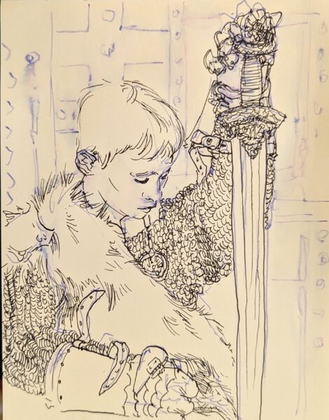
Haven’t drawn a Conan in a while, so, tried my hand at it. Fountain pen is such a delight to sketch with! This was drawn with an FPR Ultraflex nib, tho I dunno if I was really pushing it to its limits with this one.
leave a comment
Leave a Reply
-

Painted in my sketchbook with neocolor iis over a fountain pen sketch. Reffed from pinterest. After having my ass kicked learning to draw boats for a game in 2021, I can’t stop thinking about them! Little boats especially I find so incredibly cute.
leave a comment
Leave a Reply
-

Sketchbook page, fountain pen and neocolor iis and a waterbrush, layered and layered and layered.
I think there’s something here but it’ll take a fair bit more reworking to really see it. An idea for later.
leave a comment
Leave a Reply
-

I started thumbnailing out my wizard puberty zine! I think there’s another edit pass on the text ahead of me though; I’m gonna do the first ten or twelve pages, maybe all the way to finish, so I know sort of what my visual language IS, and then go back to the text one more time.
leave a comment
Leave a Reply
-
I came across detail shots of these on tumblr and had to go questing for more, and while it seems likely I’ve seen Levon Biss‘s work before, it’s been amazing rediscovering it after dipping my own toes into amateur macro photography.
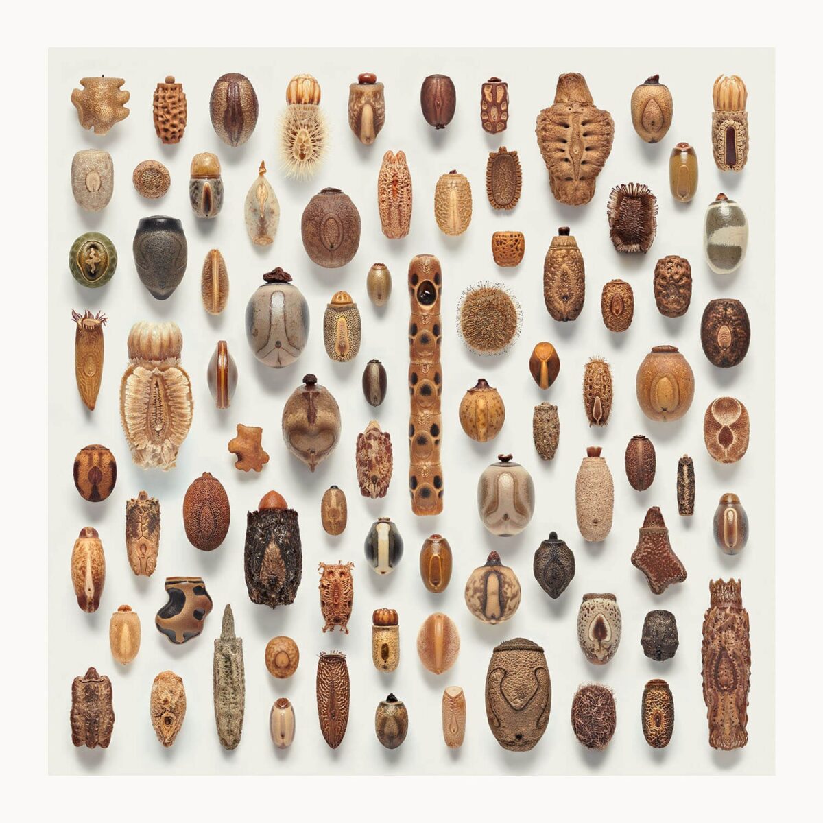
Sometimes these days when I watch movies or play games that use speculative designs, I find myself able to namedrop the visuals they reference simply because Cool Visuals Online have such a consistent cycle of being rediscovered by the next of Today’s Lucky 10 000.
Insect anatomy. Poppy seed heads. Crabeater seal teeth. Transparent fish. Olms. Petra. Brutalism. Mont Saint-Michel. They are striking visuals and it’s natural to use these as starting points for something fantastical or futuristic, but it does give me a strong case of

when they remain fairly surface level and recognizeable as references. Hopefully people who don’t work in concept art aren’t nearly so sensitive to this stuff!
But it does leave me giving myself anxiety about what visual references are useful and novel and interesting whenever I get to approach something fantastical as well, and so when something hits my eyeballs that fully stops me in my tracks I really have to grab and hold it. These phasmid (stick insect) eggs are absolutely doing that to me now!
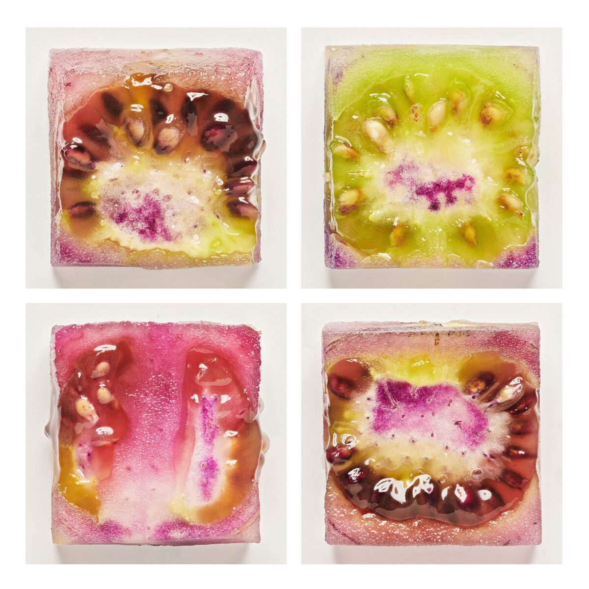
That said, browsing Levon Biss’s website, it’s hard to say if it’s the essence of the subject matter that is giving me such a hit of novelty, or the photographer’s treatment of it. Say what you will about knolling and similar urges, but Biss really has an eye for presenting things in surprising and exciting ways. Look at these cubes of genetically modified tomatoes!
In concept art, you always have to balance novelty, interest, and clarity (something I need to write about more myself on here). Fine art photography has totally different pressures and goals.
Biss’s photography doesn’t need the viewers to be able to read the contents clearly – and in fact kind of relies on them not, despite the framework and performance of clarity – so while it is immensely satisfying for me to look at, it can’t translate one-to-one into a videogame item or cinematic set piece without some additional elements that give the audience information that takes them from surprising objects or visuals and turns them into little lenses that can tell you about the fictional world.
Which is why I want to turn all those phasmid eggs into collectible hats.
leave a comment
Leave a Reply
-
More neocolor II crayons on hot press watercolour paper! Learning these is taking some time; unfortunately much of the content on youtube about them is people trying them for the first time, and that’s really not helping me unlock their secrets! But as I keep digging I am finding more folks at least systematically testing them out.
I am also systematically testing them out – next up will be to do a gouache piece and work these overtop; and also to test out how they interact with my prismacolour pencil crayons. I also want to test these solo on midtone or darker papers; and I want to see how they could work as underpaintings with oil pastel work on top. They also advertise themselves as extremely substrate-agnostic, and promise functionality on “paper, cardboard, glass, wood, leather, fabric, stone” and so forth, so there’s a lot more experimentation possible ahead of me. Mars, an artist I know over discord, told me they use these for monoprints too! which sounds extremely fun and honestly I haven’t explored monoprinting at all so far as an artist! But we might be enterinbg the dangerous realm of scope creep with these revelations, so for now I’ll focus on a gouache layering test next and take it from there.
Have you used anything like these before? How else are they fun?
leave a comment
Leave a Reply
-

Neocolor II crayons on hot press watercolour paper. This is my first piece done entirely with the neocolors – putting down layers, washing them into the paper, and adding more on top, over and over. They’re very fun, but it does require some hand strength to press them hard enough to get the richest colour laydown. Not the most accessible for me yet, but in counterpoint: so convenient!
leave a comment
Leave a Reply
-
I got a gift card in return for doing a friend a favour this winter break and I decided to spend it on caran d’ache neocolor II watersoluble wax crayons. I’ve had a couple colours for a while and not really … grokked them? But with a broader range of colours and values I am starting to see how these can work!
Shoutout to these artists’ videos for helping me understand what these are good at:
I’ve been exploring adding dry media on top of watercolours and gouache paintings for a while now – I don’t usually even get out the pencil crayons except for this purpose – so for me I think the most exciting use case of these is as a medium somewhere between pencil crayons and oil pastels. They’re much easier on my hand than the pencil crayons, and they can lay down a field of texture so easily; and where oil pastels are just pure satisfying pigment, they are too messy for many contexts.
The watersolubility is also a standout element – being able to gently hydrate them, let them absorb into the page, and then being able to layer even more paint on top? That’s a very flexible practice.
I’m excited to push them farther!
leave a comment
Leave a Reply
-

Berkey-inspired, done in one of muji’s very cheap and much-nicer-than-expected sketchbooks.
leave a comment
Leave a Reply
-
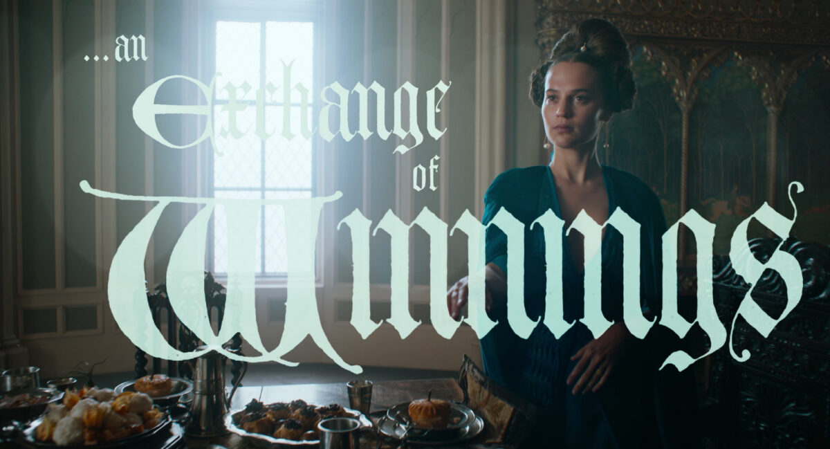
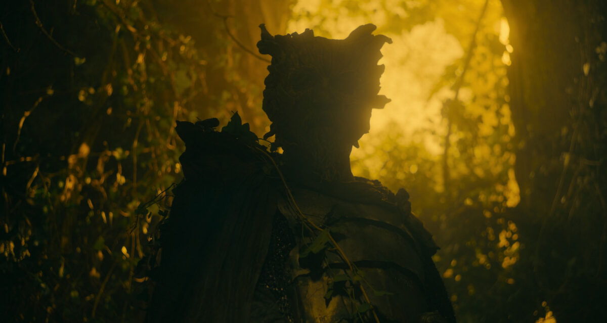
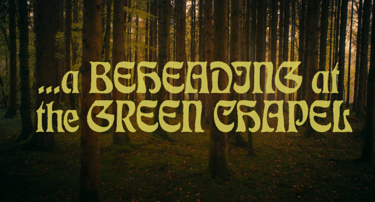
A Wizard of Earthsea and the Green Knight
posted:
updated:
posted to: mediatagged: A Wizard of Earthsea, arthuriana, books, fantasy, gawain, ged, media theory, structure, the green knight, ursula leguin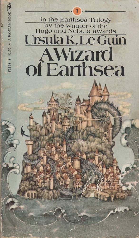
I’m rereading A Wizard Of Earthsea, and there is so much more Green Knight in this story than i ever noticed before. I wrote this up on tumblr in November, and I’m reposting it here for posterity, mostly mine.
In summary: I think it follows many of the same beats and deals with the same themes of destiny, pride, great acts, submission to duty/destiny/fate, and erasing of the self. But allow me to go into detail:
(spoilers for the Wizard of Earthsea below)
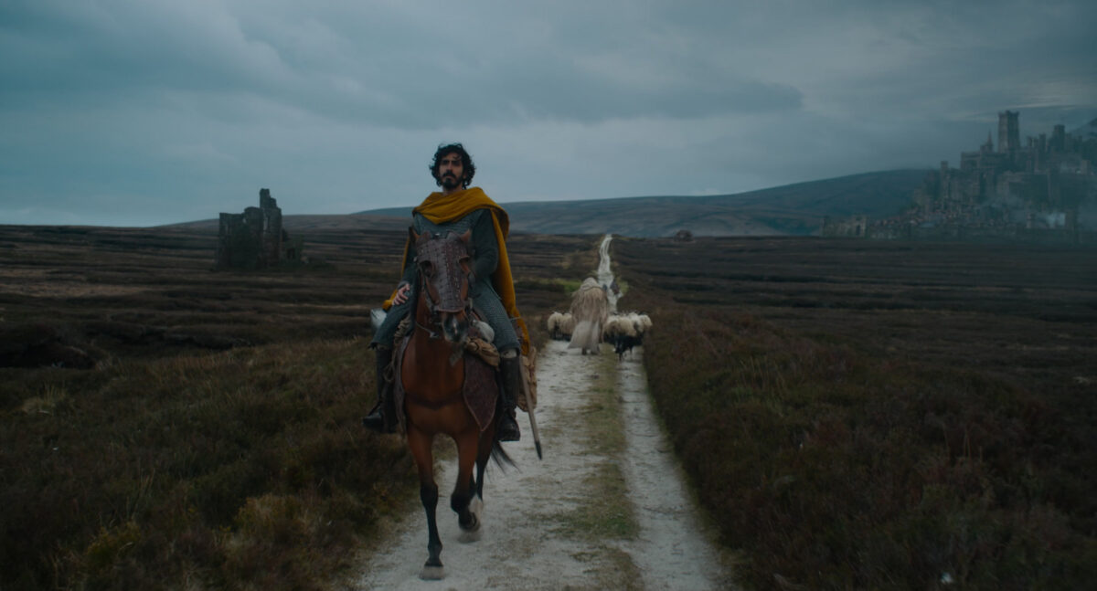
(spoilers and screencaps from The Green Knight film below)
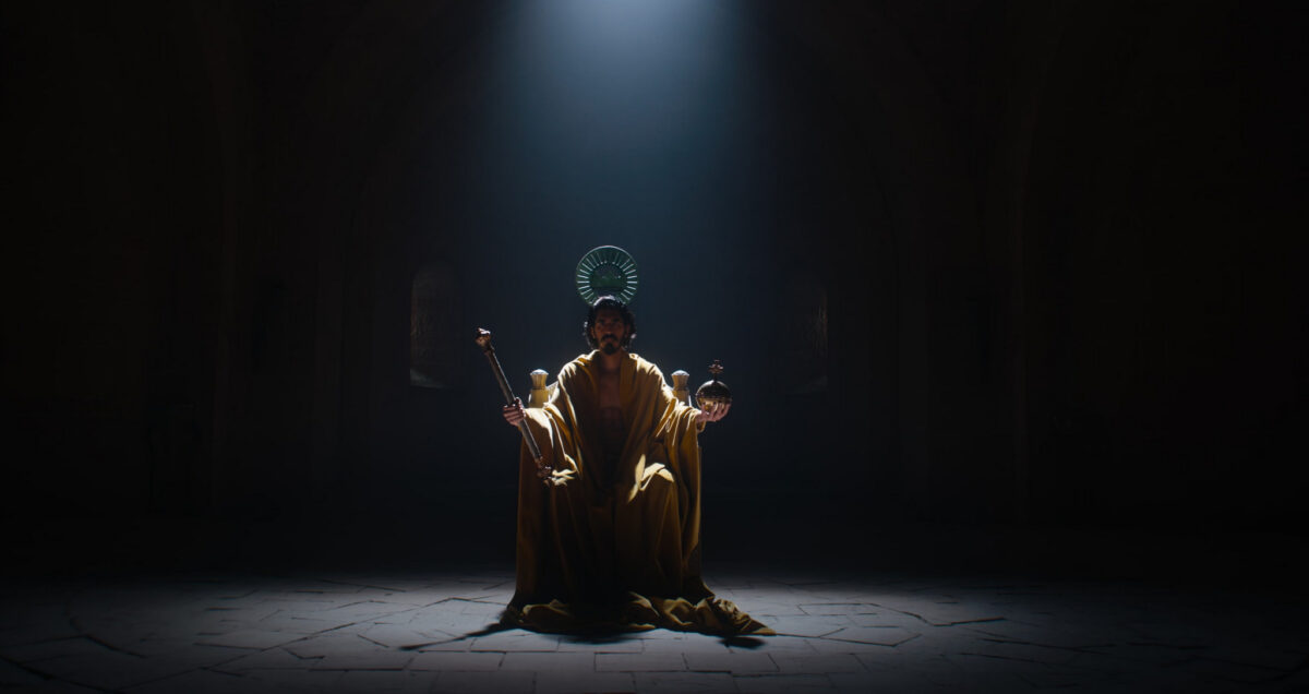
(dev patel for ged in a future adaptation filmed by someone who knows how to film the unfilmable please please please)
first we have ged, a proud boy of humble origins finding himself in a place where he has been told he has potential, power, capability, a destiny — and we the reader are told he will be a Great Man, go on to do things that change the world, become myth

but he can’t see any of it yet – he’s trying to be good, but really he’s feeling a bit purposeless, and he gets caught up in the confusion and frustration of youth

but! it’s solstice! a festival! and games are afoot! and young, ambitious, and desperate to prove himself, Ged takes on a challenge out of pride and hubris — and it goes wrong in a way he could not have imagined – he opens the door and lets in the shadow, right?

and the terms of that mistake are: it is his burden and his alone now. No one else can deal with it for him. And it is transparently a mortal danger from the start.

but he doesn’t have to deal with it immediately! he has time to prepare himself. but he doesn’t know what he is up against – no one does! so preparation feels somewhat futile.

And then it is time for him to go forth. And he tells himself he is prepared, that he is noble and capable, and that he is on a noble quest – but he can’t ignore it. it is a doom as well as a quest.
He is offered false (or true but impossibly costly) protection/aid by a dragon and resists it. He is a good man and he is trying to do right, but he made this choice earlier and it compromises his ability to do right. He is vulnerable because of it.

he nearly dies.
he is humbled again and again, and in his darkest moments he becomes a puppet of fate, arriving on the sandbar to receive and give basic kindness to people so ill done by, so ruined as to seem almost beyond life, who reward him for it.
but he doesn’t understand the gift they give
great history is happening around him and he cannot engage at all with it, he is trapped inside his own quest.
and as he becomes more afraid and the fear controls him, he ends up trapped in a castle, courted, kind of, by a woman who would subvert him against her lord’s wishes.
She wraps him in gold and furs and he becomes a rare treasure until he realizes what is happening.

She promises him protection but it becomes clear to him that he is worth more to her while in this doomed state, and he confronts the trap. Escaping it reduces him to almost nothing – he is nearly lost as a hawk on his way out. All he takes with him is the doom he owns.

and finally he knows he must go to meet the challenge despite the horror of it

he submits to his fate as an intrinsic part of himself

in fact by turning to meet it the horror lessens, the haunting is reversed, and he becomes the pursuer – there is an incredible clarity and beauty for him now
but only once he accepts he must pursue it to the edge of life and death.
and he knows that everything hinges on this confrontation. if he fails, and the gebbeth takes his body, he will rise to great power as a shell of himself, housing only fear and darkness

so he must own it fully, he must entirely accept his own fate.

…and then he is reborn from the edge of life and death, which is perhaps a twist on many green knight interpretations
LeGuin was very interested in balance and cycles and the wheel of the seasons and the intrinsic ties between dualities, so for an arthuriana reference, this makes a lot of sense to me? But i haven’t noticed till now! The movie really made the Green Knight stick in my mind in a way reading it decades ago as a teen did not.
Would love love love to hear actual arthuriana folks’ thoughts! Or if anyone knows of other writing on the subject!
leave a comment
Leave a Reply
-

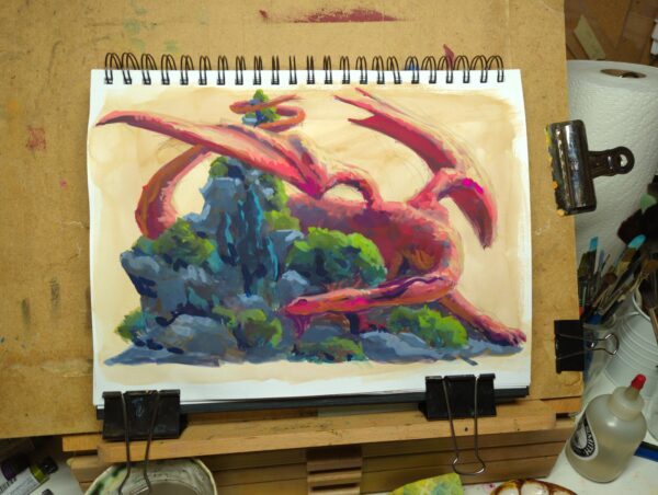
Gouache and pencil crayon on paper. Some detail shots for the texture:
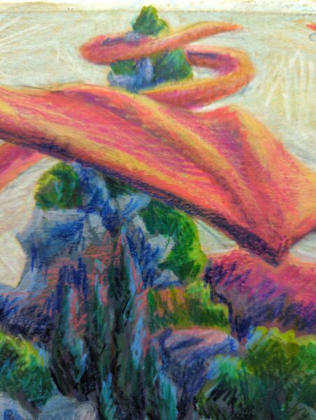
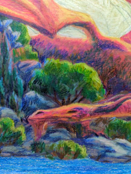
And here’s the piece at the gouache only stage:
leave a comment
Leave a Reply
-
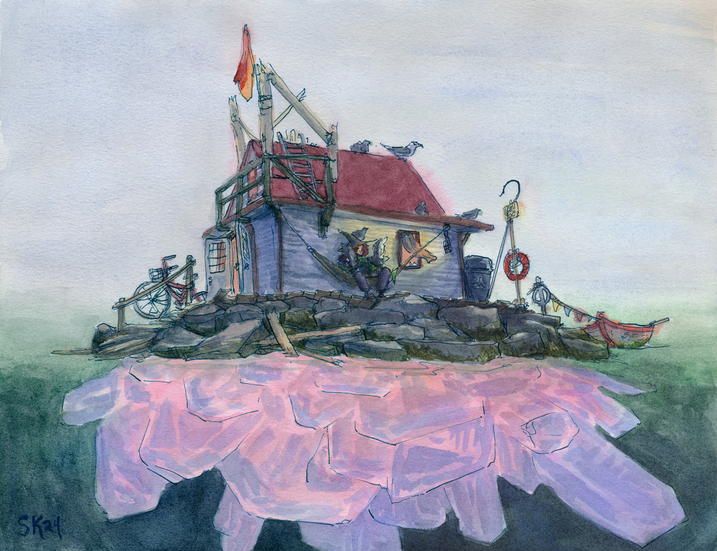
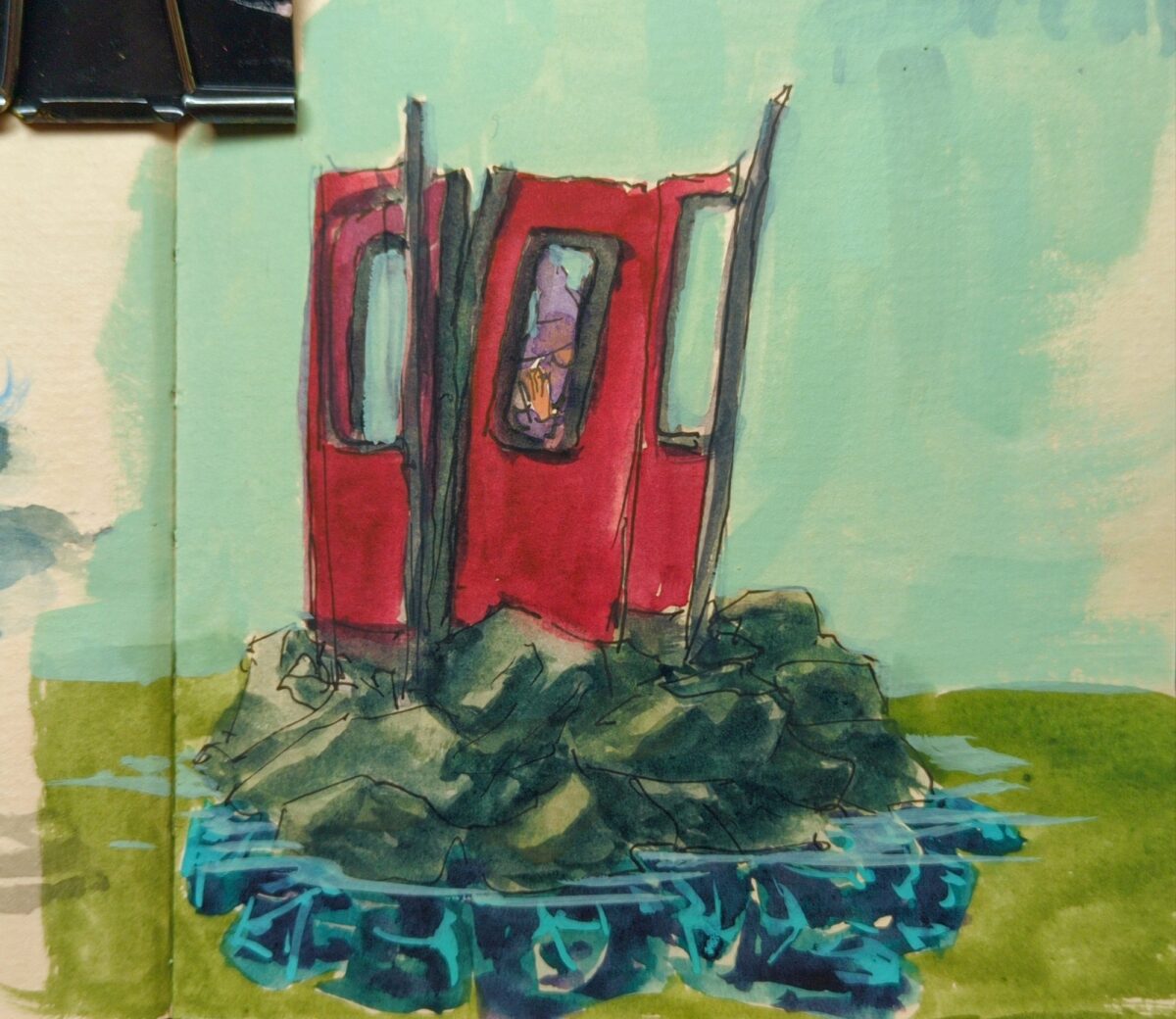
Watercolour on paper.
I’ve been thinking about adding people to my crystal islands – and adding little urban elements as well. Bits of Toronto at least. We are a lake city after all, and these crystal islands were absolutely first and foremost lake islands. I don’t know yet what I might call this series but Bits of the City seems like a good start.
I’m not quite back to full power precision with my painting etc, which has left me frustrated about small moments all over this painting, but on the whole I really like it. What do you think?
Actually, important question i’d love to hear your thoughts on: is this sad?
leave a comment
Leave a Reply
-

I loved the sketch for this and the painting isn’t quite capturing it, so I’m wondering if, at this WIP stage, it might make sense to go in next with pencil crayons and see if i can’t capture more of what I’m looking for gesturally.
leave a comment
Leave a Reply
-
watercolour, including some amazing shimmery blues gifted to me by a friend, white gouache, metallic gelly roll pens, white pencil crayons, and tense neck muscles.
leave a comment
Leave a Reply
-
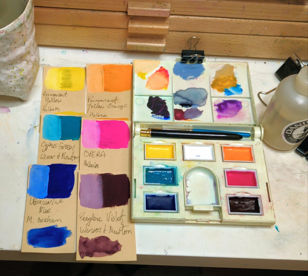
I swatched out all my gouache tubes this weekend (a great low stakes low light activity for riding out a migraine) and then used my newly organized info to put together a limited palette.
I keep thinking I’m going to do more urban sketching, more plein air, than i really make to get to, but whether this palette leaves my house much or not, I’m excited to challenge myself to stretch seven paints as far as i can.
The colours:
- permanent white, Winsor & Newton
- permanent yellow, Holbein
- permanent yellow orange, Holbein
- opera, Holbein
- perylene violet, Winsor & Newton
- ultramarine blue, M. Graham
- cascade green, Winsor & Newton
I poured them into full pans and dropped in a little bit of glycerine to help them rewet better after they dry out between painting sessions. That said, the perylene violet and the opera paints are absolutely nightmarishly un-rewettable sometimes, so they both got double the glycerine that the other colours got.
A traditional six colour palette has a warm and a cool red, yellow and blue paint; for this one, i pushed that framework a bit. Quite a bit maybe. For one, there’s no red, and I’m counting that orange as a yellow, and cascade green is my cool blue. But you can mix a pretty saturated red with magenta and orange, and cascade green mixes gorgeous purples despite the green in its name.
I suspect it’s going to feel like a warm palette overall with some very cold greens, and I’m excited to stretch it to its limits and see what i get 🤘
leave a comment
Leave a Reply
-


I’ve got a few iterations I’m exploring here and I’m thinking these might be worth doing full paintings of at some point.
leave a comment
Leave a Reply
-
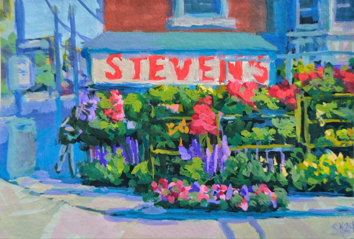
A lovely array of flowers i used to walk by every day after work.
leave a comment
Leave a Reply
-
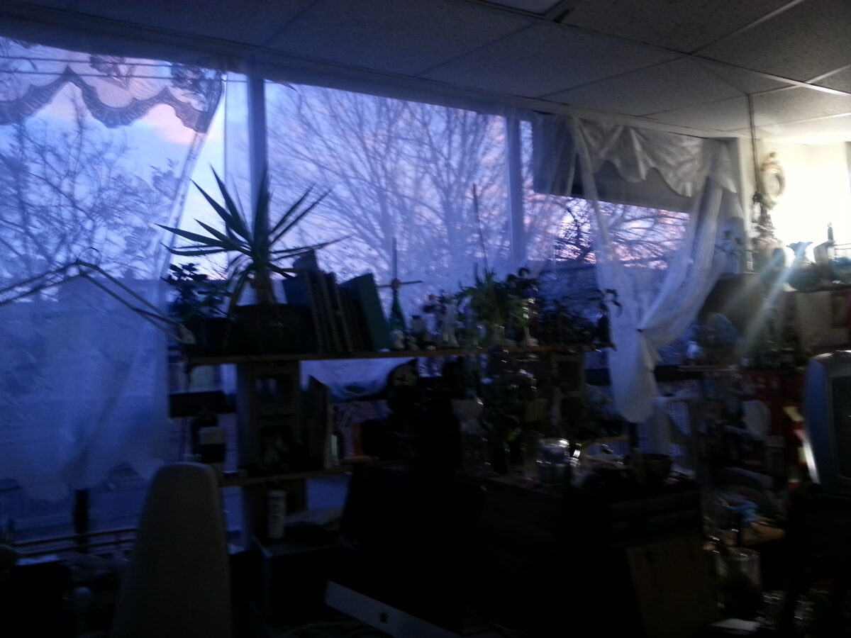
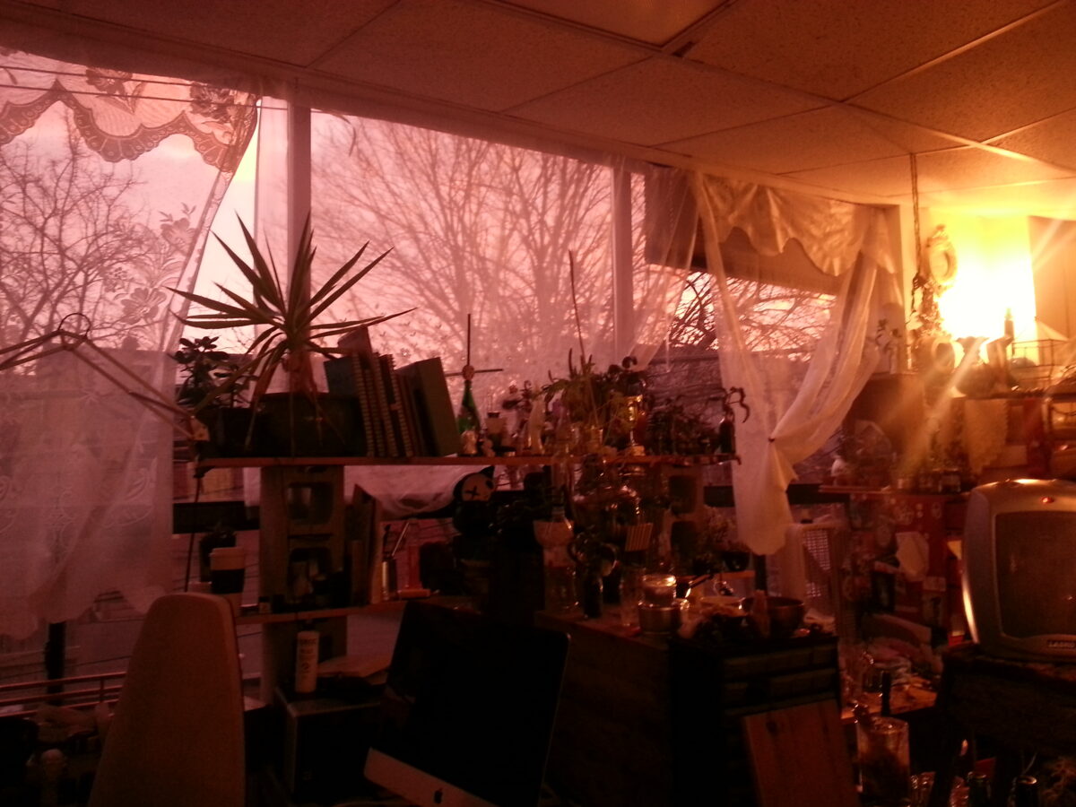
Okay, this first in-depth cellphone photography post is going to be about white balance.
One of the things that I often struggle with is getting the colors to look right on my phone. If you’ve ever tried to photograph a sunset, or anything at twilight, or anything in a dramatically lit room, you might have noticed your digital camera on your phone kind of taking the juice out of the colors a bit. There are lots of complexities to how cameras capture color, and I’m not about to give you a magic answer that solves every problem, but the understanding that I’m about to share here was a huge help for me and has made it a lot easier to get colours on my phone camera much closer to what I can see in front of me.

sunset with most of the image feeling very grey 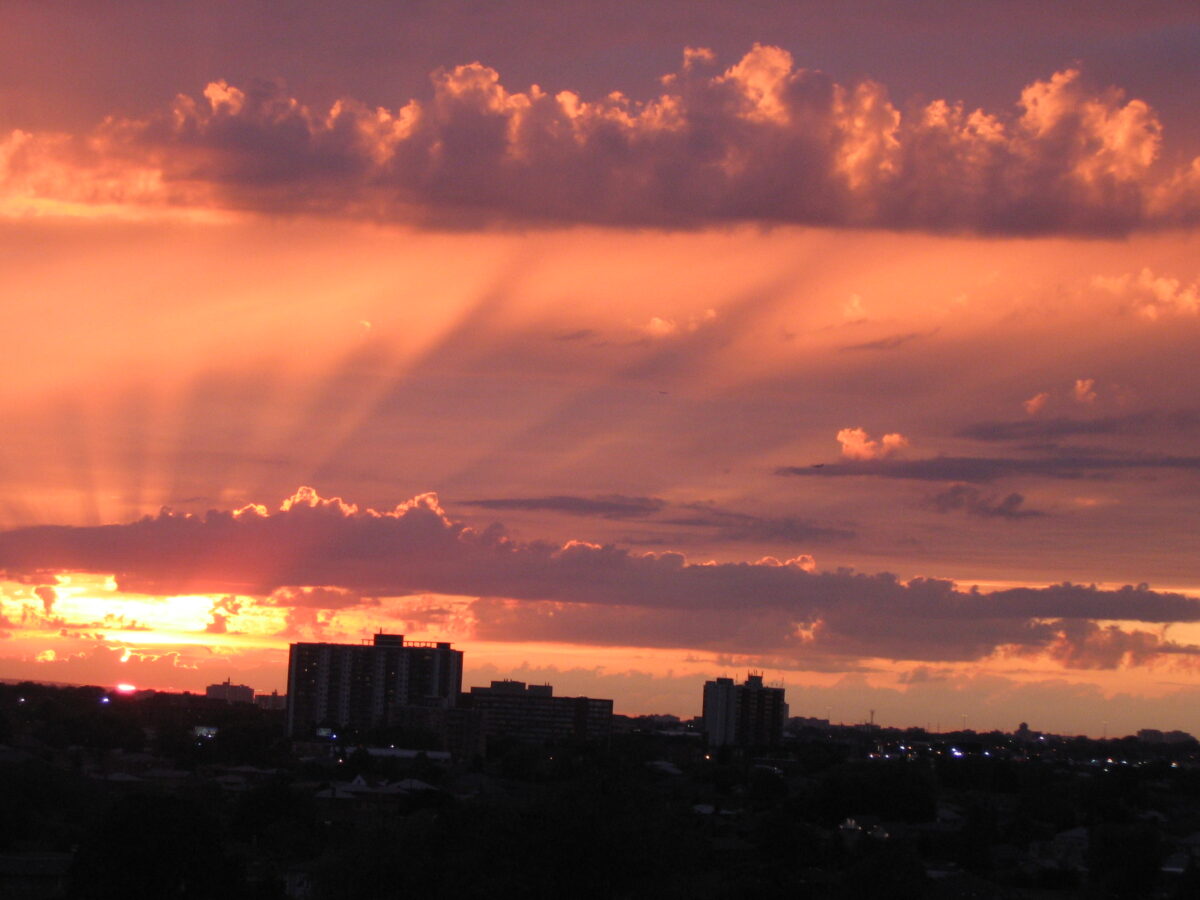
sunset with most of the image feeling very colourful and pink and orange White balance as a term is referring to how the camera is assigning colors to what you see in front of you. Unfortunately it turns out that color perception is a relative phenomenon, and while we do know the wavelengths for particular colours, the way that our eyes perceive those colours is not fixed and absolute.
To get maximum information out of any scene our brains tend to move color around a bit. If you’ve ever been in a room lit only with red, and then stepped outside into a room lit by a white light, you might have felt colors move and shift a bit on you. Probably the easiest way to prove this to yourself is to close one eye and use the other eye to look only at something very red for a full minute. Then close the red eye, open the other eye and flip between them to see how your brain is trying to deal with this dramatically different input.
Enough about brains though, we’re here to talk about cameras.
So firstly: a digital camera is not necessarily able to capture the entire breadth of colour in the visible spectrum. (Have you heard of non-photo blue pencils or ink or paint? It’s called that because it really doesn’t photograph well.)
Your digital camera also (along with any and all digital displays) cannot display the entire breadth of colour in the visible spectrum. It can display even less than it can capture, I believe.
FYI: the subset of colours that a given technology, medium, or such can display, compute, capture, etc, is called its gamut. Your screen has a gamut; a printer has a gamut; the human eye has a gamut; a bird eye has a gamut; your watercolour palette has a gamut. The gamut describes the colour hues (if it’s red, yellow, green, blue, etc), the colour vibrance or saturation (how intense it is, or how greyed out it is), and the colour values (how light or dark it is) that can be displayed or captured.
Now, while our brains can shift the emphasis of colours around a bit, we do perceive the full breadth of the visible spectum (under ideal circumstances and with full use of all rods and cones in our eyes, which is not universal), but digital cameras? Because of their reduced display gamut, they have to choose which colours to discard, combine, ignore, etc, to squeeze more data down into what you see on screen.
They have to translate from the spectrum we built them to perceive, down into the display gamut.
That choice / that translation is called the white balance.

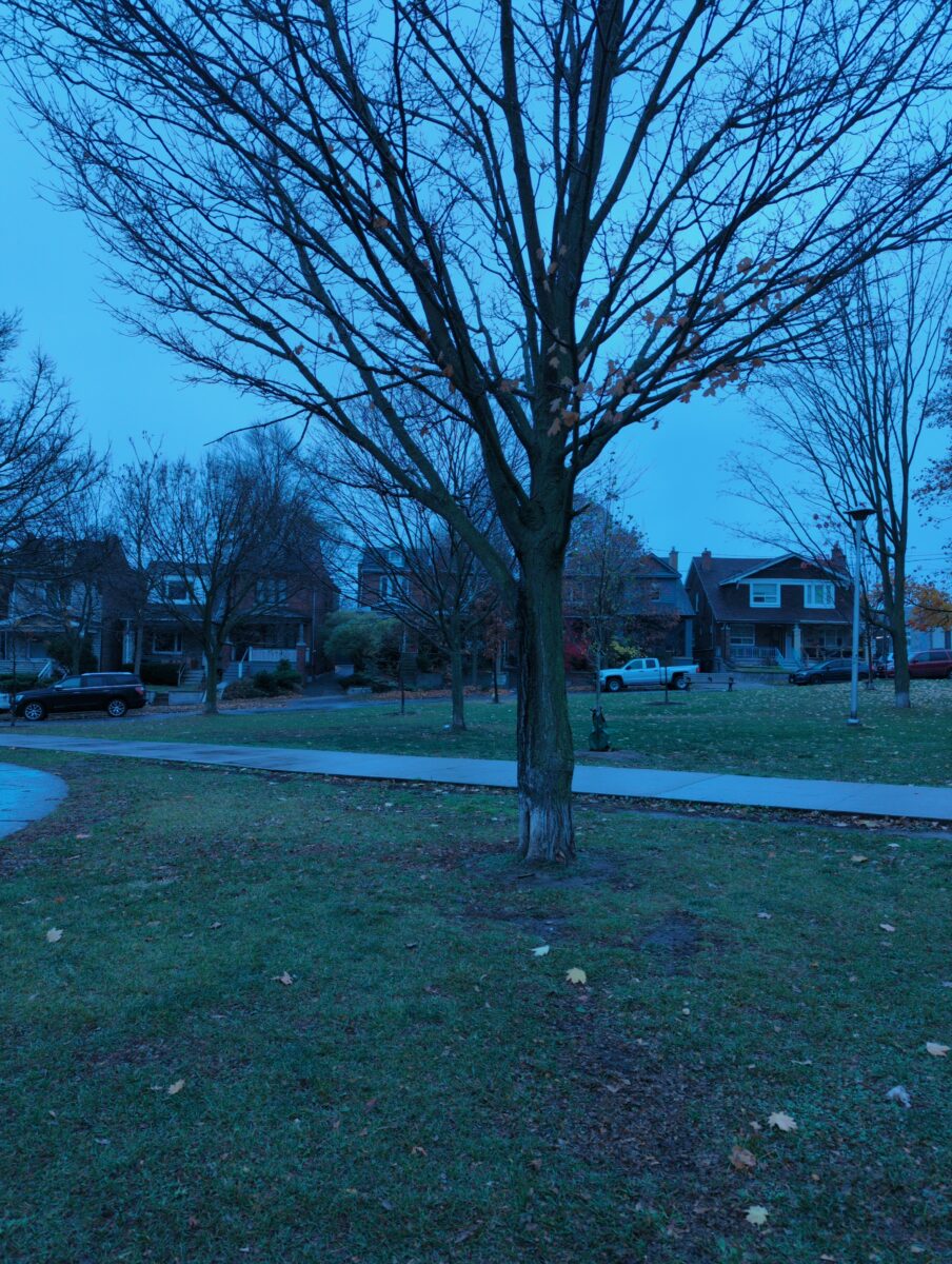
image taken on a cloudy day with the white balance set to “incandescent” – giving everything a blue cast 
image taken on a cloudy day with the white balance set to “overcast” revealing more accurate, maybe even slightly warm colours Digital cameras usually offer automatic white balance, and specific white balance settings. Specific settings could be descriptive, like “daylight” or “incandescent light” or “fluorescent light”, or they might have a temperature number you can set.
That number, as I understand it and I’m sure there’s specifics I’m not aware of or I’m missing here so, you know, feel free to do a lot more reading on this if you’re interested, but as I understand it the number is a temperature in kelvins that tells us what colour the light is based on the heat of the source.

wikipedia’s light temperature chart – click through for so, so much more info Different types of light sources match with the light produced at different temperatures, and this is why someone might talk about light’s temperature, warm or cool. Unfortunately things there are a little backwards, thanks to chaotic english verbal metaphors.
So a candle, which produces a very warm-feeling reddish light, is throwing what is actually a very low temperature light. The sun, which when it is directly overhead produces a very bright white light, is a very high temperature. Different types of artificial lighting like incandescent, halogen, fluorescent etc exist along the temperature scale, but it’s a little bit more complex than that – some lightbulbs produce multiple bands of coloured light.
If you’d like to learn more about light temperature, and light sources, I definitely recommend James Gurney’s book Color and Light. It’s for painters, but anyone who makes images from life could benefit from the robustly researched scientific info on how we see the world around us.
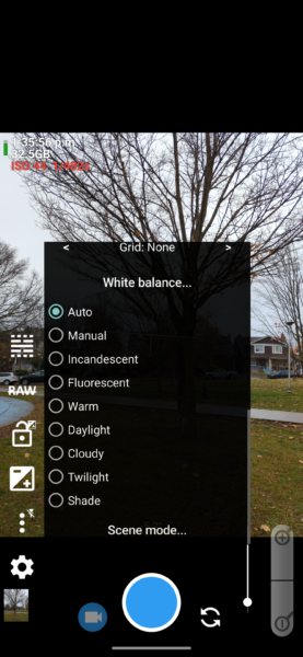
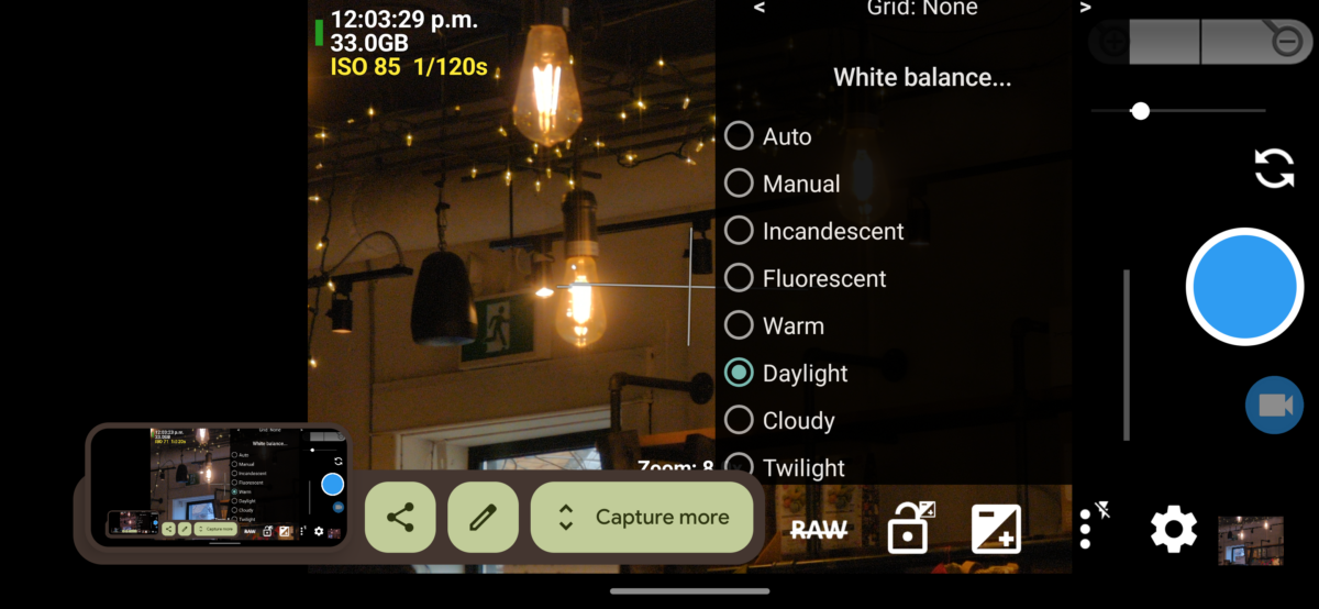
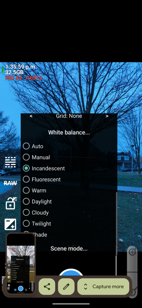
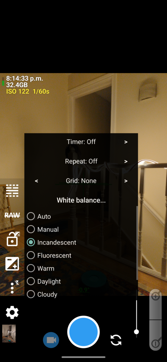
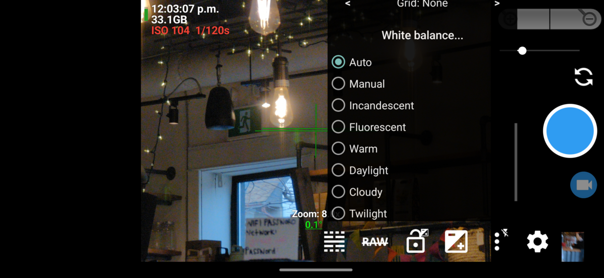
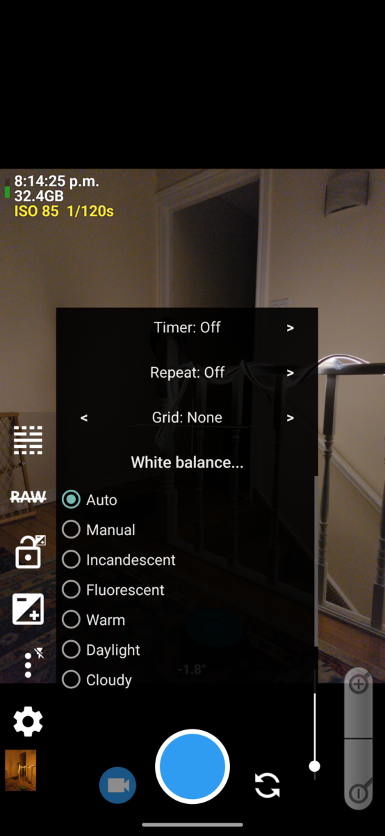
the white balance settings in Open Camera on my google pixel 6 pro 
the temperature slider in adobe lightroom I don’t have examples of the temperature slider as a white balance tool in my open camera screenshots, though, as my Google pixel 6 pro’s camera API doesn’t let the app Open Camera access that setting, and when I try, it only shows me a black screen. This is an API barrier Google has set up on its phone camera driver – even though the camera absolutely is taking photos using this info, the driver API hasn’t exposed it to outside software to control.
It will, however, thankfully, let me choose between fixed descriptive white balance settings! Everything from Incandescent to Twilight and back again. Each of these settings is associated with what I will call a colour profile, which tells the camera how warm or cool to expect the incoming light to be, on average, and how to then translate it.
Wait, wait, though, I think I’ve skipped a key concept here, hold on.
Let’s go back to that reddish firelight.

If you light a scene with a flame, say in a campfire or on a candle, you know it’s giving everything a warm glow, right? The way it’s doing that is: the light produced by the flame is itself made of mostly red and yellow wavelengths of light. It’s not producing any light on the blue wavelengths.
The way we, or a camera, perceive color is by coloured wavelengths being reflected off the object we’re looking at. The object doesn’t create the coloured light, it requires light of the right color to hit it for the colours of the object to be visible. Sunlight, white light, contains the full spectrum of colours, and so in bright sunlight the light itself shows us all the potential colours – which means it changes none of them, which means the light itself feels white.
When the flame on a candle produces light, it’s mostly producing red and yellow light, which means if it encounters a red object, it shows us the red, but if it encounters a green object, it can only show us the molecules inside that green color that are yellow, and the molecules inside that green that are blue don’t reflect any light. To our eyes, this tints the object yellowish in the candlelight.
However, if you stay a long time in a room lit only by candles, you probably feel like you can see green and blue and purple colours a little still. As I understand it (and my neurologist family members will I’m sure be haunted by this maybe oversimplified info so please follow the rabbit hole here if you’re curious, it’s really interesting stuff!) this is your brain compensating for the tinted information by shifting your identification of colours, maybe to try and help you discern as much information as possible from the limited visual data. You don’t stop knowing it’s warm light, but you adjust to it.
As an example, and here I’m talking about your eyes, remember, not the camera tech yet (we’ll get back to it shortly), here is a photo of a candle.

First off, let me assuage your dress-related paranoia – this is a teal candle.
To me, looking at the photo, this is clearly a teal candle. You can see it’s a lovely seafoam green at the top where it’s warmer and glowing through the melted wax, and a much more vibrant blue farther down, away from the flame.
So let’s take a closer look at these colours! I have isolated a few into bigger dots and overlaid them on the image where they were eyedroppered from:

And here are the same colours just on a neutral 50% grey background.
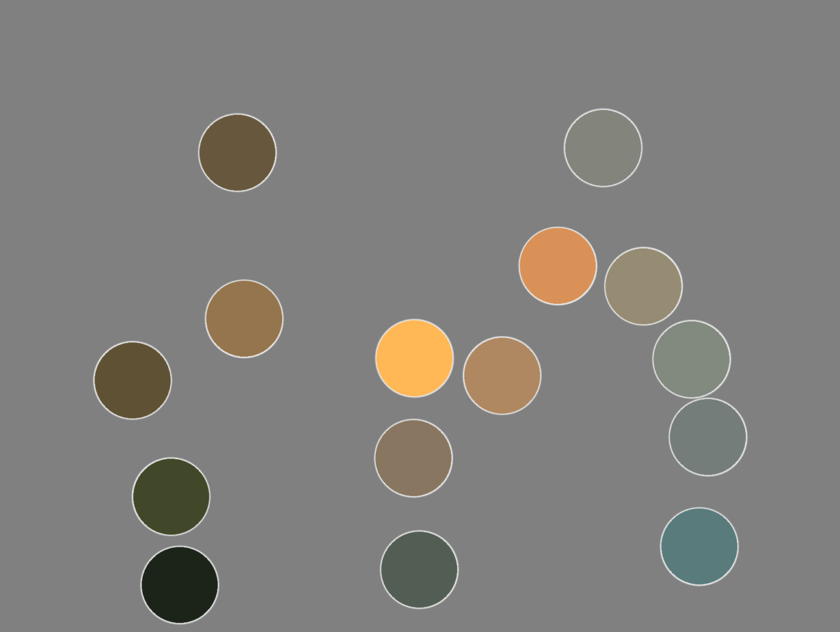
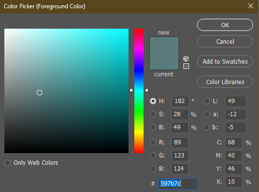
Here I have eyedroppered that brightest blue in the dots, the one on the bottom right of the image. This is how blue it is: not very blue! Pretty green still! Because that candle’s light cannot show us blue and purple wavelengths, we end up with an image where a cold green-grey starts to feel blue.
Our eyes work to compensate in limited-colour situations. We’re actually really good at it! And anyone who makes art commercially, anyone who designs colour for film and tv, advertising, fashion, games, etc? They all know this and use it when creating images. It’s why, given full colour vision, at a candlelit dinner, you can still tell your green veggies from your red ones.
And it’s not at all new! You can see this in Georges de La Tour’s famous candlelit paintings. The brightest light feels white, and colours still have some vibrance to them, and the scene feels rich, but, there’s no actual blues on the canvas, even though we have no trouble identifying the woman’s dress as light blue:
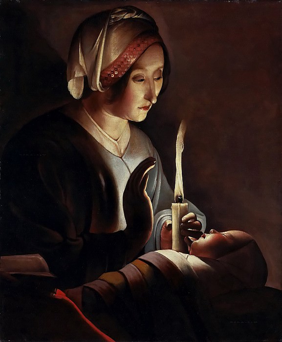
Georges de La Tour – Saint Anne with the Christ Child
1645-50So what does this have to do with camera white balance?
Sorry for the detour but it’s a useful comparison.
Your eyes can likely perceive all of the visible spectrum. (It’s called the visible spectrum because it is the spectrum of light visible to human anatomy. as mentioned above, that anatomy varies.)
Digital cameras, however, are not able to do that. They have to pick a subset of the colours in the scene to translate into their digital gamut, and they are very good at doing that convincingly.
So when you pick a light temperature, or a fixed white balance setting like “incandescent”, you’re telling your camera how to translate the light it receives into the digital spectrum.
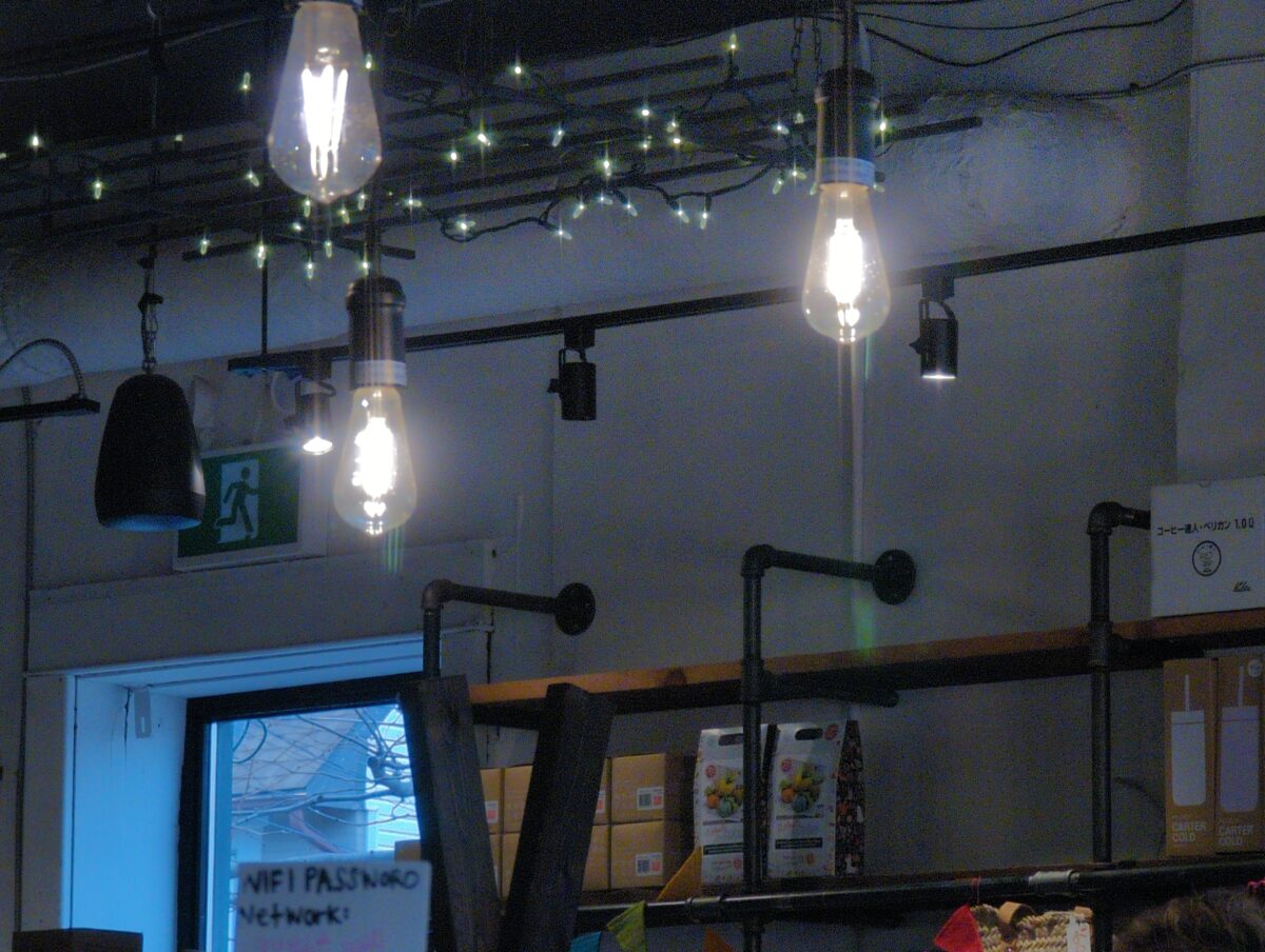
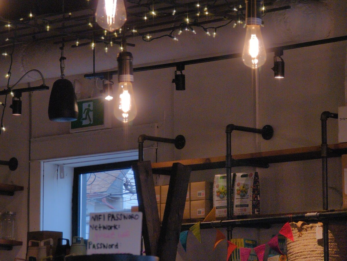
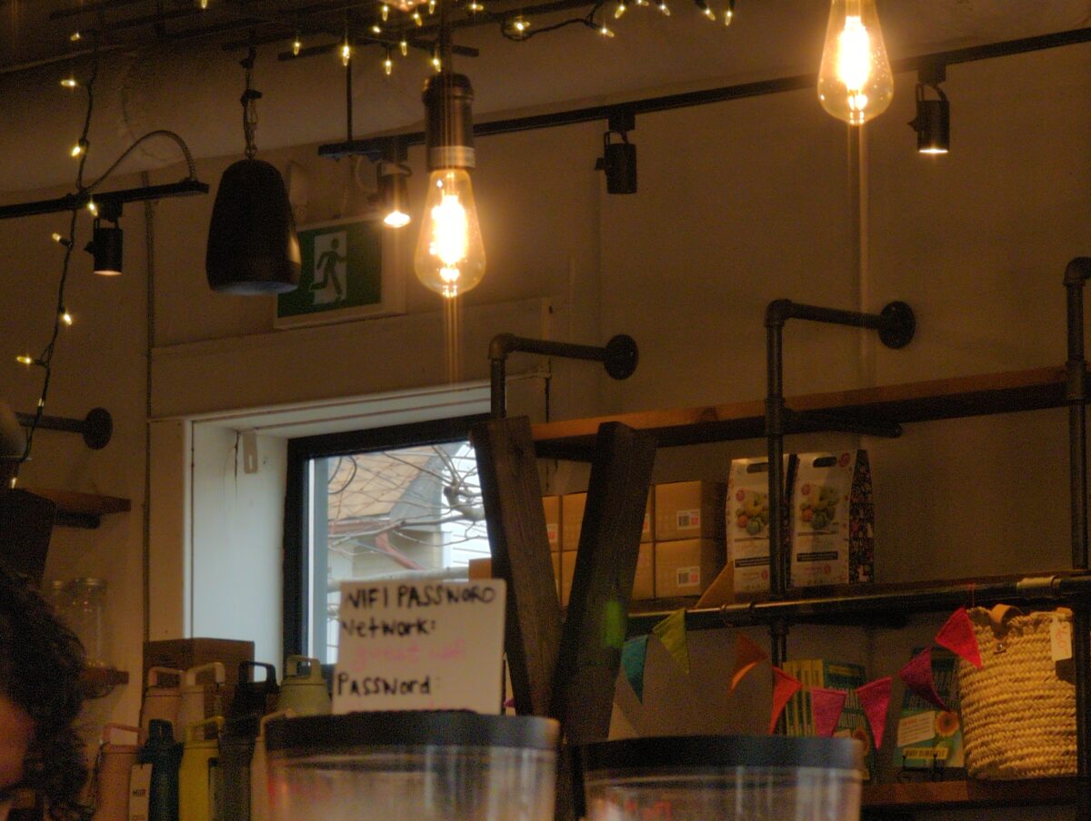
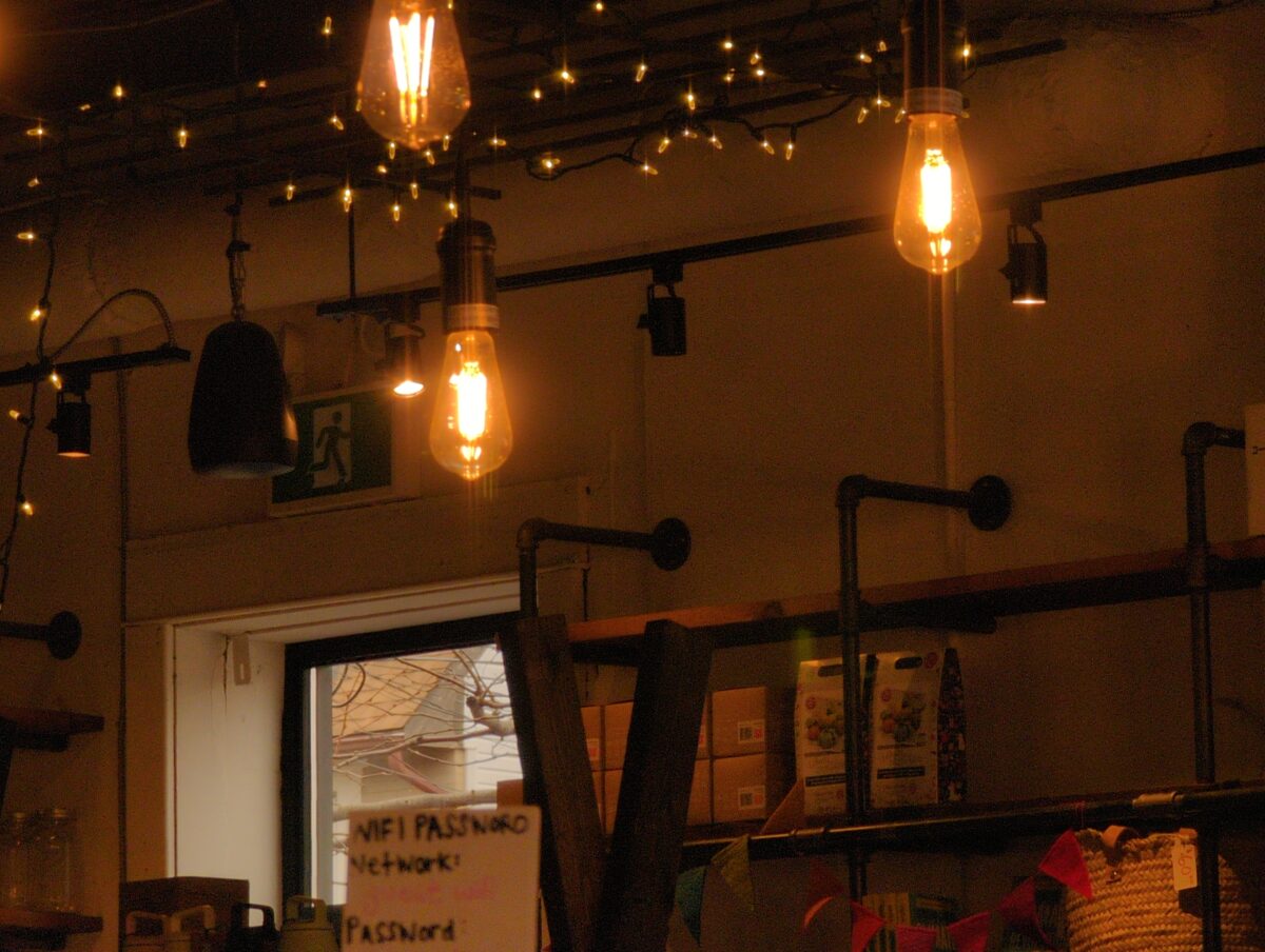
I’ve taken some example snaps here to help illustrate this point. In this scene you can see some incandescent lightbulbs, and a window out to a cloudy overcast afternoon sky.
As i switch between white balance settings, watch which parts of the image are more or less colourful, and which colours get neutralized to white.
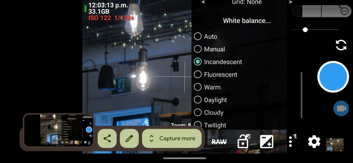
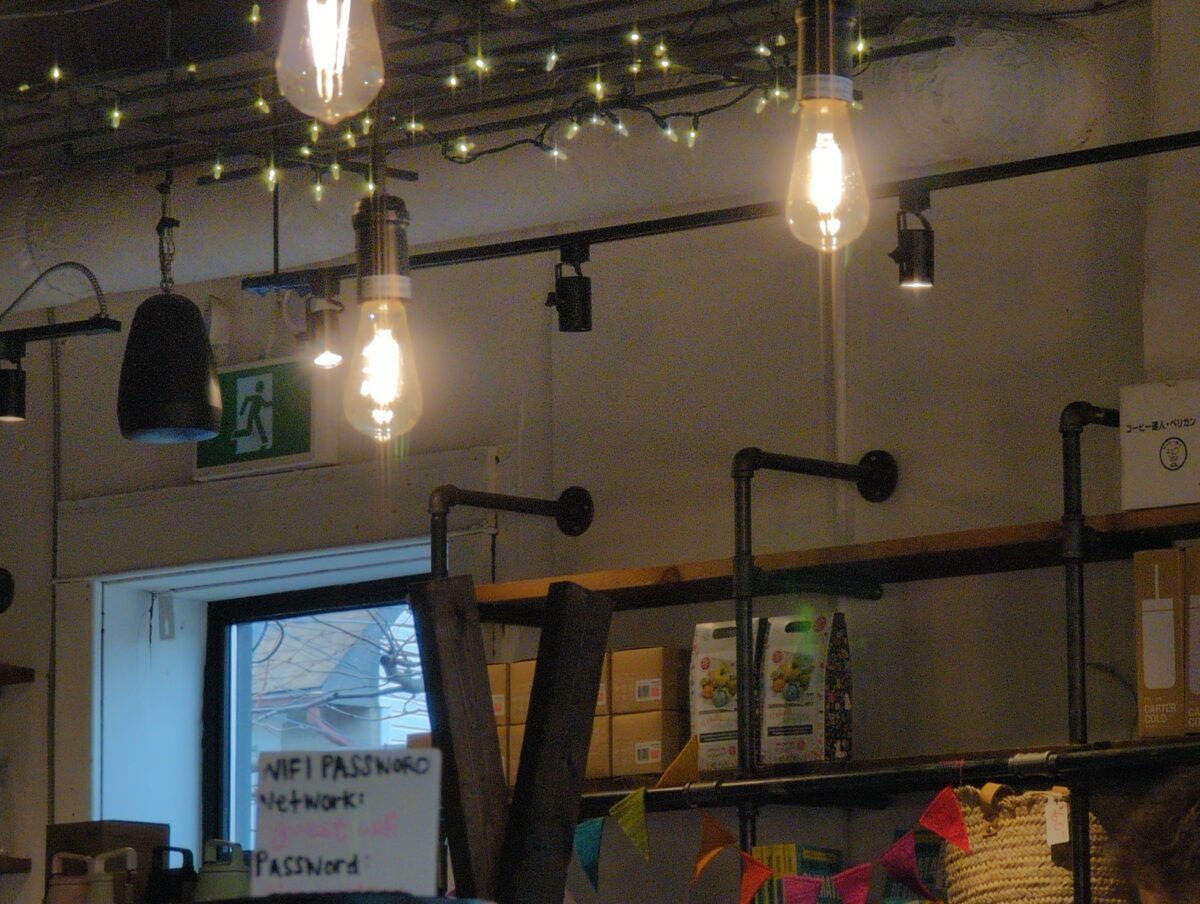
A quick note on how these settings are named. “Incandescent” is named that because it’s a great setting to neutralize the warm glow your scene would have if lit only by incandescent bulbs. You can see, above, how the bulbs appear to be throwing a cold white light. In contrast, the cold light from outside now looks REALLY cold – almost twilight blue – because the translation is being applied to the entire image evenly.
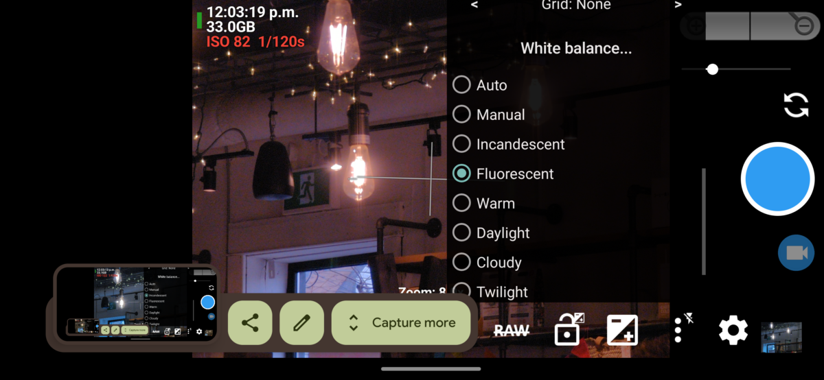

Fluorescent, then, is designed to compensate for the colour shift that fluorescent lighting applies to a scene. Since there’s no fluorescent lights in my composition, nothing feels neutral or white, and instead it all feels pink and purple.
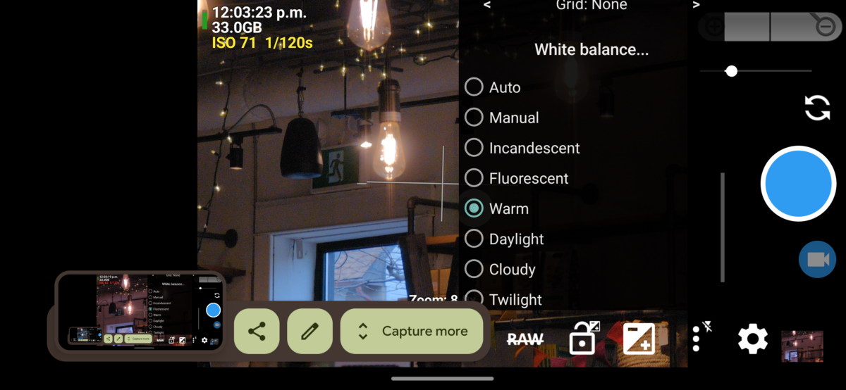
“Warm” is maybe a bad name for this setting, but as far as I can tell it’s a setting in-between Fluorescent and Daylight. It doesn’t neutralize anything in my composition too much, but you can see it is still doing some compensation for the incandescent bulbs and string lights, making them more neutral in colour than the blue outdoor light.
By contrast the Daylight setting neutralizes that outdoor light in the window very successfully, and you can see how that makes the incandescent bulbs appear quite yellow in comparison.
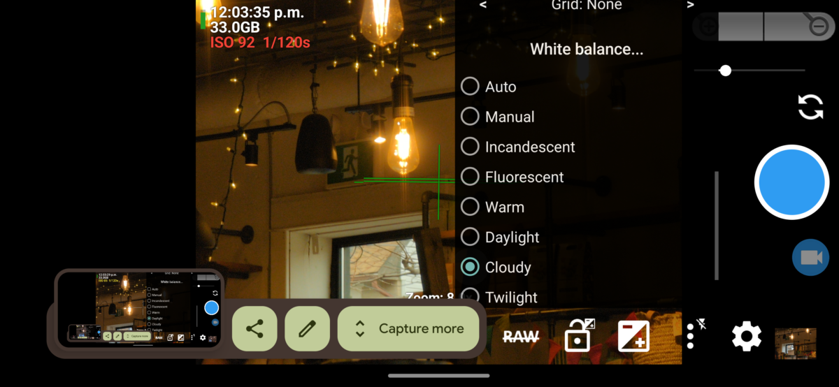
The Cloudy setting even starts to make the outdoor light feel a bit warm, kind of greenish-yellow, and the incandescent bulbs start to feel warmer too, more buttery citrusy orange.
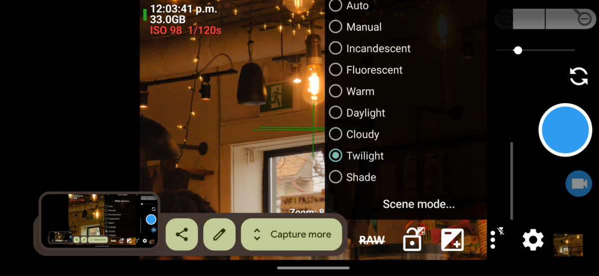
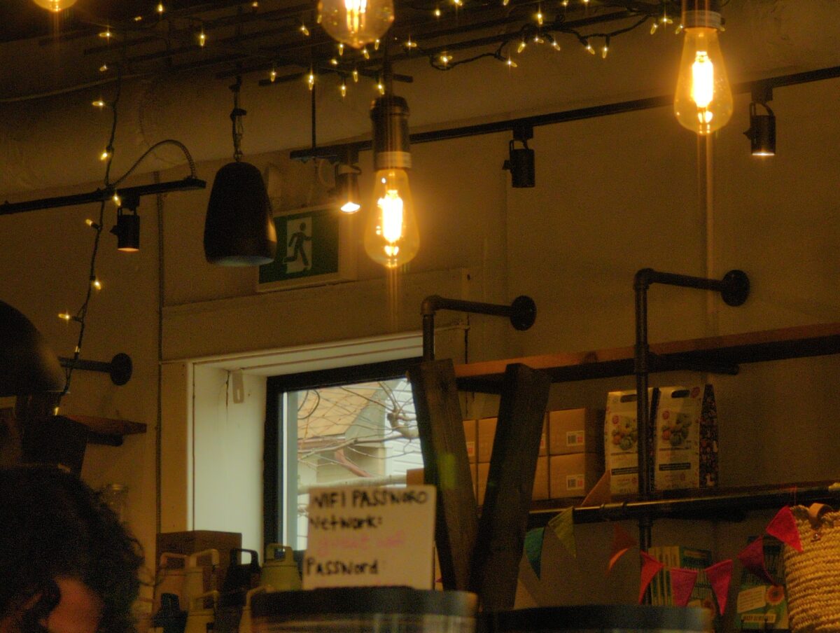
The Twilight setting is designed to compensate for that grey-blue light you get just after the sun has set, and since none of the light in this scene is anywhere near that cold, everything indoors and out is feeling orange.
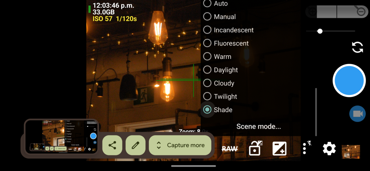
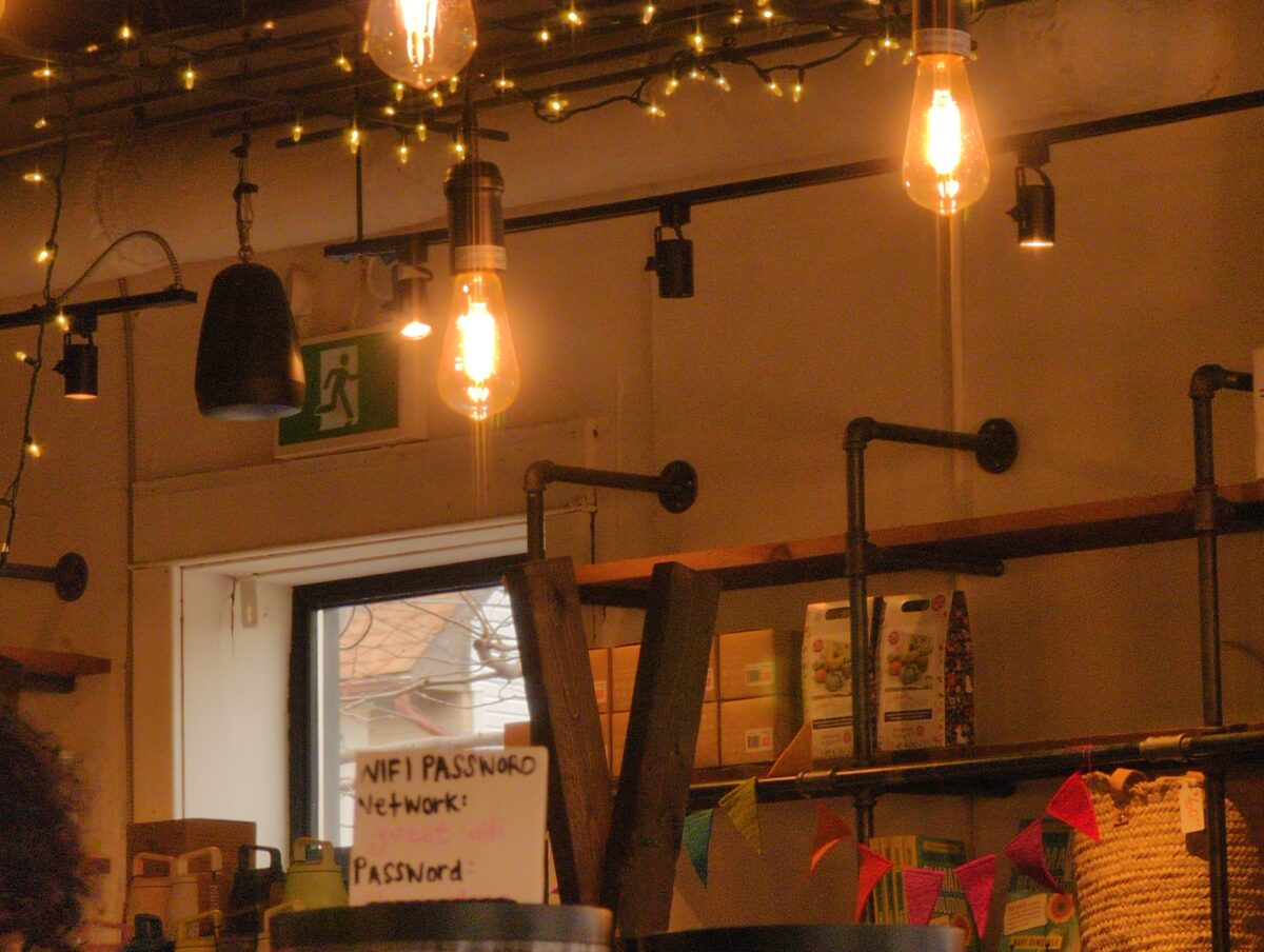
The Shade setting would be perfect at compensating for when you are photographing something that’s in the shade on an otherwise clear, sunny day – on those days, if the subject is out of the sun, it will be lit only by the blue sky, an incredibly cold blue light source. Since nothing in our composition is anywhere near that kind of cold blue light, everything is feeling orange and red.
I hope that’s a good example of what these fixed settings are and what each is doing to the image!
Note that in each of these settings, the camera has a fixed translation value it’s using. When I’m using a fixed setting like this, i know the translation value isn’t changing even if i take it from a daylight scene to a lamplit scene. This means, it’s showing me the difference between the daylight and the lamplight.
Here you can see how the Incandescent setting interprets a cloudy afternoon shot and a lamplit indoor shot:

But most digital cameras are set to auto white balance by default, and how much they let you change that can vary wildly. As I mentioned, my Google pixel 6 pro, with its very hyped up camera, doesn’t let me set temperature specific white balance, which sucks! But at least the qualitative settings like Incandescent and Daylight are still fixed.
So let’s talk about auto white balance.
So you might see that the auto setting doesn’t quite match any of the colour of the fixed settings demonstrated above. Auto white balance is calculated in response to what the camera is looking at in that moment, and it’s recalculated as you move your camera around.
Here is how the Auto setting interprets the same cloudy afternoon and lamplit indoor scenes from above:


The digital camera is attempting to detect the light colour in the scene you’re showing it, and translate the colours accordingly. From looking at these, I believe that this means that it is looking to see if there’s a dominant colour in the scene, and adjusting the translation settings to better balance out the colour distribution. This can be great for scenes where your subject matter contains a full spectrum of colours within it that all simply are being tinted by the light – say taking a photo of a bunch of friends in a restaurant at night.
Where this Auto setting lets me down is when I’m trying to take a photo of something with a very strong single colour in it – for example, a rich orange sunset. It also tends to fail at capturing the magic of something like golden hour lighting, or dramatic surreal lighting like neon etc. To do its job, it actively neutralizes what can sometimes be, in my opinion, the best part of a given scene.
If you’re having trouble getting your phone to capture the colours in sunset photos, concert photos, dusk photos, etc, i definitely recommend playing around with more fixed white balance settings.
You can really transform a photo by changing the white balance!


Personally, I’ve stopped using auto white balance entirely.
I usually prefer to have my camera colour settings stay fixed and to then learn how to use those settings to my advantage in different scenarios. Most days I set my cellphone camera to Daylight white balance and shoot everything from there.
This was a technique i learned from this YouTube video:
In here, Sean Tucker mentions that, if you shoot with film, you don’t get to adjust the white balance on each shot – the white balance is instead part of the film and development process, and most colour camera film is white balanced for daylight. This is why all my old film photos had such a rich warm tint on all the incandescent-lit photos, and a cool, almost purple feel on very overcast, cloudy days.
Here, a few of my favourites from my film days:

Now, while I cannot afford to shoot film all the time, I’m happy to indulge my nostalgia if it gets me excited about making more art, so setting my phone to daylight white balance it is!
Taking my camera out and shooting from midday to fully dark really showed me how this setting interprets different light scenarios, and frankly i love it. Much easier to imagine I’m painting with light if the light stops sliding around the colour spectrum, yknow?


A quick aside about RAW.
Raw photos contain more data than they can make visible. You can shoot a raw photo on whatever white balance setting you like, and the photo will still contain more colours than the condensed and translated selection it shows you. When you open it in specific RAW development software, you’ll be able to adjust the white balance hugely and it really barely matters what settings you used in the first place.
If you’re not shooting RAW, however, your photos can still be adjusted a bit, temperature-wise, but whatever colours got fully neutralized by the white balance settings will stay neutral, as digitally, neutral means that little or no colour data got embedded there. This is why it’s so hard to recover a sunset photo when the camera turned the sky white instead of yellow. There’s no colour info to un-translate in the first place.
This will come up again when i talk more about exposure settings, in a future post!
So this is a wall of text about white balance.
Thanks for reading!
If you’ve got questions, or corrections, or more info on the subject, I’d love it if you dropped that in the comments below! And if you’re having fun playing around with white balance in your own work, I’d really love to see it!
leave a comment
Leave a Reply
-
leave a comment
Leave a Reply
-
Folks seemed interested and excited about my Your Cellphone Camera’s Digital Processing Settings and You post, so I think I’m going to do some more specific posts about different things you can do to your digital photos, and I’m going to use Open Camera to demonstrate them on my phone because it’s free for any Android user and it seems to stick to the standard photography language for most things, so I find it pretty useful.
so this first post I want to just take a second and ask you if, should you already have the app on your phone, you have read the documentation? Reading the documentation sounds brutally unfun, and I think in many circumstances it is the worst part of all software, but in the case of Open Camera the documentation is really quite helpful. I’m not as deep into documentation as the programmers I know, but I use a fair amount of it in my dayjob, so please trust me when I tell you that the information about the app that they share (to make using it go better for you) is presented in a more useful clear and easy to read way than most things that I encounter. if you haven’t flipped through the documentation, I really recommend it.
with an open source app like this, giving a quick read through the information about the app that the designer provides to you helps you skip to knowing what the fuck the app actually does, getting a sense of what features are meant to be there, and in the case of Open Camera, reading the big disclaimer that this app is going to work differently on different phones. That part’s important, because I’m going to show you things that the app does on my phone and they might not work on other phones the same way. I’m also going to highlight things that don’t work on my phone that might work really well on your phone.
When we have diverse hardware, and phone cameras are very diverse right now, we have to be ready to understand that the software is going to vary in what it can and can’t do across that hardware.
if you haven’t read the documentation, if you are absolutely not the kind of person to read the documentation, if you’re annoyed that I’ve asked you to read the documentation, my only question for you is: why are you here then? why are you reading a tutorial instead?
documentation is like an overview tutorial in a lot of ways, or at least it can be if it’s written well. and I feel like the documentation for open camera is decent, and I would definitely recommend reading it before doing tutorials, because it’s going to make it a lot easier to understand how tutorials apply to your phone.
I’ll be collecting the rest of my writing on the subject of cellphone photography under the tag “cellphone photography” – and I’ll put a nice archive here for you to peruse should you so desire:
-

Cellphone Photography: All About White Balance
Okay, this first in-depth cellphone photography post is going to be about white balance. One of the things that I often struggle with is getting the colors to look right on my phone. If you’ve ever tried to photograph a sunset, or anything at twilight, or anything in a dramatically lit room, you might have […]
-
Your Cellphone Camera’s Digital Processing Settings and You
I am mad about cellphone cameras hiding the processing they do to my photos, and I am glad about software I found that lets me control it and opt in and out.
-
What Format You Might Want To Save Digital Photos In
What format do you recommend I save photographs in? Like raw or jpeg? I don’t know the difference.
Also, if you have questions on this subject, I’d love to answer them! Drop a comment below and I’ll either answer in-line or see if I can integrate your question into a bigger post in future. And if I’m getting stuff wrong, please connect me and anyone else reading this with accurate info – I’m just a hobbyist and there’s so much nuance, technical specificity, etc, that I am still learning on the subject.
leave a comment
Leave a Reply
-

by definition, not static
construction is continuing / old posts are being rebuilt / new archives are being built

Leave a Reply