
swap to chronological order of most recently modified
-
-
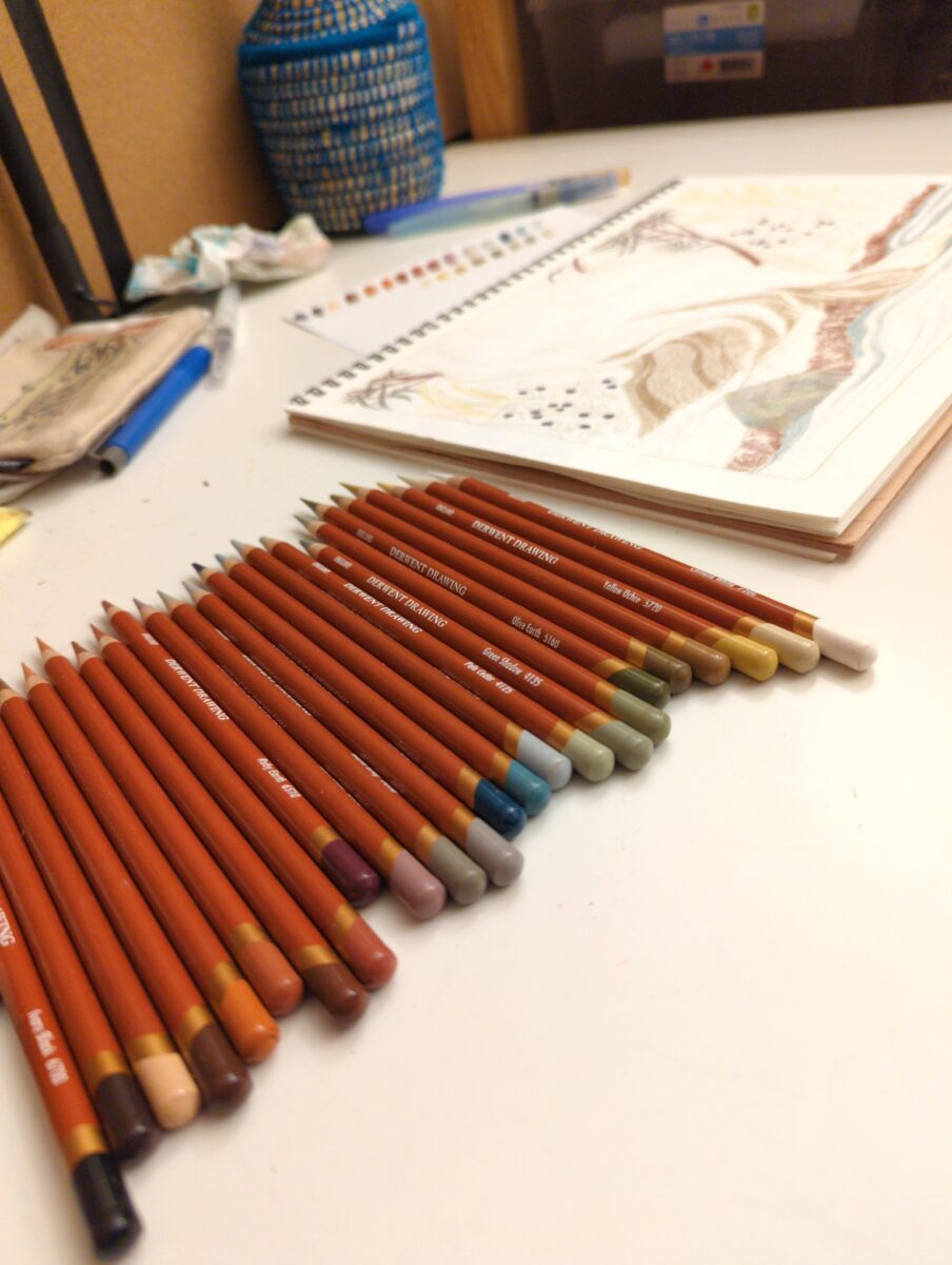
these are the Derwent Drawing line of pencil crayons, and I’m having a lot of fun with them in my cheap MUJI sketchbooks!
-
so when I reformatted my website, one of the things that I wanted to do was make it possible to post casually to this, with a similar energy to how I used to post on social media. you know, with the hope of getting myself free from social media and not simply just falling back down that slippery slope into blue sky and who knows what else I’ll join in the near future, etc. and so, when I did the reformatting, I made in my mind two key categories of posts: structural posts which work functionally as load-bearing writing or load-bearing collections of images, making the site make sense etc. and then the other category was building block posts, which I thought I would be able to collect into structural posts more.
but the problem is, I didn’t really set from rules for myself around what a building block post is, and how it’s supposed to work. I think I need to think a lot more about what posts would constitute a feed style posting for me, and then how could I make those useful to myself in future as potential collections, instead of trying to go with my gut every time.
not particular big website thoughts today but, I am still wrestling with this and it seemed worth writing down.
has anyone else struggled with and found any solutions with regards to casual posting versus full on blogging? I miss sharing casual low stakes the thoughts and studio photos and so forth. I’m really trying to figure out how to enable myself to do that again.
-
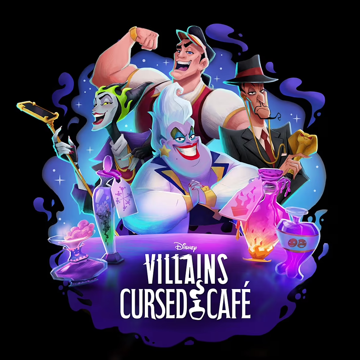
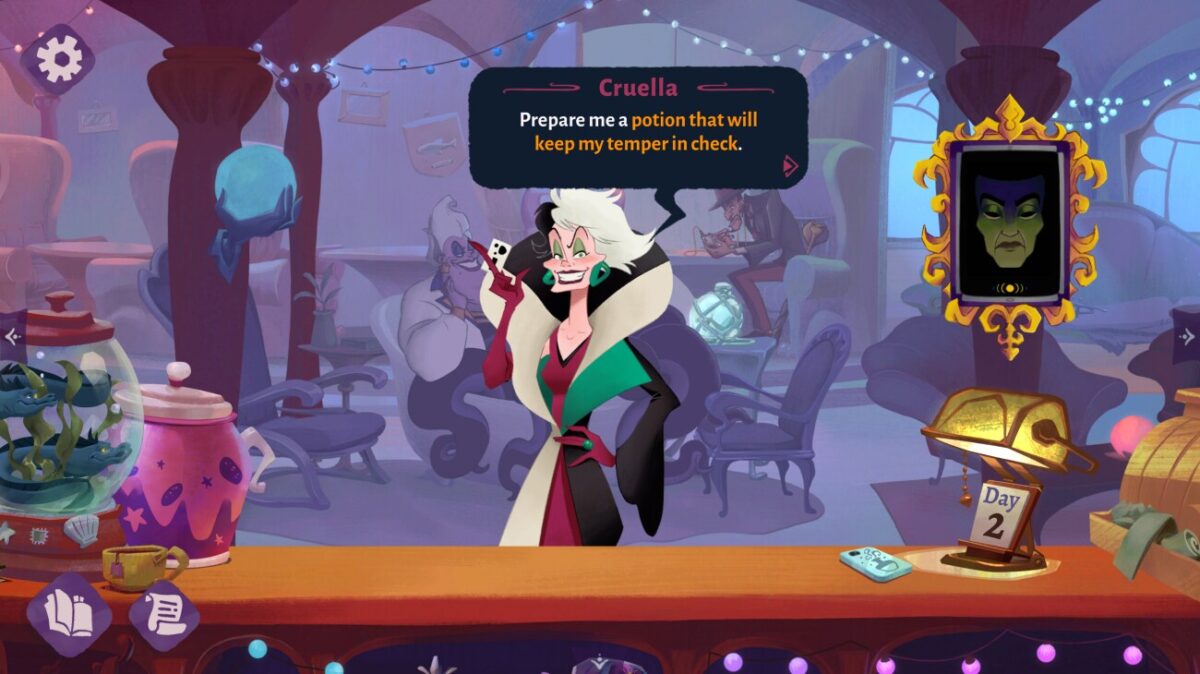
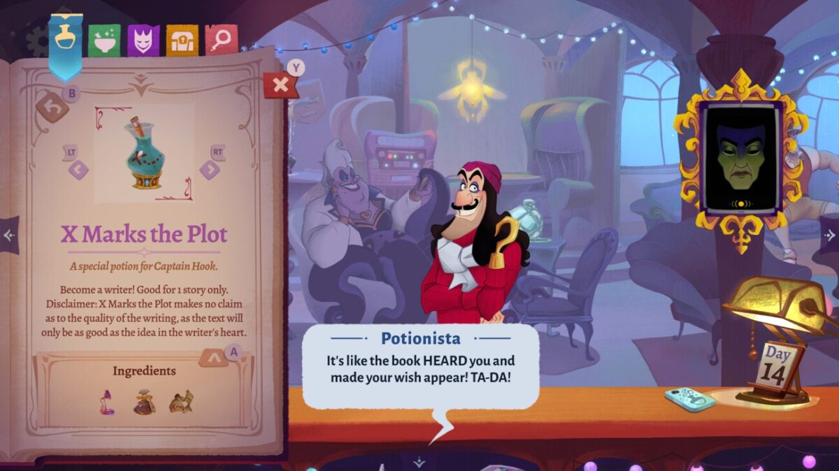
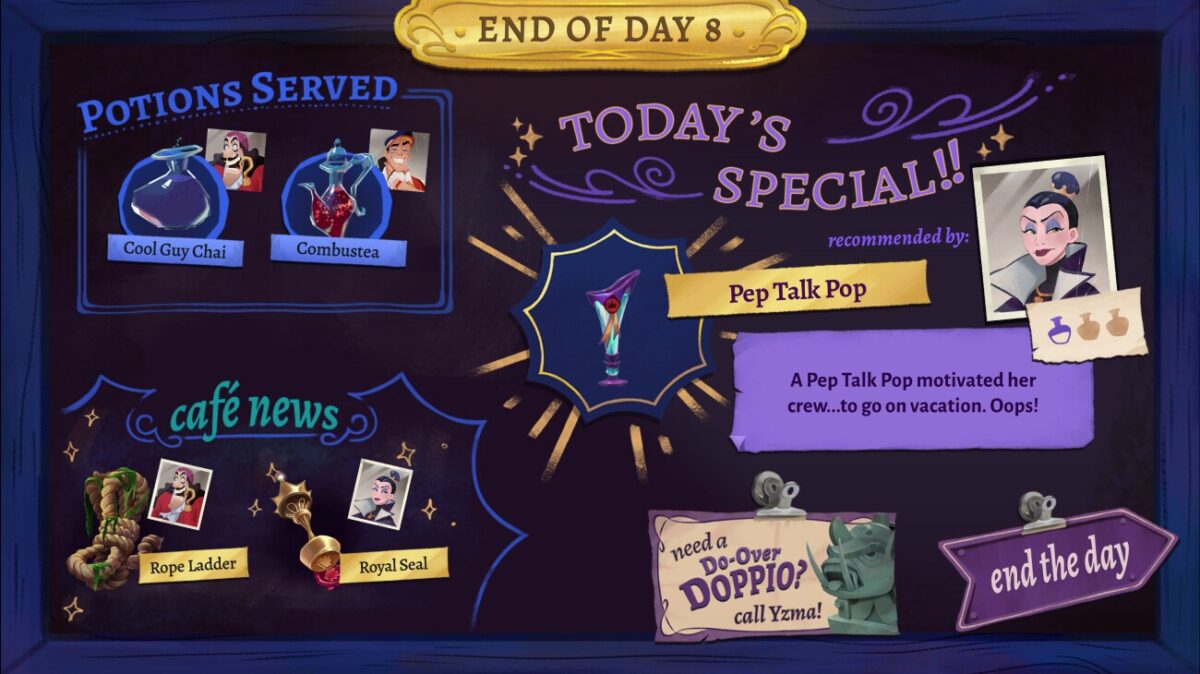
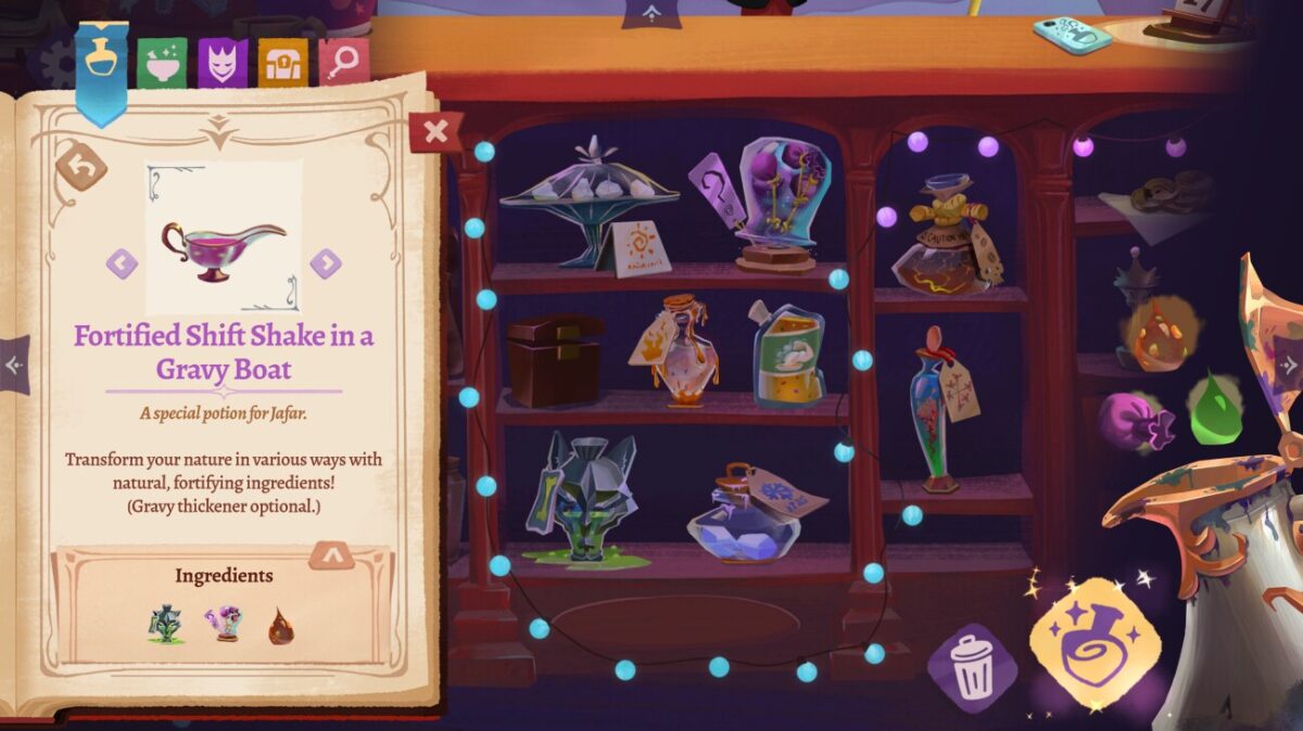
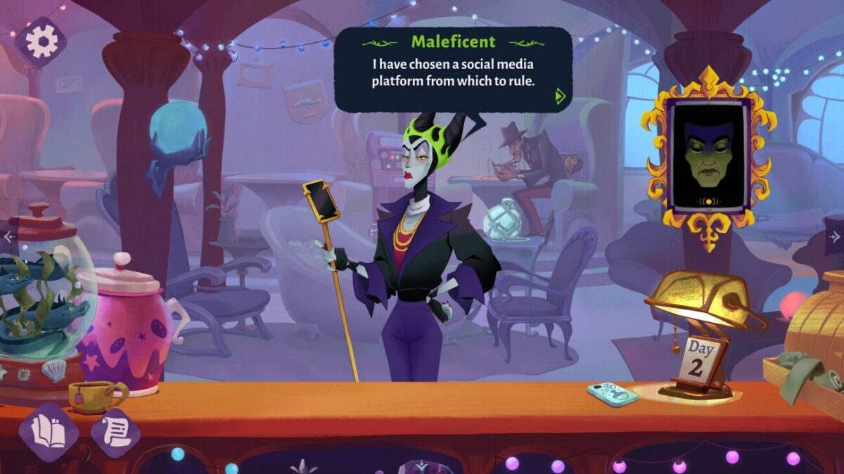
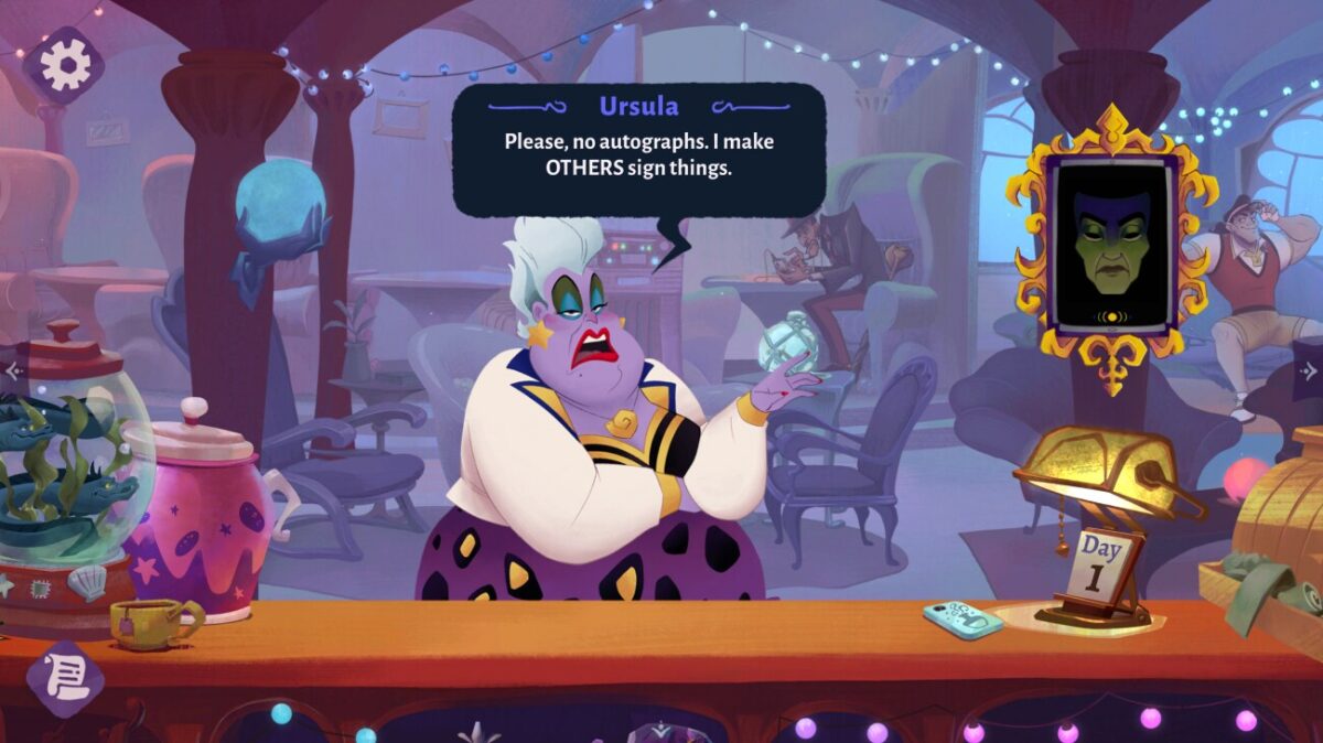
After nearly three years of work, I’m really proud to announce the release of Bloom Digital‘s newest game, Disney Villains Cursed Café. I art directed this game, and I’m so excited to get to share the results of all our hard work!
You’ve probably heard me talk about Bloom before – we’re an indie game company, known for our beloved visual novels LongStory and Later Daters. We are a team of people who love telling stories! Getting to put all that energy towards the Disney Villains was a real privilege.

Working with Disney helped all of us hold our work to an even higher standard, and push ourselves as game makers. There’s a real responsibility attached when you get the chance to work with these characters, and it would have been impossible to navigate that nearly as well without the constant guidance and feedback of the team we worked with at Disney. Thanks to everyone there for helping make this game happen!

I have to brag about my coworkers – I don’t think I can imagine a better team than the lineup we have at Bloom. When you have a team that becomes more than the sum of its parts, you get to make games that are also more than the sum of their parts! Huge thanks from me and the artists to Miriam Verburg for steering the ship the whole time, Heather Jackson for making it effortless to bring the narrative into the art every step of the way, Keana Almario for keeping us all accountable to the players experience, JP Stringham for tackling the game design inside and out, and Danielle Russell for facilitating all the communication and oversight necessary to make something like this happen.
It’s important that I tell you how wonderful the art team in particular was! It might be counter-intuitive, but, you’re not going to see a single pixel of my own drawing in this game. As an art director, it was my job to find the best artists possible and then direct them towards bringing this game to life. I had the privilege and responsibility to lead a team of incredible artists towards making this game, and whatever you see in there, I want you to know one of these people made it happen.
Yi Pan was our senior game artist, which means he and I worked together on concepts from the beginning; you can see his brilliant painting and immensely appealing design work up front and center in all our potions, gifts, and in so much of the overall color design of the game. Jey Pawlik was our character artist and I think it’s impossible to understate how charming they managed to make our modernized villains, no matter their moods! Janiel Lo worked with us across many disciplines, laying out and painting our complex, amazing environments, as well as helping us make sure our beautiful UI felt both integrated into the world and also comfortable and easy to use. Ally Rom Colthoff made it possible for us to have the environment art of my dreams by coming in and painting the heck out of that cafe! And the game wouldn’t be what it is without Sara Mena‘s concept work, and the contributions of many artists on the Disney side who contributed not only character art, UI, and identity designs, but helped us fine-tune everything that went into the game.
It’s the biggest team I’ve ever had the chance to work with as an art director, and I’m not kidding when I say that these professionals made it easy and fun to come in every day and see what brilliant new artwork awaited me.
Something extra special about this team was how excited the artists were to work with, brainstorm with, and sing the praises of each other. I’m so grateful for this team not just for their ability to make beautiful art but their ability to collaborate with each other, myself, and with the team at Disney. Everybody should be proud of themselves, not only as artists but as game makers.
I want to shout out the narrative team, who made time to be in the art meetings with me and the artists, making it so easy to keep everything absolutely on point narratively throughout the whole development. Heather and Mike took the time to get to know the art team, and made themselves available for quick questions, brainstorming sessions, and pep talks. I think what this did for the game was make it possible for every visual joke and narrative joke to play off each other in ways that could not have possibly happened without that kind of open communication.
To talk a little bit more about the UI process, one of the things that we decided to do early on was make this game’s UI very diegetic, to keep the buttons feeling as magical as everything else that you see and do in the game, and that would not have been possible without Keana’s expertise and dedication to solving complicated UX flow challenges. Her hard work let us get away with so much more by way of magical props, framing devices, and sparkles.
For me, as the art director, I don’t always get the chance to put my own handiwork into a game, and as I mentioned, all of the amazing drawing and painting that you see on screen is thanks to our art team. But what I did get to do, very much thanks to the support of JP, was tackle the majority of the VFX. Getting to be a VFX artist for a chunk of this project was a dream come true, because if there’s one thing this game is full of, it’s magic! Figuring out how to bring life and mystery and humour to all of the magic in this game was an amazing challenge that I am so glad I got to tackle.
As a game dev, launches are always special, but this launch has been outright overwhelming in such a good way. Thank you to everybody who is streaming the game, sharing lets plays, drawing fan art, and just generally yelling about getting to hang out with their faves in our magical Cursed Café! I hope as you play this game it feels like you’ve gotten to visit somewhere magical alongside the villains.
Thanks again to everybody involved for this opportunity. Drop your fav villian in the comments, and stay in touch with me and with Bloom to find out more about what else Bloom has lined up!
-
Just playing around between work and comics and life.
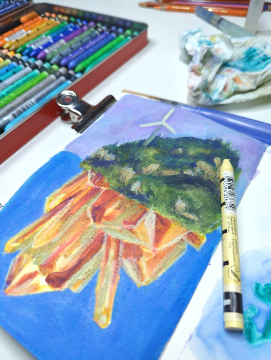
Neocolor iis and watercolours!
-
For six months I had no nerve connection whatsoever to my lower right radial nerve. This meant that all of the muscles it powered were completely switched off, paralyzed, leaving me unable to uncurl my fingers, lift my wrist, tilt my wrist, or open my thumb, and leaving me much weaker at gripping, rotating my lower arm at the elbow, and bending my elbow. This had a waterfall effect – with less function, the arm as a whole gets used less, and the whole arm weakens and loses muscle mass, even in muscles still fully powered by healthy nerve connections. This meant my right arm actually became less useful over the course of those six months after surgery, in a bad but somewhat inevitable feedback loop.
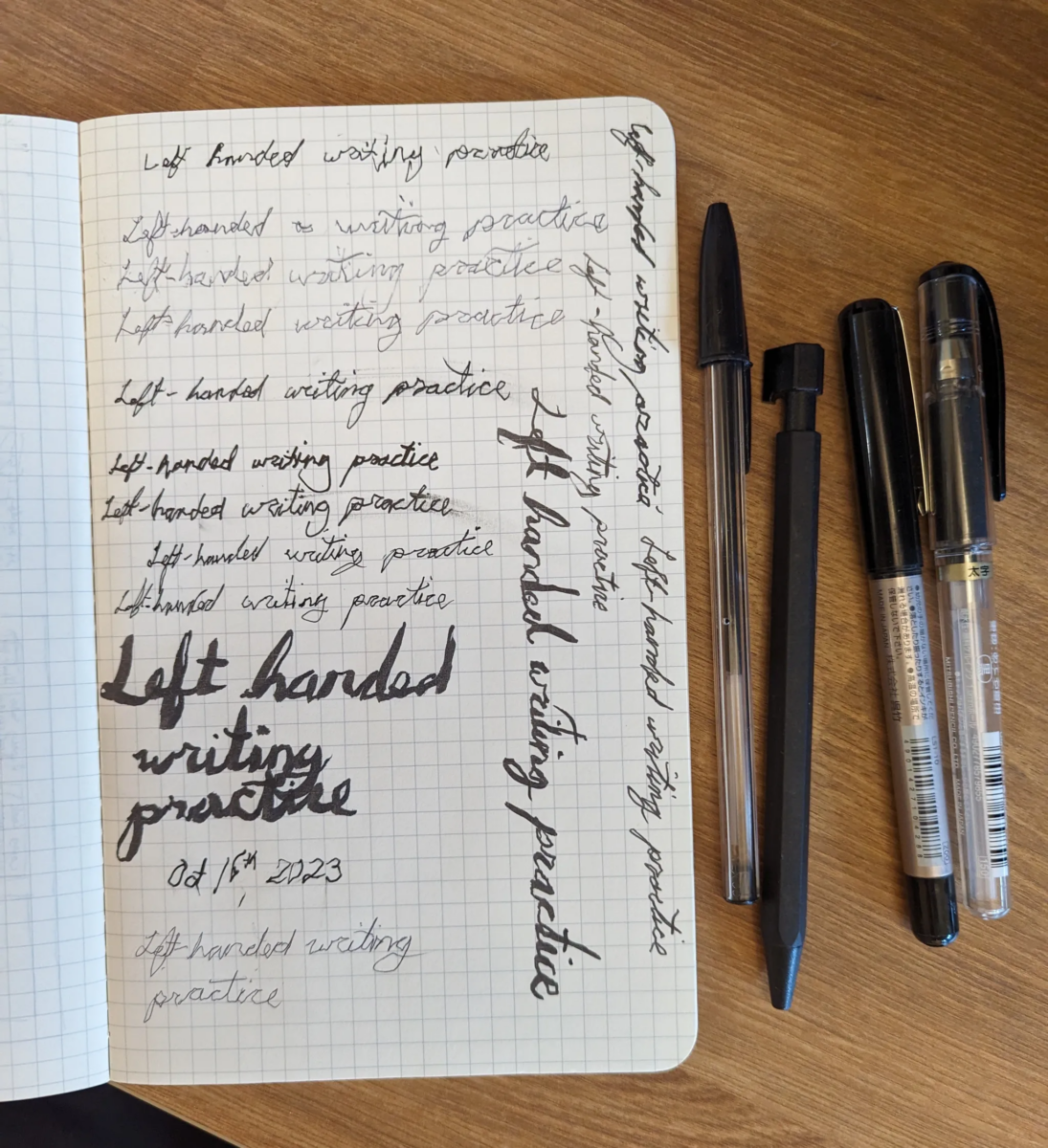
I knew this was coming, and i had started to prepare before surgery by training myself to do a few things left-handed – writing and drawing were the big ones, but not the only ones.
I also have some leftover left handed skills from having carpal tunnel back in 2007 – it was easy enough to switch over my mousing hand, for example, as I’d done it before several times, whenever my right wrist flared up. Easy, as mentioned in prior posts, as assessed on the new difficulty curve of my life.
Left-handed writing was a very strange thing to tackle – firstly, it is definitely different than right-handed writing. We’ve designed our letterforms to work with a very specific biomechanical setup, and the left hand flips it all completely.
There’s three distinct hand positions folks use to write left-handed – keeping your hand above the line, alongside the line, or below the line of text. Smearing your lines by rubbing your hand along them as you progress from left to right is a real frustration, and the above-the-line and below-the-line hand positions are both responses to that concern; but the internet was very certain that the above the line, curled-wrist hand position was a recipe for carpal tunnel, so given my experience with that I wanted to avoid it. This really only left me the below-the-line hand position for writing, and the problem with that was just how different it felt from writing right-handed.
Apparently the above-the-line hand position’s main advantage is how much it allows a left-handed writer to mimic the motions and shapes of right-handed writing. From my reading, it’s implied that this was mostly a benefit to teachers, who didn’t have time to teach two totally different systems of writing – but people who get into calligraphy left-handed tend to write from below the line, which gives them more natural wrist positions and still a whole suite of beautiful curves and swoops available to build the letters. In fact, the calligraphers I’ve found all universally turn the paper a full 90° and write from top to bottom instead of from left to right. Despite respecting their expertise, I really couldn’t get my brain around that fullly rotated page, and ended up writing from underneath with a maybe 20° tilt the other way, to help balance the natural backwards lean of my left handed letters.
As a geriatric millennial, I learned cursive writing in grade school, and I’m much more comfortable and fast with it than printing; I like taking handwritten notes in meetings, doing my brainstorming on paper, and I worked hard to be able to write as fast as I think. So my first and biggest writing concern was getting myself to learn left-handed cursive.
Well, folks, with cursive writing being forgotten at large and left handed writing of any kind being a specialized concern, there were not a lot of good resources on the internet. Many of them taught the curled-wrist above-the-line hand position and then reproduced the same letterforms and line directions as right-handed writing. But it’s patently obvious to me that left-handed cursive needs to respond to left-handed biomechanics, and folks, it’s been a real pain to track anything like that down online, except in the world of calligraphy.
Which is why I spent six months getting deeeeeeep into calligraphy.
Shoutout to left handed calligraphers through the ages for approaching their craft so seriously and for sharing their methods so generously! From out of print books on the internet archive to real time demonstrations from Instagram calligraphy artists, the world of left-handed calligraphy was an extremely inspiring and amazingly professional scene to drop into for a while.
After relearning my usual cursive with my left hand, to keep things interesting I decided to learn a few other scripts as well. Once you’ve overthought the shape of the letter A for a day or two just to get to one comfortable iteration of it, it’s not a big leap to then start exploring other variations of it just for fun.
I hesitate to assign silver linings to this whole experience at this stage still, but I will admit that having to relearn how to write with my opposite hand has made me really relearn what writing is – what letters are, how they work, how we draw them, how we read them, what different scripts etc actually mean. I care more about letterforms and fonts and such than I ever did before, and it’s made writing a lot more interesting!
But don’t assume that meant any of this was easy, or particularly intuitive, or at all relaxing.
I did purchase some learn-to-write workbooks and tried just filling them out to measure my practice, but as you can see, it was both rough going and mind-numbingly boring. Initially my left hand couldn’t reliably make any particular marks whatsoever, whether straight, angled, round, etc. It never stopped requiring intense focus to write, and I usually have to sit and think about each individual letter I am recording to the page. This is not at all a replacement for how I used to write with my right hand – I really could move thoughts through my arm to the page without having to consciously translate them into letters at all, and my left hand, despite six months of complete immersion, never got anywhere close to that level of comfort.
By February I was starting to hold the pen in my braced right hand again, which was exciting, but not at all a return to easy comfort. Additionally, it was legit confusing! but more on that in a later post.

-
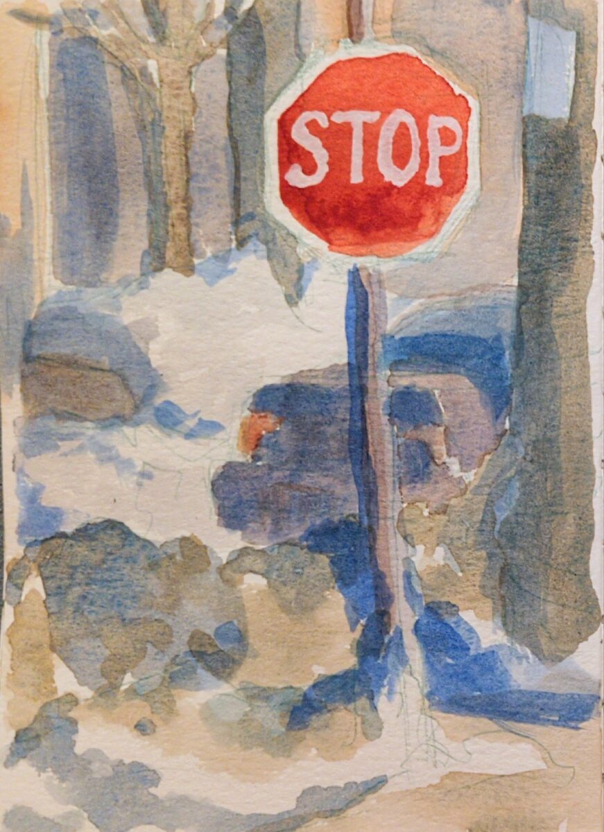
After a few weeks away it was great to get home to the oil pastels!1

I painted this one on canson mi-teintes paper, with sennelier oil pastels, and was reminded that when used on paper, even the greasiest oil pastels do set somewhat! Between days, the pastels set up enough it wasn’t blendable with my finger, though it was certainly still smudgable and easy to scratch. This meant I did really need to think in passes or layers, knowing that what was underneath would be unlikely to move much.
That aspect of this I definitely liked! But honestly, I used the more heavily textured side of the Mi-Teintes paper and I am not a huge fan of its visible texture. I’ll have to try the smoother side next time.
- They don’t travel so good, especially if they’re getting tossed around like on a plane. ↩︎
-
When all this was ramping up, I tried to do a lot of research into what tools I would need to navigate the world with my left hand, and there were two things flooding my search results: things for parents to buy for their left-handed kindergarteners, and mensa nerds looking to minmax their IQ by becoming ambidextrous.
So, life seems, at least from dipping my toe in it, to be a liiitttle bit condescending to left-handed people still.
My parents’ generation were kids back when teachers would smack you if you tried to write with your left hand, and it does seem significantly good that we don’t do THAT anymore, but, goddamn. There are a LOT of apparently right-hand-specialized tools that don’t SEEM specialized at first glance.
Left-handed scissors were by FAR the best thing I purchased: without relearning how to use scissors, using right-handed scissors in my left hand is deeply annoying. Left handed scissors work instantly with no learning curve. They contain no software, they are available most places I see any scissors (tho, def not all), and they weren’t marked up hugely over the right-handed scissors I saw in the same stores.
Left-hand dominant folks I know can all use left or right-handed scissors; left-handed ones just change how they see what they’re cutting, and how ergonomic the pressure required to cut is. They make my day to day slightly easier and I appreciate them immensely.
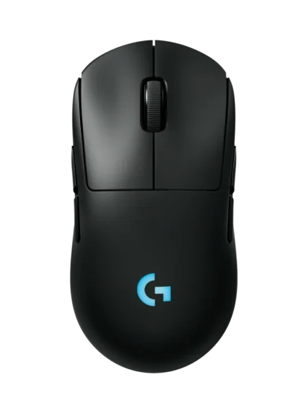
Left-handed mice are a lot harder to find; while I don’t think hand dominance and mouse hand choice is usually connected for most folks, having no ability to extend (lift) my fingers on my right hand meant mousing with it was out of the question. Being able to mouse with both hands really helped me back in my carpal tunnel days and I was determined to find a gaming mouse for my left hand for this recovery period. In the end I found an ambidextrous Logitech – the Pro 2 Lightspeed: you can change which side has the extra buttons, which is a really great feature, and when I am mousing more with both hands I might enable the buttons on both sides and duplicate their function.
In the specialized realm of music and sports there are left-handed alternatives for string instruments, for golf clubs, baseball gloves, etc. That was no surprise.
As I dug into it, though, it seemed to spiral. Did you know kitchen knives are sharpened with right-handed use in mind? Can openers absolutely are designed for right-hand dominance. Corkscrews and screwdrivers and so forth are designed expecting the strongest force on them to be compatible with the strongest force capable in a right hand. None of this PREVENTS left-handed use! It just means that left-handed use is slightly (or significantly sometimes) less ergonomic.
Slightly less ergonomic might not be a big deal when you’re able bodied, and when you’ve spent your life learning to accomodate that slight hurdle. And, as my uncles tell me, it’s a lot better nowadays than when they’d come home with welts on the back of their left hands for writing with the wrong one in class. (They rarely use left-hand specific tools as there was no chance of those being available when they were learning things as kids.) But it DOES add a layer when you’re NOT ablebodied, or have anything else adding exhaustion to your day.
Anyways, left-handed-ness. The world seems more annoying for left-hand dominance than I had realized. Sorry for my prior ignorance!
-
After surgery, I had planned to take two weeks off of work. The actual surgery itself didn’t sound as intense as some prior ones I’ve had, but I had at least some sense that it would take some time to readjust.
In the end I took four weeks off, and I’m hugely grateful to my job and the team I work with for accomodating that so kindly. For those four weeks, I slept, recovered, panicked, vibed, walked in the park, researched accessibility aids, and screamed into pillows with the rage of a thousand suns.
I have never, in my adult life at least, felt so unrelentingly enragingly constantly frustrated as I did in those first four weeks. I fucked up everything I tried doing, and since almost all of the things I tried to do in that time were self care activities like drying my hair or texting with friends, that took a huge emotional toll.
Have you ever had a moment where clumsy mistakes chain together, and you drop something, stub your toe, bump your head, spill your drink, and fill a text window with typos when you try to tell someone about what just happened?
Some days it feels like I’ve been in that mode steadily since Oct 2023.
I spill food on myself. I miss my mouth when I drink from my water bottle. I drop things I’m holding; I click the wrong link while browsing; I whack everyone and everything with the padding on my arm brace.
It’s certainly at least a little better now, a year + later, partially because I’m getting less clumsy (less, not none), but definitely also because my frustration threshold has been forcably moved, a thing past me wouldn’t have believed could happen.
That first month was utterly enraging. Everything I tried to do the old way failed to work because I was doing it one-handed with the wrong hand; every new tool I tried that supposedly would improve my life turned out to have at minimum a big learning curve, and more often than not a whole range of capitalist cruft woven into it; and the whole time I was locked in a vicious internal battle against all the toxic independance and deepseated ableist shame that had been waiting for me in my head.

I’m maybe making light here, but the rage was exhausting. I took four full weeks off of work, and I am glad I did, because I was not in a state where I would have been a positive presence on my team.
The frustration is still there; the shame and toxic independance are still there.
I misclick with my left handed mouse and close the screen I was on without saving, and the red fog threatens to roll back in.
A friend lovingly jokes about the nonsense that a dictation tool made out of my attempt to text them, and the mental tornado siren starts to spin up.
I burn myself mildly on the airfryer trying to cook dinner solo, and every curseword I know lines up behind my tongue, promising catharsis.
I am, however, less overwhelmed by it, than I was that first month. That’s largely thanks to arsenal of management techniques I have built up: I step away, I take breaks, I made a catharsis playlist for when a big feeling starts camping out in me and I can’t dislodge it. I know that having eaten is the first key to patience. And I know that some days I am just going to have to label as “FUBAR” on the calendar and treat as throwaways. But yes. Recovery has been frustrating.
-
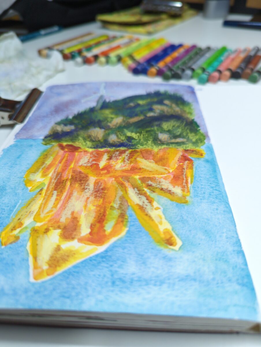
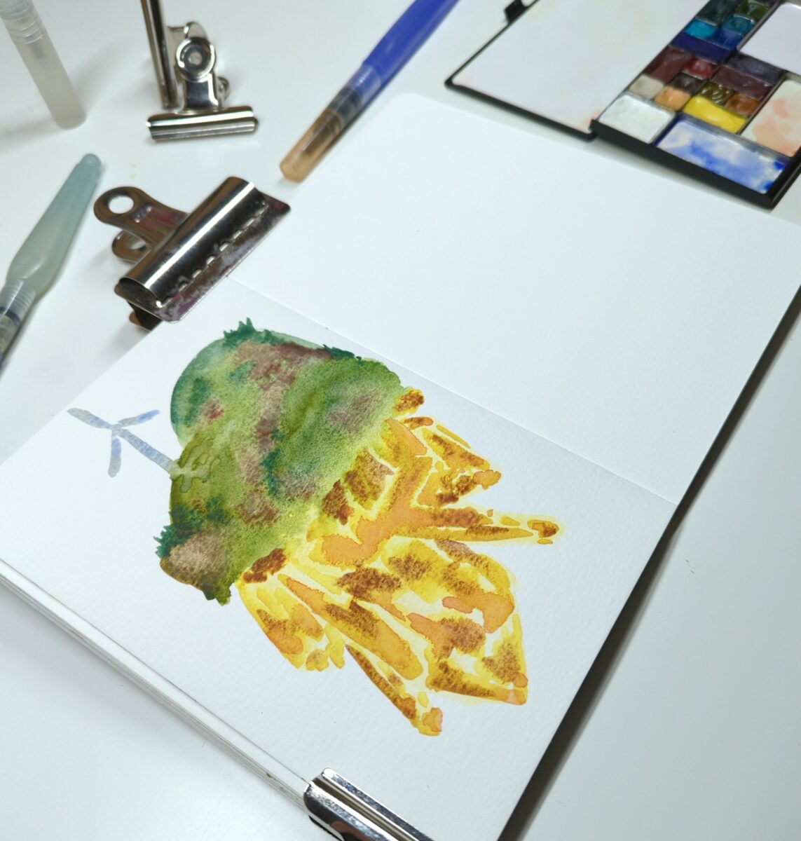
A painting from the cafe window and two made up landscapes, to test drive this watercolour selection and see if it’s missing anything.
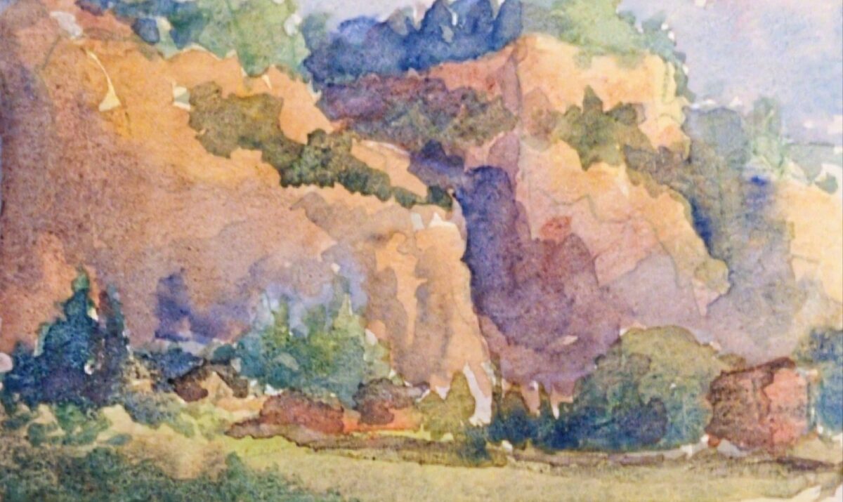

I love how warm the greens can be despite my palette having cobalt teal AND cobalt turquoise! And the granulation is really working for me.
I do miss having a near-black blue or green – anthraquinone or prussian blue, or perylene green – but it is fun finding other ways to get those deep darks. It’s definitely making me use my purple more, and I do love what purple does to green.
Probably the biggest thing missing from this palette is a saturated middle yellow. I have lemon yellow deep, which is very cold and quite pale, and I have Mijello Mission Gold’s green gold, PY150, which is warm in masstone (full power) and quite cold and intense in dilution (watered down). My only warm wash colour is raw sienna. It is giving things kind of a cool cast even to the yellow light in that middle landscape sketch; that might honestly be a nice technique to use for a palette destined for outdoor painting. We’ll see!
These were all painted in my lightwish 100% cotton watercolour sketchbook, and you can see I have a hard time getting crisp small details in here. I think there’s two reasons: firstly, the paper holds SO much water, it takes much longer than I expect to dry (this is also a feature, if you want to control and modify washes at length); and secondly, I’m testing this palette with waterbrushes, and it’s very hard to control the water enough to get dark rich sticky mixes that are JUST liquid enough to lay down smoothly. I don’t particularly think the paper itself is at fault as much as my technique. BUT. Something I’m noting and thinking about.

Leave a Reply