
swap to chronological order of most recently posted
-
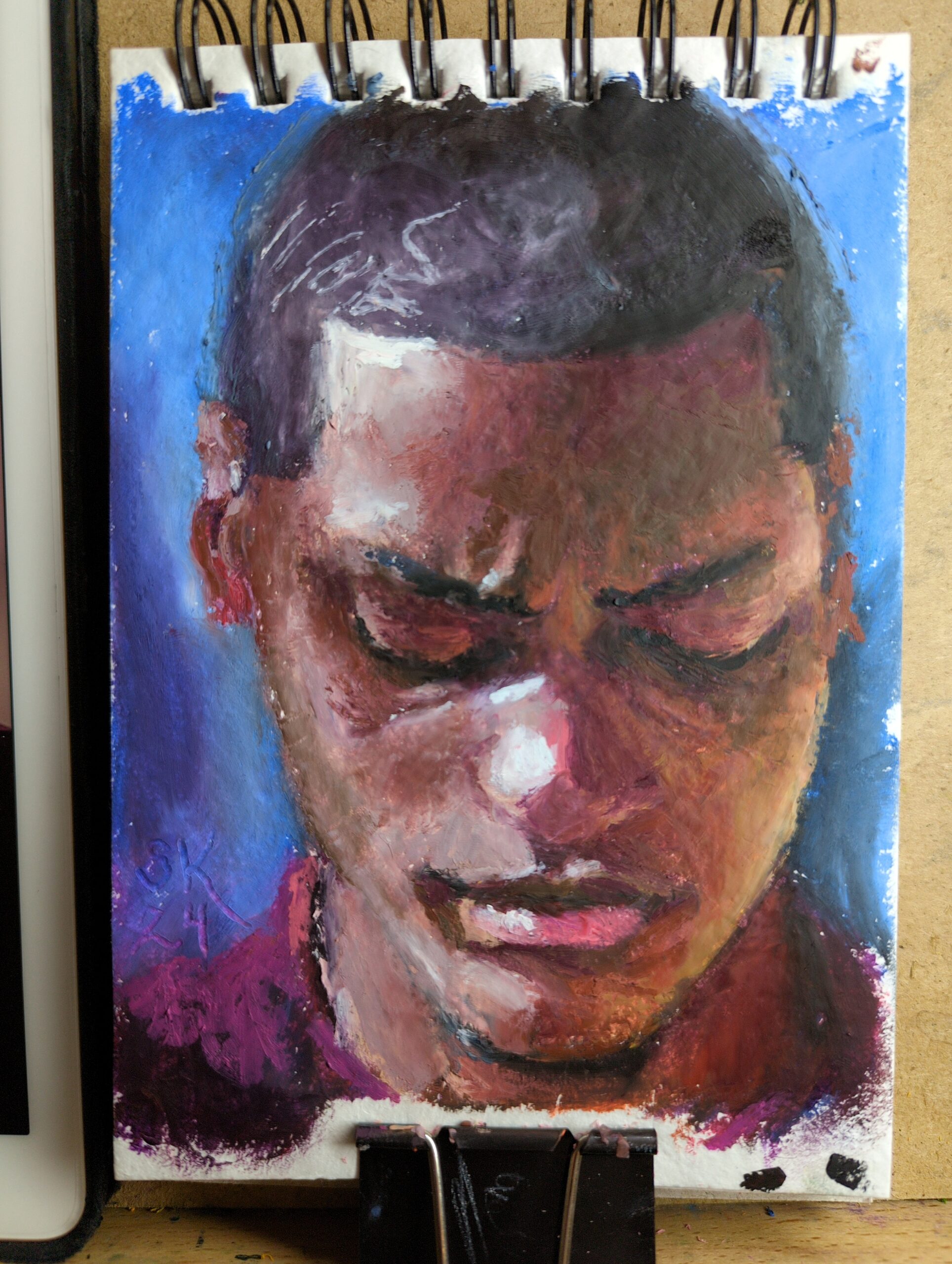
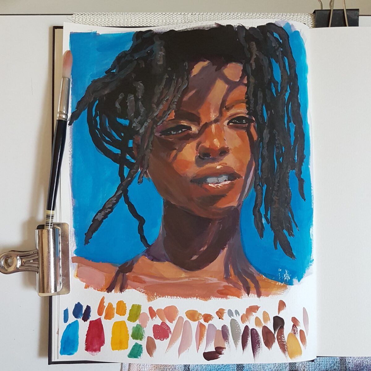
Browsed through Earth’s World for some great natural light portraits to practice with. This was made in a new little 5 x 7ish sketchbook I picked up that’s filled with recycled cotton rag paper. I’d been noticing that rag papers have taken my softest oil pastels the best – you can see one pushed to its limit here – and finding a rag paper sketchbook seemed lucky! So my plan is to fill it up with small tests and just work on my technique.
-
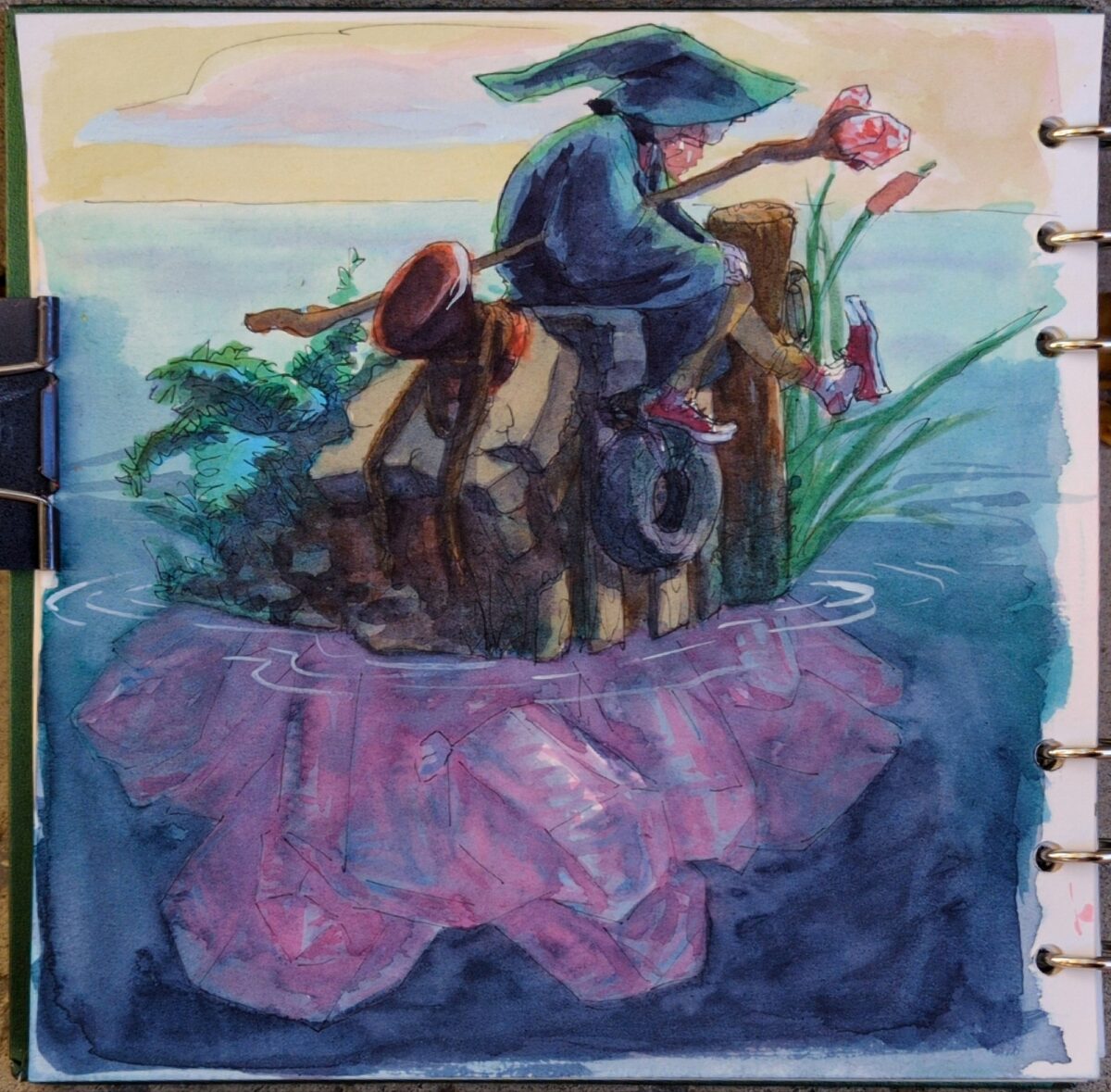
watercolour and fountain pen, in my sketchbook.
I’ve been drawing modern wizards for my wizard puberty zine and what if they hung out on crystals islands.
-
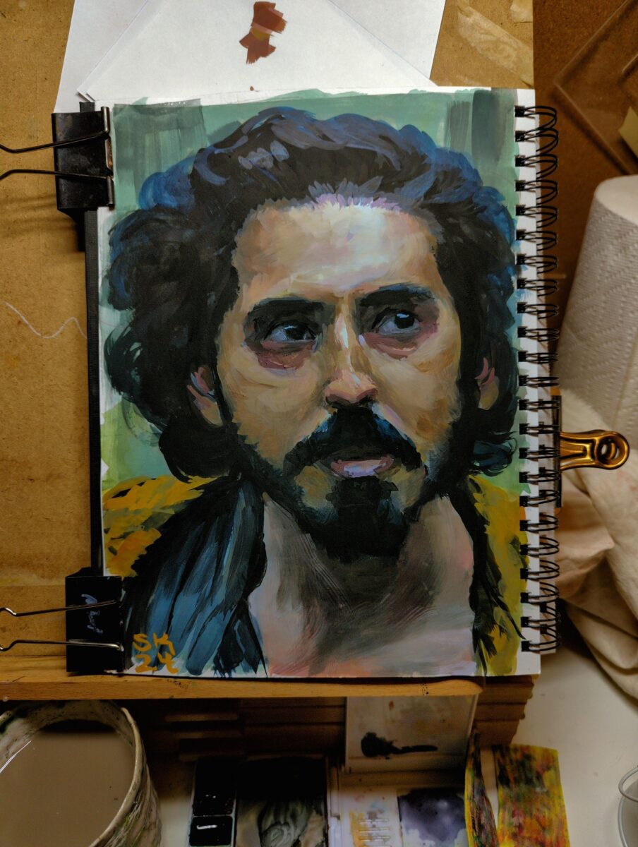
So back in 2016 I decided to learn how to use gouache.
For context, I finished my second round of art school in 2013, and that included a lot of drawing training and anatomy study, which I still use every day as an artist. I also already had some classical Russian academy style portrait painting training in oils, from back in 2012 and 2013:
gouache sure as hell doesn’t behave the same way, and there is something so alluring and entrancing about oil paint, especially for painting faces and figures! But it’s beyond my scope for a home painting setup, and I say this with four years of using it academically. Gouache just fits into my life so much better! And while it did initially feel like an alien tool compared to the softness of oil, learning it has been a fun journey!
Speaking specifically of gouache portrait practice, here’s a record of some of my stops along the way to where I am today.
2016 – started doing lengthy, and tiny (4×3″), photo studies, mostly of landscapes but also the occasional face:
then in 2017 i put photos away and just played with gouache for a year with minimal reference used, learning about the medium and learning a LOT about colour:
2018 was packed with freelance painting so i only snuck in a few proper studies, mostly still life work:
2019 saw me laid up on the couch most of the year so things were limited to digital iPad work mostly, with a few gouache sketchbook still life studies that really focused on pushing my control of the medium, not portraits:
2020 was a famously rough year but i did get back finally to my desk and my paint and my paper and started properly studying gouache portraits:
2021, i kept going, wrestling with anatomy and surface and value and temperature and just being both excited and frustrated by my gouache work:
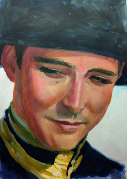
2022 I think something started to click – between getting better at anatomy AND starting to see how gouache can be blended and worked up into lost and found edges:
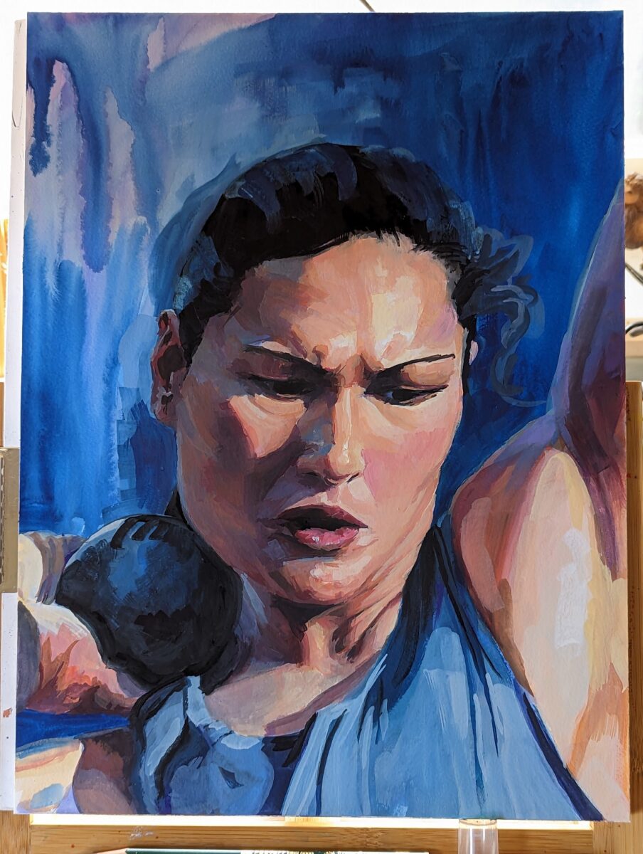
in 2023 I really felt like I was getting somewhere! Painting bigger was making the drawing harder but I was really starting to get a feel for rendering different materials and surfaces with the gouache:
… and then i had my arm surgery and i couldn’t make precise marks anymore. Early 2024, done with mostly my non-dominant hand:
and now almost a year later, I’m slowly relearning how to use my still-healing dominant hand make the marks i want, and it’s so, so good to get back to gouache!
ok but how tho
if there’s one piece of advice I can give you if you’re trying to learn how to do realistic rendering in gouache, it’s this:
these rendered paintings take me three to 12 hours of work. i am not going to get a painting to this level of accuracy and polish in a single sitting. doing a good painting requires stepping away and refreshing my eyes and coming back; and it requires being willing to paint over entire features if they’re wrong.
give yourself the time to take a painting to finish so you can see what you are capable of, then, figure out what you need to work on, work on that discreet thing as a separate sketching process, and finally come back and try another long study and see where you’ve gotten to.
-
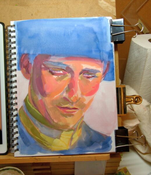
Process shots:

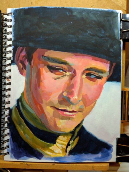
Honestly, I love the tiled effect I had going before the tighter rendering and, while the drawing wasn’t solved yet at that stage, I am curious if that isn’t a more appealing style for a potential finish for me on future studies. Something to explore.
-
-
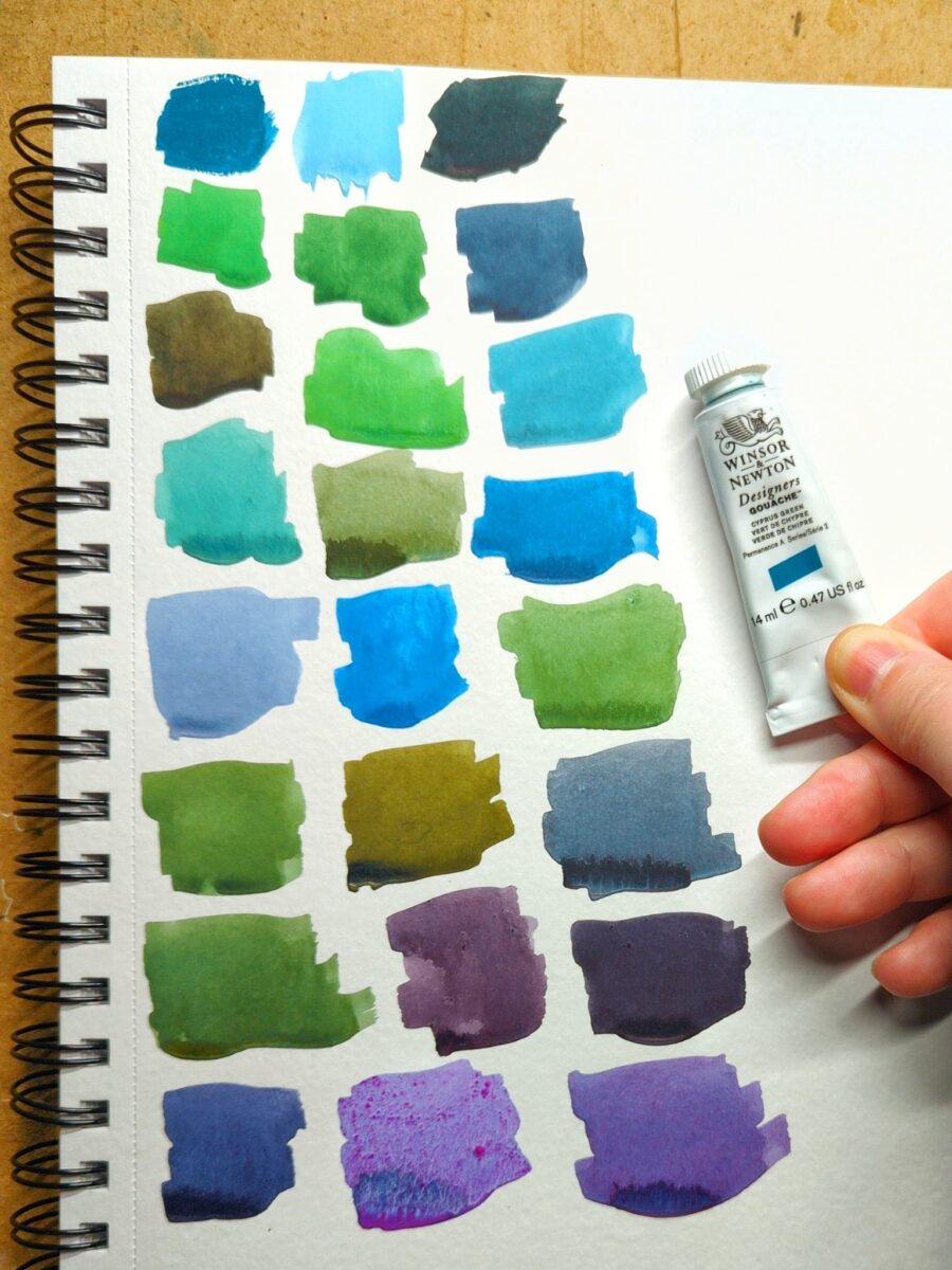
got a new tube of gouache paint! Winsor & Newton’s Cascade Green. You can see the tube colour pure in the top left swatch – the rest are mixes.
Teals are wonderfully fun pigments to work with because of this incredible breadth of mixes possible. Functionally, Cascade Green is working like a very highly saturated blue, giving me really vibrant greens, rich royal purples, and cool, elegant greys. Those singing purples in the last row are mixed with W&N Primary Red and Holbein Opera (both paints that do not like to rewet – especially the opera, hence the confetti of pigment in that one purple), the two yellowish olives with burnt umber and burnt sienna, and those vibrant glowing sky blues with various purples.
This colour is extremely hard to neutralize. the greyest two-colour mixes i could get from it still felt quite greenish, blueish or purplish. It’s going to be a very fun addition to any limited palette because of that incredible flexibility.
I chose it over buying a replacement tube of Winsor & Newton’s Turquoise Blue, a colour i used with abandon a few years ago, simply because i hadn’t tried Cascade Green yet. Honestly, I think i prefer it – I’m getting richer mixes from it, even with my multi-pigment pastels. I wouldn’t say no to owning both paints someday, but I’m definitely going to have fun with Cascade Green in the near future and I’m glad I gave it a try.
in terms of its dominance in a mix, it’s as dominant as any of my of earth tones, but not quite powerful enough to stand up to spectrum red or perylene violet.
-
-
-
Okay, this first in-depth cellphone photography post is going to be about white balance.
One of the things that I often struggle with is getting the colors to look right on my phone. If you’ve ever tried to photograph a sunset, or anything at twilight, or anything in a dramatically lit room, you might have noticed your digital camera on your phone kind of taking the juice out of the colors a bit. There are lots of complexities to how cameras capture color, and I’m not about to give you a magic answer that solves every problem, but the understanding that I’m about to share here was a huge help for me and has made it a lot easier to get colours on my phone camera much closer to what I can see in front of me.
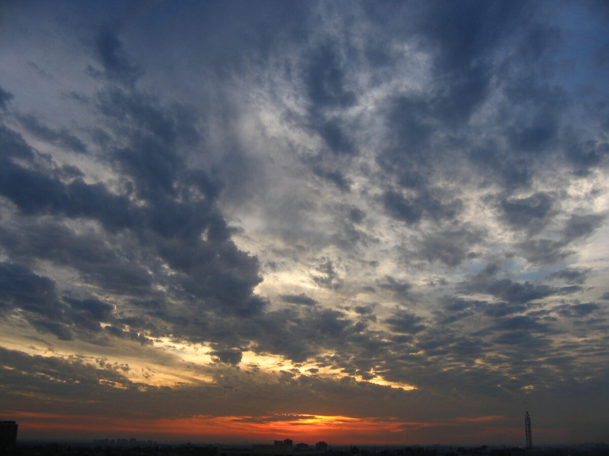
sunset with most of the image feeling very grey 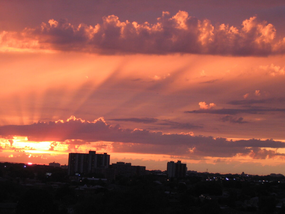
sunset with most of the image feeling very colourful and pink and orange White balance as a term is referring to how the camera is assigning colors to what you see in front of you. Unfortunately it turns out that color perception is a relative phenomenon, and while we do know the wavelengths for particular colours, the way that our eyes perceive those colours is not fixed and absolute.
To get maximum information out of any scene our brains tend to move color around a bit. If you’ve ever been in a room lit only with red, and then stepped outside into a room lit by a white light, you might have felt colors move and shift a bit on you. Probably the easiest way to prove this to yourself is to close one eye and use the other eye to look only at something very red for a full minute. Then close the red eye, open the other eye and flip between them to see how your brain is trying to deal with this dramatically different input.
Enough about brains though, we’re here to talk about cameras.
So firstly: a digital camera is not necessarily able to capture the entire breadth of colour in the visible spectrum. (Have you heard of non-photo blue pencils or ink or paint? It’s called that because it really doesn’t photograph well.)
Your digital camera also (along with any and all digital displays) cannot display the entire breadth of colour in the visible spectrum. It can display even less than it can capture, I believe.
FYI: the subset of colours that a given technology, medium, or such can display, compute, capture, etc, is called its gamut. Your screen has a gamut; a printer has a gamut; the human eye has a gamut; a bird eye has a gamut; your watercolour palette has a gamut. The gamut describes the colour hues (if it’s red, yellow, green, blue, etc), the colour vibrance or saturation (how intense it is, or how greyed out it is), and the colour values (how light or dark it is) that can be displayed or captured.
Now, while our brains can shift the emphasis of colours around a bit, we do perceive the full breadth of the visible spectum (under ideal circumstances and with full use of all rods and cones in our eyes, which is not universal), but digital cameras? Because of their reduced display gamut, they have to choose which colours to discard, combine, ignore, etc, to squeeze more data down into what you see on screen.
They have to translate from the spectrum we built them to perceive, down into the display gamut.
That choice / that translation is called the white balance.

image taken on a cloudy day with the white balance set to “incandescent” – giving everything a blue cast 
image taken on a cloudy day with the white balance set to “overcast” revealing more accurate, maybe even slightly warm colours Digital cameras usually offer automatic white balance, and specific white balance settings. Specific settings could be descriptive, like “daylight” or “incandescent light” or “fluorescent light”, or they might have a temperature number you can set.
That number, as I understand it and I’m sure there’s specifics I’m not aware of or I’m missing here so, you know, feel free to do a lot more reading on this if you’re interested, but as I understand it the number is a temperature in kelvins that tells us what colour the light is based on the heat of the source.

wikipedia’s light temperature chart – click through for so, so much more info Different types of light sources match with the light produced at different temperatures, and this is why someone might talk about light’s temperature, warm or cool. Unfortunately things there are a little backwards, thanks to chaotic english verbal metaphors.
So a candle, which produces a very warm-feeling reddish light, is throwing what is actually a very low temperature light. The sun, which when it is directly overhead produces a very bright white light, is a very high temperature. Different types of artificial lighting like incandescent, halogen, fluorescent etc exist along the temperature scale, but it’s a little bit more complex than that – some lightbulbs produce multiple bands of coloured light.
If you’d like to learn more about light temperature, and light sources, I definitely recommend James Gurney’s book Color and Light. It’s for painters, but anyone who makes images from life could benefit from the robustly researched scientific info on how we see the world around us.
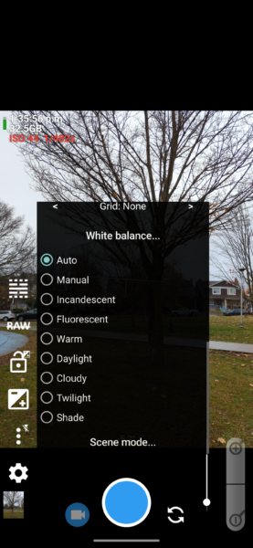
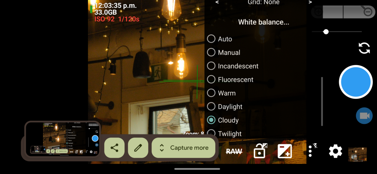
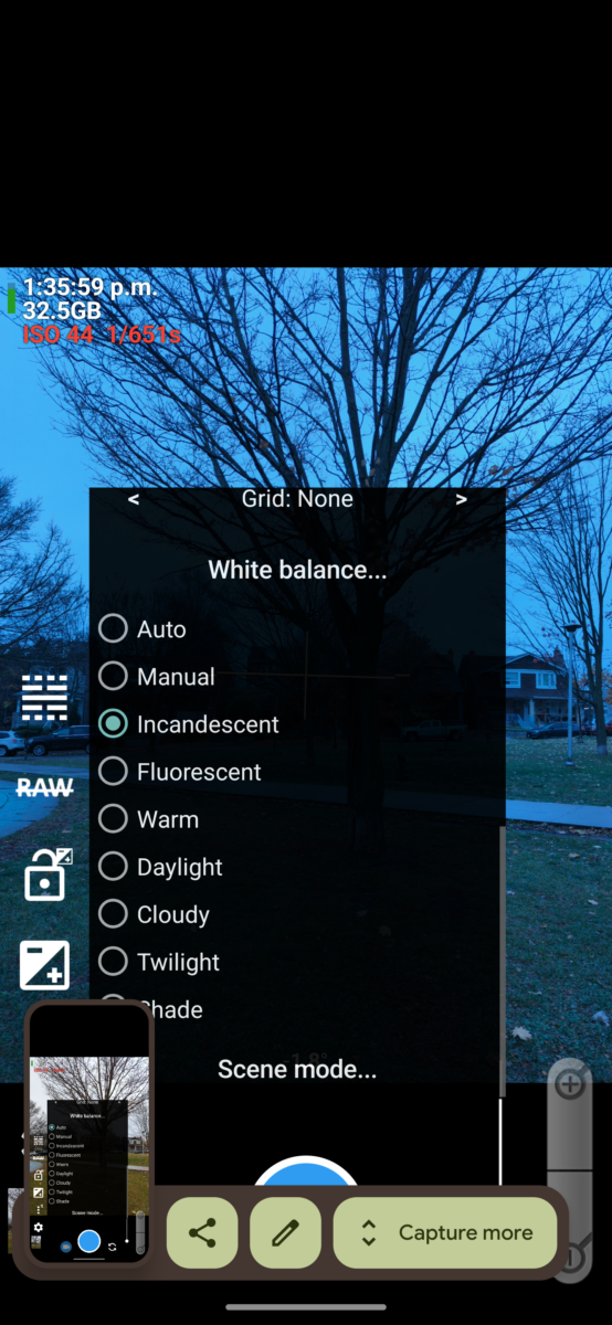
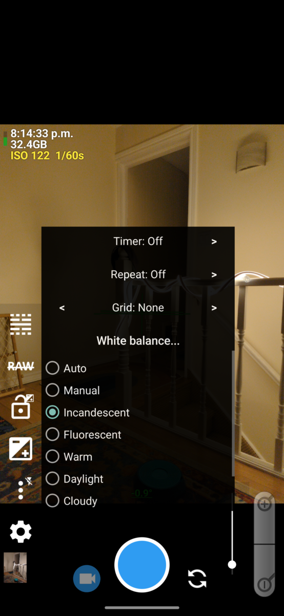
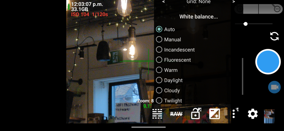
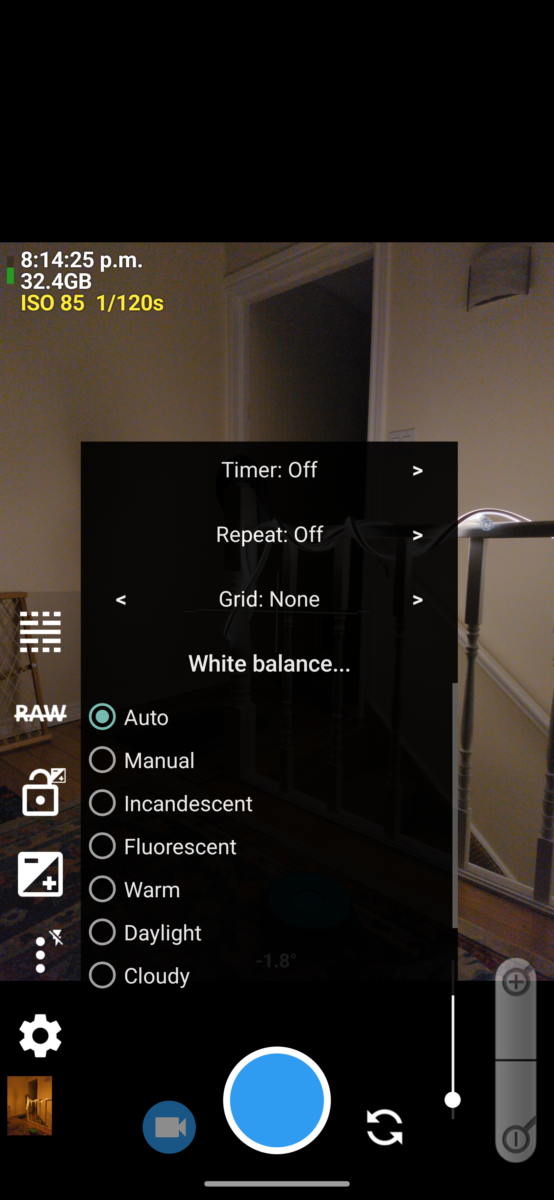
the white balance settings in Open Camera on my google pixel 6 pro 
the temperature slider in adobe lightroom I don’t have examples of the temperature slider as a white balance tool in my open camera screenshots, though, as my Google pixel 6 pro’s camera API doesn’t let the app Open Camera access that setting, and when I try, it only shows me a black screen. This is an API barrier Google has set up on its phone camera driver – even though the camera absolutely is taking photos using this info, the driver API hasn’t exposed it to outside software to control.
It will, however, thankfully, let me choose between fixed descriptive white balance settings! Everything from Incandescent to Twilight and back again. Each of these settings is associated with what I will call a colour profile, which tells the camera how warm or cool to expect the incoming light to be, on average, and how to then translate it.
Wait, wait, though, I think I’ve skipped a key concept here, hold on.
Let’s go back to that reddish firelight.
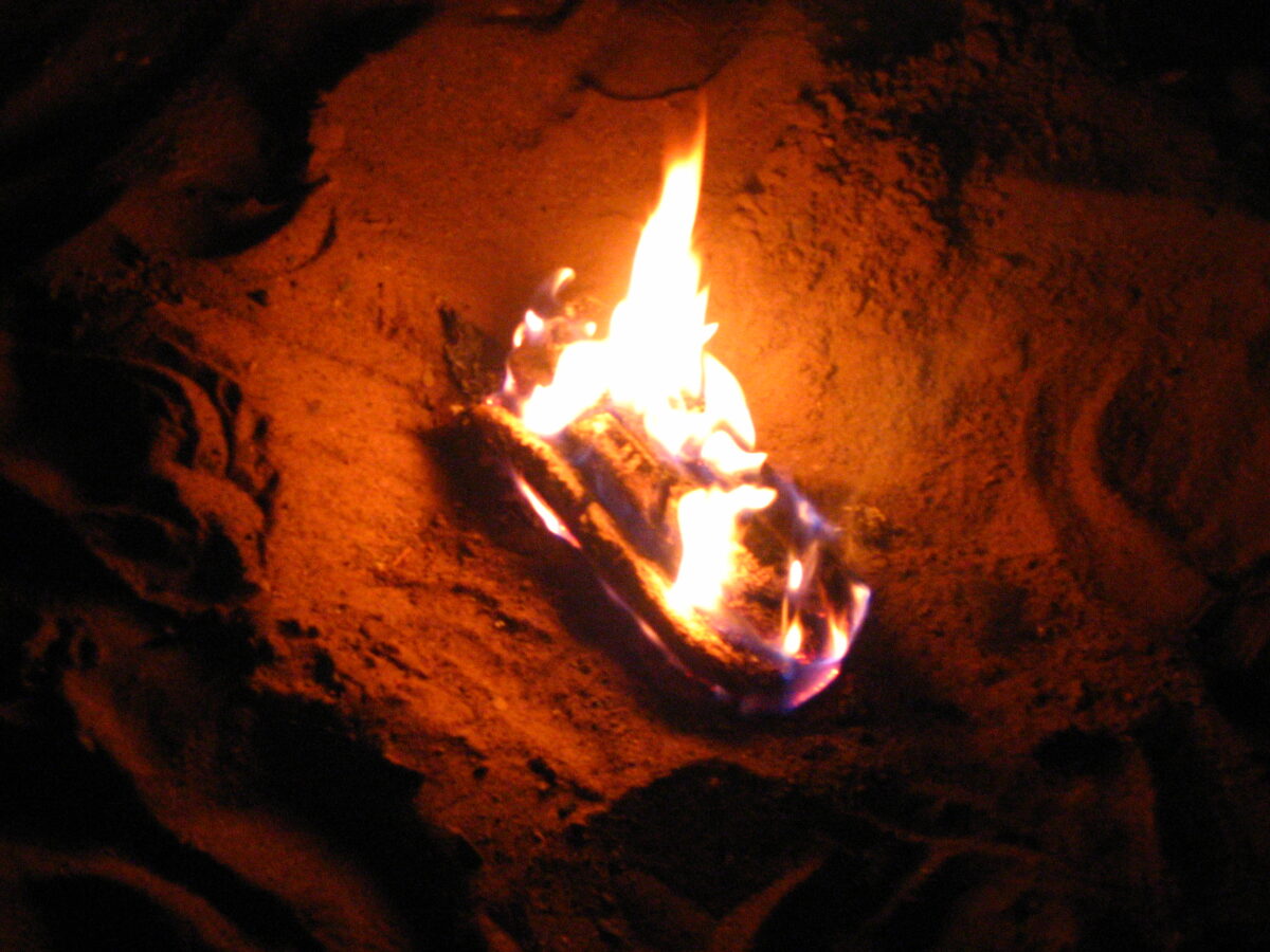
If you light a scene with a flame, say in a campfire or on a candle, you know it’s giving everything a warm glow, right? The way it’s doing that is: the light produced by the flame is itself made of mostly red and yellow wavelengths of light. It’s not producing any light on the blue wavelengths.
The way we, or a camera, perceive color is by coloured wavelengths being reflected off the object we’re looking at. The object doesn’t create the coloured light, it requires light of the right color to hit it for the colours of the object to be visible. Sunlight, white light, contains the full spectrum of colours, and so in bright sunlight the light itself shows us all the potential colours – which means it changes none of them, which means the light itself feels white.
When the flame on a candle produces light, it’s mostly producing red and yellow light, which means if it encounters a red object, it shows us the red, but if it encounters a green object, it can only show us the molecules inside that green color that are yellow, and the molecules inside that green that are blue don’t reflect any light. To our eyes, this tints the object yellowish in the candlelight.
However, if you stay a long time in a room lit only by candles, you probably feel like you can see green and blue and purple colours a little still. As I understand it (and my neurologist family members will I’m sure be haunted by this maybe oversimplified info so please follow the rabbit hole here if you’re curious, it’s really interesting stuff!) this is your brain compensating for the tinted information by shifting your identification of colours, maybe to try and help you discern as much information as possible from the limited visual data. You don’t stop knowing it’s warm light, but you adjust to it.
As an example, and here I’m talking about your eyes, remember, not the camera tech yet (we’ll get back to it shortly), here is a photo of a candle.
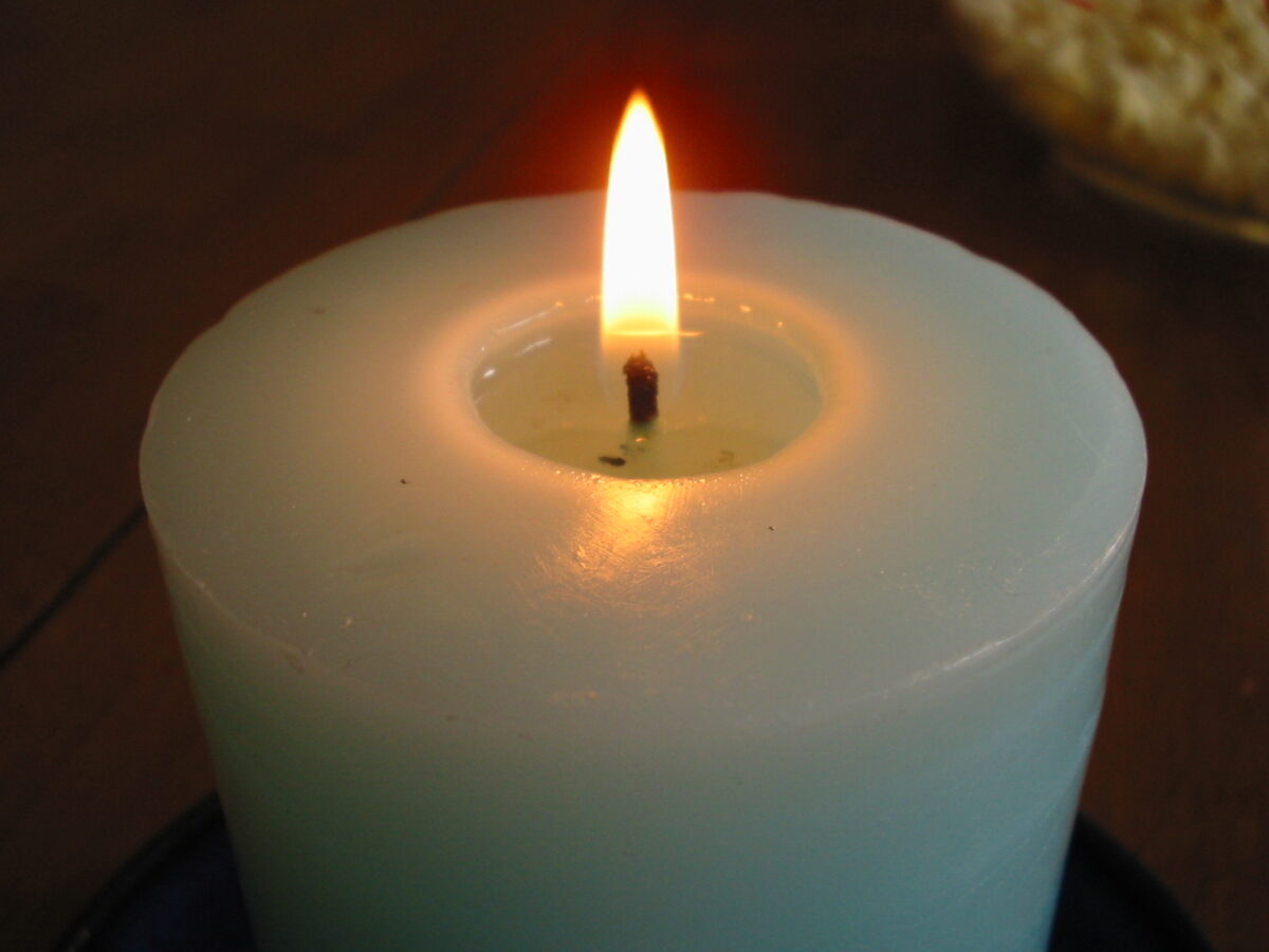
First off, let me assuage your dress-related paranoia – this is a teal candle.
To me, looking at the photo, this is clearly a teal candle. You can see it’s a lovely seafoam green at the top where it’s warmer and glowing through the melted wax, and a much more vibrant blue farther down, away from the flame.
So let’s take a closer look at these colours! I have isolated a few into bigger dots and overlaid them on the image where they were eyedroppered from:
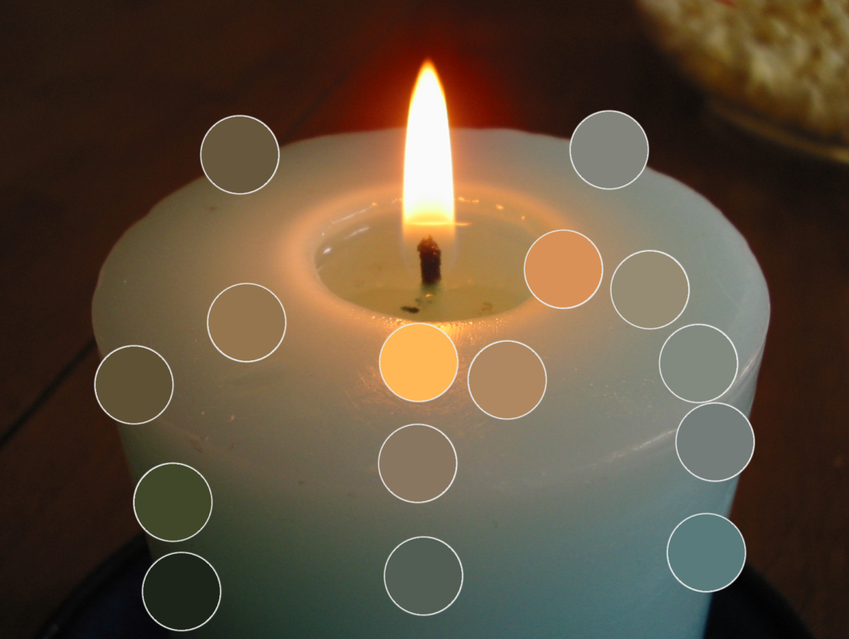
And here are the same colours just on a neutral 50% grey background.
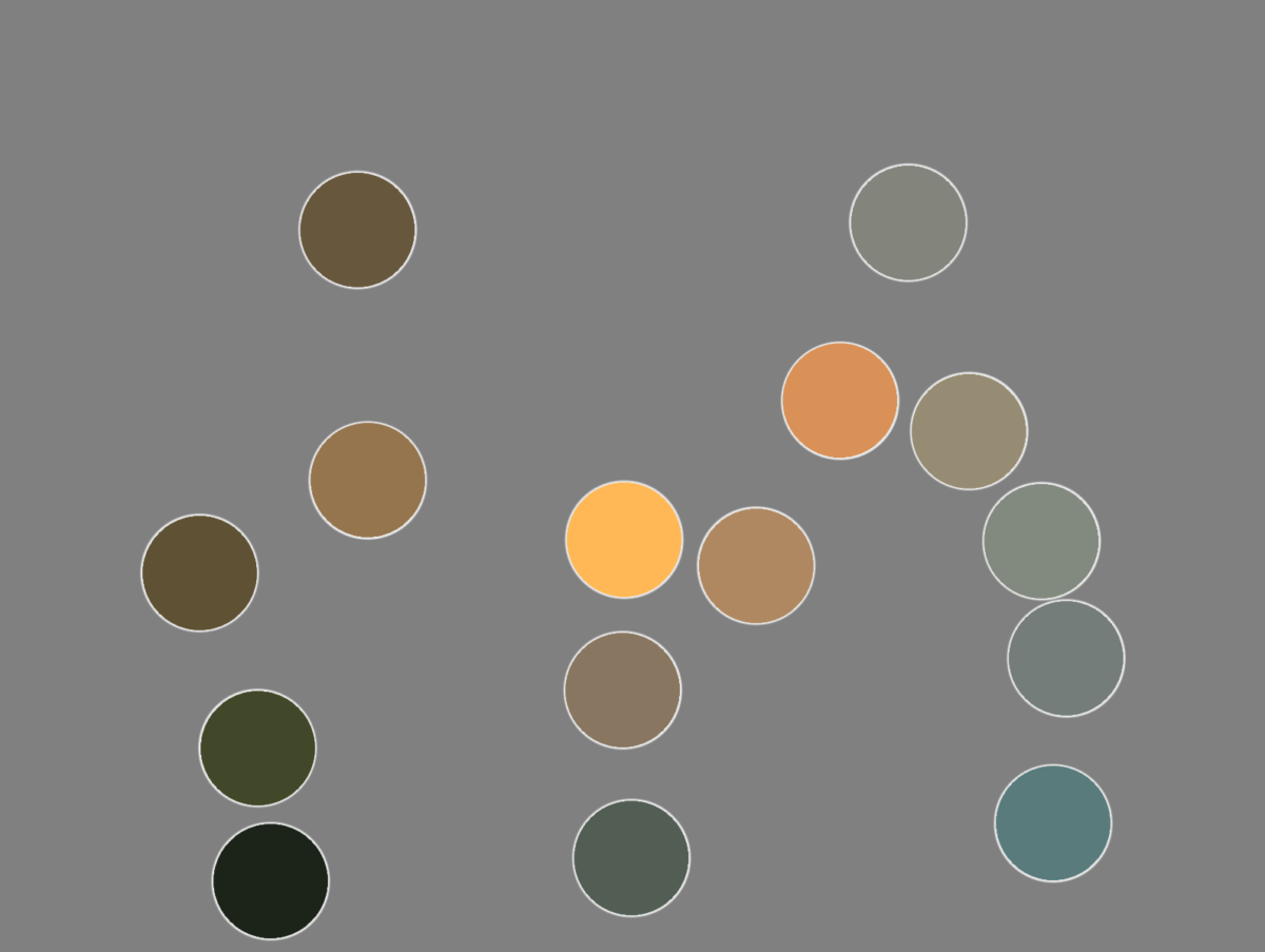
Here I have eyedroppered that brightest blue in the dots, the one on the bottom right of the image. This is how blue it is: not very blue! Pretty green still! Because that candle’s light cannot show us blue and purple wavelengths, we end up with an image where a cold green-grey starts to feel blue.
Our eyes work to compensate in limited-colour situations. We’re actually really good at it! And anyone who makes art commercially, anyone who designs colour for film and tv, advertising, fashion, games, etc? They all know this and use it when creating images. It’s why, given full colour vision, at a candlelit dinner, you can still tell your green veggies from your red ones.
And it’s not at all new! You can see this in Georges de La Tour’s famous candlelit paintings. The brightest light feels white, and colours still have some vibrance to them, and the scene feels rich, but, there’s no actual blues on the canvas, even though we have no trouble identifying the woman’s dress as light blue:
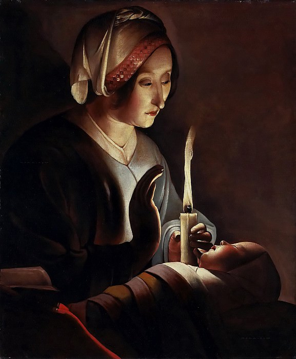
Georges de La Tour – Saint Anne with the Christ Child
1645-50So what does this have to do with camera white balance?
Sorry for the detour but it’s a useful comparison.
Your eyes can likely perceive all of the visible spectrum. (It’s called the visible spectrum because it is the spectrum of light visible to human anatomy. as mentioned above, that anatomy varies.)
Digital cameras, however, are not able to do that. They have to pick a subset of the colours in the scene to translate into their digital gamut, and they are very good at doing that convincingly.
So when you pick a light temperature, or a fixed white balance setting like “incandescent”, you’re telling your camera how to translate the light it receives into the digital spectrum.
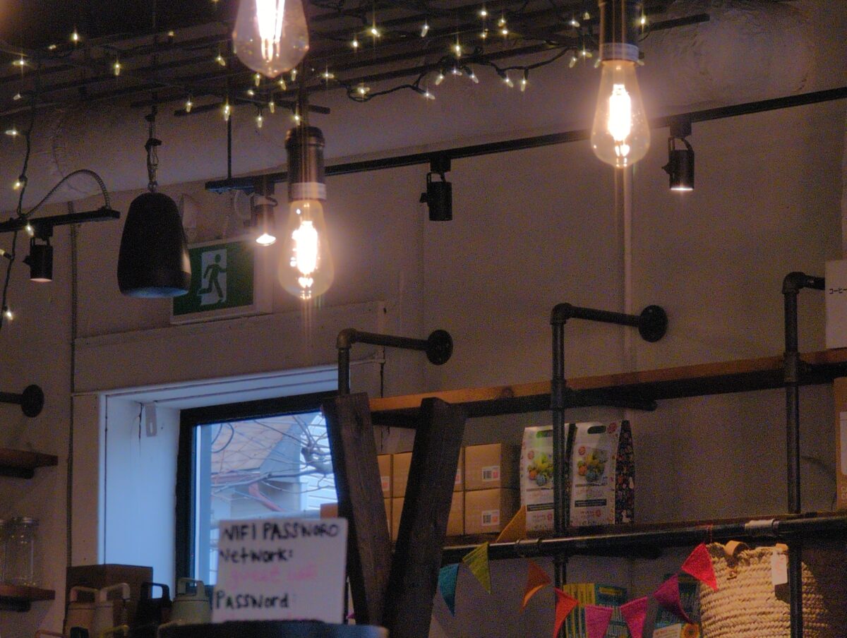
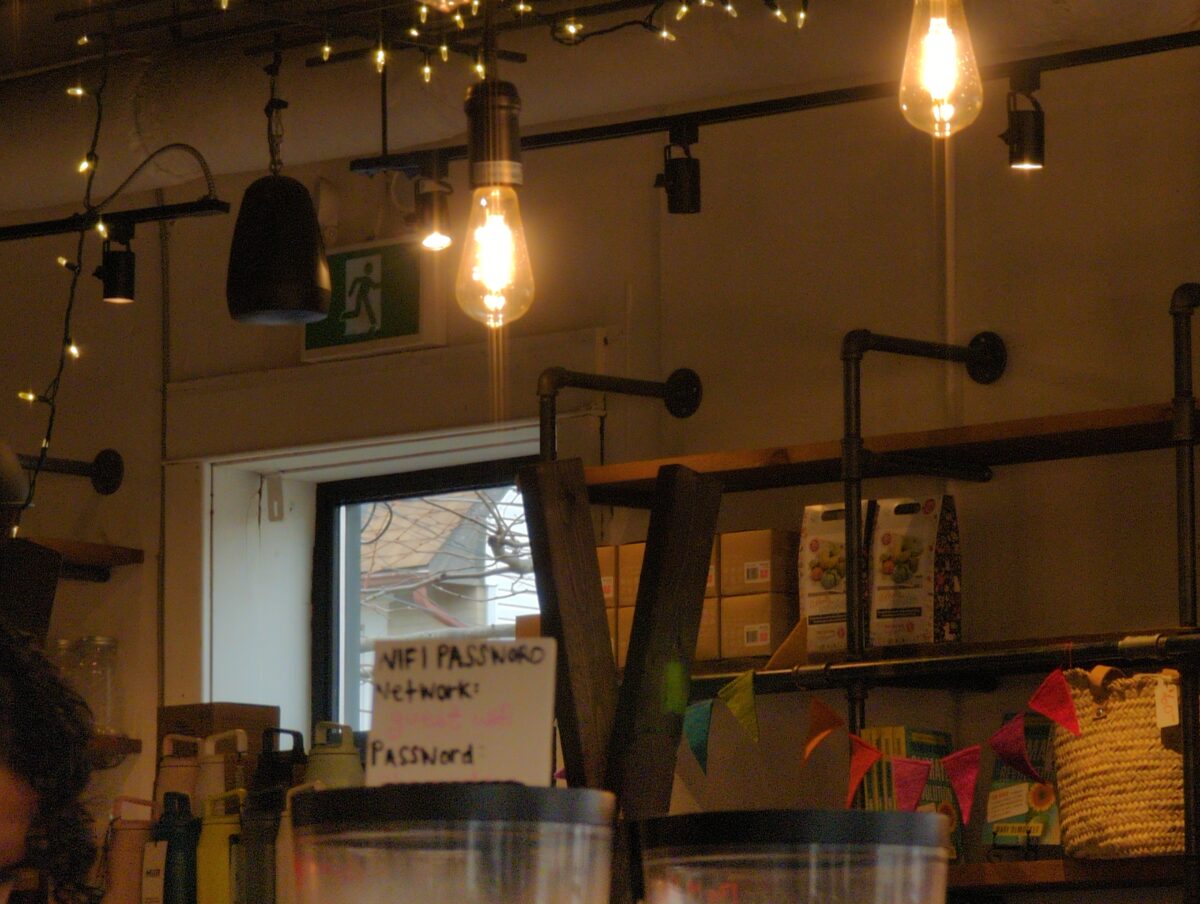
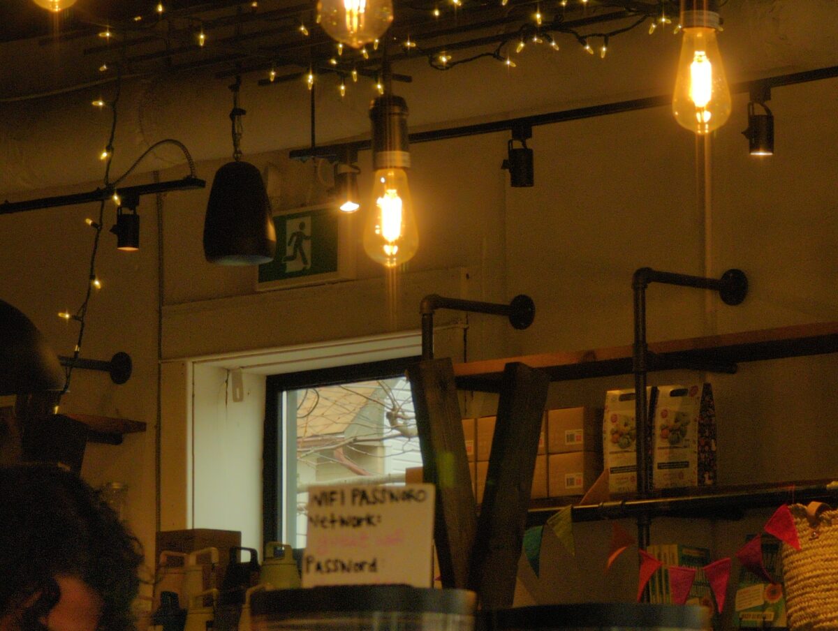
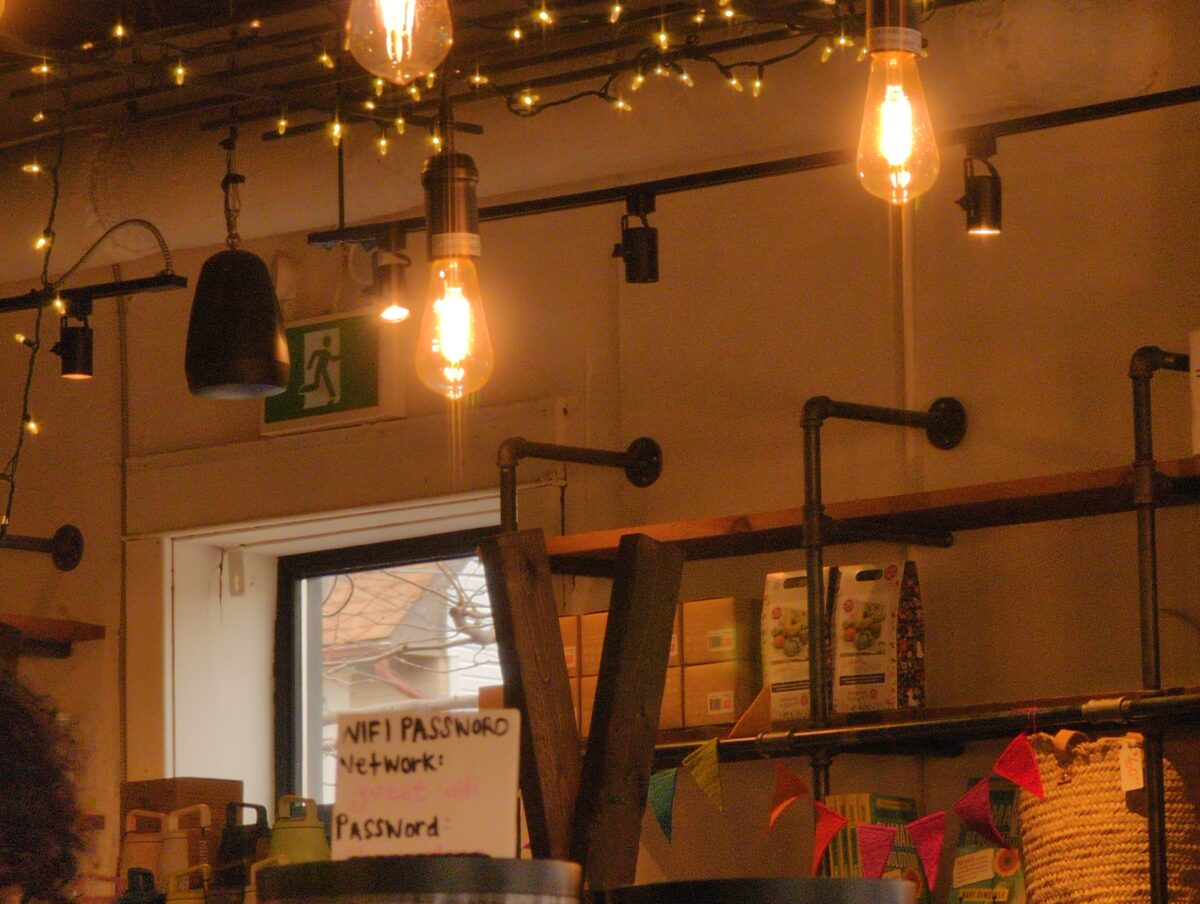
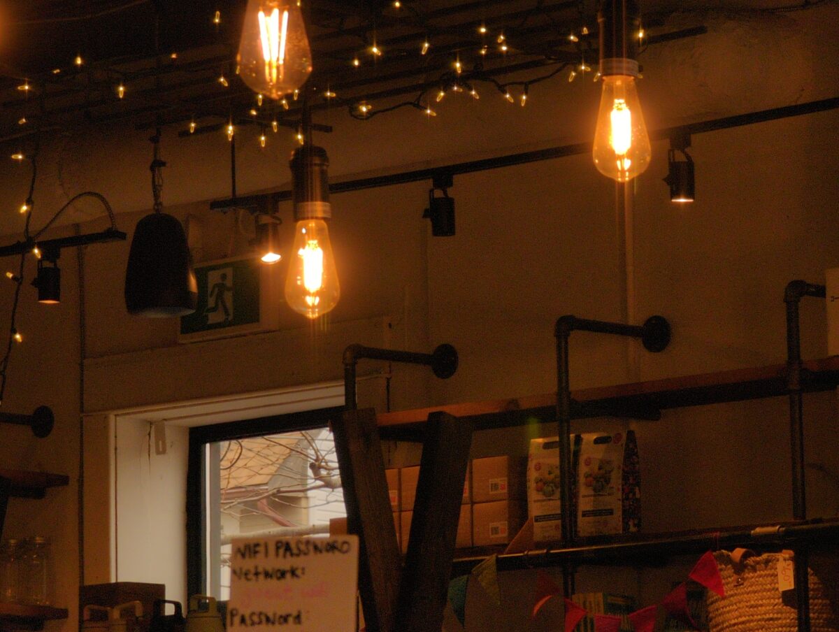
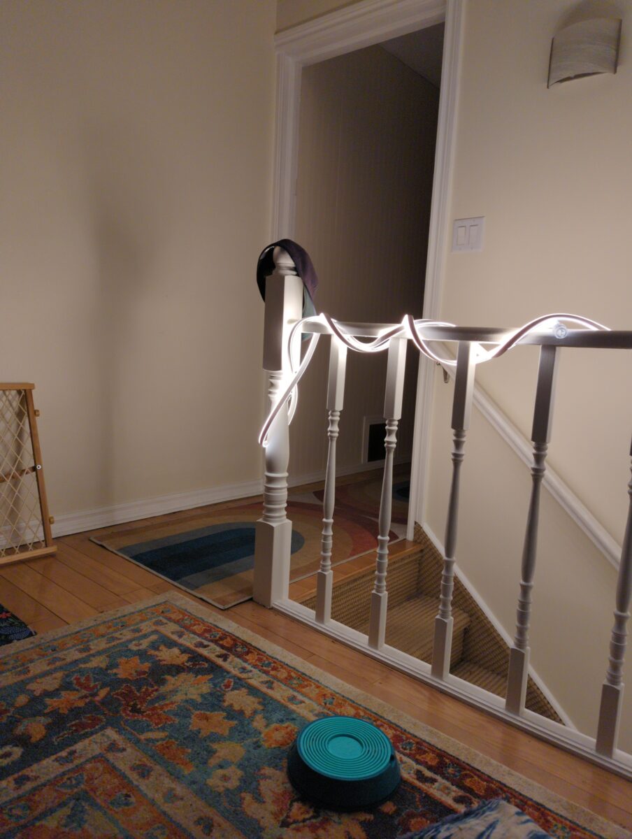
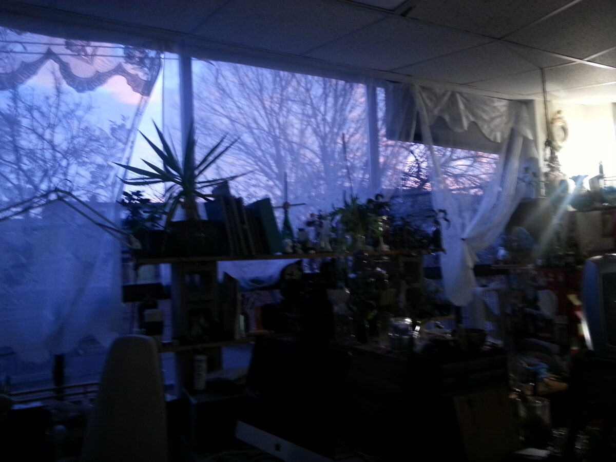
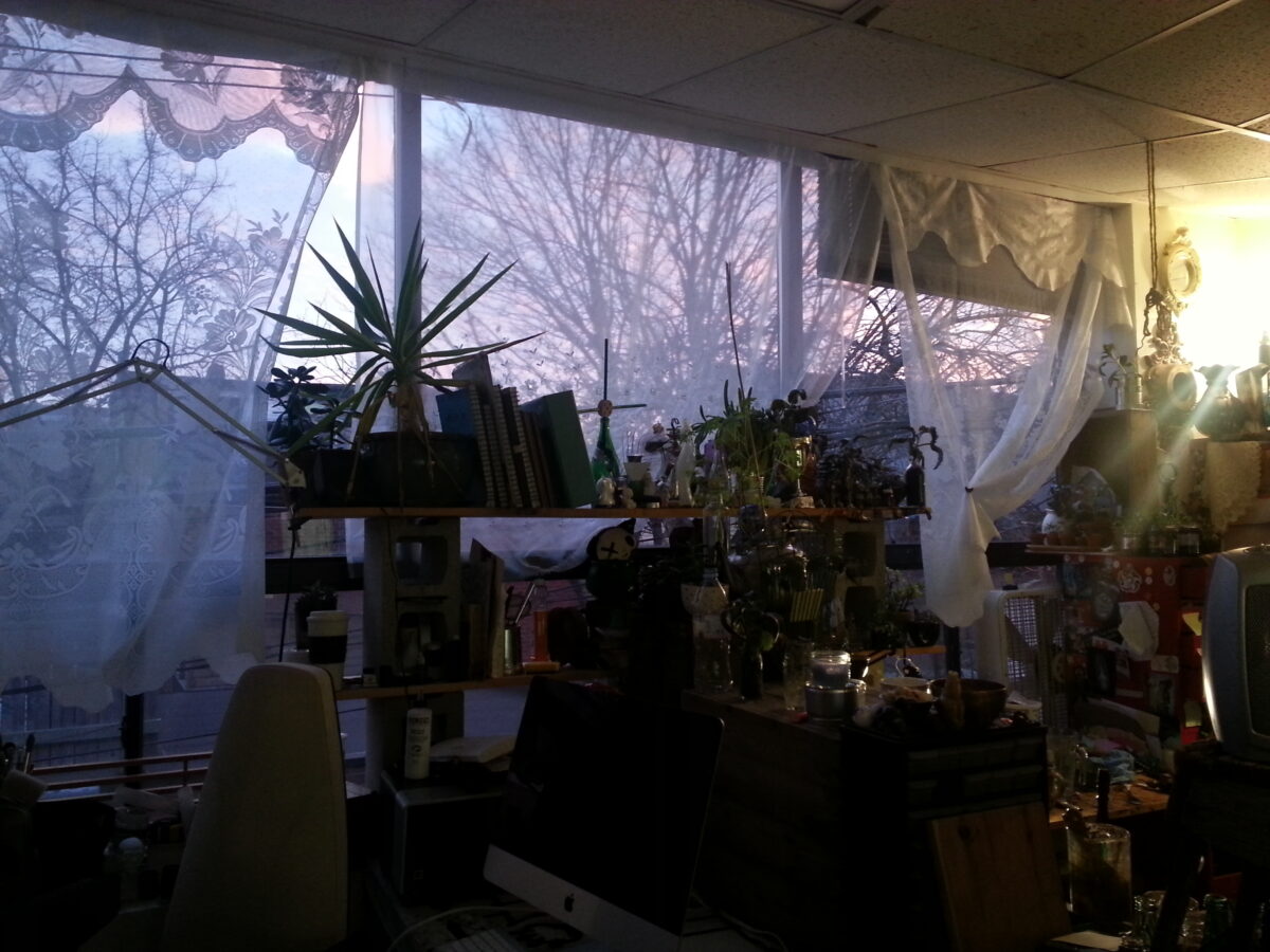
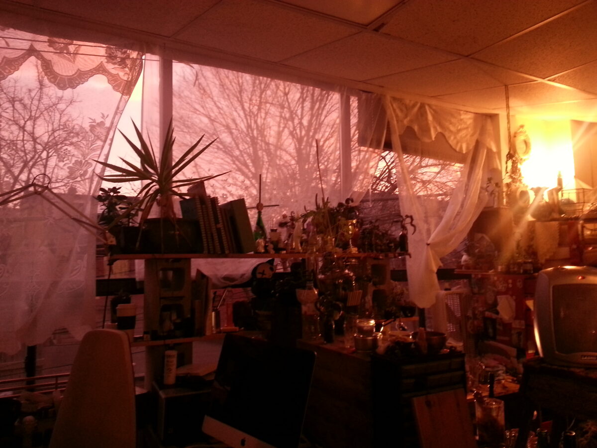
I’ve taken some example snaps here to help illustrate this point. In this scene you can see some incandescent lightbulbs, and a window out to a cloudy overcast afternoon sky.
As i switch between white balance settings, watch which parts of the image are more or less colourful, and which colours get neutralized to white.
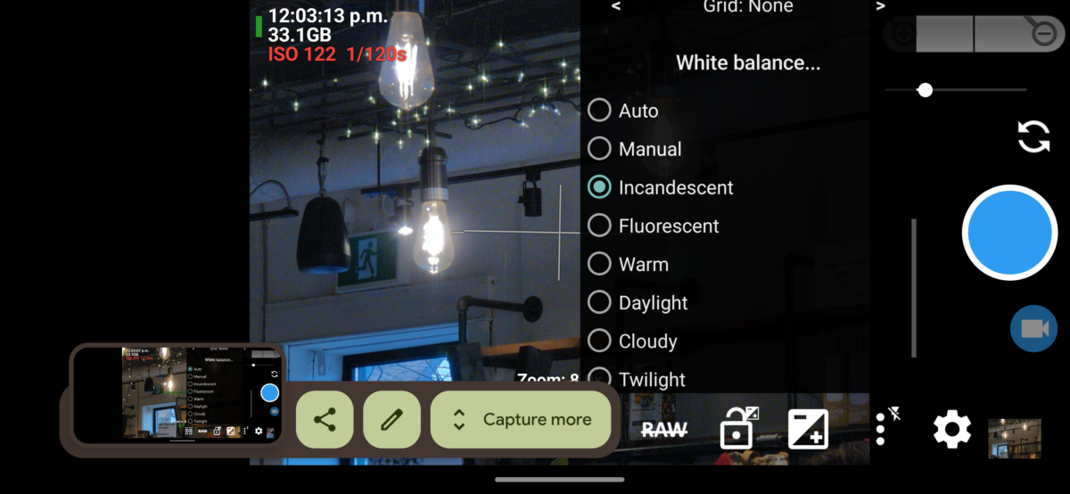
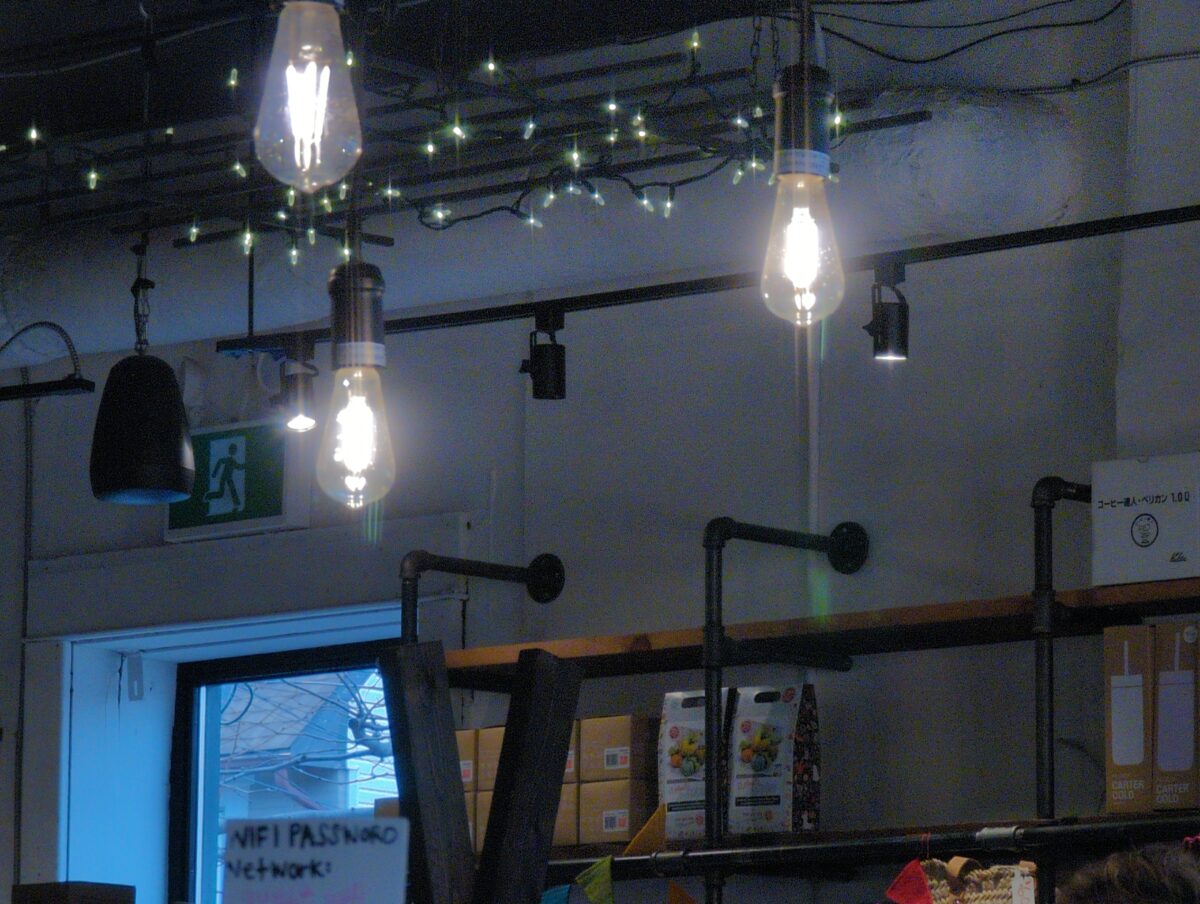
A quick note on how these settings are named. “Incandescent” is named that because it’s a great setting to neutralize the warm glow your scene would have if lit only by incandescent bulbs. You can see, above, how the bulbs appear to be throwing a cold white light. In contrast, the cold light from outside now looks REALLY cold – almost twilight blue – because the translation is being applied to the entire image evenly.
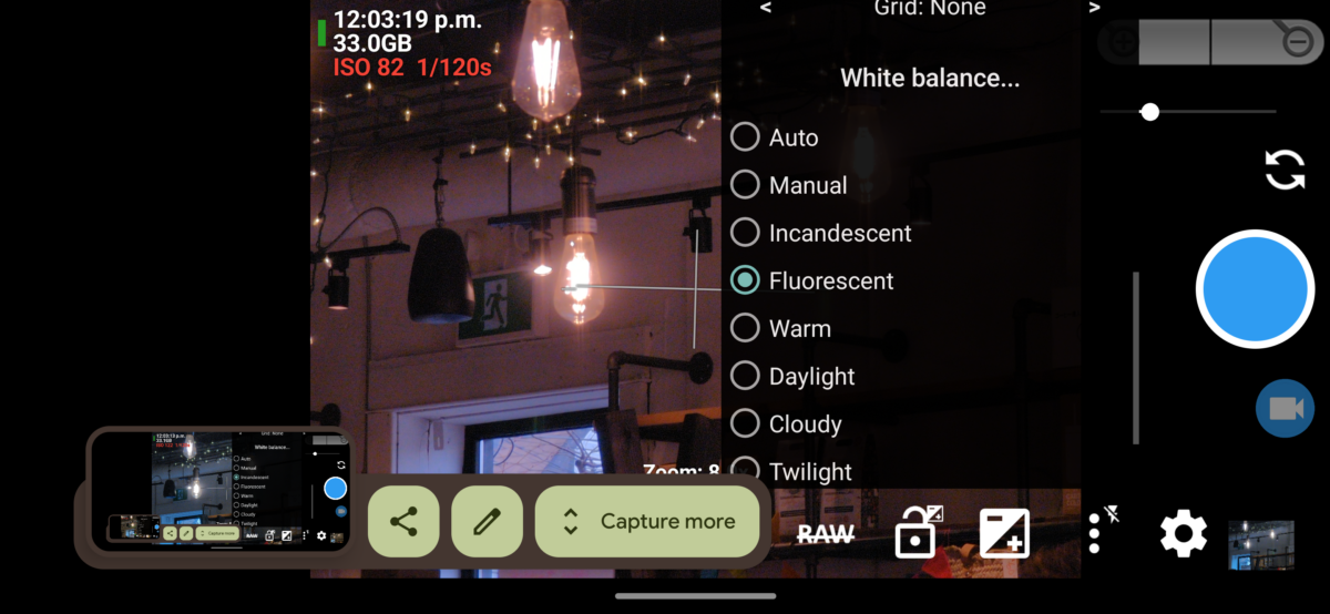

Fluorescent, then, is designed to compensate for the colour shift that fluorescent lighting applies to a scene. Since there’s no fluorescent lights in my composition, nothing feels neutral or white, and instead it all feels pink and purple.
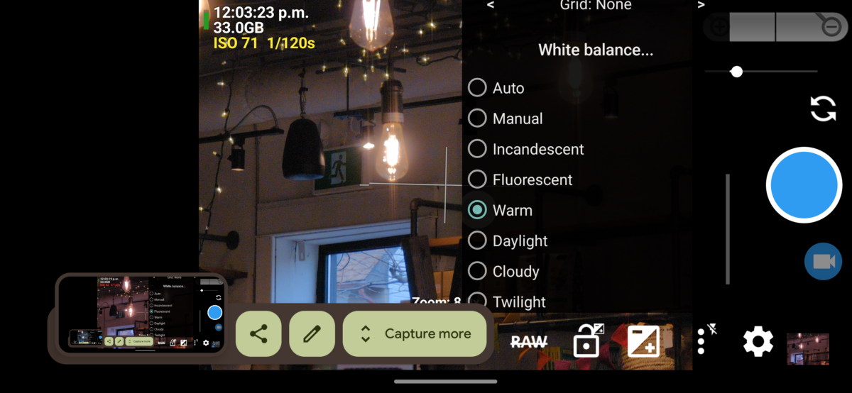
“Warm” is maybe a bad name for this setting, but as far as I can tell it’s a setting in-between Fluorescent and Daylight. It doesn’t neutralize anything in my composition too much, but you can see it is still doing some compensation for the incandescent bulbs and string lights, making them more neutral in colour than the blue outdoor light.
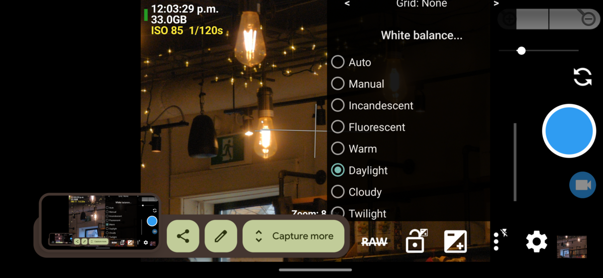
By contrast the Daylight setting neutralizes that outdoor light in the window very successfully, and you can see how that makes the incandescent bulbs appear quite yellow in comparison.
The Cloudy setting even starts to make the outdoor light feel a bit warm, kind of greenish-yellow, and the incandescent bulbs start to feel warmer too, more buttery citrusy orange.
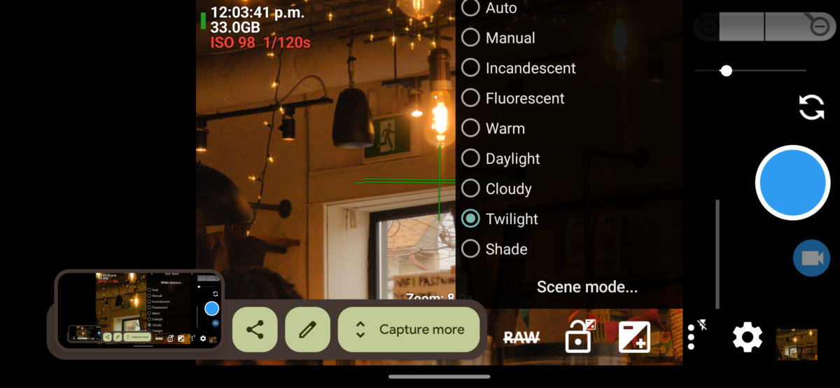
The Twilight setting is designed to compensate for that grey-blue light you get just after the sun has set, and since none of the light in this scene is anywhere near that cold, everything indoors and out is feeling orange.
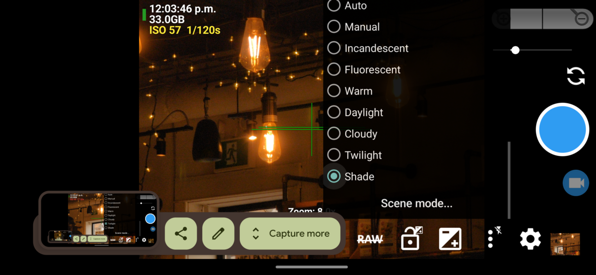
The Shade setting would be perfect at compensating for when you are photographing something that’s in the shade on an otherwise clear, sunny day – on those days, if the subject is out of the sun, it will be lit only by the blue sky, an incredibly cold blue light source. Since nothing in our composition is anywhere near that kind of cold blue light, everything is feeling orange and red.
I hope that’s a good example of what these fixed settings are and what each is doing to the image!
Note that in each of these settings, the camera has a fixed translation value it’s using. When I’m using a fixed setting like this, i know the translation value isn’t changing even if i take it from a daylight scene to a lamplit scene. This means, it’s showing me the difference between the daylight and the lamplight.
Here you can see how the Incandescent setting interprets a cloudy afternoon shot and a lamplit indoor shot:
But most digital cameras are set to auto white balance by default, and how much they let you change that can vary wildly. As I mentioned, my Google pixel 6 pro, with its very hyped up camera, doesn’t let me set temperature specific white balance, which sucks! But at least the qualitative settings like Incandescent and Daylight are still fixed.
So let’s talk about auto white balance.
So you might see that the auto setting doesn’t quite match any of the colour of the fixed settings demonstrated above. Auto white balance is calculated in response to what the camera is looking at in that moment, and it’s recalculated as you move your camera around.
Here is how the Auto setting interprets the same cloudy afternoon and lamplit indoor scenes from above:

The digital camera is attempting to detect the light colour in the scene you’re showing it, and translate the colours accordingly. From looking at these, I believe that this means that it is looking to see if there’s a dominant colour in the scene, and adjusting the translation settings to better balance out the colour distribution. This can be great for scenes where your subject matter contains a full spectrum of colours within it that all simply are being tinted by the light – say taking a photo of a bunch of friends in a restaurant at night.
Where this Auto setting lets me down is when I’m trying to take a photo of something with a very strong single colour in it – for example, a rich orange sunset. It also tends to fail at capturing the magic of something like golden hour lighting, or dramatic surreal lighting like neon etc. To do its job, it actively neutralizes what can sometimes be, in my opinion, the best part of a given scene.
If you’re having trouble getting your phone to capture the colours in sunset photos, concert photos, dusk photos, etc, i definitely recommend playing around with more fixed white balance settings.
You can really transform a photo by changing the white balance!

Personally, I’ve stopped using auto white balance entirely.
I usually prefer to have my camera colour settings stay fixed and to then learn how to use those settings to my advantage in different scenarios. Most days I set my cellphone camera to Daylight white balance and shoot everything from there.
This was a technique i learned from this YouTube video:
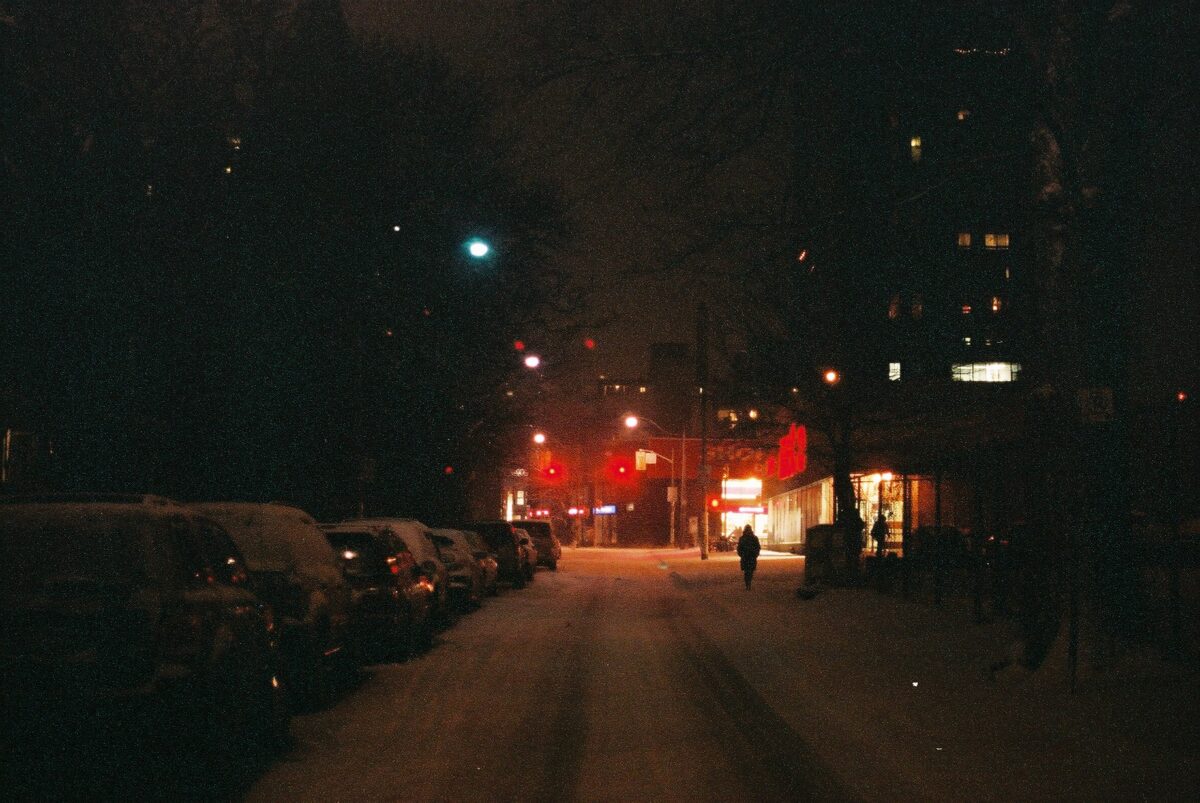
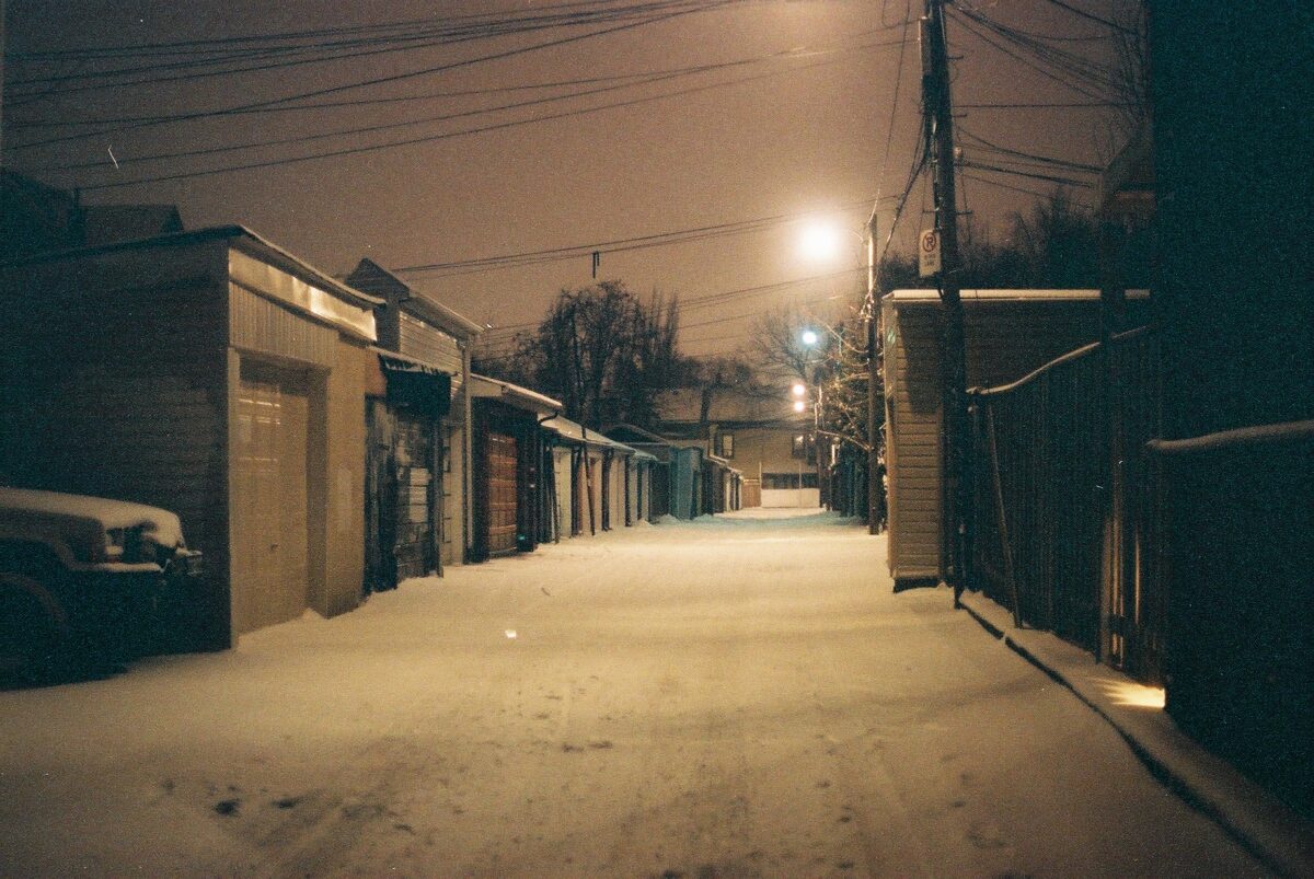
In here, Sean Tucker mentions that, if you shoot with film, you don’t get to adjust the white balance on each shot – the white balance is instead part of the film and development process, and most colour camera film is white balanced for daylight. This is why all my old film photos had such a rich warm tint on all the incandescent-lit photos, and a cool, almost purple feel on very overcast, cloudy days.
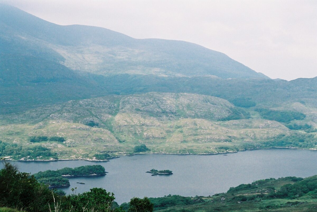
Here, a few of my favourites from my film days:
Now, while I cannot afford to shoot film all the time, I’m happy to indulge my nostalgia if it gets me excited about making more art, so setting my phone to daylight white balance it is!
Taking my camera out and shooting from midday to fully dark really showed me how this setting interprets different light scenarios, and frankly i love it. Much easier to imagine I’m painting with light if the light stops sliding around the colour spectrum, yknow?

A quick aside about RAW.
Raw photos contain more data than they can make visible. You can shoot a raw photo on whatever white balance setting you like, and the photo will still contain more colours than the condensed and translated selection it shows you. When you open it in specific RAW development software, you’ll be able to adjust the white balance hugely and it really barely matters what settings you used in the first place.
If you’re not shooting RAW, however, your photos can still be adjusted a bit, temperature-wise, but whatever colours got fully neutralized by the white balance settings will stay neutral, as digitally, neutral means that little or no colour data got embedded there. This is why it’s so hard to recover a sunset photo when the camera turned the sky white instead of yellow. There’s no colour info to un-translate in the first place.
This will come up again when i talk more about exposure settings, in a future post!
So this is a wall of text about white balance.
Thanks for reading!
If you’ve got questions, or corrections, or more info on the subject, I’d love it if you dropped that in the comments below! And if you’re having fun playing around with white balance in your own work, I’d really love to see it!
-
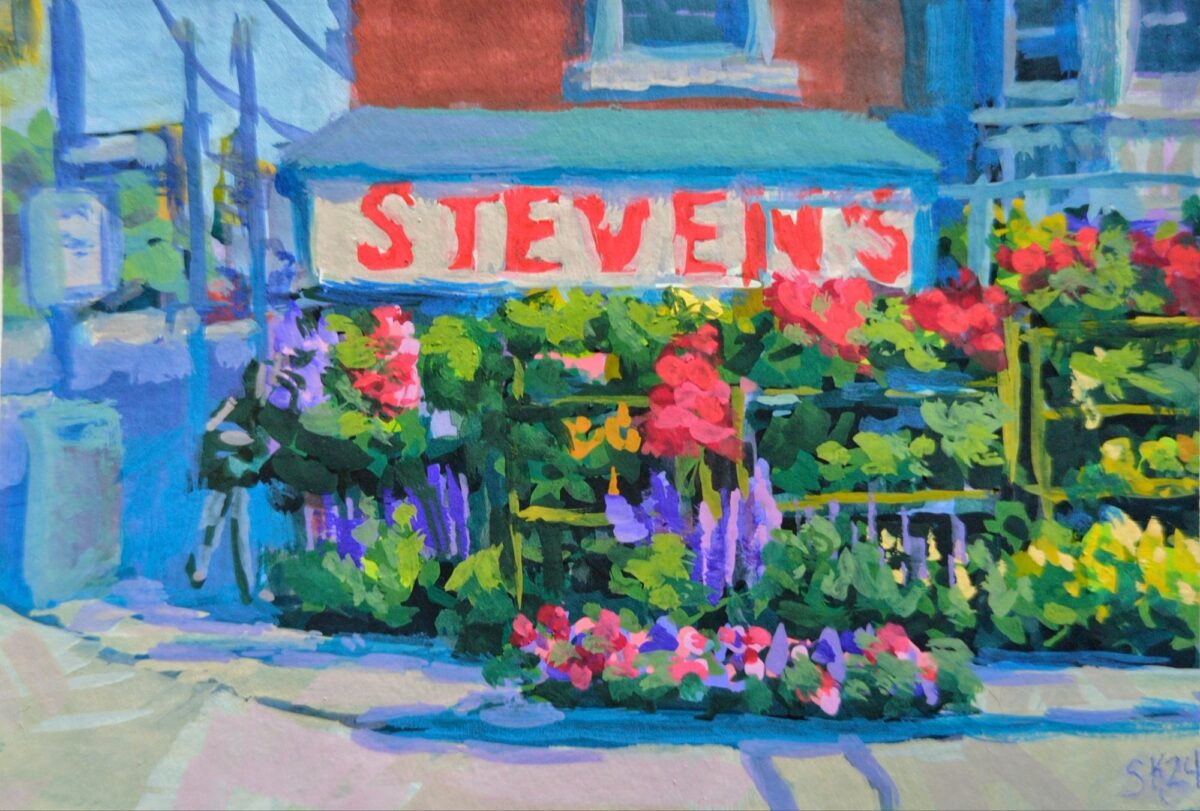
A lovely array of flowers i used to walk by every day after work.

Leave a Reply